A longtime showbiz journalist and fan's thoughts on comic books, movies and other cool stuff.

Tag: Reviews Page 1 of 2

Reminder – Mutant Cinema is FREE on Kindle! Plus, review it and get a prize!

Just wanted to remind everyone my Sequart book, “Mutant Cinema: The X-Men Trilogy from Comics to Screen” is available for download on Kindle for free. How can you not want to read it with a cool cover like this one, from artist Kevin Colden?

Click here to go straight to the download page!

Don’t dawdle, check it out now!

And while you’re at it, check out “Minutes to Midnight: Twelve Essays on Watchmen,” another Sequart book you can get free for Kindle. These offers won’t last long, so get them ASAP if you’re interested.

Again, the first five folks to email me with a link to a review (good or bad) on Amazon or elsewhere of the Kindle version of “Mutant Cinema” will get a free surprise comics treat from the extensive haul in my garage.

Who Can Canada Blame for Alpha Flight #0.1?

Alpha Flight #0.1

The absence of posts on this blog has been exacerbated by the preparations for and the birth May 2 of my daughter, Kaya. All is fantastic here at Bags and Boards central as we’ve spent the last few weeks getting to know each other. I don’t know if she will like comics, but she’s going to have plenty of them around to pass the time with as she grows up.

One such comic is Alpha Flight #0.1, Marvel’s third attempt to relaunch the once-successful 1980s series about a group of Canadian superheroes. As a Canadian who first read the group during the John Byrne heyday of the early to mid-1980s, this issue is a distinct improvement on some of the previous attempts, most notably the humor-infused Scott Lobdell effort that ran a mere 12 issues starting in 2004.

This effort does its best to restore a “classic” lineup with Guardian, Vindicator, Snowbird, Shaman, Aurora, Northstar and Marrina, but fails to distinguish itself from the mainstream mass of superhero comics and fails to do right by the basic premise of the series and its characters.

Written by Greg Pak and Fred Van Lente, the story centers on a terrorist named Citadel who seeks to disrupt a federal election by taking out the power grid in Quebec. Alpha’s called in and finds Citadel’s got help from Kara Killgrave, who once was called Purple Girl and was a member of Alpha Flight in the late 1980s when scripter Bill Mantlo was slowly but surely doing his best to make Alpha Flight the worst title Marvel published. The election goes on as planned, with former Alpha liaison Gary Cody winning as the leader of the fictional Unity Party.

Art wise, this is a decent-looking comic but nothing special. The art is by Ben Oliver with Dan Green and colors by Frank Martin. It would be nice to see some zing in the layouts if they stick around for future issues. But without some better writing, the art’s not enough to justify buying or reading this comic book.

One of the long-term problems with Alpha Flight has been the way successions of writers have completely messed up the personal histories of the characters. Mantlo was the king of this, turning Puck from a dwarf who overcame the pain of his condition into a man possessed by some kind of black genie and making the twins Aurora and Northstar into the descendants of elves from Asgard. He also killed off Snowbird and had Marrina go so crazy after becoming pregnant with Namor’s child that the Avengers had to kill her. I’m not kidding — these are actual Alpha Flight stories, and they set a precedent for writers to crap all over these characters. Since then, Guardian’s returned from the dead multiple times in a new body and, according to this issue, has a child with Vindicator that has vanished.

I don’t know how you end up with everyone back in the places we find them in this issue, but Aurora and Sasquatch are still an item; Guardian and Vindicator are back together in Ottawa and more boring than they’ve ever been; Marrina is back from the dead but not quite looking like herself; Shaman is performing open-heart surgery on a First Nations reservation; and Snowbird is back under cover with the police writing traffic tickets in the streets of Montreal. Oh, and Northstar is back after multiple stints with the X-Men living in Montreal with a new boyfriend. (Did you know he’s gay? Well, he is!)

The big question I have is this: If the writers are looking to take this comic back to basics, why would they be so sloppy with the details that show they understand who these characters are and the most basic understanding of Canada and Canadians that really is the only reason for this title to exist? Specifically:

  • Why is Snowbird writing traffic tickets for the Montreal cops when her power symbolically comes from the arctic? Her previous cover was as Constable Anne MacKenzie of the RCMP stationed in the Northwest Territories. It makes no sense that she’s now a “commandant” — which is not a real rank with Montreal police or the RCMP and even if it was, a commandant would not be writing traffic tickets. 
  • The take on Canadian politics is pretty funny. I have a feeling the Unity Party is meant to be some kind of anti-Alpha or radical conservative party, which is just plain boring compared to the real-world insanity of the Republican Party here in the United States.  
  • When did Heather Hudson become a brunette? I guess it may have been previously established that she and James MacDonald Hudson got back together, but they’re in no way a convincing couple. 
  • Shaman was clearly established as being a member of the Sarcee tribe, which was primarily based in western Canada around southern Alberta. His medical practice was always a very basic, community clinic style of operation near Calgary. Here, he’s performing open-heart surgery at the Grand Lac Victoria reservation in Quebec. Neither part of that sentence makes sense with this character. 
  • Walter Langkowski and Aurora are barely introduced. All we know about them is they’re an item. No mention is made of her being Northstar’s twin sister. Also, which Aurora is this? She wears the original black and white costume with long hair, while on the cover she has the white and yellow costume with short hair she wore after Langkowski altered her powers slightly. Also, is she still a split personality?
  • As for Walter, no mention’s made of his code name or where his power comes from. I know the source and nature of his power changed a lot over the years, so an explanation would be nice. 
  • Marrina looks completely different. Makes me wonder if this is a new version of the character. The cover shows the classic version, so some explanation would have been nice.
  • Where’s Puck? I might have missed the reason for this in another book.
  • And boy, do Marvel writers love to write scenes of Northstar being a positive, modern example of the gay superhero. After his recent run in The Uncanny X-Men, can’t Marvel find something else interesting about him? Or is he doomed to be a one-note character? Here’s one idea: he used to be a member of the FLQ, a terrorist organization that sought the separation of Quebec from Canada. (That may have been the only good plot point Bill Mantlo ever introduced to Alpha Flight, so of course it happened in Marvel Fanfare #28 circa 1985.) 

The biggest failing about this comic is there is absolutely nothing Canadian about it. I know that may seem irrelevant to a lot of readers, but when you get right down to it, it really is the only reason I can think of for this comic to exist.

Ask a comic fan to explain what Alpha Flight is about and the answer will surely involve the phrase “Canadian superheroes.” Therefore, these character need to be in some way representative of Canada, how Canadians relate to each other and the role Canada plays in the world. I don’t know if Pak or Van Lente are Canadian, but given Marvel’s track record on this post-Byrne, it wouldn’t surprise me if Pak or Van Lente’s sole experience with Canada was crossing the bridge at Niagara Falls and commenting on how there’s a maple leaf added to the logo at McDonald’s. (Don’t laugh — I’ve had that tale told to me by more than one person.)

Again, I think it’s important for a comic about Canadian superheroes have some kind of Canadian quality to it and Canada is not an easy place to figure out, even if you have lived there. It’s in many ways a lot more regional than the United States and also a lot less known. I get that someone who’s never been to New York could write an OK story set in New York because everyone absorbs the imagery and the icons through the media. But the same is not true for even the best-known Canadian cities like Toronto or Vancouver — and it’s even less true for places like Ottawa, Nunavit, Victoria, Saskatoon, St. John, St. John’s, Moncton, Quebec City or Red Deer.

This comic’s failures would not be so obvious without the high bar set by Byrne in his 28 issues. Even though Byrne was not born in Canada and hasn’t lived there in decades, he understood enough when he did Alpha Flight to inject as a theme Canada’s struggle to define itself and maintain some control over its destiny and resources while dealing so closely with the incredibly rich, insatiable and friendly juggernaut that is the United States. Failing to inject something like this into the book leaves it no different from Avengers North, and not worth publishing or reading.

Comics I like: L&R, Zot!, Next Men, X-Men Index, New York Five, 27, Who is Jake Ellis?

I have several large stacks of comics on my desk right now, including a bunch of current superhero releases from Marvel and DC. Some of these are not recent releases, but most are, and indicate where my head is in terms of comics these days.

Love and Rockets: New Stories #3 (Fantagraphics, 104 pages, black and white, $14.99) contains one of the best comics stories I’ve read in a very long time: Jamie Hernandez’s “Browntown.” It fills in the history of Maggie’s family with a story that is realistic, honest and true in every way that matters. Throw in a tale of “current day” Maggie, and some fantastic sex weirdness from Gilbert, and this easily is the best $15 you can spend in a comics shop.

Zot!: The Complete Black and White Collection (Harper, 576 pages, black and white, $24.95) is really interesting to read for the first time so many years after having absorbed Scott McCloud’s most famous work, Understanding Comics. That’s because he obviously is experimenting with some of the ideas for comics storytelling he eventually put into Understanding Comics, and it’s interesting to see those ideas put into practice with a real story. What I didn’t expect from this book was how gentle and sweet it is, and how well McCloud’s art style fits with the story. It’s also a big, thick and satisfying read — complete with commentary by McCloud on each story. Another excellent read for a great price.


John Byrne’s Next Men #(3)1 and (3)2 (IDW, 28 pages each, color, $3.99 each) were a pleasant surprise. I have been a fan of Byrne’s work for many years and I thought his original run on Next Men was easily the best, most original thing he had ever done. I love a lot of the work he’s done for DC and Marvel superheroes, but Next Men really stood out to me as the kind of comic top creators should be free to do. Having just re-read the entire original Dark Horse run prior to digging into the new issues only reinforced this in my mind, and I really think that the series would have been a huge smash and run for years had Image Comics and the speculator phenomenon not come along at the same time. But I have to admit disappointment in Byrne’s recent work — especially such DC projects as the unreadable Lab Rats and underwhelming takes on Doom Patrol and The Demon. I haven’t read his previous IDW stuff. But the first two issues of the revived Next Men really popped — the story picked up seamlessly and with plenty of surprises, and the art recalls Byrne’s style from the time he did the original series and is more inviting and stylish than anything I’ve seen from him in years. I’m glad Byrne finally came back to this series and hope it’s successful enough to encourage him to try more creator-owned material in this vein.

The Official Marvel Index to The Uncanny X-Men (Marvel, color, $19.99). I have always liked these indexes because it’s a lot of fun to just flip through info on so many series in one convenient place. This is a complete revamp from the previous X-Men indices (published in 1987-89 and 1994), and while I like that things like variant covers and some behind-the-scenes creative notes are included, I do have a few complaints: Please, Marvel, number the pages — especially if you’re going to say in the text things like “This issue has a 2nd printing variant cover, which can be seen on p. 165.” Because I can’t find p. 165 with no page numbers short of flipping through the book until I spot what I’m looking for. Second, I know space is tight, but using abbreviations for every title is a bit annoying even as I like that you added a year to each issue cited in this way. And lastly, if you’re going to index the X-Men, it would be useful to treat the X-Men in the index the same way Marvel publishes the comics: As a line of comics. It’s especially annoying when you have so many crossovers between The Uncanny X-Men and X-Men, and the index only includes the Uncanny side. I would hope a second volume is on the way to fill in those gaps. Still, I’m glad to have this and pleased is goes all the way up through 2009’s Utopia crossover.

Back to singles: The New York Five #1 (DC/Vertigo, 32 pages, black and white, $2.99) surprised me by being a lot better than I remember The New York Four being. This sequel from writer Brian Wood and artist Ryan Kelly — about a group of young women finding their way through their freshman year at college in New York City — feels more appropriate to a college age than the younger first book. The full-size comic book format also lets Kelly’s artwork really shine — it looks fantastic in all its detailed, gritty, urban black and white glory.

I picked up 27 #1 (Image Comics, 24 pages, color, $3.99) as part of an effort on my part to find something — anything — new to get excited about. And it’s a good start. Scripted by Charles Soule with art by Renzo Podesta, this is a tale of a rock guitar god whose hand injury has put his career on the rocks. Until an unusual solution is offered that has its drawbacks. Printed in a slightly oversize “Golden Age” format, the art looks like it was actually drawn (instead of the heavily Photoshopped

 Lastly, I snagged a copy of Who is Jake Ellis? #1 (Image Comics, 28 pages, color, $2.99), which presents an unusual take on the well-worn spy drama. Written by Nathan Edmondson, our titular hero is a spy who has a sort of imaginary friend who warns and advises him on how to do his job and get out of the sticky situations it lands him in. It’s not clear either to Ellis or the reader exactly what this presence is, but it is nice (again) to read a first issue that presents enough of a new story to make me feel like I got my $3 worth. The art, by Tonci Zonjic, is clear, atmospheric and well-colored, making for a nicely designed package.

Off the shelf: Wilson, Other Lives and Blazing Combat

Wilson (Drawn & Quarterly, $21.95, 80 pages) is the most-recent release from Daniel Clowes of Ghost World fame, telling the life story of a guy who is most accurately described as a misanthropic jerk in a series of one-page stories. At first, the format is a bit choppy and repetitive, but these little vignettes — each playing out like a little remembered incident you might tell at a party — start to add up and have a surprisingly emotional effect. Wilson’s story is a sad one and he’s not the first character of this type that Clowes has tackled, but the relentlessness with which Wilson is shown to constantly choose to be a jerk is compelling as it goes from annoying to self-destructive to sadly sympathetic. It’s not the easiest thing to get into, but it’s well worth it.
I’ve long been a fan of Peter Bagge’s talent for creating completely believable and weird characters, and his most-recent outing — the Vertigo original graphic novel Other Lives (DC/Vertigo, $24.99, 136 pages) — is no exceptions. Here, Bagge delves into a world where everyone is pretending at least part of the time to be something they’re not. What I like the most about Bagge’s characters is the realism that results from having them think they’re a lot smarter than they are. They never see past their own fantasies to the obvious real-life conclusion that’s bearing down on them, which makes the way Bagge resolves his plots all the more fun and weird. My biggest complaint with this book is that this is a $25 hardcover graphic novel from one of the industry’s giants and it’s in black and white. This isn’t new — Vertigo’s been doing this since the likes of The Quitter, The Alcoholic and Incognegro. Honestly, I’m already paying $25 — I would pay an extra $5 if that’s what it took to get this in color.

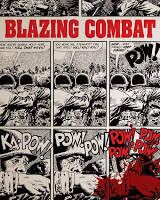
Saving the best for last, there’s Blazing Combat (Fantagraphics, $19.99, 208 pages), an amazing collection of the stories from the short-lived cutting-edge mid-1960s Warren Publications series. These are all short stories in the mode of Harvey Kurtzman’s Frontline Combat, but with a 1960s edge to them. They’re all written by the outstanding Archie Goodwin, with a few assists, which for most fans would be reason enough to buy this comic all by itself. But then you throw in some of the most amazing art, all of it sharply and expertly reproduced, and you’ve got some real dynamite here. This book includes prime artwork from Joe Orlando, Gene Colan, Reed Crandall, John Severin, Alex Toth, Al McWilliams, Wally Wood and Russ Heath. And there’s fantastic bonus features, including interviews with original publisher James Warren and Goodwin on the book and the troubles it faced getting distribution after being labeled an “anti-war” book in the early days of the Vietnam War, and the original color covers by none other than the late Frank Frazetta. If all that doesn’t sell you on this as a must-buy, then you may need professional help.

Off the Shelf: Jonah Hex: No Way Back

Jonah Hex: No Way Back (DC Comics, $19.99, 136 pages) is better than it needs to be, which I mean anyone who buys this book because they like the upcoming movie version will no doubt feel they got their money’s worth.

As a graphic novel, it’s a solid Western tale that is not without some pretty obvious rough edges.

The gist of the story by Jimmy Palmiotti and Justin Gray is that Jonah Hex discovers from his dying mother that he has a half-brother. With her death, Hex heads to meet the brother he never knew he had and lay their mother to rest. This is far and away the best part of the story, as it highlights the tragedies of Hex’s life and provides a convincing contrast to his violent nature.

Less convincing is the nominal villain of the story, a bandit named El Papagayo who wants revenge on Hex’s family. While El Papagayo provides an excuse for some good action sequences in the book, this element feels very tacked on — as if it was added solely because the book needed an action element.

Tony Dezuniga, who was known for his work on the original 1970s Jonah Hex series, does an outstanding job on the art for this series. His storytelling and compositions are relaxed, confident and clear, while the scratchy finish — assisted by John Stanisci — is a perfect fit for the genre.

Dezuniga also deserves credit for bringing some taste and class to the art. The script calls for a number of rather gruesome scenes that Dezuniga draws with just the right mix of restraint and clarity so that it’s always clear what’s happening without being gratuitous or ostentatious.

Which brings me to the one part of this book that really annoyed me, which is the use of eye dialect in writing Hex’s dialog in particular. (Eye dialog is the practice of writing a character’s dialog phonetically to convey a heavy accent. Chris Claremont used this a lot in his Uncanny X-Men run on characters like Rogue, whose lines were written like “Ah shore do, shugah!” rather than “I sure do, sugar!”) I think this is a technique where a little goes a long way — a few lines early on to establish the accent can let readers assume it continues through the book and let the writer put the emphasis more back on what’s said than how it’s said.

And in Jonah Hex: No Way Back, I found it very distracting. Other characters had distinctive speaking patterns or used terms common to dialog in the genre without going to the extent of Hex near the end saying, “Guilt ain’t sumpthin’ Ah live with. Ah figger guilt is a disease that eats yer soul.”

Maybe it’s just me, and it won’t bother anyone else. Which is fine because despite its rough edges the positives of this book clearly outshine the negatives.

Off the Shelf: Wednesday Comics

Wednesday Comics (DC Comics, $49.99, 200 pages) is even more impressive to look at in the spiffy new oversize hardcover edition. The strips read much better (and more quickly) grouped by feature than they did one page a week.

The quality of the strips is overall pretty good, but they obviously are not equal, so here’s a strip-by-strip rundown of this very cool comic.

Batman, by Brian Azzarello and Eduardo Risso, kicks things off with a slight disappointment and is not as good as I was expecting given the creators. A basic detective story whodunit in which a banking magnate dies and the suspects include his son and his trophy wife, is simply serviceable. Risso doesn’t seem to have time to find his legs in the new format and doesn’t have the freedom to cut loose with the sex and violence he draws so well.

Kamandi, by Dave Gibbons and Ryan Sook, is a flat-out tribute to Prince Valiant and its peers in the classic adventure strips genre. Gibbons eschews balloons and scripts the story Prince Valiant style, with blocks of text that combine both narration and dialog. And it works extremely well with the classic look of Sook’s artwork. The lush, illustrative art deviates radically from the iconic Jack Kirby version, but Sook sells it with detail and elegance.

Superman, by John Arcudi and Lee Bermejo, is a gorgeous looking comic that combines old-school illustration with terrific modern coloring. I saw some of these original art pages at San Diego last year, and Bermejo and colorist Barbara Ciardo deserve credit for the best-looking Superman comic in years. The story mixes the action with the human side of Clark Kent to mixed results, though I can’t say the fault lies with Arcudi entirely as DC has for years focused on the man at the expense of the super when it comes to the Man of Steel. Fans of today’s Superman comics will dig it; the rest of us can just look at it and drool.

Deadman, by Dave Bullock and Vinton Heuck, was a lot of fun to read. As someone who’s never read a Deadman comic before (though I would like to read the classic Neal Adams run), the wise-cracking characterization of Boston Brand was unexpected. Bullock, who comes from the animation side of Warner Bros. and directed the very cool Justice League: New Frontier home-video adaptation, injects a lot of energy and fun into the kind of karmic life-after-death story that is so dreary in the wrong hands. Of all the strips, this one surprised me the most and I would read more of Bullock and Heuck on this character.

Green Lantern, by Kurt Busiek and Joe Quinones, is a pretty standard GL story that stands out visually because of the retro, Space Age setting. I like the idea of Hal Jordan as a test pilot during the era of Chuck Yeager and the Mercury astronauts because that’s really the only time in American history where those men were well known and admired as heroes. I wish the storytelling had been a bit more inventive, but it works just fine as is.

Metamorpho, by Neil Gaiman and Mike Allred, sounds like one of those can’t-miss team ups. And while it looks great and the story has some nice details in it, it doesn’t blow the doors off the way I was deep down hoping it would. As always, Allred’s art shines and is gorgeous to look at. He doesn’t go overboard with experimentation, but he does try some very cool tricks, primarily the “Snakes and Ladders” game board and Metamorpho and Element Girl hopping through all the elements of the periodic table in a huge two-page spread. The problem is these tricks don’t come off as an organic part of Gaiman’s story, which features a rather plain plot and some really fun wordplay in the periodic table pages especially.

Teen Titans, by Eddie Berganza and Sean “Cheeks” Galloway, is one of the harder strips to follow as both the story and the art confuse. Berganza’s tale is a pretty standard superhero story that would be well-suited to an episode of the cartoon series. Galloway is an excellent artist and a fantastic character designer whose work on such animated series as The Spectacular Spider-Man is top-notch. But the layouts used in this format are extremely confusing, muddied even further by using anime-style muted coloring. It looks better in the collected edition than it did on newsprint, but still seems like a poor choice when brighter colors and stronger contrasts could have made this really pop.

Strange Adventures, by Paul Pope, picks things up again. Pope is exactly the sort of artist whose style and design sense really play into the broadsheet comics idea. The story, which stars Adam Strange, is again a pretty standard Adam Strange story, but the joy comes from the way in which Pope draws this familiar character and his worlds in a way that completely recasts it as more Heavy Metal and less Murphy Anderson. If Paul Pope drew a dozen science fiction comic books a month, I would buy them all.

Supergirl, by Jimmy Palmiotti and Amanda Conner, is the must purely fun strip in this collection. The story shows Supergirl chasing after Krypto and Streaky as they chase each other and playfully cause their share of super-size damage. Conner really has a knack for the story, and for the first time I can remember Supergirl is a enjoyable and cute character without being hyper-sexualized. Paul Mounts, who colored this story, also deserves a pat on the back for giving it a bright, clean look that really pops off the page.

Metal Men, by Dan DiDio and Jose Luis Garcia-Lopez and Kevin Nowlan, was a real pleasant surprise. I know that Garcia-Lopez is revered in comic art circles and is to many professionals the best artist in the business, but I haven’t had much chance to ever read much of his work beyond, I think, an arc or two of Legends of the Dark Knight. But his reputation is certainly supported by the outstanding artwork here. Not only is everything well drawn, but the scenes are beautifully composed and the pages laid out to take maximum advantage of both the format’s ability to display both big iconic images and pack in a lot of story. I always found the Metal Men a little too goofy to read a long run of stories about them, but this was just right.

Wonder Woman, by Ben Caldwell, is the lightning rod tale of this book. Like Galloway on Teen Titans, Caldwell uses a distinct but subtle color scheme that made deciphering the sketchy, small-panel art style almost impossible on newsprint. The collected edition is a big improvement, and I found a lot more to like in the dream-like story than before. It still is my least favorite strip in the book, however, though I applaud Caldwell and DC for being willing to experiment like this with such a high-profile character.

Sgt. Rock and Easy Co., by Adam Kubert and Joe Kubert, is a real old-fashioned DC war comic story that works as entertainment even though it doesn’t break any new ground. Joe Kubert’s art is, as always, outstanding and instantly recognizable. No one can do this kind of material as well as he can. The story is solid and stands solidly within the tradition of Sgt. Rock stories, which also makes it very old-fashioned and perhaps a little stodgy given that World War II ended 65 years ago.

The Flash, by Karl Kerschl, Brenden Fletcher, Rob Leigh and Dave McCaig, is the best superhero strip in the book by a long shot. It’s also one of the best and most memorable Flash stories I’ve ever read, perhaps because the plot is willing to take its premise all the way to a conclusion that’s both logical and satisfying. There’s a lot of little things to like, such as including a separate Iris West strip in the old romance-comic style and even a Gorilla Grodd sequence that’s a nod to old Tarzan comics. This one also does some of the coolest bits with the broadsheet page, designing sequences of panels that easily lead the eye all over the page in patterns that would render most other comics unreadable. This is a very appealing take on the Flash, and I wish that the character’s new comic book series had even half the panache of this version.

The Demon and Catwoman, by Walter Simonson and Brian Stelfreeze, is a strangely bloodless exercise. Stelfreeze is a good artist, and he delivers the kind of solid drawing and polished inking that I would like to see in more superhero comic books. But there’s not as much experimentation or playing to the format here. Simonson’s story is solid, but similarly doesn’t do much to make me care about these characters or showcase the pairing in such a way that it makes me want to read more.

Lastly, there’s Hawkman, by Kyle Baker, which is expectedly hilarious. Baker just pulls out all the stops and turns the character into the ultimate macho superhero who responds to the weirdest plot twists by just hitting everything as hard as he can. The opening page, which parodies Frank Miller’s 300 comic with “We flap!” replacing “We march!,” is a riot. The art is similarly ripped, with what looks like computer models and photo referencing producing every kind of macho detail a fanboy could want. All this, and it never takes itself seriously! I love it.

This edition wraps with two single-page strips that I imagine didn’t make the cut. The first is a cartoony Plastic Man strip by Evan Dorkin and Stephan DeStefano, the second is a Creeper page by Keith Giffen and Eric Canete. I can’t say either impressed me enough to want to see more, though I would definitely try a Dorkin and DeStefano superhero comic.

The Wednesday Comics experiment falls into the success category. Even though not every strip succeeded, the experience of reading the book was a satisfying one — moreso than reading the strips in the original serialized form. A big part of that for me is the variety of the strips — no two strips were alike; no two creative teams experimented with the format in quite the same way. More than anything, Wednesday Comics is adventurous in a way that DC would do well to try spreading to the rest of its comics line.

New Comic-Con pictorial history is an absolute must have!

Attending Comic-Con is a unique experience — there’s nothing else like it on earth and the experience is different for each person, each year they attend. And as the show has grown exponentially, it’s become almost impossible to experience more than a fraction of it. Admittedly, it can at times be as frustrating an event to attend as it much more often is exhilarating and exciting.

So I was thrilled to find a review copy of what is sure to be one of the hottest items at this year’s convention: A big pictorial history book of the show, titled “Comic-Con: 40 Years of Artists, Writers, Fans and Friends.”

I guarantee: This will be the hottest item at this year’s show.

What’s in it? Well, there’s a good overall history of the show, from its earliest days through to today’s pop culture phenomenon, but even better the book is absolutely packed with photographs, artwork, profiles, vintage articles and lists of the show’s many guests and awards. All this is wrapped up in a fantastic cover by Comic-Con mainstay, Mad-man Sergio Aragones.

Among the amazing tidbits and sights I learned from devouring every page of this book are:

  • In 1975, Alan Light (founder of what became the Comics Buyers Guide) and his Dyna Pubs produced an LP record featuring programs from the Comic-Con. I instantly hit Google to search for more info on this, as I would love to listen to this, and came up empty. Anyone know anything about this? Has it ever/could it be re-issued? I love that this simply exists somewhere.
  • Vintage photographs of Chuck Norris shaking hands with Stan Lee at the 1975 show and Alan Moore with Jack Kirby at Moore’s only U.S. con appearance ever in 1985. Also pics of folks like Jerry Siegel and Joe Shuster, Harvey Kurtzman, Harlan Ellison … and it just goes on and on. This book is a treasure trove of photos of comics creators and Con attendees past and present.
  • Images of program covers, promotional fliers and ads, badges, limited-edition prints, all the official Con T-shirts, and even the covers of the updates and magazines.
  • Profiles of Con mainstays, illustrated of course, such as Forrest J Ackerman, Will Eisner, Jack Kirby, Ray Bradbury (who also writes the intro), Will Eisner, Dave Stevens, Mark Evanier, Neil Gaiman, Frank Miller and Jim Lee.

I have to say I’m thrilled to see all this history out there, because it’s not been something terribly easy to come by in years past. I recall editing the first Comic-Con special for Variety five years ago and finding little published material out there on the Con’s past. I was therefore thrilled when Evanier, one of the few folks who has been to every San Diego Con, agreed to write a piece for the special. (You can read that piece here.)

Flipping through this book evoked for me much the same thrill I get from attending the show. There’s something amazing to look at with each turn of the page. This book instantly made the two-month wait for this year’s convention seem unbearably long.

The book, which was written by Comic-Con mainstays Gary Sassaman and Jackie Estrada (with lots of help), is designed and published by Chronicle Books — so I’m sure that it will be made available through normal book publishing outlets at some point.

But I’m also convinced this will be one of the hottest items at this year’s Comic-Con. The current issue of Comic-Con magazine offers a preview of the book and says the first print run will be limited and a special preordering system will be set up for folks to pay their $40 in advance and pick up at the show. Details will be forthcoming at comic-con.org.

Don’t miss out. This one is worth it.

Reading a Big Stack of Comics, Part 2

Let’s get right to it, shall we?

Ignition City #1-2 (Avatar Press, $3.99 each) was exactly the kind of thing I think to myself that I want to read. So I should really have liked this, but instead I found it annoyingly unsurprising. Maybe I should take a break from reading just about everything Warren Ellis writes, because Ignition City felt too much like Ellis-by-numbers: Tough, smart, hot chick protagonist? Check. Lots of swearing, drinking and talking about swearing and drinking? Check. Making a fetish of air travel, space travel and or British exceptionalism? Check. I still liked it, though I wish artist Gianluca Pagliarani didn’t try so hard to get me to look at Mary Raven’s ass.

Soul Kiss #1-2 (Image Comics, $3.50 each) puts a fun twist on the deal-with-the-devil idea as a struggling young production assistant gains the power to kill with a kiss. Man of Action Steven T. Seagle delivers a peppy script, well matched by some bold and vibrant from the artist, Marco Cinello. This feels like the indie comics of decades past and I’m on board for the rest of this one.

Seaguy: Slaves of Mickey Eye #1 (Vertigo, $3.99) is something I bought mostly because anything Grant Morrison does is almost always worth a look. But this is a reminder that not everything he does pans out. My first clue should have been that I remembered the art from reading the first Seaguy series but nothing about the story. This sequel made an equally lax impression on me as Seaguy mopes his way through a story that’s strange but as lifeless and pointless as the first series was (now that I remember it).

Elephantmen #15-18 (Active Images/Image Comics, $2.99 each) has turned into a real favorite, largely because each issue actually adds to the story. The pace isn’t exactly a rip-roaring roller coaster, but unlike too many other series when something happens in Elephantmen it happens for a reason. It also looks fantastic, with great artwork, lovely coloring and effective (though occasionally over-busy) designs and top-notch lettering. It also is one of the few comics that actually feels like a periodical publication, its pages filled with bonus features, articles about British comics and even backup features. I particularly liked issue #18, which featured some lovely artwork from comics newcomer Marian Churchland.

Astro Boy: The Movie #1 (IDW, $3.99) debuts a four-part prequel to the upcoming CG-animated movie. The comic has an appealing, simple style, courtesy of writer Scott Tipton and artist Diego Jourdan, that is ideal for a kids audience (which is what I assume they’re going for). Fans of Osamu Tezuka or the old anime Astro Boy cartoons are probably going to find this a little shallow, but this is pretty good for a kids-movie tie-in.

From the Ashes #1 (IDW, $3.99) is a strange and fun “speculative memoir” by misanthropic cartoonist Bob Fingerman in which he and his wife, Michele, appear to be the sole survivors of a mysterious apocalyptic event. It’s surprisingly funny to watch them take relief in the idea of not having to go to work or that all the annoying people they hate aren’t around — until, of course, the cannibals show up. The almost blasé reactions are a nice counterpoint to the hysteria of, say, Cloverfield.

Buck Rogers #0 (Dynamite, 25 cents) is a short preview of a new series resurrecting the classic sci-fi hero for the 21st century. Most of my knowledge of Buck Rogers comes from the 1970s TV show, which was decidedly cheesy, so this is a pleasant surprise. Scott Beatty sets things up with an action packed script and the art by Carlos Rafael has a terrific modern look.

American McGee’s Grimm #1 (IDW, $3.99) is a reasonably fun little lark in which the title character — who apparently stars in his own video game series — spoofs superhero comics by helping the supervillains actually win, for once. While superhero comics are a pretty easy target, this has a few clever moments and some interesting looking artwork, courtesy of writer Dwight MacPherson and artist Grant Bond.

Stephen Colbert’s Tek Jansen #4 (Oni Press, $3.99) continues the series spun off the Comedy Central faux news hosts’ fan fiction joke. The joke was funny when the first issue came out, some two years ago, but it’s wearing a little thin in this fourth issue.

Blue Monday: Thieves Like Us #1 (Oni Press, $3.99) brings back Chynna Clugston’s ode to ’80s high school highjinks and hasn’t lost a step. There is something odd about seeing these characters coming back after a pretty lengthy absence having aged not at all, but it’s made up for by Clugston’s overall sharp sense of humor and an art style that’s increasingly influenced by the work of Jaime Hernandez. Now, my sole complaint is that this series isn’t in color …

Spawn #188 (Image Comics, $2.95) is Part Four of the Endgame story that brings creator Todd McFarlane back into the creative process. Having read this book for the past few years, I find this title to be quite underrated. McFarlane co-writes the story with Brian Holguin and it’s got a good hook, a sufficiently creepy undertone and makes loads more sense than any of the issues McFarlane did back in the early 1990s. Artwork also is quite goood, with pencils from the always-interesting Whilce Portacio and “digital inks” from McFarlane himself. It may not necessarily look much like classic McFarlane, but at least a little of his iconic style sneaks through to nice effect.

Shrapnel: Aristeia Rising #2-3 (Radical Comics, $2.99 each) is military sci-fi in the mode of Heinlein’s Starship Troopers. While the machismo, even from the lead female character, is a little much for me, fans of this kind of thing will likely find this to be a superior comic. Created by Mark Long and Nick Sagan and scripted by M. Zachary Sherman, the details of the story get a bit lost in the dark but lovely painted artwork of Bagus Hutomo. I appreciate the look of the art, but some clarity in the images would help the storytelling.

Hotwire #1-2 (Radical Comics, $2.99) is another Warren Ellis comic starring a tough-as-nails hottie chick — this time she’s a exorcist detective in a world where ghosts are real. Scripted and painted by Steve Pugh, this is an imaginative world featuring a story that’s attractively told and could develop into something really interesting.

The Unwritten #1 (Vertigo, $1) is the discount-priced debut of the new series from writer Mike Carey and artist Peter Gross. This ongoing series kicks off with a guy named Tommy Taylor, whose father wrote a series of Harry Potter-style books starring his son — and suddenly disappeared. Tommy himself is the object of adoration at conventions, signings, etc. — until it’s revealed he may not be who he says (or thinks) he is. Written with Carey’s usual care and in a nice literary style, this book also looks terrific thanks to Gross’ excellent art and truly fine coloring from Chris Chuckry. This feels like the kind of hit Vertigo specializes in and should make fans of Fables, Sandman and Y: The Last Man happy.

BONUS BLAST FROM THE PAST #1: It doesn’t really matter that DC’s Heroes Against Hunger #1 (1986) is not a good comic, because it was a benefit book for African famine. It’s amazing to look back and see how many benefits of this type there were, from Band-Aid and Live-Aid to USA for Africa, Northern Lights and Marvel’s X-Men comic Heroes for Hope. This is very much like Heroes for Hope, in that it features a ton of great talent all contributing a few pages at a time. The story, such as it is, features Superman and Batman working on various hunger problems and needing the help of Lex Luthor. It’s got a cool cover by Neal Adams and art by just about every top artist of the era — Jack Kirby, Carmine Infantino, George Perez, John Byrne, Barry Windsor-Smith, Walt Simonson, Dave Gibbons, Denys Cowan and Jose Luis Garcia-Lopez. It’s also got most of the DC writing stable of the era, but it’s lacking the star power evident in Heroes for Hope, which had pages by Alan Moore and Stephen King. Again, little of that matters, as this wasn’t really meant to work as a great piece of art as much as a good excuse for comics fans and DC to contribute to a good cause.

BONUS BLAST FROM THE PAST #2: Pacific Comics is no longer around, but Alien Worlds #2 (May 1983) proves it put out some good stuff. This particular issue offers fans of sci-fi art some terrific eye candy. Up first is a tale called “Aurora,” written and drawn by the late Dave Stevens in 1977. It’s a great reminder that he was a fantastic illustrator, and this sci-fi tale portrays a beautiful heroine in a lush, beautifully detailed and believable alien world. Each panel looks like it was labored over with love, and the result is really enchanting. Up next is a harder-edged story from Ken Steacy that again is beautifully illustrated with inky shadows and slick tech. Last is “A Mind of Her Own,” written and drawn by Bruce Jones and another tale where each panel encourages the reader’s eye to linger. Terrific, and well worth seeking out.

The Other Side of J.J. Abrams’ Star Trek

I saw Star Trek the other night and feel the need to write down my reactions to it here, even though Trek is not a comic-book property. My love for Trek, however, does extend to comics and my collection includes all but a dozen or so issues of the Gold Key run, everything from DC and Malibu, and some of the Marvel stuff from the mid-1990s, which was the point at which my interest in Trek began to fade. And I’ve never made a secret of my skepticism for this reboot, as evidenced by the article I wrote for Mania.com titled “10 Reasons to be Worried About Star Trek.” That article was written well before I saw the film and is definitely an exercise in playing Devil’s advocate. I would have been happy to have been proven wrong about all of those points and happy to agree some of them didn’t pan out. There’s no way I can write objectively about this new Star Trek. I have been a fan since Grade 1, when every boy at my elementary school rushed home each afternoon to watch this coolest of cool shows in syndication. I was already a space fan, thanks to a book my parents gave me about the planets and the moon missions, and classic Trek was the first and, I think, still the best pure science fiction show ever made. And I think that’s a point worth remembering. Trek came along and did science fiction — traditional science fiction, not the space fantasy with sci-fi trappings of Star Wars — at a time when there was none on TV. And while there were a few imitators, Space: 1999 being the most obvious example, none was as good or successful or worthy of re-watching as Trek. In the 1980s, the Trek movies were dependable and successful productions and the series was second only to the runaway success of Star Wars in terms of sci-fi. By the time of The Next Generation, there was no other science fiction on TV, and even TNG’s success didn’t do much to change that for quite a while. I think this is important because Trek really was a pioneer that had precious little company for a very long time. Many of the hipper, more fashionable shows that have come since — everything from The X-Files to Lost to the revamped Battlestar Galactica — owes something to Trek. So does the convention scene, which borrows a lot from the heydays of Trek cons. (I’m pointing this out for the benefit of the many bloggers out there who are bashing Trek as dated and talky, implying that Trek is something most of them would never watch were it not for J.J. Abrams finally coming along to make it cool enough for them to admit they’re interested.) That’s a long intro, so let’s get to the movie itself. While most everyone considers Star Trek II: The Wrath of Khan to be the best Trek movie so far (and I agree with that), this new Trek owes a lot more to 1996’s Star Trek: First Contact. That film had many of the same elements, including time travel, a nasty but attractive enemy in the Borg Queen, and some terrific action sequences that the TV version of TNG could have used a bit more of. Abrams and company take that example and amp the action way up, creating a wild, enjoyable and at times thrilling ride through the Trek universe. This is the most purely entertaining popcorn movie I’ve seen in a long time and most everyone I know who’s seen it was sucked in right away and stayed in love with it right through to the end. My take is a little more complicated. There’s plenty to like, but at the same time there’s a lot missing or glossed over that takes away from the qualities that used to define Star Trek. On the plus side, the film’s storytelling style is tight and economical. It even works well within the established parameters of the Trek universe. It also hits a lot of iconic moments from previous incarnations. Perhaps most amazingly, the time travel element manages to keep this new Trek in continuity with the old while explaining at the same time why a lot of things are different. That is a pretty impressive bit of storytelling right there, on top of the film having a nice, fast pace that never lets go of your attention. The next real plus is the cast, especially Chris Pine as a young James T. Kirk. I have been extremely skeptical from the start that anyone could step into this role and both convince you this was the same character and not do an impression or imitation of William Shatner’s performance. Somehow, Pine manages it far better than I would have expected, and with only a couple of exceptions I bought him as Kirk. He adopts a few mannerism Shatner used on the classic series, but they’re surprisingly subtle and pulled off well enough that they actually enhance rather than detract from the character. Zachary Quinto is a bit more of a mixed bag as Spock. His version of the half-Vulcan science officer is decidedly more human than Leonard Nimoy’s version. He’s more expressive and just seems softer in the role. I think fans will debate this one quite a bit, as the devotion to logic and amazingly relentless intelligence that came through from Nimoy’s version is missing and sorely missed in this film. The rest of the classic crew doesn’t get as much screen time as you may think. In fact, many of their best bits are already on display in the various trailers and clips. And it’s a real shame because the glimpses we do get of these characters, especially Karl Urban as Dr. McCoy and Simon Pegg as Scotty, are spot on. The script cleverly and seemingly effortlessly concocts moments for each to deliver a trademark line — “I’m a doctor, not a physicist,” “She cannae take any more!” etc. — but not a lot more. In the case of McCoy, I think it’s sorely missed, as his relationship with Kirk in the classic series was a grounding influence that would have helped make Kirk’s arc a little more convincing.
Zoe Saldana’s Uhura has a bigger role than Nichelle Nichols ever got on Trek, but it’s not necessarily an improvement as she’s unfortunately reduced to the role of hot chick where Nichols’ version had a competence and natural dignity that carried special significance in the mid 1960s but remain admirable qualities even today. Eric Bana does a good job as the villain of the piece, Romulan Captain Nero. But with so much ground for the film to cover he never gets the chance to make as much of an impression as Khan, the Borg Queen or even Christopher Lloyd’s Captain Kruge from Star Trek III: The Search for Spock. Also good but underused are Bruce Greenwood as Captain Pike and Winona Ryder as Spock’s mother, Amanda Grayson. And then there is Nimoy, returning for possibly the last time as Spock Prime (that’s how he’s listed in the credits). Nimoy’s presence is the only thing that lets the film slow down even a bit from its breakneck pace and allows some of that old-time Trek magic comes into play. It’s a welcome break from the explosions and monsters, and helps set up the rest of the movie. It’s amazing how much class his small role brings the film, bestowing on it through his generous act of continuity approval for this new direction. Definite negatives include the look of the film, which is all over the place. The bridge is a futuristic and modern set (which still looks to me like an Apple Store instead of a functioning command center), while on the lower decks of the Enterprise mundane industrial locations have replaced the Jeffries tubes and impressive warp core setup of previous Treks. The CG is top notch, but hampered by such short cuts that you rarely get more than a few moments to take in the new Enterprise in all its glory. There also was an annoying tendency to use lens flares wherever possible and some shots were out of focus. (I don’t know if that was just at the screening I saw, but it was distracting and pulled me out of the film.) The score also is a major misstep. The music was always top-notch on previous Trek outings, which featured sweeping and rousing classical themes. Here, it’s all percussion and unfortunately sounds like every other action film score of the past decade. There also are a few action sequences in the film that feel very unnecessary — such as one involving Scotty and a series of water pipes, and another in which a monster straight out of Cloverfield chases Kirk across an ice planet. They keep up the pace of he film, but don’t add much. I also don’t know how people who know nothing about Trek will deal with the film doing almost nothing to explain who anyone is. There’s a brief explanation of Starfleet early on, but the Federation, the Romulans, Vulcans are never explained and the standard tech — transporters, phasers and warp drive — are present but barely referenced let alone explained. So far, those are pretty minor complaints and most everyone I know who’s seen the film loves it unconditionally. But looking beyond the thrill ride, comparing the themes and drama to the humanity of previous Trek films, and Abrams Trek is as shallow as a theme park ride. It has great effects, amazing action sequences and appealing updated versions of its classic characters, but at the same time it has missed out almost entirely on the themes and ideas that made the original series so unique, enduring and popular. Star Trek was never just about fighting space battles. The Enterprise is not a warship but a vessel of exploration. The drama came from its crew facing the unknown with a courage that opened up the galaxy and lead to a better understanding of the universe and humanity’s ability to lead it to a better tomorrow. Very little of that is found amid the very appealing surface of this flashy and action-packed new Trek. To say as Abrams’ version does that Trek is mostly about cool space battles, hot chicks and quippy characters is like saying The Lord of the Rings is mostly about sword-fighting Hobbits, or Fahrenheit 451 is mostly about a fireman, or 1984 is about the crimes of a political traitor. The joy of spectacle is fleeting, and will be almost immediately challenged by such films as Terminator: Salvation or Transformers 2: Revenge of the Fallen. (In the face of so much positive press, I’m actually somewhat relieved to see Roger Ebert and David Poland also raise some of these points in their reviews.) The ending of the film is predictable and lacking in logic, but at this point the film has done its job and left the potential for the franchise wide open. I think the sequel will be as much, if not more than, a challenge for Abrams and Co. to pull off, but potentially much more fulfilling. I hope they avoid the idea of trying to re-imagine old characters (everyone keeps bringing up the idea of a new Khan) and find a way to reboot the heart of this grand series rather than just giving it a facelift.

X-Men Origins: Wolverine lacks passion, vision

X-Men Origins: Wolverine can be taken in two completely different ways. Taken one way, it’s a decent little bit of B-movie action entertainment. Taken another, it’s a disappointing movie that unfortunately adds nothing essential or even interesting to the character and fails to have even a basic answer to the question of why anyone should care.

Those who know Logan only from the movies will like this survey of his life more than most. The film does a decent job of covering all the bases, from the days of young James Howlett, through his ongoing rivalry with Sabretooth, the Weapon X program and his eventual struggles with memory. That the movie manages to pack all that in, reinventing it as needed, shows an effort on the part of the filmmakers to digest and do something interesting with the source material. And the story does follow a sort of logic and makes sense all on its own if you’re not too picky about it.

But there’s no getting around that there are some major problems with this film, which is just not very well made. The biggest problems are in the script, which for all its efforts to incorporate comic book storylines fails to transfer the character of Logan or his motivation for doing what he does in any way.

Admittedly, this has always been the problem with Wolverine comic books. Yes, the original 1982 miniseries by Chris Claremont and Frank Miller is a classic and you have to wonder why they didn’t go that route for a Wolverine solo movie. But pretty much everything from the time Logan got his own solo comic in 1988 has felt in a lot of ways like a place holder. Wolverine comics have always sold well and the character remains popular, but few of the hundreds of Wolverine stories have made as much of an impact on him as anything that happened in one of the X-Men titles. What’s weird is there’s really no reason Wolverine comics couldn’t be better, aside from the fact that really sticking to the core elements of what makes this guy tick results in a character that’s too violent for Marvel to market to kids. So they always have to hold back and even create nice guy versions for the cartoons and so forth — leaving anyone older who might be interested in seeing this guy truly unleashed with not a lot to hold on to.

This movie doesn’t seem to really know who Wolverine is. The guy they’ve come up with is definitely not the cool guy fans first came to know and love in the early days of the new X-Men.

So, my take on the character has always been that he was a mutant with a healing factor and bone like claws (even though I hate that idea, added in during the early 1990s) who was experimented on against his will and given adamantium bones and claws that made him near indestructible. The event was so painful and traumatic that he suffered severe memory lapses and, more importantly, struggled to retain control of his sanity in the face of his tendency to fall into animalistic berserker rages. It was always his struggle to hold on to the little bits of humanity — his few friends in the X-Men, Mariko Yashida, the idea of one day having control of his dark side — that defined him. The ultimate Wolverine action sequence was one in which he faced alone a giant horde of enemies who couldn’t beat him no matter how much they shot, cut or punched him. Every blow hurt him and he’d walk out of it enraged and bloodied, waiting for his power to painfully knit him back together.

The movie Logan, however, is a real moper. Here he’s cast as a good kid who did something bad, became a soldier in a lot of wars and did a lot of nasty things alongside his brother, but really always wanted to live a peaceful life away from it all. But it turns out he can’t do that and when his past comes back to haunt him, he seeks revenge and willingly submits to the Weapon X procedure in order to get it. That’s what you’d call a major change in your character’s motivation, and you can argue based on it that the movie Wolverine is not Wolverine at all.

The procedure itself is described as terrible, and we have to take everyone’s word for it because it seems to give Logan little more discomfort than a root canal before he’s back out in the woods and using his newfound claws to chop up military vehicles. When he learns he was sort of tricked into getting the procedure, there’s a bit of teeth knashing and distant stares, but not much more. The memory loss comes much later via a deus ex machina that I’ll leave a surprise.

Along the way to that ending, there’s a lot of action sequences — some of them fairly cool, though nothing especially exciting or innovative — and a whole bunch of cameos from various mutants, some welcome (Gambit, John Wraith), some not (Blob, everyone else). There is a cool, Die Hard-esque final battle against an interesting version of a popular Marvel character that’s too little too late, and a terrible cameo from a CG Patrick Stewart as a walking Professor X.

In the end it’s hard to get too worked up about anything in this movie because nothing about it conveys any kind of emotion. Wolverine should be about rage unleasahed, but nothing here is really all that interesting enough to get even slightly mad at. It’s all very rote and routine, with no passion for the character or the story coming through in any of it.

On top of that, this movie is just not well made. This movie looks muddy, the editing does no favors for the action sequences or the performances, the score has no subtlety, and even though there’s a lot of good CG VFX there’s also some truly awful effects in there too.

In the end, I’m not sure the quality of this film matters much. Fox will keep making X-Men movies in order to hang on to the rights as long as possible. And their track record will likely continue to falter as long as they keep micromanaging the property instead of finding a filmmaker like Bryan Singer who can bring some passion and vision to the project and just let him do his job.

Page 1 of 2

Powered by WordPress & Theme by Anders Norén