“The Fantastic Four!”
Created by Stan Lee and Jack Kirby
Script by Stan Lee
Pencils by Jack Kirby
Inks by George Klein (at least that’s the best guess from Mark Evanier, whose opinion I trust in such matters)
Letters and logo execution by Artie Simek
Colors by Stan Goldberg
Production and logo design by Sol Brosky
Fantastic Four #1 is a fascinating comic, as much for the ways in which it doesn’t stand out as much as for the ways it does.
Let’s start with the cover. First, I love the logo. Every time Marvel decides to change the FF logo, it’s an unspoken strike against the current creative time. Which is not exactly fair, to be honest, but it inevitably reverts to this original version and to me it’s as much a part of the book as the Baxter Building, Willie Lumpkin and all the rest. The lettering style is very much of the times, but at the same time wholly suited to type of book this was to become and very different from the style in vogue at DC and other publishers. Plus, whoever decided to print it as large as possible and in that awesome red ink against the white background was a genius. It was one of the major drawbacks of the original Masterworks and the Marvel Milestone Edition to change the logo to black. The image of the monster is fairly typical for what Marvel was putting out at the time. There’s a weird bit of copy in the blurb about these characters being “together for the first time,” which is true. But it also implies that they’ve appeared separately before, which is impossible since three of them never appeared in any form before this very issue.
Public panic over superheroes would be a running theme through Silver Age Marvel, reaching its heights in J. Jonah Jameson’s diatribes against Spider-Man and the anti-mutant public sentiment in X-Men.
This issue really is divided up into chunks — all of them quite good. The first chunk introduces the characters, starting with Susan Storm. Sue, often given short shrift in later issues, gets a lengthy intro here. She’s also pretty aggressive in testing her powers by making sure the cab driver really can’t see her at all.
The Thing’s intro is another pretty standard scenario for the early days of Marvel. But even in his first scene, in which he’s trying to find clothes that fit him, the pathos that defines the character comes through. The Thing also is pretty well defined at this point as a guy who’d rather be normal but who also gets more than a little kick out of being big, strong and indestructible. I particularly like the first panel on page 5 in which Thing pops up out of the sewers and is unhurt as a car smashes head-on into him.
The intro of Johnny Storm is a bit odd because of one line. Johnny says there’s only one thing that interests him more than cars, and it turns out not to be girls but playing superhero. So much for the typical teen-ager … The most obvious scripting gaffe in this issue occurs in the scene where the U.S. Air Force goes after Johnny, launching a missile at him that Johnny describes as “nuclear.” “If it explodes, I’m a goner!” he says. Yeah, no kidding. Mr. Fantastic appears next and handles the missile, which explodes “harmlessly” over the sea. The obvious explanation for what could have been Marvel’s first No-Prize would be that Johnny was mistaken in saying the missile had a nuke.
Mr. Fantastic is the one member of the group who in this particular story is not as well developed as he would become. Here, he uses his power to save Johnny — no explanation is given for how his regular clothes stretch with his body, as we’re at least a few issues away from the idea of unstable molecules — and is otherwise a pretty generic scientist. He shows none of the potential to be the world-changing scientist he would become. In fact, he’s more of a screw up than anyone in this issue, as we find out in the second section of the story, which is the flashback to the origin events.
The origin sequence is told in a no-nonsense manner. I think Kirby draws a particularly pretty Sue in panel 2 on page 9, even as Lee has her accusing Ben of not loving America enough to beat the Commies into space. This sort of thing was pretty normal back in 1961, but out of date even at the time as Yuri Gagarin of the Soviet Union became the first man in orbit on April 12, 1961, a good four months before this comic came out.
The scene on page 10 in which the cosmic rays begin to penetrate the space ship is surprisingly well done. Kirby’s depiction of the rays as some kind of bolts combined with the “RAK TAC TAC TAC” sound effect similar to the noise a Geiger counter makes was a great start. But the coloring also was great, with pinks, yellows and blues – it just looks great. The crash on the next page? Not as great, but panel 3 on page 11 is again a really nice mix of image, copy and color.
Susan again gets to go first, turning invisible briefly before reverting to normal — and falling into Reed’s arms. That upsets Ben, whose anger and jealousy were extremely unusual traits for a comic book hero of the time. Those emotions also seem to trigger his transformation into the Thing, while Reed’s defensive reaction brings out his power. Johnny is the last to discover his new talent, setting the forest on fire accidentally.
This is the point where Reed first takes on the leadership mantel, urging the other to join him in using their power to help mankind. But there’s just a tiny hint of these characters being a bit more self-aware than superheroes had shown in comics before this point, when Ben says: “You don’t have to make a speech, big shot! We understand! We’ve gotta use that power to help mankind, right?”
And then comes the famous panel of the hands coming together, inspired most likely by the Three Musketeers’ motto “all for one and one for all,” which Ben joins reluctantly.
So after 13 pages, the story shifts yet again to the Mole Man story, starting with a splash panel that is a slightly different version of the cover.
The next couple of sequences show how Lee and Kirby tried to ground the story in reality as much as possible. I like the fact that the FF has assembled in a nondescript room that I always assumed was either Reed’s apartment or his office. Since he’s got a “radar machine” there, I guess it would be his office, though he could always have a lab at home being most likely unemployed after the rocket crash.
There’s also mention of the Monster Island’s position that references Australia, South America and French Africa, setting the story in a wider world than DC’s were. Yes, the FF are based in this issue and next in “Central City,” but that quickly becomes Manhattan. A lot of Silver Age DC stories often tried to set themselves in the kinds of normal, suburban settings most kids of the times would be familiar with. (Don’t get me wrong, there were plenty of other dimensions and alien planets in Silver Age DC stuff, but when they did Earth, they usually did Earth-Bland. Is that one of the 52 Earths in the new multiverse? If not, it really should be … )

The opening of the Mole Man bit, with the monster rising out of the Sahara to attack the French Legionnaires is exactly the sort of thing Lee and Kirby had been doing in the monster books Atlas had been doing at the time. That might be one reason why this sequence works well; another would be that it was drawn well and the coloring was excellent.
It’s not clear at all where the FF got the jet plane that delivers them to Monster Isle. I guess Reed had some money stashed away. Again, the characters go into battle here without much more than their newfound powers and without the costumes and gadgets theylater put to such good use.
When the monsters attack, we finally get to see some of Reed’s potential as a superhero. Of course, none of this was new, given that his powers are pretty much identical to those of Plastic Man and DC’s Elongated Man. But Plastic Man was a largely comedic series and Elongated Man was only a bit more serious, whereas Reed is at this point starting to show some potential as the kind of “serious” hero Marvel fans would soon gravitate to.
One of my favorite bits is the throwaway concept of the Valley of the Diamonds, which just shows up for a few panels and, aside from looking and sounding cool, plays no real role in the story.
The last chapter, The Moleman’s Secret!, finally unleashes The Thing, and it’s a bit underwhelming to see him dispatch his monster foe in three small panels on page 21. But his time to shine would come later.

The Mole Man’s origin, told in a single page, is full of themes that Marvel would later exploit to much better effect. Mole Man is told he’s ugly, he can’t get the girl, he’s laughed at and ostracized by society until he finds his own kingdom to rule and is condemned to never leave it due to a strange accident.
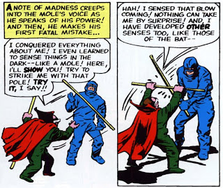
Page 23 is an odd one because Mole Man fights either Reed or Johnny with a pole, but since Reed and Johnny were both wearing identical suits that obscured their faces and neither is mentioned by name or has any dialog, it’s unclear which of them is in this sequence. I always assumed it was Reed, but there’s nothing there to back it up.
The final two pages see the arrival of the monster from the cover, who’s dispatched rather easily by the FF. The group flees, initially with Mole Man, but he’s explained away as having been left behind in the dialog – a sign that thing may have been a bit rushed by this point and Lee had no other way to work it out with the artwork Kirby turned in.
The end sees the FF returning home, and a caption promising more in the next great issue.
Looking at the issue as a whole, it really is a terrific story. I can’t help but wonder what might have happened with this series and Marvel had Lee and Kirby resisted the demands to turn the group into more obvious superheroes. As it is, this concept could fly as a TV series (an expensive one sure, but sticking to a kind of X-Files or Fringe style approach would have made this possible long before CG VFX were around.)
The art also is an excellent example of what made Kirby so great, even before he took his style to the unrestrained extremes that would define his work from the 1960s onward.
The last thing I want to mention is a quick revisit of the unique presentation this issue received in the Maximum FF book, a book I previously raved about that takes the book and blows it up panel by panel and turns it into a very cool coffee table book. This comic stands up to that kind of examination, and it’s a very, very good first issue.
Like this:
Like Loading...
 And while I doubt Johnny Cash read Fantastic Four comics, I do like the idea that this panel might have influences the writing of his classic 1963 tune. Maybe in the Marvel Universe, Cash’s “Ring of Flame” was a major hit.


