Cover to Star Trek #7 (Oct. 1980), by Michael Nasser.
“Tomorrow or Yesterday” (17 pages) Scripter: Tom DeFalco Penciler: Mike Nasser Inker: Klaus Janson Letterer: Ray Burzon Colorist: Carl Gafford Editor: Louise Jones Editor in chief: Jim Shooter Cover: Mike Nasser
There’s a lot to like in this issue, which reads like a comic-book equivalent of a TV episode. It’s all done in one, and has all the basics of a standard TV story, with an A plot involving Kirk, Spock and McCoy on the planet, and a complementary B plot with Scotty and the ship.
Tom DeFalco does a nice job on the scripting end. This reads very much like a classic TV episode, even if it doesn’t always make a ton of sense. The pencils by Mike Nasser (now known as Mike Netzer), opens up the panels to tell the story and brings some dynamism an visual splash to the proceedings. Klaus Janson’s inks give Nasser’s pencils continuity with the previous issues, while the colors and letters are suitably well done enough to not be noticeable. There’s no fancy use of color holds here — just solid work.
Solid scripting by Tom DeFalco on this splash page. The title is pretty much lifted from the original series episode “Tomorrow is Yesterday,” which was one of the better first-season shows.
So this one starts off with the Enterprise heading to a section of the galaxy threatened by a cloud of Vega radiation. Kirk is to find and help any threatened populated planets by evacuating the threatened populations until the cloud passes. This is all conveyed rather nicely via “Captain’s Log” narration captions on the splash page, setting up the story quickly and clearly.
Page two is a good example of how this comic recreates the feel of the original show. Nasser starts with a large, irregularly shaped panel that gives a good view of the bridge crew and their urgency in discovering a small group of 200 intelligent life forms living on Andrea IV, right in the path of the Vega cloud We get a nice closeup of Kirk as he delivers a line that would come straight of the show and is easy to hear being spoken by William Shatner.
Page 2. A good example of how to hook your readers with solid layouts and scripting.
Pages three and four get the plot going even more quickly, with more transporter shenanigans (acknowledged this time with footnote from Louise Jones), and taking the transporter off the board as a deus ex machina solution to the crew’s problems.
Then things get weird, as the aliens show up and state they have been awaiting the Enterprise’s arrival for a very long time. I really dig Nasser’s design of the alien for its unusual graphic look, even as it’s unclear how a thing like that could move about in any useful way. I have to say it’s a nice lettering effect to give the Andreans a script style in their dialog balloons.
Again, Nasser does a fine job keeping things dynamic with good layouts and a really interesting alien design of the type you could only do in the comics at this time.
Pages six and seven are both very solid, with the former revealing that the Andreans have build massive statues of Kirk, Spock and McCoy that is a great shocker and would be an ideal spot for a commercial break if this was a TV episode. Page seven fades back in with Spock revealing the statues to have been built some 24,000 years ago. It’s a great panel that actually shows the characters — something the small-box layouts seen so far in the series have been unable to deliver. Kirk asks the lead Andrean what’s going on, but he’s about to “step beyond.”
Another nice page with interesting layouts in service to a good story point. I like the alien hand breaking the panel and the reaction shots of Kirk, Spock and McCoy. Coming back from the commercial break, Nasser again gives us a nice big look at the heroes with that lead establishing panel. The dialog moves things along well, too. This stands out in contrast to the extremely boxy layouts and small drawings seen so far in the series of the lead characters, who are really the main draw to all of this stuff.
Now we spend a couple pages on plot, with McCoy explaining the Andreans are dying, and the Andreans denying any danger from the Vega radiation — because they know that Kirk et. al are “the protectors.” Kirk and company do their best to persuade the Andreans to evacuate, but they refuse because of their complete belief in the belief that the protectors will be save them. Spock comes up with a long-shot possible solution in which very precise phaser strikes by the Enterprise could disperse the Vega radiation. Kirk says they’ll go for it, but the transporter is still out. So Kirk orders Scotty to disperse the cloud and come back.
I really like this layout, with the mirrored effect in panels 1 and 3 at the top of the page, with Kirk’s changing expression, and then again at the bottom. I should say that Janson’s inks are, as always, very polished.
Unable to help Scotty, Kirk follows a hunch of Spock’s that leads them to discover a massive solar collector, which their Andrean host tells them is one of many on the planet. Again, taking a page from TV pacing, McCoy tells Kirk he’s made a major discovery without explaining what it is.
Meanwhile, Scotty leads the crew as they try to disperse the Vega radiation, which doesn’t work and strands the Enterprise without warp capability and they put everything they’ve got into the deflectors to try to shield themselves from the approaching cloud. Back on the planet, McCoy tells Kirk that one of the Andreans is evolving at a fantastic rate, which is what the aliens mean by “stepping beyond.” A doorway in the base of the giant statues opens to admit the transitioning alien, and Kirk, Spock and McCoy follow.
Another nice example of showing the characters up close and large as a way to bring some dynamism to the proceedings. By the way, Scotty injured his hands in the earlier transporter accident.
Here we get some more interesting art, as the passage reveals a massive underground complex. Spock mind melds with the Andrean, and gets enough information from it to relay that this species is always in evolutionary flux and can see all periods of time simultaneously. They prepared for the Vega cloud accordingly by building the solar collectors to amass the energy needed to disperse the cloud, and knew that Spock would figure all this out in time to push the activation button and save the day for the Andreans and the Enterprise.
So here’s the underground complex under the statues, as well as Spock’s mind meld. I like the extreme perspective in panel 1 to give this a sense of scale. The rest of it’s a bit compressed, but still clear.
The tale ends with a cryptic, almost pun-like observation from Spock about how he would love to ponder this paradox “… if only I had the time.”
The story concludes with more nice layouts. I like that panel of Spock for its expressiveness and the steady point of view of the final three panels playing against the pun-like concluding dialog.
All in all, a decent issue. You know this because the obvious criticisms are all more about the story itself than how it was executed. The book looks good — or as good as a comic like this could look in 1980 — and the story does evoke the style of the old TV show. But like too many episodes, the aliens are never fleshed out or made to be interesting in any way, even though we’re told that their intelligence far outstrips even Spock’s. The Vega cloud also is really not developed as a specific idea that has any kind of scientific credibility.
There’s a letter’s page in this issue, though no great revelations this time from editor Louise Jones. She does say that every issue of the comic is scrutinized and approved by Gene Roddenberry, and gives co-plotting credit on issue #5 to Denny O’Neil.
I think if Marvel had started off the comic with an issue like this one it would have earned more attention from fans. But coming out as it did in the summer of 1980, its thunder was stolen by the excitement among sci-fi fans surrounding The Empire Strikes Back, and by the Dark Phoenix saga in X-Men among comics readers and Marvel fans.
This issue was later reprinted in Marvel’s second paperback collection of Star Trek comics, the first having collected the movie adaptation. It also included issues #11 and #12, so I’ll talk about that after getting through the original issues in the run.
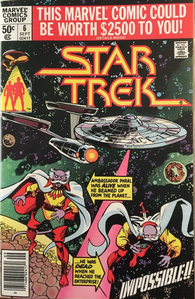
Cover to Star Trek #6, by Dave Cockrum and Klaus Janson.
“The Enterprise Murder Case!” (17 pages) Writer: Mike W. Barr Artists: Dave Cockrum & Klaus Janson Letterer: Rick Parker Colorist: Carl Gafford Editor: Louise Jones Editor in chief: Jim Shooter Cover: Dave Cockrum & Klaus Janson “Historian First Class”: Marian Stensgard
This one hurt my brain. The splash page for this one is pretty good for a Star Trek comic: Kirk and Spock rushing to Lt. Rand in the transporter room, where something appears to be going wrong with the beaming up of an important ambassador. I especially like on this page the color hold effect of the transporter, which uses the limitations of the printing technology to good effect. Less impressive is the rather pointless “computer paper” effect on the captain’s log captions. In 1980, that might have seemed futuristic, but anyone who had to use that kind of paper will tell you what a pain it was to remove neatly those perforated side sprockets.
The lesson of this page is: Never use the transporter when Rand’s in charge.
The real problem with this image, though, is that it’s lifted almost directly from the movie. Another transporter accident? Really?
When they pull the transportee through, it turns out that Ambassador Phral is dead, thanks to a dagger that apparently found its way into his back during transport.
That’s a decent premise for a Star Trek story, I’ll admit. I just wish the rest of the issue had lived up to its potential.
The captions reveal the setup for this issue: Kirk is to ferry Ambassador Phral from his home planet of Yannid IV to a ceremony admitting the planet to the Federation, essentially a defeat for its rival, the Klingon Empire. But the death of the ambassador is, clearly, a problem. Especially when it’s revealed that Phral was dead for 10 minutes before appearing on the Enterprise — impossible given he was alive just moments before the transport, which did experience some unusual interference.
Spock, by the way, has this plot figured out by the end of page three. The rest of us have 14 more pages to endure.
Throughout all this, Kirk is more on-edge than normal – snapping at crew members and living up to his lower-decks nickname, “Kirk the Jerk (Off).” There’s a bunch of exposition setting up a subplot for the captain that almost completely crowds the art off the page.
Some nice color work here gives some depth to this panel.
Meanwhile, Sulu, Chekov and Chief DiFalco are boozing it up on Yannid IV and get into a classic bar fight. Barr’s narration is blunt and appears ripped from the pages of a prohibitionist group. I’m not sure if Sulu, et. al, are escaping via beam-up the swords of the Yannidians or the captions.
Writer Mike W. Barr fights with the captions for a … bar fight.
After a cursory appearance from Admiral Fitzpatrick (who looks like he was originally Commander Adama cut and pasted from Marvel’s Battlestar Galactica comic), Kirk comes clean to McCoy and Spock about his past screw-ups on Yannid IV.
Finally, we get a cool page as Cockrum gets to conjure up some of the wacky space machinery and costumes he did much better in X-Men. We also get to see a tantalizing glimpse of young Kirk, wearing the old green sweater uniforms seen only in the original Trek pilots, “The Cage” and “Where No Man Has Gone Before.” There’s also an original phaser! Yay, Original Series!
Cockrum almost makes this page work. Almost.
Kirk’s version of what happened is that he was an ensign just out of Starfleet Academy, leading an away team into a war on Yannid IV. The pro-Federation King Geror had been killed by pro-Klingon forces that also had captured the king’s son, Prince Arlph. Kirk led a landing party to find the prince and succeeded in liberating him, although a into the fray and rescue Prince Arlph — without casualties. It worked, except a warning shot Kirk fired ricocheted unexpectedly and put Prince Arlph into a coma. Arlph’s brother became king and blamed Kirk, as did Arlph when he came out of his coma, changed his name to Pharl and became the ambassador who died in the transporter accident. Starfleet, of course, exonerated Kirk. That’s a lot to convey in less than two pages, so it’s a lot of cranky copy supported by Cockrum doing his damnedest to make it work.
There’s also signs of just plain crap. Arlph and Phral are both anagrams of Ralph. Geror is one for Roger. And Storf is one for Frost. I don’t know what the anagram is for Yannid, but I assume there is one. Barr is not exactly pulling a Marc Okrand on this one. It pulls me out, because as soon as I realized this, I couldn’t help but read Arlph and Phral as Ralph and Geror as Roger.
Spock comes up with a theory of what happened, and pulls out some really lame proof that apparently so discombobulated Cockrum that he couldn’t keep track of who he was drawing in a single panel.
The rest of the comic is about solving the mystery — something it does in the most comic-book-y fashion imaginable. Kirk, Spock and McCoy beam down in disguise — in this case, that means pirate costumes, “purpleface” makeup (Prince would love it), tails, and some really bad hairdos and facial hair.
The iconic look of Calgary Flames legend Lanny McDonald, left, is foreshadowed by Mr. Spock.
It’s here that Spock reveals his deep affection for Calgary Flames icon Lanny McDonald. Don’t listen to me — decide for yourselves!
The trio tracks down a clue leading to “Doctor Loroc,” who’s a female plastic surgeon, and gets shot in her third panel. The idiocy continues as Spock et. al deduce the real killer has changed his appearance and is one of three aliens in the clinic.
In classic Trek fashion, Spock’s bluff exposes — with the current leaders of Yannid VI now assembled in the room — the ambassador and how they subbed the dead body for his during mid-transport. The exposed Phral grabs a weapon and holds the princess hostage. Bones, once again, thinks fast and stabs Phral with a hypo spray conveniently loaded with “the most potent knockout drug I’ve got!”
Bones “shoots” someone for the second issue in a row.
The grateful Yannid VI leaders agree to sign the Federation treaty and hang out on the Enterprise for a few days before beaming home.
Strangely enough, this is all done in 16 pages — leaving a real clunker of a final page for Kirk, Spock and Bones to tease each other before the ship finally warps off past more overwritten copy and on to the next issue.
The creative team on this issue was clearly attempting to compress a story as complex as a full episode of the original series into a mere 17 pages. And it really doesn’t work, especially when the plot is as underdeveloped and overwrought as this one.
Some nice color work here, even if the story is by this point incoherent.
Cockrum and Janson are clearly not meshing any better. This issue struggles to find moments where the art can shine, and way too often has to rely on color effects to get any kind of “wow” factor into the mix.
The covers are an obvious problem for this series. This issue’s cover — marred, as were all Marvel comics that month — with an ad promoting a contest for fans as a way to apologize for raising the price to 50 cents, is just plain awful. Again, there’s an apparent aversion to putting Kirk, Spock and McCoy on the cover in favor of a not-great rendering of the inanimate object kn0wn as the U.S.S. Enterprise. And the bit with Ambassador Ralph, I mean Phral, evokes old DC Comics but lacks any kind of visual hook for the story inside.
Covers to a couple of classic comics: X-Men #137 (Sept. 1980) and Star Wars #39 (Sept. 1980).
This issue also features a letters page, with no great revelations from editor Louise Jones. However, at the bottom of the page is “The Mighty Marvel Checklist” of comics on sale this month, at least two of which are stone-cold classics: Star Wars #39, the first episode of Marvel’s adaptation of “The Empire Strikes Back,” by Archie Goodwin, Al Williamson and Carlos Garzon; and the double-size X-Men #137, featuring the final fate of Phoenix, by Chris Claremont, John Byrne and Terry Austin.
There were a few other Edmonton comic shops from the time that I visited but no longer remember. I’ve hunted online for any trace of these shops and they are, I’m sure, long gone and exist now only in the memories of those who shopped at them.
I recall one shop located on Stony Plain Road that I visited some time in 1986. I know the year because the woman who was working there was having a loud conversation with a friend about how much she was enjoying both Frank Miller’s The Dark Knight Returns and John Byrne’s The Man of Steel. There were plenty of back issues in this shop, which is what I remember the most. And I remember scoring a beautiful copy, that I still own today, of this pivotal issue of X-Men:
X-Men #166 (Feb. 1983). Cover by Paul Smith.
This was my first issue with Paul Smith art and, when I got it home, I loved it. Loved, loved, loved it. It was double-size, had all kinds of amazing stuff happening in it, and it concluded the long-running Brood saga with a satisfying punch — and still ended with a cliff-hanger that ensured next issue was going to be even better. This was a high point of writer Chris Claremont’s long run and did a lot to cement X-Men as my favorite comic book.
The other shop I recall was located in West Edmonton Mall. For those who don’t know, WEM was as much an amusement park and tourist attraction as it was shopping mall. When it opened in 1981, it was just a nice mall. Big for the times, but nothing too special. It had the usual anchor stores, food court and movie theater (six screens!) where I saw Time Bandits more than once. In 1983, the mall doubled in size and exposed its ambitions, adding an NHL-size skating rink, even more movie screens, a huge McDonalds, and an amusement park area called Fantasyland that featured a handful of rides and attractions for mostly younger kids. In 1985, it doubled in size again, adding a third set of movie screens, a second food court, submarine rides, a dolphin tank, a replica of Christopher Columbus’ Santa Maria, miniature golf, a massive water park with a wave pool and slides, and two theme streets: Europa Street, which evoked a European feel for high-end fashion stores as tenants, and Bourbon Street, with restaurants and bars for lovers of the night life. There was a hotel with theme rooms planned, and Fantasyland doubled in size, adding a triple loop rollercoaster and “drop of doom” style ride for older thrillseekers. Yes, it was a lot. And legal action from Disney did prompt a name change from Fantasyland to Galaxyland.
Cover to Power Pack #1 (Aug. 1984) by June Brigman and Bob Wiacek.
When the second phase opened, it included an area for smaller retailers who sold things like sunglasses and jewelry. I forget the name of that part of the mall, but it was located above the massive video arcade in Fantasyland. You’d take an escalator up from Fantasyland, and then if you went to the immediate left, there was a small comics shop that sold new issues and had a modest selection of back issues. I remember buying there a copy of Power Pack #1 for $3, which was a good deal at the time. And the store ended up being drawn by former Edmonton resident John Byrne into Alpha Flight #26 (Sept. 1985).
Alpha Flight #26 (Sept. 1985). Cover by John Byrne and Bob Wiacek.
The issue starts with Alpha Flight — newly reunited in the previous issue with its founder, Guardian, who was believed killed in Alpha Flight #12 — undergoing a training exercise with the Canadian Military near Red Deer, Alberta. This takes up 12 pages of the issue’s 22 pages. Guardian then gets a message from his wife, Heather Hudson, that Alpha Flight is needed at West Edmonton Mall! They arrive and some man in a suit tells them everyone was chased out of the mall by these super-powered types who called themselves Omega Flight! The team splits up and each member is defeated by a member of Omega Flight — with help from a mysterious benefactor. Finally, we find Heather, who’s in front of the mall’s real comic shop when Guardian finds her.
Heather Hudson strolls past a comic-shop in West Edmonton Mall in Alpha Flight #26 (Sept. 1985).
Byrne draws the shop pretty much exactly as I remember it, though there appears to be more Byrne issues on sale there than I remember them having.
The story concludes with Guardian revealing himself to not be James McDonald Hudson, but the android that previously posed as Delphine Courtney in the death of Guardian arc. The story continues into Alpha Flight #27 (Oct. 1985), Secret Wars II #4 (Oct. 1985) and concluded in Alpha Flight #28 (Nov. 1985), which was Byrne’s last as writer and artist on the series.
Covers to Alpha Flight #27 (Oct. 1985), Secret Wars II #4 (Oct. 1985) and Alpha Flight #28 (Nov. 1985)
The comic shop eventually moved to a larger retail space on the lower floor. There, it was the last comic shop I visited prior to our family’s move to Arizona. I distinctly remember that visit, and buying copies of the just-released X-Men #213 (Jan. 1987) with Sabretooth fighting Wolverine on the cover, and a copy of The ‘Nam #2 (Jan. 1987), which I had seen in a report on one of the American network news shows and decided to give it a look.
Cover to X-Men #213 (Jan. 1987) by Alan Davis, and The ‘Nam #2 (Jan. 1987) by Michael Golden.
The only other comic shop I can recall was in the now-defunct Heritage Mall. It was mostly a gaming store, but they did have a small rack of comics and I recall thumbing through copies of Star Wars #104 (March 1986) and Power Pack #21 (April 1986) there, likely while just killing time until the next bus home.
Covers to Star Wars #104 (March 1986) by Cynthia Martin and Steve Leialoha, and Power Pack #21 (April 1986) by Brent Anderson and Terry Austin.
And that’s it for Edmonton comics shops. I’ll do one more post on my newsstand experiences there, then move on to shops in Arizona.
Cover to Star Trek (Marvel) #5 (Aug. 1980), by Frank Miller and Klaus Janson.
“The Haunting of the Enterprise!” Writer: Mike W. Barr, with plot assist from Denny O’Neil Artists: Dave Cockrum & Klaus Janson Letterer: John Costanza Colorist: Carl Gafford Editors: Denny O’Neil & Louise Jones Editor in Chief: Jim Shooter Cover: Frank Miller and Klaus Janson
With Marv Wolfman gone, Mike W. Barr and Denny O’Neil step in to wrap up the tale started last issue, with inauspicious results.
The issue starts off with the Klingons vaporizing a Starfleet Ensign with a phaser, prompting Kirk to do the same to one of the Klingons. During the brawl, Spock is knocked out with a chair to the head and taken captive by the Klingons as the shields go down and both sides beam back from the haunted house to their respective ships.
An ensign gets phasered, and our eyes suffer for all the orange, pink and purple on this page.
Spock learns from his captors that they are interested in the new warp engines on the Enterprise and they have a secret weapon to use. On the Enterprise, Raytag hints the girl from the haunted house knows what’s going on, though she denies it.
Monsters begin appearing throughout the Enterprise, terrorizing the crew. Bones does a scan of the girl and finds something unusual.
Spock learns the Klingons encountered a damaged starship weeks ago and found as the sole survivor a “horror film archivist.” To earn his willing cooperation, they create a “construct” of his dead wife. The Klingons then put him in a new “thought-enhancer” machine, which tapped into his brain and brought to life the monsters in his dreams.
The plot stands still, but Cockrum and Janson deliver a few panels of nice art.
More monsters plague the Enterprise as the plot treads water, while Spock get close enough to the film archivist to mind meld with him and project a warning to the Enterprise to kill the girl. Bones figures out she’s made of the same stuff as the monsters and is therefore not real, so he pulls out his phaser and disintegrates her.
Fast decision by Bones, and more eye-cancer inducing color holds.
Meanwhile, Raytag is revealed as being the receptor for the images on the Enterprise, and a sudden power surge kills him in the bring.
Finally, some fun! The monsters are unleashed on the Klingons.
This wakes the film archivist, who unleashes his monsters on the Klingon vessel instead. Spock frees him and they transport back to the Enterprise and hightail it out of Dodge.
And the transporter saves the story once again. Maybe.
After dropping off the film archivist at Starbase 16, the Enterprise is off to its next mission.
So, any hope that the previous issue evoked in readers that this series was going to work were seriously shot down by this issue.
It’s easy to be too hard on Barr and O’Neil here, as they obviously came in at the last minute to plot their way out of a pretty odd setup. But their solution just treads water and meets only the minimum standards for resolving this story.
The “film archivist” bit is the weakest — neither he nor the image of his dead wife get even a name in this issue. The Klingons also appear to be the dumbest creatures in the galaxy if this is their plan for getting intel on the new Starfleet engines. Bones deciding in the course of a panel to phaser the girl into oblivion is seriously out of character, while Spock is reduced to a source of exposition and Kirk just shoots things with his phaser. There’s little charm and even less humor in this tale, which clearly sprouted from Wolfman’s real affection for old movie monsters. Also, Raytag’s story goes nowhere, and the death of the ambassador from last issue has no impact or part to play in the story’s conclusion.
The art veers away from Cockrum shining through to being more about Janson’s finishes, and their styles just don’t gel here. There is not much action of interest in this story and little room for the visual storytelling to explore the idea of monsters in space in any interesting way. The lettering and coloring also were off this issue – the splash page alone is an impossible-to-read assault on the eyes.
The cover, at least, is an improvement — no surprise considering it’s penciled by Frank Miller. This issue came out several months before Daredevil #168 introduced Elektra to the world, but you can see Miller moving that direction with his femme fatale composition and the classical look of the nameless girl’s sandals. Again, though, Kirk and McCoy are small on the cover and the ghostly image of Spock gets a bit lost in the purple on purple color hold. Perhaps another color would have worked better.
Wrapping up this issue is a letters page with answers from Barr, who was obviously slated to take over regular writing on the series. No real revelations this time, but Barr shows real enthusiasm for Star Trek comics that will really come to benefit readers only after the license moves to DC Comics.
The opening of Warp 1 Games sometime in 1985 or 1986 cemented the Whyte Avenue strip of Edmonton as its comics capital. Warp One opened at 10332-81st Ave., which was almost exactly one block south of Comic Master on Whyte Avenue. (The old Warp 1 location is currently the Tea House Cafe.)
Warp 1 was a large store. I remember entering into a large lower area with I want to say blue carpet, and a line of racks for new comics along the left side. There was a little loft, where you went upstairs to an area with back issues both in long boxes on tables, and on the walls. I remember a window that was round and may have been a dome. I thought it looked cool, remembering having visited on rainy days where the effect of it was enhanced.
Warp 1 was best for back issues. Its selection was deeper than other shops in town and it was easier to track down issues older than a year or two. Back issues were reasonably priced, though condition often varied more than at other shops. It seemed to have more newsstand copies of comics, which means Canadian newsstand copies that have in recent years become in-demand variants.
Three editions of X-Men #207 (July 1986), from left: Direct edition for comics shops, Canadian newsstand edition with 95-cent cover price, and U.S. newsstand edition.
I never cared for the newsstand copies. They usually were in lesser shape, and I honestly preferred the cleaner look that Marvel in particular used for its direct market copies, with that “M” design and the nice, big issue numbers. The newsstand issue numbers were squished and crammed into a tiny box to make room for the Comics Code Authority symbol, and presaged my typographical interest and subsequent distaste for distorted type.
TheNew Mutants Annual #1 (1984), Secret Wars II #6 (Dec. 1985) and X-Men #170 (June 1983)
Among the comics I remember buying at Warp 1 are Secret Wars II #6, X-Men #170, and The New Mutants Annual #1. My X-Men #170 is a very nice-condition Canadian newsstand copy, which may put a few extra dollar or two in my pocket should I ever sell it.
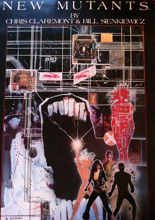
The other thing I remember buying at Warp 1 was a copy of Bill Sienkiewicz’s poster of The New Mutants. It was and is a stunning piece of work that just looks great. Warp 1 was the only store where I had even seen one and so I bought it in September 1986, just a month before we moved to Arizona. I wish I still had it, or that Marvel would re-issue it, as it’s very hard to find one and they’re quite expensive even if you do.
The New Mutants poster by Bill Sienkiewicz.
Of the stores I’ve written about so far, Warp 1 is the only one that is still in business. Online, I found this profile of the store from the Sequential Tart website. When I visited Edmonton sometime in the 2000s, I stopped in with my friends at its new location on Whyte Avenue at 99th Street. It was still a solid shop, though it had changed with the times to be more focused on graphic novels than back issues, even then. Warp 1 is still open, and has two additional locations called Warp 2 and Warp 3. I’m sure I’ll check it out again whenever I find myself back in Edmonton.
Star Trek (Marvel) #4 (July 1980). Cover by Dave Cockrum and Klaus Janson.
“The Haunting of Thallus!” (17 pages) Cover: Dave Cockrum and Klaus Janson (signed) Script/Edits: Marv Wolfman Pencils: Dave Cockrum Inks: Klaus Janson Colors: Carl Gafford Letters: Jim Novak Consulting Editor: Jim Shooter
Marvel’s first original Star Trek story is action packed, full of surprises and features much improved art from the movie adaptation. So, of course, this was writer and editor Marv Wolfman’s last issue on the title, which from this point on struggled to find a consistent creative team or direction for itself despite contributions from numerous talented creators.
Raytag escapes as soon as he’s beamed aboard.
Storywise, this issue starts off with a rare teaser splash page of the Enterprise encountering a haunted house in space. The actual story starts on page two, with Kirk and Spock receiving a new mission from Admiral Fitzpatrick (no clue why they didn’t use Admiral Nogura, already established as Kirk’s superior officer) to transport a “totally insane!” prisoner back to the prison he escaped from on the planet Thallus. Overly humble Regulan Ambassador R’kgg is to accompany them on this mission, which goes off the rails as soon as the prisoner, Raytag M’gora, is beamed aboard and escapes.
All this happens by the end of page three, so the pacing is already much ramped up from the sullen pace of the movie and its adaptation.
A nice example of the improved writing and art in Star Trek #4.
The next three pages feature the Enterprise crew trying to recapture Maytag, who’s escaped into the engine pylon structures and fended off attempts by security and Kirk to stop him. Since Raytag is like a bat and “sees” with sonar, they broadcast a “sonic backlash” to distract him long enough for Spock to deliver a nerve pitch.
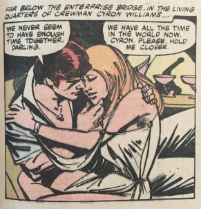
Crewmembers “forming friendships”.
That taken care of, the Enterprise then receives new rendezvous coordinates from Thallus and obligingly changes course. Meanwhile, a pair of crewmen “forming friendships” in their cabin are attacked by and fend off a werewolf, and Chekov and Sulu see a ghost on the recreation deck.
Raytag tries to convince Kirk not to return him to Thallus and suggests that the Enterprise will become as trapped as he will be. Approaching the rendezvous, Dracula appears on the bridge and trounces a couple of guards before turning into a bat and vanishing into the turboshaft. He’s next spotted on C-Deck where a crewman fired at Dracula and Ambassador R’kgg is found dead with puncture wounds on his neck.
This is classic Cockrum — the woman’s pose, the alien, and the circular inset. Nice stuff.
The Enterprise arrives at its rendezvous to find the floating haunted house teased on page one. Raytag warns Kirk that he and his crew are now also prisoners of Thallus.
There’s more action on this page than in all of Star Trek: The Motion Picture.
Beaming over, Kirk, Spock, McCoy and a couple of crew members (they don’t wear red shirts anymore, but they’re definitely in the same category) find an elaborate reproduction of a haunted house with spider webs, dust and a storm brewing outside. They hear a scream and rush in to find Frankenstein’s monster choking a young woman. Kirk knocks it out the window and a whole slew of horror monsters appear around them. Among them is a critter who looks an awful lot like Marvel’s Man-Thing.
Check out Man-Thing at right in the bottom panel.
The girl says they’ve been holding her prisoner here as long as she can remember. Bones suggests they bail, but then a a crew of Klingons appear and its commander saying there is no escape.
The last page shows a Klingon ship arriving to inform the Enterprise it has entered Klingon space and its landing party has been captured. Meanwhile, Raytag laughs at this madness as he sits in the brig.
This issue features a letters page that provides some hints at what’s going on with the publishing of the title. First, it lists not Marv Wolfman as editor, but Louise Jones. There are few responses to letters, but she does explain in in answer to a letter from Sim Parks of Swansea, S.C., a bit about the rights situation vis a vis the original series.
More adaptations of novels and short stories aren’t in the cards right now, Sim, mainly because Marvel only has the rights to adapt the movie and do new material based the movie. As yet, we have no rights involving the TV shows or other Star Trek material. Nevertheless, we hope to do stories that you enjoy … even if they are brand new. Let us know if we’re on the right track, okay?
Louise Jones, Star Trek: The Letters Page, Star Trek (1980) #4.
Wolfman’s story echoes a tactic the original series used to save money: set the story somewhere that looks a lot like a standing set you’d find on a TV studio lot in the late 20th century. Wolfman does a good job of packing a lot of story into this issue and using the dialog effectively to indicate character and make clear who’s who and what they’re doing. The mystery connecting the haunted house, the Klingons and Raytag is built up well enough to be a convincing reason for a Trek fan to come back and see how it plays out in the next issue.
For the art, this story plays so much better to Cockrum’s strengths as an artist. Most fans recall him for his amazing character designs, but he also had a real flair for action sequences that really shows here. Assuming he and Wolfman worked Marvel-style, the top-notch pacing of the story and the effective storytelling that gets a lot of information across comes down to Cockrum’s pencils. More of Cockrum’s flair comes through Janson’s inks, which works to the benefit of the story, even if I still think it’s a less-than-ideal match that fails to convey the sleek, modern look of the movie.
The cover, however, is not effective at conveying the story inside as a Star Trek story. The Enterprise is small and obscured through a window, while Kirk and McCoy have their backs to the camera. Spock looks good, but he’s too small and the jokey nature of the image not something that would have appealed as much to Trek fans, I think. It looks like a rejected monster comic cover that had a couple Trek elements pasted in to work for this series.
This issue was the unexpected final issue for Wolfman, who did not return to plot the conclusion in issue #5. As mentioned previously, Wolfman had been editor in chief at Marvel for a short while around 1975-76, and when he passed that title on he carved out a writer-editor deal that allowed him to run the projects he worked on himself with little or no oversight. That approach changed when Jim Shooter took over as editor in chief in 1978. Shooter realized that the single editor approach for a line of comics as numerous as Marvel’s was unworkable and began hiring a team of editors to each work on a reasonable number of titles. He also did not think writers should edit themselves, and refused to renew the writer-artist deals. As they expired, the writers who had them — Roy Thomas, Len Wein, Gerry Conway and now Wolfman — all left Marvel for DC Comics.
Wolfman’s departure from Marvel was bad news for Star Trek, but very quickly resulted in him pairing with artist George Perez to create The New Teen Titans, one of the most iconic, best-selling and critically acclaimed superhero titles of the 1980s. So that worked out.
New Shooter hires Louise Jones and Denny O’Neil stepped in to fill the gap on issue #5, with Jones taking over Star Trek as her own title the following issue. It’s interesting to note that Jones, who was then very new to Marvel, was at the same time taking over X-Men from editor Jim Salicrup amid the climax of the Dark Phoenix saga under somewhat tense conditions. Not sure that it had an effect on Star Trek going forward, but it sure didn’t help.
Marvel Super Special #15. Cover painted by Bob Larkin.
Stan Lee wrote in one of his Stan’s Soapbox columns in the 1970s that Marvel had been very interested in getting the rights to do a Star Trek comic book, but that they were all tied up. Western Publishing and its Gold Key Comics line started publishing Star Trek comics in 1967 and retained the license throughout the 1970s as the show’s popularity soared in syndication and its fandom was in full blossom.
As with many things, the success of Star Wars changed the expectations for what a space property could be. George Lucas and company had targeted Marvel for a Star Wars adaptation and had to be pretty persuasive to get them to agree to the project. Of course, the Star Wars comic famously was a huge hit and all by itself propelled Marvel to profitability the year it came out. Its success spawned lots of imitations, with Marvel taking on Battlestar Galactica, adapting Close Encounters of the Third Kind and, of course, landing the rights to Star Trek: The Motion Picture.
Gold Key’s rights ended so abruptly that there exists a script for the unpublished Star Trek #62 that can easily be found online (or here). Gold Key managed to stay in the licensing game with licenses for The Black Hole, which ran a mere four issues, and Buck Rogers in the 25th Century, which ran what looks like 15 issues. But Gold Key’s more child-oriented approach to comic-book storytelling was not to survive much longer; the company closed down completely in 1984.
Marvel seemed the ideal fit for Star Trek, and there was no shortage of professionals on staff at the publisher champing at the bit for a shot at the title. Among them were artist Dave Cockrum, acclaimed artist on DC’s futuristic Legion of Super-Heroes title, co-creator of Marvel’s New X-Men, and working at the time, I believe, on staff at Marvel as a cover designer; and Marv Wolfman, who had parlayed his 1975-76 stint as editor in chief into a writer-editor deal. It was under this deal that Wolfman headed up the adaptation of Star Trek: The Motion Picture and the monthly comic book series that was to follow.
That seemed like an ideal team at the time for a top-tier comic book, especially when they were joined on inks by Klaus Janson, who had made a huge impact on comics as the finisher and inker on Frank Miller’s classic Daredevil run.
The Marvel Super Special series was an irregular line of color comics in magazine size, printed on nicer paper and selling for $1.50 and up. The first issue was an original The Beatles story and a big hit, but by the time it came to Star Trek: The Motion Picture, it became the line for projects like movie adaptations that could sell to fans of the movie that don’t normally read comics. Marvel Super Special #15 includes the complete adaptation of Star Trek: The Motion Picture as a single, 52-page story, along with supplemental material such as photos from the movie, an article on the Star Trek phenomenon, a glossary, and an interview with Jesco von Puttkamer, a NASA consultant on the production of the movie. The cover features a really nice painting by Bob Larkin. A facsimile edition of this magazine was published in 2019 by IDW in celebration of the movie’s 40th anniversary.
The Canadian paperback edition of Star Trek: The Motion Picture. Cover by Bob Larkin.
As was the norm at the time, Marvel was looking for new markets for its comics. With Star Wars, Marvel had a lot of success not just reprinting the original issues, but also in repackaging them into new formats, which included treasury editions and a black-and-white mass-market paperback size edition. The same approach was taken from the start with Star Trek: The Motion Picture, with the Marvel Super Special edition coming out to coincide with the movie’s release, followed closely by the first issue of the regular Star Trek comic and a color mass-market paperback edition. All three featured the same content, with the regular comic book breaking the adaptation across three issues and the paperback edition reformatting the panels into a 144-page reading experience.
Production on the project was admittedly rushed. In a full-page article on the Star Trek comic series in Starlog #33 (April 1980), Wolfman and Cockrum admit to a difficult adaptation. Wolfman says he didn’t think much of the story and found the script inscrutable, making it difficult to do more than transcribe what they had received into comic book form. They had photo reference, but no idea what the effects – which were famously worked on until the very last minute — were going to look like. And Cockrum admits he had to work too fast, cranking out two pages a day, preventing him from giving the project his very best work.
Cockrum himself backs this up in an interview with Peter Sanderson in The X-Men Companion I, published in 1982 by Fantagraphics. Asked about his return to penciling X-Men in 1981 and which of the new issues was his favorite so far, Cockrum replied:
Sanders0n: Which issue is your favorite of the ones you’ve drawn, and why?
Cockrum: That’s hard to say too. I’ll tell you, in some respects I’m most pleased with #145, the first of my new ones, because it was like coming out of a tunnel into the daylight after the Star Trek crap and all that. I’m a Star Trek fan; I got the book because I asked for it, and there was nothing but garbage the whole time. [sighs]
Sanderson: Do you mean the stuff you did, or the writing, the limitations imposed by the Trek people?
Cockrum: No, no … For one thing, Klaus [Janson] and I don’t make a happy combination, I think. I like Klaus’s inking on other people but I don’t think it works on me. Most of the stories were dumb. The whole thing was a big flop, I thought …
The X-MEN COMPANION I, P. 78, FANTAGRAPHICS BOOKS, INC., 1982.
Similarly, Marv Wolfman had this to say:
“The Marvel problem was deadlines. I had to write the entire adaptation of Star Trek: The Motion Picture, which was 64 pages, in less than a month. And that was without knowing a lot of what was going on inside it because the first movie was so late in the working that we flew out to Doug Trumbull’s and John Dykstra’s studios in August and they had yet to design half the major things which would be in the movie which was being released in December. Also Marvel’s deadlines were ridiculously tight because of the release dates. Dave Cockrum had to draw faster than I think he’s ever had to draw in his life, and I had to write it faster.”
Marv Wolfman, Comics Feature #28 (1983), via tom Brevoort’s Marvel 1980s blog.
Covers on the comic book version were drawn by Steve Leialoha (#1), Cockrum and Janson (#2) and Bob Wiacek (#3). There was another version of the cover to #2 drawn by Terry Austin that uses the same basic concept as the published version. Austin’s version was included as a pinup in the final issue of this series, #18.
Newsstand edition covers for Star Trek (Marvel) #1-3 (April-June 1980).
None of the covers is terribly effective.
Leialoha delivers a movie-poster like image that has decent likenesses of William Shatner and Leonard Nimoy, but its images of Decker and Ilia are soft looking and do little to really sell the book. Cockrum and Janson’s cover to #2 is the best of the lot, extrapolating a much more dynamic image of the V’ger probe’s incursion on the bridge. The coloring kills it though, making it hard to even figure out what you’re looking at. And Wiacek’s cover is just an image of the Enterprise firing photon torpedoes; generic, and likely pulled together at the last minute to meet a deadline.
The adaptation itself is, overall, serviceable. It follows the general plot and tone of the movie rather well, despite being unable to rely upon Jerry Goldsmith’s iconic score. There are obvious attempts to give the art some technical flair via color holds. These work much better in the Marvel Super Special edition than in the regular comic book, which was printed on the then-standard newsprint. That said, there are a few spots where the newsprint edition looks better because of how the paper mutes some of the uses of more highly saturated tones.
The opening splash pages, from Star Trek #1, left, and Marvel Super Special #15. A closer look at the difference in color brightness, via a color hold on page 2.
The magazine format’s nice paper and larger size also gives some clarity to the artwork that brings out the details and helps it look better. Janson is a formidable artist who has always produced good work quickly and to high standards, but his rough style is a mismatch for the clean and slick look of the movie. Cockrum does an admirable job re-creating the likenesses of the actors, though his work on that aspect is inconsistent. And Marie Severin does a fantastic job on the colors, though as you’ll see production didn’t always serve them well.
The comic book version, left, might more closely match the palette of the movie, but the reproduction on newsprint is muddy, while the magazine printing is clearer and brighter.
Great use of color hold effects in Star Trek #1, where the poor newsprint reproduction adds to the image.
Two-page spread of the Enterprise leaving drydock, from Marvel Super Special #15. The same spread from Star Trek #1. This version’s colors are more harmonious, but the art is muddier.
Coloring a book like this is yet another challenge, given the muted grays, whites, slate blues and faded oranges used for the costumes and sets in the movie. The original Star Trek series at least had variations in the colors of the uniforms with black pants and boots that offered contrast. This version just comes across as muddled, especially on the newsprint page over Janson’s sketchy inking style.
New splash page added to Star Trek #2.
A fuzzy inking job on Kirk.
Wolfman and Cockrum deserve credit for doing all they can to save the pacing and varying the visual storytelling enough to keep it from descending into complete boredom. I’d hate to see how some of the artists today would handle the endless discussions on the bridge and cruises through V’ger’s interior.
The comic book version adds new splash pages to issues #2 and #3 to catch up readers and provide credits for those issues. Nothing special, but it is two extra pages of art.
Artist Dave Cockrum did great hand gestures, keeping things visually less than completely dull.V’ger revealed looks much better in Marvel Super Special #15, above, which brings out the detail in the art and the color. It doesn’t translate very well to Star Trek #2. Advert in Star Trek #2 for Star Trek: The Motion Picture action figures, toys and vehicles. I understand that students at the Joe Kubert School often drew these ads. And, boy, those toys are expensive for 1979!
A good example of how much more clearly the art printed in Marvel Super Special #15, left. The screen tone on Spock’s face becomes a bit of a mess here and the detail in the inking on Decker’s face in particular suffers.Decker looks more like a Cockrum character here, while Ilia has a heavy Janson influence. Splash page added for Star Trek #3.
More heavy use of magenta color holds here, with varying results. The top panel looks better with the nicer printing in the magazine, but I think the center panel of Ilia is better in the comic book version.Spock is caught in a color hold.
The magazine definitely had an advantage with consistent tones, left. This was the key scene of the movie that was cut from the theatrical version and later added back in. Cockrum’s chops just keep shining through, no matter how fast he had to draw. The likeness of Spock in the top right panel is great and the center panel’s action is all Cockrum, baby!
Much of the excitement surrounding the release of Star Trek: The Motion Picture faded pretty quickly after its release. It was clear by Christmas 1979 that the movie wasn’t going to be a huge hit along the lines of Star Wars. It just didn’t tell the kind of story that inspired kids to play Star Trek and send their parents out to the stores in search of that great V’ger playset. (Although, if Roddenberry had his way, I’m sure the parents would be heading out to other kinds of toy stores to re-enact “forming friendships” in the bowels of the Enterprise … ugh.)
So with Marvel Super Special #15 coming out right around the movie, followed quickly in December 1979 by Star Trek #1, that puts the conclusion of the adaptation in February 1980 and the first original issue of the comic book in March 1980. By which time, the movie had already been largely ignored and forgotten, with everyone champing at the bit for the May release of The Empire Strikes Back (I know I was).
Add to that, the changes at Marvel and the restrictions that fans would soon learn applied to the book, and the new comic book series was already seriously behind the eightball.
Though Starbase 12 was the best stocked store around, Comic Master was the most convenient shop for me to get my comics fix from in the mid-1980s. Located at 201-10326 82nd Ave. in Edmonton, Alberta, Canada, Comic Master was found on the second level of a two-story building on the city’s cosmopolitan Whyte Avenue strip. You accessed the store by entering a door at the far left side of the front of the building and climbed the stairs, took a left into a small hallway and another left through the door into the store itself.
Comic Master was not a big shop, but it was open and benefited from a bank of street-facing windows that let in a nice amount of natural light (at least when there was some natural light to be let in). It had the usual racks for new comics with most of it space devoted to back issues. Comics of note were on wall racks for display purposes. And at the register, a large glass display case for more expensive books. I recall the layout of the shop changed more than once.
The cover to Marvel’s Star Wars #68 from 1982.
I recall stopping in one summer day to find the shop had found almost all of the remaining issues of Marvel’s Star Wars comic I needed at that point. I think these were mostly issues from 1982 and 1983, and included my copy of Star Wars #68, which I wrote about here.
What made Comic Master convenient was its location. I was attending high school not far from Whyte Avenue, so the strip and its shops were a popular after-school stop. It also was close enough to home to be easy enough to swing by on weekends. I recall one day in the autumn of 1985 borrowing the family truckster (it was a station wagon with faux wood paneling, I promise) to head over and get the new issue of Star Wars — issue #103, I believe. I forgot, however, that daylight saving time had ended overnight and found I had to wait for the better part of an hour for the store to open.
Star Wars #103 (Jan. 1986)
At the time, I was looking for recent back issues to the series I liked. One of which was X-Men, and I distinctly recall feeling lucky to pick up for a couple of bucks a copy of issue #171, a key issue in which Rogue joins the team. At the time, it was the oldest copy of X-Men in my collection!
X-Men #171 (July 1983)
There was an amazing bonus to visiting Comic Master, in the form of a second comic shop located right next door. The name of the store escapes me. There was no sign, and the shop was essentially a narrow hallway with racks of old comics on one side of the store. They were racked in all kinds of strange bags and were generally cheap and perhaps of slightly lesser condition. But when looking for those back issues, I almost always found stuff there I needed but had eluded me at other shops in town. I specifically remember scoring my copy of Star Wars #61 there, which was one of the best of the Marvel series with a great cover by Walt Simonson.
Star Wars #61 (July 1982)
And if that wasn’t enough, another shop opened within a block of these two shops soon thereafter. But that’s another post.
Promo shot of Kirk confronting the V’ger-created version of Ilia, as McCoy and Spock observe, in “Star Trek: The Motion Picture.”
Picking up where we left off:
We’re 83 minutes into Star Trek: The Motion Picture. Kirk has taken back command of the Enterprise from Will Decker to deal with a huge alien object heading toward Earth that destroyed some Klingon ships and a Starfleet space station. Decker’s day gets ruined further when his ex-lover, Lt. Ilia, shows up. Spock leaves behind his yoga practice on Vulcan to join up and then fixes the ship so it works. They arrive at the alien object, get sucked in, and Lt. Ilia is killed by a probe and re-incarnated in the shower.
And now, the conclusion of Star Trek: The Motion Picture!
Scanning the Ilia probe in sickbay, which has some nice effects on the display.
Dr. Chapel examines Ilia in sickbay, mostly to use the set and make the point that even though Ilia’s now a machine she’s still capable of common biological functions like, uh, crying? And Roddenberry’s wife, Majel Barrett, gets in a few more lines to keep her a part of the series.
Decker sees Ilia’s still alive and she responds by whispering his name. Spock and Kirk both have the same idea: It can’t hurt if Decker distracts it with sex. It takes a big man like Kirk to admit the younger officer is better suited for this task, which according to Starfleet tradition falls to the captain.
The torn door makes no sense, but OK.
The effect of Ilia bursting through the metal door is weak at best. They have to hide its cheesiness with quick cuts.
Spock proves how invaluable he is by recognizing almost immediately that Decker sexing up an alien probe is unlikely to solve his personal problem or make the movie more interesting.
I guess Simon is still a popular game in the 23rd century.
Decker takes on his assignment with limited gusto, giving Ilia-lite a tour of the ship that the real Ilia never got to see. Kirk and Bones spy on them from the captain’s quarters. But there’s not much to see: The long gazes between Decker and Ilia are as cold as they are drawn out and boring. The big news is that Ilia reveals V’ger’s plan to digitize the Enterprise and store it in a library — like an early version of iTunes. Of course, Decker’s horrified, as any good vinyl man would be.
The interiors of the USS Enterprise are really pretty dull in this movie. I hope Kirk and Bones are having some Saurian brandy.
Back to Spock, who decides the only way to get this movie moving is to steal a space suit and penetrate V’ger himself!
Meanwhile, Chapel and McCoy are tagging along with Decker and Ilia. Since Ilia was only on the ship for about 10 minutes before she was vaporized by V’ger, it’s really not clear when she and Chapel became friends. I suppose they could have met on a previous assignment, but that’s exactly the kind of seemingly broken plot point the novelizations love to fix and, in this case, do not.
Given this crew member’s mustache, I have to wonder if he frequents those areas of the ship Gene Roddenberry says are set aside for forming “friendships.”
As usual, Bones has the best lines. When he notices Decker becoming aroused (either through those funky monitor belt buckles everyone wore or just by looking at his skin-tight gray pajama uniform), he basically tells Decker that fucking a machine is a terrible idea — an opinion he surely formed from watching first hand his pal Kirk in action. The pacing is really bad in this scene, with even Goldsmith’s score failing to give it any energy whatsoever.
Robot Ilia is truly indistinguishable from the original, save the glowing neck gem.
The countdown to Spock firing the thrusters on his suit marks the return of the dreaded procedural aspect of this movie. He can just hit fire and it would shave a few moments of boredom off the proceedings. Everything about this sequence takes on a huge amount of innuendo. The V’ger “orifice” is very biological looking and the sequence has this weird sense of trepidation on Spock’s part. There’s also a sense of obtaining forbidden knowledge, of lost innocence or, perhaps more in line with Roddenberry’s predilections, deflowering. Nimoy does a good impression of Keir Dullea in “2001: A Space Odyssey” here.
Could they not have put the rocket a little higher up on Spock’s back so it doesn’t look like he’s propelling himself with internal gas?
Once he’s inside V’ger, Spock’s journey becomes one of the visual highlights of the movie. The images are all pretty great and spot-on, though it’s hard to figure how Spock travels through all of this so quickly.
Nice effects here. Clearly inspired by “2001: A Space Odyssey.”
Roddenberry’s influence can be felt here — there’s lots of tunnels. And balls. Heh.
I really enjoy these abstract images from inside of V’ger, as they’re just weird enough to defy explanation and are well done from a VFX perspective.
Even the giant Ilia looks cool, and the mind meld was a good throwback to the elements that made the original series so much fun. It’s clearly trying to play to “2001,” and while it falls far short of that, it’s an admirable attempt and gets closer than you’d think.
Spock attempting to mind meld with the giant Ilia plays like he’s emotionally reaching out to his partner postcoitally. Of course, doing so breaks his brain — and gives him the tools to move on and get a life. As we’ll see later. And it is Kirk who comforts him after the trauma.
Spock mind melds with V’ger. It’s clear how as he usually has to touch another person to do so. The effect is cool, but the use of miniature photography is pretty clear.
There is an alternate version of this sequence that sees Kirk join Spock on this journey. The two of them encounter a little bit of action inside V’ger, with some alien things attacking Kirk, and Spock fending them off. That version is in the Marvel Comics adaptation, and photos of the filmed sequence are easy to track down online.
William Shatner as Admiral Kirk floats past the memory wall in a sequence cut from “Star Trek: The Motion Picture.”
There also is the extended version shown on ABC and released on VHS that show unfinished shots of Kirk standing in the doorway and jetting out to follow Spock. They are truly unfinished, meaning you can see the set scaffolding at the side of the screen because the matte painting effect wasn’t finished. Showing these on TV with the pan-and-scan 4:3 aspect ratio made it only slightly less obvious.
Though unfinished, this shot was used in the extended version of “Star Trek: The Motion Picture” despite the rest of the ship not being finished. The 4:3 ratio of old TVs and some good old-fashioned pan-and-scan helped cover it up.
But the finished version is much, much better, even if Kirk is left out of Spock’s adventure and can only ferry him inside to see McCoy when it’s all done.
I think this moment excited fans who wanted a Kirk/Spock relationship. But despite the key revelations, this scene falls flat.
Having finally become a man, Spock sees the meaningless of his life so far and laughs at the joke that it is! This is very significant for the character and the story. Kirk and McCoy don’t look like they buy it. And they’re trying hard to make it work, but the script here is weak and the direction can’t save it. The grasped hand, knowing nods, Kirk’s flat summation of all this as “incredible” — it’s flabby, undefined and just plain weird.
Back on the bridge, it should be clear for even the densest of viewers with Spock’s reveal of a “radio” signal that we’re seeing a re-hash of the TV episode “The Changeling.” The let-down is palpable, even as V’ger threatens to kill everyone on Earth.
Spock has the logic to see through V’ger’s emotional needs and outbursts to guide Kirk to the right solution in “Star Trek: The Motion Picture.”
So thank god for Kirk! When you have an omnipotent, logic-driven, god-like mechanism threatening you, he’s the guy you want on your side. He invented this defense, and quickly sets about — with help from the newly enlightened Spock — shutting down V’ger’s logic with a contradictory emotional argument. This bargaining also plays into the poker element that was part of Trek from the start (“The Corbomite Maneuver”) and continued to play a major role in The Next Generation.
I wonder if anyone working on the movie thought it was weird that V’ger’s yonic orifice gets all electric as soon as it gets “angry.” And as soon as Kirk complies, it opens up for him.
We’re now 105 minutes into the movie.
A key moment that closes Spock’s arc was cut from the theatrical version of “Star Trek: The Motion Picture.”
It’s somewhere around here that a key scene was deleted. It shows Spock shedding a tear for V’ger, claiming that as Spock was before he came aboard the ship after failing to achieve Kohlinar, so now is V’ger. This is a pretty important scene to cut! This gives closure to Spock’s arc for the movie and helps establish the mental framework of V’ger that leads to its decision to merge with Decker. Everyone involved admits this omission was a mistake, and every subsequent version of the movie
I always hated the matte painting of the ship as they exit for the final walk to V’ger. The proportions are wrong. They fixed this in the Director’s Cut.
The proportions are all wrong in this matte painting effect.
The reveal of V’ger is pretty impressive. By all accounts, this was an impressive set but also a dangerous one because it was elevated off the stage floor to accommodate all the light effects and more than one crew member took a tumble.
The final V’ger set was an impressive elevated structure.
The use of the Voyager 6 probe was pretty smart — it connected Star Trek to then-current space projects, such as the early Voyager and Pioneer probes that captured such amazing photos of Jupiter, Saturn and beyond. Star Trek always relied on having just enough real-world scientific plausibility to be convincing and this really establishes the movie as a work of science fiction as opposed to the space fantasy or space opera of Star Wars.
And it could have been really almost profound in that 2001 way — if only it hadn’t been done before multiple times in the original series of Star Trek.
Admiral Kirk reveals the true identity of V’ger as Voyager 6 in the climactic moment of “Star Trek: The Motion Picture.”
On thing that couldn’t have been done on the original series was to have the human and god-like alien consummate their love in a cosmic merger. The patterning of Ilia shows itself to have had a greater impact on V’ger than might be evident on a first viewing. V’ger-Ilia now has enough emotion in it to get all doe-eyed and whiny about needing to lose its virginity to its god.
V’ger-via-Ilia is hot for Decker.
That’s a damn weird idea to think about, and this movie deserves credit for at the very least squeezing it in at the last minute. It’s a shame it’s not more rewarding, as neither Ilia nor Decker have developed personalities that make the audience care for them as much as they do for the classic crew members or even the Enterprise itself.
Decker connects the wires that will trigger his merger with V’ger. I wish there had been more time in the script to develop this motivation and give it some depth.
While it kind of makes sense for V’ger, I have no idea what’s going through Decker’s mind beyond the prospect of being somehow re-united with Ilia inside V’ger. But to do that, he’s giving up being a starship captain, and even his humanity. I’d think Starfleet captains would be a little more dedicated to their missions to fall prey to a trope that’s essentially “going native.”
Decker begins to merge with V’ger amid a sparkly, um, cloud of white, um, light.
Despite all the story problems, the movie does a fine job selling the merger of Decker and Ilia thanks to some good practical effects and visual effects. The light and wind blowing on Collins on set works extremely well with the glitter effect added later. And Ilia’s little swagger as she walks over to join him finally gives viewers an idea of why she’s so unforgettable to Decker.
This whole idea of Decker joining with Ilia/V’ger is a bit hokey, but this effect was well done with practical lighting on set and effective use of then-current VFX.
Even better, the glitter effect spreads rapidly and effectively. It’s one of the cooler moments in the movie, watching it spread from V’ger as Kirk, Spock and McCoy haul ass back to the ship, and then it dissipates in a massive cloud of light that reveals — with a great flourish from Goldsmith’s score — the Enterprise triumphant.
More nice effects as V’ger vanishes in a nice bit of sturm-und-drang.
And just like that, we’re ready for our denouement. This scene could have been taken straight from one of the episodes, which gives viewers a sense of hope that future adventures would be a bit more fun.
So what happens after Decker and Ilia/V’ger consummate their relationship? They have a baby; this one is called “more Trek.”
And to complete the weird double entendre undertones of the movie, the climax has produced what Dr. McCoy calls a “baby.” Spock, having now found peace for himself, is happy to stick with the ship as it heads off on more adventures.
I think the USS Enterprise jumped its cue here, because the music continues for quite a while at the very end of “Star Trek: The Motion Picture.”
So we end with another loving shot of the Enterprise being caressed by Goldsmith’s rousing score before it warps off into expected sequel land, indicated by the final card before the credits.
The final card of the movie, and a fitting prediction for the eventual heights “Star Trek” would reach in the 1980s and 1990s.
As most fans know, the critics were not terribly kind to the movie. Neither were many fans.
The movie opened Dec. 7, 1979, with a solid $11 million opening-weekend gross. It went on to a domestic gross of $82 million, which is pretty impressive. Other reports put the worldwide gross at $139 million.
The old rule of thumb was that a movie had to make two-and-a-half to three times the production budget to earn a profit. What the exact budget was on the movie ranges from about $35 million to $45 million. By that metric ($45 million times three is $135 million), Star Trek: The Motion Picture defied its troubled production and poor critical reception to become profitable solely via box office receipts. So profits from licensing and merchandising for everything from action figures, toys, novels and comic books to soundtrack albums, costumes and McDonald’s Happy Meals is gravy on top.
And that doesn’t include the revenues from the then-nascent home video market. Star Trek: The Motion Picture was a hit on videodisc, video cassette, pay TV services like HBO, and — as mentioned in a previous post — garnered a big broadcast deal with ABC that saw the extended version air as a three-hour Sunday Night Movie event.
To bring this all back around to comics, I’ll next take a look at Marvel’s adaptation of the movie and the short-lived monthly comic book series thast followed. Stay tuned!
I don’t recall if this was the very first comic book shop I ever patronized, but it was the first one I remember looking forward to visiting. It was located at 10627-101st Street in Edmonton, Alberta, Canada, just south of the big Brick furniture store, which remains a prominent local retailer.
The first time I visited Starbase 12, probably in summer of 1985, my dad was with me, and he thought it was the craziest thing he’d ever seen. Even the idea of a comic book shop was still a novelty back then.
I used to take the bus from school downtown to the shop, pick up some new and back issues, and then head to my dad’s office, on the 16th floor of what was once the CIBC building and is now known as Bell Tower, at 10104-103 Ave., and hitch a ride home.
Star Wars Annual #2 (1982)
Power Pack #15 (Oct. 1985)
Cloak and Dagger (2nd Series) #4 (Jan 1986)
The shop had a bi-level back issue rack in the middle, by which I mean there was a top level of comics and a lower level. They were all filed alphabetically by title, as is the norm. Back-issue comics were bagged but not boarded, and the shop would put the comics in the bags with the flap on the back side of the comic. The price tag was put along the top of the front side of the comic, and the flap taped over the price tag. I assume that was to prevent people changing the prices.
The back issues were the big draw. For someone just starting out, they had plenty of copies of recent issues of most books, going back a year or two. For some reason, I remember the rack as being orange in color. Prices were usually a dollar, or $1.25, for recent back issues, which wasn’t bad considering the cover price on Marvel and DC comics at the time was 95 cents in Canada and 75 cents in the U.S. On the plus side, there was no sales tax in Alberta, so you didn’t have to allow for that calculation when trying to maximize the $10 bill in your pocket.
New comics were on racks around the perimeter on about three sides in all. These were multi-level racks, so there were, I think, three rows of comics on the top level, and the same on the lower level.
The fourth side had a small glass display case for more expensive comics, and a rack for larger items like the old Marvel Graphic Novel books.
X-Men Annual #9 (1985)
X-Men #203 (March 1986)
X-Men #204 (April 1986)
I have strong memories of buying a number of comics there: Marvel Star Wars comics, early issues of Power Pack and Cloak and Dagger, as well as my first X-Men comics, which were issues #203, #204 and Annual #9. I also remember going in there the day Classic X-Men #1 came out in the spring of 1986, and also coming home that day with an Alpha Flight Annual #1 and X-Men #209. I also remember buying Marvel Age #36, with the David Mazzuchelli cover, and Power Pack #20 there around Christmas 1985.
Classic X-Men #1 (Sept. 1986)
Alpha Flight Annual #1 (1986)
X-Men #209 (Sept. 1986)
In 1986, the shop was celebrating Marvel’s 25th anniversary by having a drawing for a copy of Fantastic Four #1. I remember seeing that book in the display case, blown away that it was selling for a whopping $100! I don’t remember what condition it was in. I entered, but did not win.
Marvel Age #36 (March 1986)
Power Pack #20 (March 1986)
The last time I visited the shop, sometime in 1986, they had put a rack of discount back issues in the front lobby. (You came in the building’s front door into this small lobby, and opened the door on the right for Starbase 12 and the door on the left for whatever business was in that part of the building.)
I don’t know how long the store lasted, though I recall noting on a subsequent visit in 1988 or 1989 that it was no longer there.
But perhaps because it was the first really well-stocked comic shop I frequented, it set the bar for the many shops I would frequent in the future.