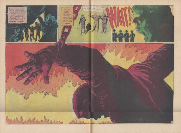
 “Secret Six” #3 (July 1968). Art by Jack Sparling.
Jack Sparling takes over the art on ”Secret Six” as of issue #3, and the title immediately improves across the board.
Sparling had an interesting career in comics. Born in 1916 in Winnipeg, Manitoba, his family moved to the United States when he was very young. His first comics work was in New Orleans before he and writer William Laas created the ”Hap Hopper, Washington Correspondent“ comic strip, which Sparling drew from 1940 to 1942. He later drew another strip, ”Claire Voyant,” from 1943 to 1948. He then moved into comics and worked mostly for Dell, Gold Key and DC, with his handful of assignments for Marvel including “X-Men” #30 in 1967. One of the books he drew for Dell was an adaptation of the “Mission: Impossible” TV series, which could be one reason why “Secret Six” editor Dick Giordano tapped him to replace Frank Springer. His last work in comics looks to have been about 1989 or 1990, and he died in 1997.
Admittedly, Sparling’s cover for ”Secret Six” #3 is less than promising. The unusual composition of an extreme closeup at an odd angle of a solider holding a machine gun at the top of the cover is difficult to make out at first. The logo is shrunk, which is never good. And the art of the team members in the various cross-hairs just looks off, even though that cross-hair gimmick is cool enough for other artists — John Byrne’s cover to ”Alpha Flight” #12 (July 1984) comes to mind — to have used to good effect elsewhere.
 Page 5
But things get much better inside the book, as Sparling stylishly handles the series’ difficult exposition with each character getting a page that introduces them to readers and puts each in immediate peril. Sparling draws each page with a full-length figure of a cast member that reveals character in a bold, inky and elegant line. It looks great and it’s a long way from the house style DC used for years, perhaps best exemplified by just about anything inked by Murphy Anderson. And this, along with a couple pages explaining this issue’s mission gets the story a good eight pages in before the real action takes place.
 Page 9
That action is the one element in the series that hinges on continuity. In “Secret Six” #1, Mike Tempest fights a henchman he recognizes as Hanrahan, one of the mob muscle men who clobbered him after he blew the whistle on their attempts to fix the fight. Now, the syndicate Hanrahan is with is out to get its final revenge on Tempest and they capture him and are prepared to kill him by firing squad in the morning. The rest of the team, of course, has to rescue him.
In addition to the sketchier style and heavier inks, Sparling’s art reflected the changing styles at DC with angular panel designs of the type made popular by Neal Adams. The technique works well enough here to liven up pages driven by plot, with Carlo Di Rienzi infiltrating the prison dressed in a sombrero and sporting a Spanish accent bad enough to embarrass Speedy Gonzales.
The Secret Six liberate Tempest and replace him with a captured Hanrahan doctored up by Di Neuve’s makeup to look like Tempest.
 Pages 13-14
Then the real highlight of the issue arrives in a really excellent two-page spread in which the firing squad puts an end to Hanrahan. There’s a lot to love in this spread, with the chains in the massive third panel overlapping the row of panels above it, the display lettering for “Wait!”, and most notably the excellent coloring of the final panel to really add depth and drama. It’s also pretty violent, establishing for the first time in the series a real sense of stakes and peril. It’s not typical DC Comics stuff.
The story deals with plot for a few pages as the villain is revealed and the Secret Six track him down. The final showdown can’t live up to the drama of the firing squad, but Sparling again gives the final melee energy, believability and grit. There’s a few more angular panel shapes, of course, and then the final blow is delivered by Crimson Dawn, who clearly begins to step to the forefront of the series, and then it’s over and the 60-day wait begins for the next issue.

Leave a Reply