A longtime showbiz journalist and fan's thoughts on comic books, movies and other cool stuff.

Tag: Jim Lee

Comic-Shop Memories: AAA Best Comics, 1991, Phoenix, Ariz., Part 3

The summer of 1991 was huge for two reasons: X-Force #1 (Aug. 1991) and X-Men #1 (Oct. 1991).

I was mostly buying new comics from AAA Best, where I had a pull list. But I was really into it at this point and spent most of my free time that summer hitting every comic shop I could find in the Phoenix area. All About Books and Comics was my No. 2 choice. They had their main store on Camelback Road and also a small Scottsdale location close to where I was staying with my parents.

Most of the comics I was reading at this point were solidly entertaining, and I was buying a lot of them, so I wasn’t trying a ton of new books. Batman, Spider-Man, Justice League, Doom Patrol, Avengers, The Sandman, Hellblazer and probably a few others were keeping me pretty busy.

It was all about the X-Men that summer. The commercial success of the book with Jim Lee on it just spilled over into everything. Interest in X-Men comic books may never have been higher. Both the collector crowd, dominated at this time by speculators who bought up multiple copies — even cases! — of new issues as they came out, and the fans more into the creative and storytelling side of things were unable to resist the oncoming onslaught of X-Men books.

But this interest also was so intense, it couldn’t help but radically change the comics themselves. When Chris Claremont took over as writer on X-Men in 1974, this was a very small and unimportant corner of the Marvel Universe. A mere 17 years later, X-Men and its various spinoffs were an industry of their own. The demand for X-Men material was insatiable, and Marvel was more than happy to do its best to deliver.

There was one problem. Claremont and his closest collaborators — the artists he worked with, as well as the editors who backed him, most notably Louise Simonson and Ann Nocenti — couldn’t deliver on their own nearly enough material to meet that demand, though they appeared to have a solid grip on the core of the X-Men franchise. And other comics creators, spying the very large checks X-Men books generated under Marvel’s sales incentives program, wanted a piece of that pie.

That changed with the publication of Barry Windsor-Smith’s Weapon X serial in Marvel Comics Presents #72-84 (March-September 1991). Claremont for years resisted any attempt to fill in the gaps in Wolverine’s past, and now another creator was doing exactly that.

Marvel Comics Presents #84 (Sept. 1991).
Cover art by Barry Windsor-Smith.

Suddenly, copies of Marvel Comics Presents were hard to find. I had missed a number of issues prior to Weapon X and had to track down the first issue in particular by visiting just about every store in the Phoenix area before finding one at, I believe, All About Books and Comics.

As the release of X-Force #1 approached, there was a lot of excitement because, for the first time I could remember, comics were becoming popular within the larger culture. I saw people wearing X-Force T-shirts at Target. The Levi’s TV ad featuring Rob Liefeld and Spike Lee was a minor sensation on TV. Comics shops on new release day and weekends were crowded.

And suddenly the comics world didn’t seem so distant from the rest of the world.

I stopped by AAA Best the day that X-Force #1 came out — the first week of June 1991 — to pick up my regular stack of comics as well as take part in that momentous event. The store was more crowded than I’d ever seen it, with people lining up to buy huge stacks of copies of that issue. One guy proudly boasted that he was buying 25 copies of the book – and that this was nothing compared to what he was going to get when X-Men #1 came out.

Polybagged copy of X-Force #1 (Aug. 1991).
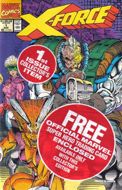
Cover art by Rob Liefeld.

While there was only one cover, each copy of X-Force #1 was polybagged with one of five trading cards drawn by Liefeld. That means most people bought six copies — five to save, and one to open and read. Within a week, I saw All About’s main location was selling the extra cards from opened copies — for a premium. There also was a brief sensation about a certain number of copies that for some reason had a reversed image of Captain America in the UPC box on direct market issues. I don’t know if that’s a legit variant, but I did scoop up an extra set of those for some reason I’m glad to have forgotten.

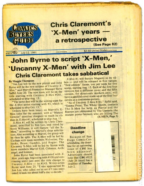
I spent most of my free time that summer driving through the desert heat from comic shop to music store to movie theater to bookstore and back around again. One of the nearby stops was a Bookstar outlet in the then-still-new Scottsdale Pavilions. They didn’t have much in the way of comics, but they did have a big newsstand that included copies of the Comics Buyers’ Guide. I doubt I’ll ever forget picking up the July 12 issue and reading that Jim Lee was taking over as plotter of the book, with John Byrne stepping in to script, while Claremont took a “sabbatical.” This was less than a month before X-Men #1 was due out.

Cover story in Comics Buyer’s Guide #921 (July 12, 1991).

There was no internet back then, and few publications that carried comic book news in a timely enough fashion to learn any more details before X-Men #1 came out on Aug. 13, 1991. The new issues of The Uncanny X-Men offered no hint of what was to come. Jim Lee stopped drawing the series after issue #277 (June 1991), with the incredible Paul Smith returning for #278 (July 1991), and Andy Kubert on #279 (Aug. 1991), on which Claremont’s run ended halfway through the comic. The rest was by Fabian Nicieza, who wrapped up the storyline in #280 (Sept. 1991) and set the stage for the Mutant Genesis relaunch.

That summer also was a big one for Star Trek, which was celebrating its 25th anniversary. Star Trek: The Next Generation continued to thrive on TV, its reputation growing with every new episode that aired. The original crew also was due back for one final voyage, with Star Trek VI: The Undiscovered Country scheduled for a December release. Not only was the original crew getting back together, but Star Trek II: The Wrath of Khan director and writer Nicholas Meyer was returning to both roles. There also was a rumor that TNG’s Michael Dorn had been cast in a small role in the movie.

The teaser trailer was frustratingly unspecific, but the title — originally meant by Meyer for Star Trek II — was terrific and built up expectations for a satisfying and very final finale.

On the comics side, DC put two more great Star Trek annuals, and put together the first sanctioned crossover between TOS and TNG with a pair of four-issue miniseries called The Modala Imperative. The creative teams swapped, with TNG comic scribe Michael Jan Friedman starting things off with a four-issue story of Kirk and Co. that was released biweekly that summer.

It was followed up with a sequel TNG series by regular TOS scribe Peter David that brought back Admiral McCoy from the TNG premiere episode “Encounter at Farpoint,” as well as an older Spock who was now an ambassador. (That last detail later panned out on the show itself when Leonard Nimoy returned that fall for a two-episode run as Spock on TNG, “Reunification.”)

There also was to be an original hardcover TOS graphic novel titled Debt of Honor from Chris Claremont and artist Adam Hughes, but it was delayed into 1992. More on that later.

August was the big month. With X-Men #1 (Oct. 1991), Marvel was releasing five variants of the double-size first issue. The first four would be standard format comics with covers that would connect to form a single image. Each also had its own pinup spread by Jim Lee. The fifth edition was a deluxe edition on glossy paper with no ads, all the spreads from the other four variants, a double gatefold cover with all four of the other covers as a single image, and some bonus sketches by Lee. The editions were released once a week, rather than all at once, with Marvel pushing back the release of X-Men #2 (Nov. 1991) a week to make room for the deluxe edition room to have its own week in the spotlight.

X-Men #1 — Cover E (Oct. 1991). Cover art by Jim Lee and Scott Williams.

Ken Strack at AAA told me that he thought the deluxe edition might be hot enough to be worth something. But at that time no one expected Marvel would print and ship 8 million copies of the book, making it the highest-selling comic of all time (at least to comics shops) and the most common. I picked up a couple copies of the first edition at AAA Best on the day of release, also swinging by All About’s Scottsdale location just to get some of the contact buzz.

Reading the book was bittersweet. It was much better than X-Force #1, featuring the full-on return of Magneto as a villain, some cool Danger Room shenanigans to introduce the new Lee costume designs, an orbital nuclear blast, and a final showdown in Genosha. To be continued!

The Uncanny X-Men #281 (Oct. 1991).
Cover art by Whilce Portacio and Art Thibert.

The Uncanny X-Men #281 (Oct. 1991), came out the same day as the first edition of X-Men #1, and was more of a mess. Marvel countered Claremont’s departure by bringing back John Byrne to script both series over plots from Jim Lee (starting in X-Men #4 (Jan. 1992)) and Whilce Portacio in Uncanny #281. While Portacio’s art was exciting, let’s just say letting an artist with limited writing ability plot one of your most visible and top-selling series is about as good an idea as it sounds. The story involved some Sentinels, the return of the Hellfire Club, and some new villains that didn’t make much of an impression at the time.

X-Men #2 (Nov. 1991).
Cover art by Jim Lee and Scott Williams.

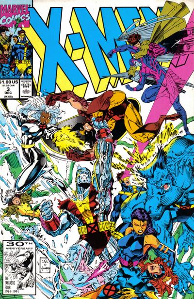
Claremont changes his plans for the series to wrap things up as best he could. While X-Men #1 was originally intended to be an introductory issue Claremont referred to as “X-Men 101,” it now kicked off a three-issue storyline that attempted to resolve the Xavier-Magneto conflict in some kind of convincing manner. When X-Men #3 (Dec. 1991) shipped in October, it was truly the end of an era. There was no acknowledgement of Claremont’s departure, no farewell message — no mention in any way that the man arguably most responsible for this commercial triumph was being displaced from that role.

X-Men #3 (Dec. 1991).
Cover art by Jim Lee and Scott Williams.

Between the release of the first edition of X-Men #1 and the fifth edition, I returned to Tucson and the University of Arizona for my final semester. I was originally slated to be the assistant news editor for the Arizona Daily Wildcat, but after only a few weeks found myself promoted to full news editor, in charge of keeping something like eight reporters busy covering the goings on of a campus of 36,000 students. Oh, and a full load of classes, too.

Next: How I almost — almost! — stopped buying comics after graduation.

Comic-Shop Memories: Fantasy Comics, 1990-91, Tucson, Ariz., Part 2

Things changed again for me in in the autumn of 1990. In pursuing my journalism career, I began working as a reporter for the the college newspaper, the Arizona Daily Wildcat. I worked three days a week at the Wildcat, and my beat was the University Medical Center, and general assignment.

This took up a lot of my time and instantly expanded my social circle from almost nothing to an entire newsroom of like-minded people. My first published article was about students who worked as lifeguards at one of the pools and were suddenly laid off despite new pools opening up in a new recreation and sports center. I wrote about some of the research being done at UMC, covered some student health issues, and did a fair bit of general assignment stuff on whatever needed to be covered.

Boy, was it fun. Very hard, at times, but a lot of fun.

It also cut into my comics time. I didn’t mind so much — it was good to have those new experiences. I had gone back to buying from Fantasy Comics over on Campbell Avenue. I was enjoying the increasing energy in the overall superhero field with the rise of the artists who would soon form Image Comics, and started to branch out more into other types of comics.

I already mentioned I was digging Shade the Changing Man by Peter Milligan and Chris Bachalo. This was before Vertigo was its own imprint. But the “mature readers” section of DC was already pretty unified, as it was all under the leadership of Karen Berger. I started checking out the other titles from this corner that were mentioned in the Shade letters column. Two of them made an immediate impact: Hellblazer and The Sandman.

I saw the ads for the new writer taking over Hellblazer with issue #41 (May 1991), a writer named Garth Ennis. The ads made clear that the series’ protagonist, John Constantine, had lung cancer from smoking in almost every single panel he’d ever appeared in. The art looked cool, so I picked up that first issue and liked it.

But what really blew me away was the second issue, Hellblazer #42 (June 1991), and it remains to this day one of my favorite single issues ever of a comic book.

Hellblazer #42 (June 1991)
Cover art by Tom Canty.

This story, titled “A Drop of the Hard Stuff,” has cancer-stricken Constantine heading to Ireland to seek the help of his old pal, Brendan, who lived in a lighthouse with dark-haired beauty Kit and dabbled in magic himself. Brendan loved to drink, and always had time for a pint of stout, glass of whiskey, or goblet of wine.

After catching up and getting pleasantly sloshed, Constantine tells Brendan he’s got cancer and he was hoping that his old pal might know a spell that would help him out of this spot. Brendan replies by saying he was hoping John would be able to help him in the same way, though for him it’s liver cancer, and he’s got very little time left.

So they decide to get completely sloshed, and Brendan takes John down to the cellar of the lighthouse where there’s a pool of holy water blessed by St. Patrick himself. He lights a candle, casts a spell — and turns the holy water into stout beer. John and Brendan start drinking it, and Brendan reveals that he made a deal with the devil to be able to acquire and enjoy the greatest life of drink known to man, in exchange, of course, for Brendan’s soul. Brendan says he tried to get one over on the old man by stipulating that his soul must be claimed by midnight on the day he dies or it goes free.

Brendan spends his final few hours with John, who gets up to leave noting it’s almost midnight. At the top of the stairs, he comes face to face with the devil himself, who’s come to claim Brendan’s soul. John figures he owes it to his pal to try to delay him until midnight, so he offers the devil a drink, saying that doing so would put all Brendan’s drinking adventures to shame. The devil likes this and agrees. John fills two pints of Guinness from the well, they say cheers, and each take a deep drink.

“So that’s what he was up to! Magic stout …” says the devil.

“Yup,” says John. “As long as that candle burns it keeps it from turning back into holy water.”

The devil panics, John smiles, and kicks over the table with the candle and it goes out. The devil screams in pain. John lights a cig and pushes the devil into the pool of holy water, and the devil dissolves in a hideous howl.

The clock strikes midnight. John’s saved his pal, but now he knows for sure he must do anything he can to avoid dying and ending up in hell because he’ll have to pay big time for this offense.

I was so completely hooked by this story, I began to buy every back issue of Hellblazer I could find. The previous issues, mostly written by Jamie Delano and drawn by the likes of Mark Buckingham and Richard Piers Rayner, were quite different, but unlike anything else I had ever read and quite fascinating. Once I figured out stout was Guinness, it became my adult beverage of choice.

Then there’s The Sandman. As I’m writing this, the first season of the Netflix series adapting the first two major arcs of the comic has just debuted. I’ve seen the first episode and adored it, and I can’t wait to see the rest of season one and what’s coming up in season two.

The first issues I bought of the comic book was The Sandman #22 (Jan. 1991) and #23 (Feb. 1991). This was the beginning of “The Season of Mists” storyline, with art by Kelley Jones and script, of course, by Neil Gaiman. I distinctly remember the literary quality of this comic stood in stark contrast to anything else I had read before, even the likes of Watchmen or The Dark Knight Returns. I quickly scored back issues through #16 at Ken Strack’s AAA Best Comics in Phoenix, and in those issues found two stories that made me a forever fan of The Sandman – and comics as a medium.

The Sandman #17 (July 1990)
Cover art by Dave McKean

The first was “Calliope,” in The Sandman #17 (July 1990). This was one of Gaiman’s single-issue stories and it was devastatingly good. The story followed Richard Madoc, a novelist with writer’s block who acquires a real life muse named Calliope. Her services are not acquired freely — he rapes her to get the inspiration that not only undoes his writer’s block, but fuels his rise to literary and cultural stardom unknown in modern culture. Calliope pleads with Morpheus in a dream to help free her — they had one been intimate. The Sandman appears before Madoc and makes his case. But when the writer complains that he’d have no ideas without her, Morpheus unleashes his anger and fills the writer’s mind with so many ideas it drives him mad. He frees Calliope, and the rush of ideas fades away to nothing at all. This was all in 22 pages with fantastic art, and made a huge impression on me.

The Sandman #19 (Sept. 1990)
Cover art by Dave McKean

The other was “A Midsummer Night’s Dream” in The Sandman #19 (Sept. 1990). This is one of the most famous issues of the series, as William Shakespeare and his troupe perform the first of two plays commissioned by Morpheus for a unique audience — the faery folk the play itself portrays as a way to ensure they are never forgotten. It’s clever and engaging beyond words, with delightful, delicate and expressive art by Charles Vess.

I hope both episodes are adapted for season two of the Netflix show, even though I know that even the greatest adaptation could never equal the stature of the comics in my mind.

The Sandman was one of the first comics I set out to read trade paperbacks on. This is because the back issue prices were already pretty high. There already was The Doll’s House, which collected issues #8-16 — a steal at $12.95.

The Sandman: The Doll’s House trade paperback
Cover by Dave McKean

I remember looking forward to buying the trade paperback of the earlier issues, and picking up a copy at Fantasy Comics on the day it came out. Preludes & Nocturnes collected issues 1-8 of The Sandman, and did not disappoint. (Yes, both editions included issue 8, “The Sound of Her Wings,” which introduced Death. At the time, I’m sure it made sense to kick off The Doll’s House with that terrific story, but it more correctly belongs as the epilogue to Preludes.)

Back and front covers to The Sandman: Preludes & Nocturnes
Cover art by Dave McKean.

In direct opposition to pre-Vertigo DC comics was the explosion of energy new artists were bringing to mainstream Marvel and DC superhero comics.

The X-Men were top of the heap at Marvel, with Jim Lee and his Homage Studios mates taking over the art chores on The Uncanny X-Men, starting with issues #267. The following issue, #268, which came out in early fall of 1990 was a huge jolt of excitement with Lee drawing a single-issue tale by regular scribe Chris Claremont that alternated between an 1940s meeting between Captain America and Logan, and a present-day tale involving Logan, Jubilee and Psylocke helping out the Black Widow.

The Uncanny X-Men #268 (Late Sept. 1990)
Cover art by Jim Lee and Scott Williams

That was followed up by the return of Rogue in The Uncanny X-Men #269. Always a favorite, Rogue had vanished into the Siege Perilous some 20 issues before and just now returned. She ended up in the Savage Land, just getting by on her own — in a wonderfully revealing torn up costume that fueled the imagination of many a male reader. She runs head to head in her mind with Carol Danvers, and comes out face to face with Magneto.

The Uncanny X-Men #269 (Oct. 1990)
Cover art by Jim Lee and Scott Williams

The Extinction Agenda crossover was next. Compared to today’s crossovers, this was a modest affair — it ran a mere nine issues, three each for X-Men, X-Factor and The New Mutants.

But it was Lee on X-Men that drew everyone’s attention and jump-started sales to a new level. I remember being home at my parents’ house that spring with a cold. My mom was driving past AAA Best and stopped in to get some comics. Ken knew who I was, and my mom came home with copies of Superman #54 and the double-sized Jim Lee glory of The Uncanny X-Men #275 with a gatefold cover.

Things were building now toward the relaunches that defined the summer of 1991. Louise Simonson dropped off of The New Mutants, and Rob Liefeld instantly began transforming it into X-Force. Whilce Portacio took over X-Factor and, with Chris Claremont scripting, finally resolved the identity of Cable and set up the eventual return of the original X-Men to the team.

One of the nice thing about comics at the time was they were still cheap. Most Marvel and DC comics cost $1, and most stores were moving lots and lots of copies of Batman, X-Men, Spider-Man and other top heroes. Batman books especially were doing well, with sales strong across the board two years after the Tim Burton movie. We now awaited the sequel, which was due in 1992.

Speculation also was coming into play in a more obvious way. There had for years been people buying multiple copies of certain hot comics as they came out in the expectation that they would increase in value. While the vast majority of Marvel and DC back issues were common and relatively cheap in the 1980s, the influx of both readers and speculators started to have an effect. Once-common back issues became a bit harder to find, and prices started to edge up a bit. DC and Marvel both had hits with multiple covers on Legends of the Dark Knight and Spider-Man, and had now bought into this promotional tool wholeheartedly with X-Force #1 and X-Men #1, coming in the summer of 1991.

Comic-Shop Memories: AAA Best Comics, 1990, Phoenix, Ariz., Part 2

A lot changed at the end of my third year at University of Arizona. My family was living in Phoenix, just off North 19th Avenue, way up north of West Bell Road. I don’t remember how, but I landed a summer job at a nearby Minit Lube. I mostly took service orders from cars that drove up, squeegeed windows, and vacuumed the floor mats.

Everyone has a job they survive. This was mine. The people were nice, and that was the best part of it. This was an open-air, drive-through oil change place. That meant you were not working indoors, where the Arizona summer temps could be tempered with air-conditioning. The boss was generous with using petty cash to get us Gatorade, water, or sodas from the Circle K next door several times a day to help us avoid dehydration, so that was nice. It paid slightly more than minimum wage — about $4 and change per hour.

But this was an especially cruel summer. On June 26, 1990, the temperature in Phoenix set a record: 126 degrees Fahrenheit — that’s 52 degrees Celsius for those of you who live outside the U.S. I was not working that day. I was home, with the shades drawn, the AC on, cold drinks in the fridge, watching movies on VHS in the dark.

At one point, I remembered I had left several music cassettes in my car and decided to save them. I put on flip-flops, grabbed my keys, and went out to the car. I opened the door and quickly grabbed the hot tapes, pulling my shirt out like an apron to carry them indoors. As I was walking back to the front door, I thought I had stepped in some gum. Looking down, I saw my flip flops were melting on the concrete driveway. I hurried inside and did not re-emerge until the rotation of the Earth had put a merciful end to the sun’s daily punishment.

Star Trek: The Next Generation, "The Best of Both Worlds"
One of the best TV cliffhangers of all time. It was uncertain that Patrick Stewart was coming back, so this really could have gone a number of different ways.

A few weeks before that, my Star Trek fandom hit new heights with the broadcast of the third-season finale of Star Trek: The Next Generation: “The Best of Both Worlds.” What a stunner! The third season had really taken off, and the show was now firmly boldly going into new territory in exciting, well-crafted and thoughtful ways. I miss it.

I remember catching early that summer a couple episodes of The Flash on CBS, which clearly took a lot of visual inspiration from the Tim Burton Batman movie success of the year before. It didn’t click with me, and was canceled at that point after only one season.

Warren Beatty in Dick Tracy.
Don’t have much to say about this movie, other than it seemed like a business venture more than a creative one.

In theaters, there was Warren Beatty’s Dick Tracy. This movie was very hyped in a clear attempt to emulate the success, again, of Batman. The miscalculation was in not realizing that Dick Tracy hadn’t been a character people cared about for decades at that point. There had been no resurgence of interest, or reframing of the character for the times, as Batman had gotten from The Dark Knight Returns and The Killing Joke. It was just an old comic strip, and the only strip back then that had any kind of active audience was Calvin and Hobbes.

Dick Tracy could have overcome that if the movie was better, but it wasn’t. It was a bunch of old actors putting on silly makeup to turn an old comic strip no one read anymore into a movie that no one really ended up caring much about. I haven’t seen the movie since it came out, though I do have a DVD somewhere of it.

Back to the Future, Part III
I like Back to the Future, Part III a lot more than Part II.

Other cool stuff going on that summer included the release of Back to the Future, Part III, which prompted a thorough review on my part of the previous two films in that series. In the end, only the first is a really great film, but the others are at least entertaining.

Less interesting was Die Hard 2: Die Harder. Not at all up to the standards of the first one — a movie series of true diminishing returns.

It was Spider-Man #1 (Aug. 1990) that drew me back to AAA Best Comics. I had a day off work the day the issue came out, June 19, 1990, and decided to head over to Ken Strack’s shop to pick up a copy. He had moved down the street — he was always on North Seventh Street — into a slightly larger space.

He had ordered plenty of copies, and I picked up two each of the green cover and the silver cover, and one each of the green bagged edition and the black bagged edition. I believe the bagged editions are still unopened in my collection somewhere.

I distinctly remember Ken raving about a new DC series called Shade the Changing Man. The first issue was recently out, and he talked up the striking Chris Bachalo art. I can’t remember if he gave it to me or if I paid for it, but I found myself agreeing with him that it was cool, and coming back for the next issue for at least the next two or three years.

It was overall a fun time to be reading comics, which still were cheap. Most DC and Marvel series cost $1 per issue, which made it easy to buy a stack of new, untried books for not a lot of money.

Marvel had this new-series program, where they introduced a new first issue each month for the first half of 1990. Among them were Ghost Rider, the John Byrne She-Hulk, The New Warriors, Guardians of the Galaxy, Byrne’s Namor: The Sub-Mariner, and McFarlane’s Spider-Man.

I was in on Spider-Man and Namor. The others, for whatever reason, struck no nerve with me. With Namor, the appeal was the art. Byrne was using duotone paper that gave his work a new element. And he had some good ideas for the character that made for a really fun read, namely having Namor forage lost treasure from the ocean floor to turn himself into a captain of industry.

I was still reading comics that summer. I recall really enjoying the various Batman and Star Trek series.

X-Men was in an unusual but still very interesting place. In the main X-Men title, writer Chris Claremont split up the team after Inferno and scattered them across the world. Many found completely new identities, with older characters fading away and new ones, as always, coming in. There were a lot of single-issue stories, with the overarching story building in the background — sometimes so deeply, it wasn’t clear to the reader, or even perhaps to Claremont himself, where things were going and how. These were the last Marc Silvestri issues, which were followed by a series of fill-in artists awaiting the inevitable arrival of heir apparent Jim Lee later in the year.

Fans were impatient with this approach to X-Men.

I recall reading in a copy of the Comics Buyers Guide a letter from a fan who answered another fan’s letter asking what the hell was going on in X-Men. The reply letter ended with a plea to Claremont to return to more conventional comic book storytelling, and a note from the CBG editors stating they paid the letter writer a small fee for all the work he put into answering the question.

The Uncanny X-Men #266 (Late Aug. 1990). The first chronological appearance of Gambit, though X-Men Annual #14 (1990) was released first.

The introduction of Gambit was much hyped, though the execution of it was a mess. It took a while for the comics to find some space in which to convey anything about him that wasn’t superficial. And I remember reading that Days of Future Present crossover between the Fantastic Four, The New Mutants, X-Factor and X-Men annuals, and being flat out unable to make sense of it. There was some nice Art Adams art in the X-Men episode, though.

The other X-Men titles seemed like they were in a bit of another universe. Excalibur’s Cross-Time Caper seemed to go off the rails a bit as Alan Davis wasn’t drawing every issue and there were even a few writing fill-ins for Claremont. The momentum, clarity and humor the book had in its earlier days burned off quickly and the title soon was passed around the Marvel office like a hot potato.

The same was true for Wolverine. After the solid but underwhelming arc by Archie Goodwin, John Byrne and Klaus Janson, there were fill-ins galore with a variety of artists and writers. And these issues came out while the book was published twice monthly in the summer months. These were supposed to be highlight issues, top stuff meant to drive traffic into comics shops. And it was far from special material.

In Louise Simonson’s corner, X-Factor had been a bit lost since Inferno, and in 1990 also was rotating through a series of fill-in artists drawing stories that at best were treading ground. I understand there were plans for Cyclops and Marvel Girl to finally marry and be parents to baby Nathan, but soon crossovers and changes in creative direction would push back that actually happening for years.

I had stopped reading The New Mutants shortly after Inferno. But Ken recommended issue #93 to me, and I was indeed impressed at Rob Liefeld’s more testosterone-driven take on these characters. That issue had Wolverine both inside and on the cover fighting Cable. I quickly put together the issues I had missed, which was very easy — I paid $3 for issue #87, which is now a key from that time.

The New Mutants #93 (Sept. 1990). Art by Rob Liefeld and Todd McFarlane.

As up and down as Marvel was, DC was even more more hit and miss. I tried Green Lantern, with the original Emerald Dawn series, followed by a regular title. This character just didn’t work for me. It was the same with Lobo. Everyone went ape-shit crazy for this character, but it was all one joke to me, and not one I found funny at the time.

I did very much like Justice League, which at the time was the brainchild of J.M. DeMatteis and Keith Giffen, and really quite funny.

Another title Ken recommended to me was Doom Patrol, by Grant Morrison. This was my first Morrison book, and it immediately stood out as something different, daring, and fun to read. I came on with issue #32, and it was years before I filled in Morrison’s run back to #19. But I bought every issue going forward and really enjoyed that book.

It was a quiet summer, to be honest. I was looking forward to going back to university in the fall, mostly because I had been hired as a reporter for the Arizona Daily Wildcat and was really excited to be a part of that team and to finally get some real experience in my chosen field of study.

For comics, it was in some ways the quiet before the storm.

These books were still enjoyable and worth buying while they were so cheap. But they also weren’t really satisfying, either.

When the bottom didn’t fall out after the year of the Batman movie, it felt like there was an explosion waiting to happen. That there were new heights to reach. That all it would take was the right book at the right moment, and comics would vault out of the shadows and into the mainstream. The signs were there, with an influx of brash boys in comics shops wondering aloud why Batman doesn’t use guns, or why Marvel doesn’t make Todd McFarlane draw Wolverine, or expressing in plainly lustful language their admiration for Jim Lee’s latest rendering of a swimsuit-clad Psylocke.

All things in their time.

Jim Lee Psylocke pinup from Marvel Illustrated: Swimsuit Issue (1991). Yes, such things existed.

Comic-Shop Memories: Fantasy Comics, 1989-90, Tucson, Ariz., Part 1

I don’t remember why I stopped shopping at AAA Best when I started my junior year at the University of Arizona. Instead, I starting shopping weekly in Tucson at Fantasy Comics, which is located at 2745 N. Campbell Ave.

Fantasy was in an unremarkable one-story building, with a glass case at the front full of its more expensive comics. New releases were racked to the immediate right. The rest of the current comics were stocked in alphabetical order in racks that stretched to the back of the shop. The main floor featured lots of back issues. Charlie Harris, a frequent DC “letter hack,” either owned the store or worked there.

One of the most memorable things for me about shopping at Fantasy was that back issues were in heat-sealed bags. To get them open, you needed scissors, so there were lots of discarded comic bags in my trash.

Into the Trek comics wormhole

I fell deep into Star Trek at the time. DC published in August new Star Trek and Star Trek: The Next Generation series that I really enjoyed. Star Trek V: The Final Frontier had done poorly at the box office and with critics, but Star Trek: The Next Generation‘s third series debuted in September and was by far its best to date.

But it was the classic Star Trek comic that really caught my eye. It had clever scripts by Peter David and slick art printed on good paper from the team of James Fry and Arne Starr. And nothing beat those covers by Jerome K. Moore. They are spectacular and I never tire of looking at them or admiring the skill Moore brought to those illustrations.

My Star Trek obsession led me to a Star Trek convention experience that cemented my fandom for that franchise. It was a weekend Creation Convention at the Tucson Convention Center, with special guest Patrick Stewart.

Prior to Stewart’s entrance, Gene Roddenberry’s assistant, Richard Arnold, previewed upcoming episodes of The Next Generation. These were sneak peeks at some of the best in the series’ run: “Deja Q,” “Yesterday’s Enterprise,” “Sins of the Father” and “Captain’s Holiday.”

Stewart appeared for a charming Q&A session at the end of the day. Among the secrets he revealed: He had accepted a teaching job at the University of Arizona. But the offer slipped through through the cracks and after landing the role of Captain Picard, he never looked back. What might have been!

Marvel’s X-Men on the rise

The other hot franchise was X-Men. It had been a best-seller for years at this point, but new artists raised the excitement to a new level. Jim Lee’s arrival on X-Men seemed inevitable after lengthy runs on Alpha Flight and Punisher War Journal. He did a few issues here and there at first, before taking the full reins in the summer of 1990. At the same time, Rob Liefeld also was pitching in on X-Men titles and getting some heat. He took over the penciling chores on The New Mutants in 1990 and introduced Cable, another high point. Erik Larsen took over penciling The Amazing Spider-Man from Todd McFarlane, who was set to launch a new Marvel title. With Marc Silvestri jumping from X-Men to Wolverine, the seeds of the Image revolution were taking root.

But Star Trek had sort of taken over my mind. I collected the first DC series, re-watched the movies and original TV shows, and even enjoyed some of the Star Trek novels. “Writer of Stuff” Peter David was the creator whose work I most enjoyed, leading me inevitably to The Incredible Hulk.

Lost in the aisles of Bookman’s

Fantasy was but one of the shops I frequented that year. Another mainstay was Bookman’s, a used-book store that filled a former grocery store space with tons of fascinating objects. Each visit took hours, it seems. I’d start with out-of-town newspapers and move on to a newsstand section full of old and new magazines. Then there were aisles full of used books, cassettes, CDs, and bargain low-grade comics. I always flipped through Comics Scene and the Comics Buyers Guide, catching in the latter news of a Peter David signing at All About Books and Comics in Phoenix. I skipped out on school to drive up from Tucson in time to hit the Thursday evening event.

The Hulk tour hits Phoenix

The signing was part of a tour promoting David and artist Dale Keown’s work on The Incredible Hulk. Keown had only drawn two issues of Hulk at this point, and the signing was sparsely attended. That gave everyone a chance to hang out with David and Keown and chat about a lot of things. David signed several Star Trek issues for me, a Next Generation novel he’d written, and some Hulks. He joked about calling his editor back in New York to rave about the warm Arizona weather.

To my surprise, Keown hailed from Alberta, so we talked about Canada and Arizona, as well as comics. I remember he sold the splash page to The Incredible Hulk #367, his first issue, for about $150. A few years later, I saw the same page for sale in another Phoenix-area store for many multiples of that.

The signing was part of a mini-tour that continued that weekend to comic shops in Los Angeles and Las Vegas. All About produced a poster for the signing similar to the McFarlane one I wrote about previously. Mine is framed but in storage.

Hunting for back issues in Tucson

After that, I started seriously looking for back issues of The Incredible Hulk. David had been writer on Hulk for about three years, and I began by tracking down his back issues. I often visited a Tucson shop called Comics and Things, located in a strip mall at 3934 E. Grant Road, in search of Hulk and Star Trek back issues. It had a good selection of recent back issues but soon vanished into the ether.

The writing and art on Hulk surprised me. David started with a fairly conventional Hulk story with McFarlane on art. Their collaboration ended with a satisfying climax that completely changed the series’ premise. David next turned the Hulk gray and got him a job as a high-end Las Vegas bouncer named Joe Fixit. Jeff Purves drew this run and did a fabulous job before disappearing from the world of comics.

Hulk was so good that Sam Kieth drew the fill-ins — if you could call them that.

Keown drew Hulk for the next three years, and it became was a huge hit. David stuck with the title for years after, and still writes new Hulk stories from time to time. Great stuff.

How much is too much Batman?

This also was a time when Batman was still riding high on the popularity of the Tim Burton movie. So Batman was super-hot and DC released in the autumn of 1989 Legends of the Dark Knight #1. Promoted as the first new solo Batman book since 1940, this series set free top talent to do their ultimate Batman story.

The first issue also marked the first time I remember variant covers from a major publisher, as DC promoted the book with a second cover that came in four different colors. They said in the book that it was “just for fun,” but the result surely made DC’s accountants happy as fans decided they needed to have a copy of each color — and therefore bought four copies of that first issue.

Pointing out the differences between Tucson and Phoenix, that first Legends of the Dark Knight sold out immediately down south. The same was true of The New Titans #60 and 61, which were key parts of the current Batman storyline, “A Lonely Place of Dying.” I easily found both on my first comic shop stop on my next trip to Phoenix.

Next: My short career as a “letter hack.”

Reviews: Hulk #1, DD #5, Cold War #1, Last of the Greats #1, Aquaman #2, Justice League #3

The Incredible Hulk #1 was better than I expected. Not having read the book in years, I missed out on and don’t understand most of the Red Hulk stuff or what mental state Bruce Banner and the Hulk are in these days. I therefore expected to be confused, but wasn’t, though I’m sure it helped that I recognized the Mole Man’s underground minions. Writer Jason Aaron did a good of job of putting it all together and making sure there was some actual action in a first issue. The art by Marc Silvestri et. al was quite good — definitely Silvestri’s distinctive style but amped up with some nice detail that came through quite well in the inks and was well-complemented by Sunny Gho’s colors. That said, I”m not interested enough in the Hulk to make this a regular read at $3.99 a pop.

Daredevil #5 is another terrific issue from Mark Waid and Marcos Martin. This reads very, very smoothly and is clear enough that I think the average reader could pick it up and understand pretty much the whole thing. It looks incredible, too. Martin and colorist Javier Rodriguez deserve very high marks for making such a great-looking book.
Cold War #1 is a new, period espionage thriller from John Byrne that I was mildly disappointed with because I thought Byrne had done such a great job on the revived Next Men series. This isn’t quite as good as that, as it’s just a bit too restrained and dated. The dated part is on purpose, as though this is a series Byrne has wanted to do for decades, i.e., a time when this kind of thing would have been much more relevant. It’s still a nice modern Byrne comic, though, with solid art and decent storytelling. It just doesn’t have the kind of zip that a book like this should have.
The Last of the Greats #1 by Joshua Hale Fialkov and Brent Peebles is for me a tough one. I like the concept, which is that seven alien beings came to Earth and used their powers to solve many of mankind’s problems in return for demanding control and fealty from the people of Earth. People then turned on them, and all but one were killed. The issue begins with six humans coming to the last of these aliens, dubbed the “Greats,” and asking for his help with a fairly big problem. But I think the execution is talky and exposition heavy, and think this could have been much more compelling by show more than telling.
On to the DC relaunch books, Aquaman #2 was about the same as the first issue — a story that’s slick and commercial if not particularly deep — but it was the cover that struck me the most. My first thought was it was a recolored version of the cover to Star Wars #64, my least-favorite issue from the original Marvel series. It’s close enough to be an homage — or a swipe if you’re so inclined — but it’s far too distracting for me and I don’t know I will remember much else about this particular issue.
Justice League has been getting better with each issue and #3 is the best yet. Finally, we get to meet Wonder Woman, and she both charms and kicks ass. The action kicks into high gear with a huge invasion from Darkseid’s minions, while writer Geoff Johns delivers a nice chunk of the ongoing Cyborg origin subplot. It’s interesting to note the ways in which Jim Lee’s art has evolved as well as the ways its stayed the same. The finale’s introduction of Aquaman gives him a hairstyle, facial hair and costume straight out of 1996. Some other details, like the cops on the first page also look a bit dated. But the way Lee draws his heroic figures — both men and women — has improved tremendously from his days on The Uncanny X-Men, with anatomy and posing that’s overall more realistic and more solid looking. Wonder Woman here is a far cry from the somewhat plastic looking sexy Psylocke from way back in the day. Anyway, issue #4 looks like it’s going to be a barn-burner.
That’s only a fraction of the stack I’m looking to get through, so I may just stay up late and read funny books until my eyes pop out of my head to get a look at more New 52, the Fear Itself epilogues and more X-Men: Regenesis.

Reviewing DC’s Justice League #1 in print and in digital

I haven’t reviewed new comics in a while, though I’ve had a few requests and will get some comments on those books up in the next day or so.

In the interim, DC’s New 52 kicked off yesterday with the release of Justice League #1. I got a copy from DC, and found it to have some good points and some bad. I also tried the digital edition on my iPhone and that spurred lots of ideas on what works and what doesn’t about that format.

But first, the comic itself is good but not great.

Jim Lee and Scott Williams deliver some fantastic looking art. It’s attractive and highly detailed and colored well by Alex Sinclair. And while Lee’s never been the very best storyteller in comics, he’s also much better than he used to be and the book is an attractive and easy read.

As usual, Lee’s designs for Batman, Green Lantern and Superman are powerful and modern. I especially like the intense detail Lee and Williams give to Green Lantern’s powers.

I almost think the art is too detailed, though that may just be my middle-aging eyesight speaking. When this gets collected into a slightly larger format like a hardcover, I think it’ll look even better because there will be a bit more room for these details to shine.

The script by Geoff Johns is a bit more mixed. This issue takes an approach similar to that of the first episode of a TV series. We start knowing nothing, get a big splash of action with Batman, and then introduce some conflict as Green Lantern shows up and the pair head straight for a confrontation with Superman. There’s also a sub plot introducing Vic Stone, who eventually will become Cyborg. The issue is quickly paced and reads well, though some of the dialog is a bit stiff.

And that’s it. That’s all that happens. There’s some decent action, some decent characterization and a solid finish, but there’s just not quite enough story here to build the anticipation that I think would make readers truly excited to come back for issue two. It’s close, but if this was a double size issue that featured at least a glimpse of all the characters on the cover and conveyed a sense of where this was going, it would have been a much stronger read.

I expect reactions to this book will be all over the place. Something like this brings so many pre-conceived notions and inflated expectations with it, that there is no way it will play the same way to any two readers.

So the copy I received from DC was the digital combo pack version, which costs a dollar more than the regular version and includes a code for downloading the digital version of the comic.

I have not been a regular reader of digital comics. Part of it is just that I prefer to read comics in print and part that I haven’t really enjoyed my attempts to read comics on a computer screen. I don’t have an iPad, which seems to be the ideal device for reading digital comics, and my iPhone is great but I just can’t see myself reading many comics on so tiny a screen.

Still, I tried it out on my iPhone and it worked quite well. The code, which is printed on the inside back cover, is a fairly long 32-character alpha-numeric code. I can imagine some folks might get frustrated at having to type in such a long code for each digital comic, but it worked for me on the first time. I entered the code at the website on my laptop and Justice League #1 was assigned to my ComiXology account and available to read on my iPhone instantly.

Reading the comic on the iPhone was a good but not perfect experience. The art looked good and the way the phone transitioned from panel to panel was intuitive and easy. I kind of liked turning the phone every so often to get the displayed panels to fill the screen. What things got problematic was on the larger images — panels that take up half a page or more. It was just not easy to see what I was looking at in those panels. I expect the iPad would not have the same issue.

What this digital experience left me wondering, though, is why DC is packaging its comics in two editions. Why charge an extra dollar for the digital code instead of just making them packaging them together in a single product? I think comics are expensive already without having the option of paying even more for another edition of the same thing. When I buy music, either on CD or digitally, I have the right to listen to it on my computer, my iPod, my car stereo, my living room, etc., for no extra cost. I’d be far more likely to read digital comics if they came with the print comics I’m already buying at no extra charge.

Similarly, I would think anyone who pays the full price for a digital comic should have the option to get a print copy if they want it. And It’s not at all clear to me if DC (or anyone else) is offering digital subscriptions similar to the way iTunes sells a Season Pass for TV shows. A reasonably priced digital subscription plan that included print copies is something I would think hard for people to pass up, while at the same time having the potential to boost readership in both print and digital.

With the first huge wave of first issues set to arrive next week, I find myself hoping for surprises. Everyone’s going to read Grant Morrison’s Action Comics #1, but what I would really like to find is a few hidden gems from further down the list. I’m playing wait-and-see on these books and want to look at them before I decide which ones to pick up. But I really hope this experiment makes room for the kind of fun, strange and interesting mainstream comics that the major publishers have had trouble making a go of in recent years.

Beyond that, we’ll see.  

Powered by WordPress & Theme by Anders Norén