A longtime showbiz journalist and fan's thoughts on comic books, movies and other cool stuff.

Category: Uncategorized Page 6 of 19

‘Pariah’ slickly covers familiar ground

Pariah is indicative of the current state of indie comics: It’s a high-concept story that’s slickly produced and has some kind of movie ambition and/or Hollywood connection or talent behind it.

First, the book itself. Pariah #1 starts with Brent Marks, who we’re told is a “Vitro,” which makes him superhumanly smart. Completely isolated from other Vitros, he lives a miserable teenage life in Ohio, where he can’t meet girls at high school and hates his brain-dead parents. But he’s also got this idea for a working interplanetary spaceship and has started building components for it in his room. Then, an explosion at a weapons research laboratory that employs a large number of Vitros releases a deadly toxin in the air, making Vitros persona non grata. Brent runs afoul first of some bullies, then of the law and is captured for what is certain to be a nefarious purpose.

The high concept here is the idea of Vitros, which is based on real world research that indicates genes can be modified before birth — i.e., in vitro — to achieve certain genetic outcomes. I wish this had been explained in the book itself, though. I learned this fact from the press kit that came with it.

(As a total aside, this was one of the best press kits I’ve ever seen for a comic book release. It included several professional-quality press releases, bios of the creators, a bookmark, printouts of reviews, a hand-written note from the publicist, a copy of the book and even synopses of upcoming issues.)

The book is well done on every level. The writing is good, with snappy and believable dialog and instantly recognizable characters. The story is by Aron Warner, who was a producer on DreamWorks Animation’s hugely successful Shrek series, and Philip Gelatt, an up-and-coming comics writer.

The art is excellent, which is no surprise since it’s by Brett Weldele of The Surrogates fame. The production values are top-notch. And it’s a nice book overall.

Which leaves me thinking about the big picture, and that’s where i wonder where this is all going and whether it’s going to be worth the ride. The synopses of issues 2-4 indicate they will be very similar, introducing other Vitros in other parts of the country while undoubtedly slowly advancing an overall plot. The series is meant to run 12 issues, so I imagine there’s a finale in mind along with plans for an eventual movie or TV version.

But the biggest problem is this effort still feels incredibly familiar. The troubled teens with powers has been done to death in comics from X-Men to Brian Wood and Becky Cloonan’s Demo, which is the comic Pariah reminds me of most.

The good news is that this is loads better than any other stealth movie as comic book idea I’ve seen in ages. The bad news is that for all its slickness, it doesn’t offer anything new or different enough for me to want to come back for issue two. And that’s exacerbated by knowing that the next three issues will mostly introduce three more Vitros and the meat of the plot won’t really get started until at least issue #5. That’s a lot of time and money at $3.99 a pop to ask of an audience.

For more info on this book, including a preview of the first issue, visit www.pariahonline.com.

Small Press: Diamondback is Unpolished but Enthusiastic

Every so often, folks send me an email asking if I’ll take a look at and review their comics. For a long time, I had no time to do so, but a couple of recent requests piqued my interest and so I’m going to do a couple of these indie reviews before I dig into this week’s tantalizing pile of The New 52, sitting since yesterday afternoon on my desk.

I have here the first two issues of Diamondback, published by Colorado-based Anasazi Comics, each $3.99 for 24 pages in color. Written by Jeremy Lee, who created the series with Michael Andereck, Diamondback is set in an “anarcho-capitalist” future in which all government has collapsed and the only justice you can get is what you pay for. In the massive Denver City, a man named Jack Cody’s wife is killed in a gangland gunfight. Lacking legal insurance, his child is taken from him and Jack is sent to prison, where he makes socks and his soul dies. He’s pulled out after a year by a an agent named Cowboy, who believes Jack also can be an agent for the Carroll-Dodgson company and begins training him. Jack takes on the name and identity of Diamondback, and he and Cowboy immediately clash with the big boys of the agency game at Dyja International, which forms the spine of the first two issues.

There are some interesting tidbits in here and I think this could be developed into something that works as a story and would be quite interesting as an action tale with some social commentary in it. The execution leaves something to be desired, even though it makes up for its many technical flaws with sheer enthusiasm. I wish the script had an editor who could make sure that the concepts in the book were clearly explained.


Frankly, if you want to nitpick this, there’s a lot to pick on. But the ideas and characters somehow still came through to me, despite things not being terribly well explained or introduced the way we’re used to.

The artwork by Nick Bove has many of the same issues. If you want to, you can critique it to death for problems with perspective, anatomy, clarity, etc., but the story still gets through. The designs of the future city in particular offer some interesting glimpses of what this world could be. The biggest problem with the art is it’s just not delivering much to convey this world and these characters as physical things — as it is, the images are flat and two-dimensional, though there is some improvement already evident in the second issue.

I don’t know that I can really recommend this to anyone as a great reading experience. It’s kind of a throwback to the kind of stuff that flooded the market in the various small-press boom times. But it does have tons of enthusiasm, and I like that comics is a medium where these things can see the light of day and have a shot at not just developing an audience, but at getting better.

This book is not yet available through Diamond, so if you want to check it out for yourselves, head on over to www.diamondbackcomic.com, www.anasazicomics.com or to Facebook and ask them how you can get a copy.

New 52, Week One, Pt. 3: JLI, Swamp Thing, Batwing and Static Shock

Delayed slightly by a short-lived, mildly annoying illness and tons of work and baby duties, here, now, are some thoughts on the last batch of releases in the first full week of DC’s The New 52.

Swamp Thing #1 is a very tough comic to do, because no matter how good the book is it always has to live in the shadow of great runs by Alan Moore and the original run by Len Wein and Bernie Wrightson. Also, after nearly 20 years as a Vertigo property, I find it somehow incongruous to see Swamp Thing appear alongside Superman and other mainstream superheroes. None of which has anything to do with this particular story by Scott Snyder and Yanick Paquette. I”ll start with the art, which I found to very good and atmospheric and, appropriately, lush. I had to double check the credits because I was sure those distinctively-inked faces meant Kevin Nowlan was working on this issue, but it is all Paquette. Snyder’s story does a decent job of resetting the character and his Alec Holland alter ego in the DC Universe, but still failed to really sell the idea as a good one. The horror elements were good. But I don’t think this version of Swamp Thing is distinctive enough to work as a Swamp Thing comic for established fans, while this is easily, I think, the most confusing first issue for neophytes. 
I was surprised in a good way to see Justice League International among The New 52. I am, as regular readers of this blog will know, a fan of the Keith Giffen and J.M. DeMatteis run on the title from the late 1980s. Those writers haven’t returned for this version, which is written by Dan Jurgens with Aaron Lopresti and Matt Ryan on art — all solid superhero creators. The key to this seems to be Booster Gold, who Jurgens created a long time ago and whose series he was writing and drawing before it ended with Flashpoint. The supporting cast includes JLI stalwarts Guy Gardner, Batman, Rocket Red, Ice, Fire and Batman, along with Vixen, a Chinese hero named August General in Iron and a cheeky brit chick named Godiva. The premise is a little odd, as the United Nations agrees to form its own Justice League that it can control, under the leadership of U.N. Intelligence Chief Andre Briggs. So the JLI has no relation to the other Justice League, even though Batman’s in both. The story itself is decent but not spectacular. It has a  plot that it clearly tells, with a couple of character moments that old fogeys like me will be familiar with but may appeal to the newbies. There’s foreshadowing of conflicts, a cliff-hanger ending, some mid-level superhero action and it all looks very clean if average. All of this makes it hard to recommend one way or the other — it’s far from bad, but it’s nothing special enough to go out of your way for unless you already like these characters and this concept.
Static Shock #1 is perhaps the most standard first issue of the bunch, running through the standard story points of introducing the hero, his supporting cast, the premise and giving him a first villain to fight. I admit to not having read really anything about this character after about the first year of the original Static series from Milestone in 1993-94. I know there was a cartoon, and I know this was a signature character for the late Dwayne McDuffie. But this doesn’t match up with anything I remember liking about those original comics, which to me evoked Steve Ditko’s early Spider-Man work. This is a just a lot more generic. The story is by Scott McDaniel (who also does the art) and John Rozum, with Jonathan Glapion and LeBeau Underwood on inks. I really wish this book was better, but I fear this will be one of the first on the block for cancelation.
The last book on the list is Batwing #1, by Judd Winick and Ben Oliver. This is another book I was hoping would be a surprise simply because it’s new. And it’s a bit of a mixed bag, mostly because it didn’t grab me the way I expected it to. This is a new character, sort of spun out of the idea of Grant Morrison’s Batman, Incorporated idea, about David Zavimbe, who is, essentially, the Batman of Africa. His secret identity is as a police officer in the city of Tinasha in the Congo. The city is corrupt, there is plenty of rather ghastly crime and no one to fight it except Batwing. The first issue sees Batwing fight his new nemesis, Massacre, and establishes the setting, etc. It reads OK and looks very nice, but I think the reason this didn’t grab me is it just feels like old DC. Most of the new books seem to have attempted to put in more plot and tell the stories clearly — this feels sparse and slow. It also doesn’t show much of Africa itself, which I would have thought to be a major source of cool imagery and therefore a selling point for the book. I’m not sure it’s future looks much better than that of Static Shock, but the concept is one that I think could work well with a more energetic take on the material.
And that’s it for week one! Plenty more to come next week … 

Batgirl Surprises, ‘Tec Shocks and Two New 52 Surprises

It appears that Batgirl #1 by Gail Simone, Ardian Syaf and Vicent Cifuentes is the surprise hit of The New 52, becoming the first book to sell out in many stores. It’s no surprise that Simone writes a great Barbara Gordon, but I was especially impressed by the artwork. Not only was it attractive looking and nicely polished, but the coloring by Ulises Arreola really added to the tone of the book without sacrificing clarity. I keep harping on this point, but coloring has been a real weakness at both Marvel and DC in recent years and it’s nice to see DC make a concerted effort to improve the coloring in their comics. The story was very engaging, though I missed exactly how Babs got the use of her legs back. The new outfit is very cool and the book is overall just a good bit of fun. I’m not sure why this particular book is so in demand — it could just be pent-up demand for seeing Barbara back in the cape, but I think there’s more going on here and I hope the book continues to be as much fun to read as this first issue.

OMAC #1 was a book I thought had potential right from the start. This was a great concept for the character when Kirby came up with it back in the 1970s, but its original run was cut short and no one has ever quite found the right mix. But Keith Giffen, getting back into the Kirby mode he exhibited years ago on Legion of Super-Heroes, really delivers a story that gets the Kirby spirit right. Working with Dan DiDio as co-writer and Scott Koblish as inker, this is another action-packed and fun comic book that evokes the King’s work in every panel and twist and turn of the story. That it does so without seeming dated is an impressive feat that few other Kirby imitations have succeeded in doing. This is exactly the sort of book I was hoping to find in the New 52 — an unexpected surprise that delights and entertains.

Detective Comics #1. The last time we saw a Detective Comics #1 on the stand was March 1937, and this  is the title from which the company derives its name. (Yes, DC Comics does mean Detective Comics Comics, and trying to correct that lack of logic is just as pointless as trying to get people to stop saying ATM machine.) So, this is one of the titles that changed the least, with writer and penciller Tony S. Daniel moving over to ‘Tec from the same job on the just-concluded run of Batman. Daniel does raise the bar here. The storytelling is better, the color is better and the scripting is better than his recent Batman run. He’s also telling an especially intense story with a conclusion that is already getting a lot of shocked responses online. I admit that it surprised me, by being both unexpected and particularly gory for a Batman comic. But it does make me want to read more.

Green Arrow #1 is another example of the kind of book I was hoping to find in the New 52. Now, Green Arrow has never been a character I’ve been especially fond of. He is, after all, a guy with a bow and arrow. I walk my dog in Lower Arroyo Park in Pasadena, and see archers there almost every day at a public range down there. Archery just isn’t threatening to me in the same way that firearms would be, even in a safe setting like a shooting range. As a character, Green Arrow has always been a bit of a caricature, going all the way back to his role as the voice of hippiedom in superhero comics when he teamed up with that square dude Green Lantern way back in the early 1970s. This new Green Arrow keeps Oliver Queen as the hero, but updates him to be much more modern and less one-note. Gone is the goatee, and Queen is like a young Steve Jobs who runs a major tech company as a side job to playing superhero. He’s assisted by tech girl Naomi and skeptic Jax. The book is, again, heavy on the action and it plays like vintage late 1980s DC, courtesy of writer J.T. Krul, penciler Dan Jurgens and inker supreme George Perez. The art really helps sell this book, as both Jurgens and Perez are veteran superhero artists who seem to relish the opportunity to revisit a more fun take on this character. This book would have easily fit into the post-Crisis on Infinite Earths relaunches of 1986-1989, which makes me very happy because that’s perhaps my favorite era of DC Comics.

One more post to wrap it up.

First Batch of New 52 Releases Delivers Solid Comic-Book Entertainment

Sometimes, life is great. Yesterday afternoon, FedEx rang my door and had me sign for a package from the publicity folks at DC Comics. Quickly tearing open the package, I found inside all 13 of this week’s releases of The New 52.

It was tough to not just stop working and dig right into the big pile. I took a little break and read Hawk & Dove #1 followed by Action Comics #1. I read the rest of the books last night and now will delve into them for your reading pleasure.

The good news is these books are overall quite good. After the mild letdown of Justice League #1, I found every one of the 13 new books to deliver a satisfying and entertaining story. These read a lot like comics from the late 1980s or 1990s, with more story, more action and fewer talking heads than superhero comics have delivered of late. They also have some sharp art and, thankfully, overall good coloring. The books look quite sharp. I still wish there was some kind of introductory text page and maybe a house ad promoting comic shops, explaining digital availability and an ad offering subscription info.

I don’t know how truly new readers will receive these books, but I give DC great credit for doing a pretty good job delivering on material that I think has a wider appeal than superhero comics have delivered in a while.

So, let’s go through them, one by one. I’ll try to avoid spoilers, but if you’re a stickler you might want to wait until you’ve read the books to proceed. Also, this may take multiple posts.

I started with Hawk & Dove #1 just because a comic by Rob Liefeld always evokes some kind of interesting reaction. Yes, the anatomy on the cover is awful, but the image still has that unique energy Liefeld brings to his projects. Inside, the story by Sterling Gates was better than I expected, though in a crazy, comic-book kind of way. It at least delivers on action, complete with monsters, zombies (or maybe monster/zombies) and a close call between a plane and a national monument. The books keeps it simple, though some of the ideas in here are a bit puzzling (what is a “science terrorist”?) if you think about it too hard. The dialog is a bit hammy, especially from the slightly one-note characterization of Hank Hall as a hothead. Still, this works in a very basic way thanks to lots of action and a couple of good twists toward the end.

Action Comics #1 is THE high-profile book of the week, featuring Grant Morrison and Rags Morales’ anticipated revamp of the Man of Steel. And boy, does this get the blood pumping. If you go back and read my take a few months back on how to fix Superman, it looks like Morrison had a lot of the same ideas. This issue is all about the action, and features some great, gritty sequences. Morrison takes Superman back to the beginning — this version of the character is surprisingly similar to the original concept by Jerry Siegel and Joe Shuster. This Superman is a crusader, tackling the powerful interests of Metropolis that are otherwise above the law. His power levels also are scaled back and he leaps more than flies, and has the potential to be hurt. This Superman also is young, but not mopey — he’s out there acting on his convictions and doing what he sees as right. This is a great first issue and it succeeds at being an exciting and fun take on the Man of Steel.


Stormwatch #1 was a slightly more confusing read for me. The plot centers on the new Stormwatch, which includes as members the Martian Manhunter from Justice League and most of the cast of the Authority, as they are faced with no less than three interesting challenges: Finding the superhuman known as Apollo, dealing with something very strange on the moon, and a third mystery involving a horny mystery in the Himalayas. There’s definitely a different vibe to this book that recalls in ways the spirit of the best Stormwatch/Authority stories (most of them written by Warren Ellis).

Animal Man #1 was a true standout for me, with a terrific story by Jeff Lemire and equally good art by Travel Foreman. This one really is the best of all worlds, as it recasts the lead character into a new role, makes him and his family interesting characters in their own right and features some unique action and promise of more to come. I know I’ve read comics drawn by Foreman before, but he’s obviously raised his game significantly because I was never blown away like I was with this issue.The colors by Lovern Kindzierski are also outstanding. I have to put this up there with Action Comics as the best of this week’s bunch.

Men of War #1 surprised me. War comics have never been my favorite — Marvel’s 1980s series The ‘Nam being the lone exception — because I usually find them either unrealistic or too chaotic, confusing and repetitive to follow. This book, however, avoided all those issues while at the same time recasting the venerabel Sgt. Rock into contemporary times. In the lead story, Ivan Brandon delivers a story full of soldi war action (with a tantalizing hint of the superheroic) and good character development. The second story, Navy Seals: Human Shield, by Jon Vankin and Phil Winslde, is even more compelling than the Rock story. It’s a bit more procedural, but it’s done clearly and vigorously, leading to a compelling cliffhanger.

More in the next post.

Reviewing DC’s Justice League #1 in print and in digital

I haven’t reviewed new comics in a while, though I’ve had a few requests and will get some comments on those books up in the next day or so.

In the interim, DC’s New 52 kicked off yesterday with the release of Justice League #1. I got a copy from DC, and found it to have some good points and some bad. I also tried the digital edition on my iPhone and that spurred lots of ideas on what works and what doesn’t about that format.

But first, the comic itself is good but not great.

Jim Lee and Scott Williams deliver some fantastic looking art. It’s attractive and highly detailed and colored well by Alex Sinclair. And while Lee’s never been the very best storyteller in comics, he’s also much better than he used to be and the book is an attractive and easy read.

As usual, Lee’s designs for Batman, Green Lantern and Superman are powerful and modern. I especially like the intense detail Lee and Williams give to Green Lantern’s powers.

I almost think the art is too detailed, though that may just be my middle-aging eyesight speaking. When this gets collected into a slightly larger format like a hardcover, I think it’ll look even better because there will be a bit more room for these details to shine.

The script by Geoff Johns is a bit more mixed. This issue takes an approach similar to that of the first episode of a TV series. We start knowing nothing, get a big splash of action with Batman, and then introduce some conflict as Green Lantern shows up and the pair head straight for a confrontation with Superman. There’s also a sub plot introducing Vic Stone, who eventually will become Cyborg. The issue is quickly paced and reads well, though some of the dialog is a bit stiff.

And that’s it. That’s all that happens. There’s some decent action, some decent characterization and a solid finish, but there’s just not quite enough story here to build the anticipation that I think would make readers truly excited to come back for issue two. It’s close, but if this was a double size issue that featured at least a glimpse of all the characters on the cover and conveyed a sense of where this was going, it would have been a much stronger read.

I expect reactions to this book will be all over the place. Something like this brings so many pre-conceived notions and inflated expectations with it, that there is no way it will play the same way to any two readers.

So the copy I received from DC was the digital combo pack version, which costs a dollar more than the regular version and includes a code for downloading the digital version of the comic.

I have not been a regular reader of digital comics. Part of it is just that I prefer to read comics in print and part that I haven’t really enjoyed my attempts to read comics on a computer screen. I don’t have an iPad, which seems to be the ideal device for reading digital comics, and my iPhone is great but I just can’t see myself reading many comics on so tiny a screen.

Still, I tried it out on my iPhone and it worked quite well. The code, which is printed on the inside back cover, is a fairly long 32-character alpha-numeric code. I can imagine some folks might get frustrated at having to type in such a long code for each digital comic, but it worked for me on the first time. I entered the code at the website on my laptop and Justice League #1 was assigned to my ComiXology account and available to read on my iPhone instantly.

Reading the comic on the iPhone was a good but not perfect experience. The art looked good and the way the phone transitioned from panel to panel was intuitive and easy. I kind of liked turning the phone every so often to get the displayed panels to fill the screen. What things got problematic was on the larger images — panels that take up half a page or more. It was just not easy to see what I was looking at in those panels. I expect the iPad would not have the same issue.

What this digital experience left me wondering, though, is why DC is packaging its comics in two editions. Why charge an extra dollar for the digital code instead of just making them packaging them together in a single product? I think comics are expensive already without having the option of paying even more for another edition of the same thing. When I buy music, either on CD or digitally, I have the right to listen to it on my computer, my iPod, my car stereo, my living room, etc., for no extra cost. I’d be far more likely to read digital comics if they came with the print comics I’m already buying at no extra charge.

Similarly, I would think anyone who pays the full price for a digital comic should have the option to get a print copy if they want it. And It’s not at all clear to me if DC (or anyone else) is offering digital subscriptions similar to the way iTunes sells a Season Pass for TV shows. A reasonably priced digital subscription plan that included print copies is something I would think hard for people to pass up, while at the same time having the potential to boost readership in both print and digital.

With the first huge wave of first issues set to arrive next week, I find myself hoping for surprises. Everyone’s going to read Grant Morrison’s Action Comics #1, but what I would really like to find is a few hidden gems from further down the list. I’m playing wait-and-see on these books and want to look at them before I decide which ones to pick up. But I really hope this experiment makes room for the kind of fun, strange and interesting mainstream comics that the major publishers have had trouble making a go of in recent years.

Beyond that, we’ll see.  

Wilma Flintstone in Batman? Joker in X-Men? It’s all in the coloring …

It’s strange the things you notice when you’re reading a comic. Take this panel from DC Retroactive 1970s Batman:

“Oh, Willlllmmmaaaa!” 

I don’t know if this was intended by writer Len Wein and artist Tom Mandrake or if colorist Wes Hartman is just having a bit of fun. Of course, The Flintstones is part of the Warner Bros. animation empire, just as the DC Universe is.

It reminds me of this panel from X-Men #130, about which artist John Byrne later said he had hoped colorist Glynis Wein would pick up on his idea and color it in green, white and red. Here’s the printed panel:

The joke’s on Scott and Jean.

Oddly, Byrne also has said in interviews that he realized as a child that he could write stories with the best of them when he came up with an idea for a TV series about cavemen who had prehistoric equivalents of modern conveniences long before The Flintstones came on the air with much the same idea. 
I admit I liked the three Retroactive issues DC publicity was kind enough to send me, though I admit to not being interested enough to buy any more of them. This is a good idea for a project, and the reprints were nicely chosen, but it should have been spread out over more than a month. Six specials each for the 1970s, 1980s and 1990s at $4.99 a piece ads up to a whopping $89.82, which is way too much.

X-Men: Schism Takes the Low Road to Mediocrity

In Marvel and DC’s near-constant onslaught of mega-events to drive sales, the X-Men titles that popularized the gimmick have fallen victim to one of the most underwhelming and skeevy events in its history with the arrival of X-Men: Schism.

I have a lot to say about this one after reading the first three of five issues in the series, so consider yourself forewarned. I also think I need to explain why something like this is worth writing about in detail when it really would be easier to just roll my eyes, say “it stinks!” and move on to something worthwhile.

Comics are the only reason where I’ll bother being critical like this because the comics is so dominated by superheroes and franchises from Marvel and DC that the failure or success of any one such franchise has a much greater ripple effect than it would in any other medium. When something like X-Men (or Batman or Spider-Man, etc. — take your pick), which has so long been a dominant creative and commercial force does just about anything, you just can’t ignore it the same way critics can pass over, say, Sucker Punch, Glee or a new album from David Archuleta.

So here we have X-Men: Schism, a five-issue miniseries that sets the stage for the next relaunch of the entire line this fall. It’s written by Jason Aaron, with each issue drawn by a different artist. Carlos Pacheco and Cam Smith draw issue one, Frank Cho is on issue two and Daniel Acuña does it all on issue three. Alan Davis is slated for issue four, with Adam Kubert apparently on issue five. There also are no fewer than four editors credited on the book, which makes the errors in execution even more questionable. Plus, these books aren’t cheap, with the first costing $4.99 for 32 pages of story, and issues two and three cost $3.99 for 22 pages of story each.

If you’ve missed the premise for this series, it’s about a dispute between Cyclops and Wolverine that forces them to go their separate ways with each taking a number of fellow X-Men to form two distinct factions. This will lead to several relaunched titles, including a new Uncanny X-Men #1.

So this series should be attempting to get fans excited for what’s promised to be a “new” era for X-Men comics. Unfortunately, “new” is the last thing that Marvel appears interested in delivering when it comes to the X-Men, and Schism is guilty of rehashing some very old and worn concepts at the very core of the story. None of this is new for Marvel, but the company has had some success in recent years by executing its rehashed material in an engaging way, and it’s the failure to execute well on pretty much any level in the first three issues of X-Men: Schism that truly sinks them.

So Marvel’s big idea for setting up the future of the X-Men starts by reviving two ancient concepts: The Sentinels, which first appeared in X-Men #14 (Nov. 1965), and the relatively youthful Hellfire Club, who first showed their faces in X-Men #129 (Jan. 1980). Both have been used in literally dozens of X-Men comic-book stories in the intervening years — some of them good, some not so good. To make an impact with either of those ideas requires a fresh new take on them and some exciting execution, neither of which is present in X-Men: Schism.

First, these are not some new, scary, super-advanced Sentinels that pose a serious threat to the mutants of the world. They are, instead, old Sentinels that have been in storage for decades and, in most cases, don’t even work. The only twist is the idea that every nation in the world has a secret stash of Sentinels on hand in case they have a “mutant problem.” The few working Sentinels are handily dispatched by the X-Men, with little dramatic payoff.

The real crux of the story so far is the new Hellfire Club, which is composed of a quartet of super-smart, rich, evil children. Yup, children. They’re lead by 12-year-old Kade Kilgore, who murders his father and claims his place running a legitimate arms-manufacturing company.

Any time the villain turns out to be a super-smart child, whether it’s in an episode of Star Trek or The Twilight Zone, or a comics character like Hit-Girl in Kick-Ass or Anarky from late-1980s issues of Detective Comics or even the X-Terminators that spun out of X-Factor in the late 1980s, it’s a device that’s rarely good for anything more than adding shock value. But the more realism you want in your comics — and with Marvel and DC both wanting every comic to be movie worthy, trying to appear realistic is paramount on every title they publish — the less you can take the idea of “evil” children seriously.

So Kilgore, the new Black King of the Hellfire Club, starts out as a cliche of fiction that is completely devoid of believability even on the level most superhero comics require. He murders, he plots, he doesn’t care about anything other than himself — and the reader has almost no reason to care or believe that he is anything other than a stereotypical character.

Still, it’s possible that even with two weak concepts that Marvel could still turn this into something interesting with some clever execution. And how far short this series falls on any such standard is the most disappointing element. It’s one thing to not come up with a brilliant premise for every single comics crossover, but a company like Marvel has the resources and the talent to avoid the kind of sloppiness found here.

This is “Switzerland,” and most definitely not the U.N. General Assembly in New York. No.

Swiss security guards prove
global stereotype! Film at 11!

X-Men: Schism #1 begins with four pages that poke fun at the idea Wolverine appears in so many comics that he’s exhausted. Cyclops, however, needs Wolverine to accompany him to an “international ams control conference in Switzerland.”

“Switzerland,” however, must be code in the Marvel Universe for the United Nations in New York City. Unless, of course, the economy in the Marvel Universe is so bad that the U.S. is exporting overweight tough-talking security guards to the land of chocolates, accurate clocks and secret banking. Speaking of security, this “arms control conference” appears less secure than a concert at Staples Center.

You can’t really see it, even in print, that there are supposed to be people at those desks. 

Cyclops and Wolverine have a long conversation that runs two whole pages and supposedly occurs as Cyclops walks toward the podium, meaning it happens in full view (and, I presume, earshot) of every delegate in the place. None of which you can see because they’re washed out in a mudslide of bad coloring.

The copy is full of little mistakes. I know there’s not 100 percent English-major agreement on this point, but the words “insure” and “ensure” are not interchangeable. Most dictionaries and style guides will tell you the former involves buying a policy and the latter means to make certain.

Then, Cyclops’ speech is interrupted by a world leader who looks a lot like Iran President Mahmoud Ahmadinejad. So much so, that the panel looks lifted from this particular image:

I want you … to take art lessons! 

This is a pretty blatant swipe, but what’s a shame it’s not even that effective. With no identification, this guy looks like some average joe who just walked into the international arms conference in Switzerland from the street. I know it’s got photo reference, but some kind of visual cue that this is a world leader (maybe a tie, or something?) would have helped. Even more embarrassing — the artists drew the world leader with six fingers. Count ’em.

This guy, who is not Iranian President Ahmadinejad, goes to 11.

Then, we get Quentin Quire. I must have missed his coming back from his death in Grant Morrison’s New X-Men as well as his physical transformation from a skinny teen to a big hulking adult. (No one tell Kitty that you don’t have to be stuck at age 14 for a couple of decades.)

“You’re double dead, dad!”

The rest of the issue concerns the return of various sentinels and the emergence of Kade Kilgore as the Black King of a new Hellfire Club. Kade is 12 years old and kills his father by kicking him out of a flying car — and then shooting him in mid-air. I still can’t figure out how that works.

I was very disappointed in the artwork of Carlos Pacheco. This generic kind of work is not what I think anyone who had read Avengers Forever or Pacheco’s previous late-1990s run on X-Men would expect from the artist. This is blocky, pedestrian and just plain dull, with none of Pacheco’s previous style to be seen. I would not have known Pacheco drew this book without looking at the credits. And the coloring, credited to Frank D’Armata, was a real detriment to the overall look of the comic.

Kitty kicks off the “ew” factor in this series. Nobody over age 14 should want to think about that.
Rogue busts out in X-Men: Schism #2

The Kade Kilgore story, which was already strange in the first issue, gets weirder in the second with the debut of his playmates. There’s three of them, and none of them are properly introduced. But apparently, they’re paying some space aliens what at first seemed like $4 billion in cash (what they would do with American currency is beyond me) and is later clarified to be $4 billion in “untraceable intergalactic credits.” It’s never explained where the Hellfire Club or Kilgore got any amount of space money, let along 4 billion quatloos’ worth of it. And that’s probably for the best, given that answering that question in any fashion would only compound the idiocy of the whole idea.

And you thought Anakin was annoying.

Oh, and the little girl villain has a lightsaber, which she uses to chop off alien limbs left and right. Again, explaining this would do more to expose how ludicrous it is, so maybe it’s best that it’s just kind of there.

So then, Quentin Quire just shows up on Utopia and Scott protects him. This was a scene that made me long for the days when superheroes used their powers instead of just talked at each other endlessly like they were stuck in an episode of The West Wing. Would it have killed this story, which is severely lacking in action, to have had an old-fashioned blow out when characters meet?

My satellite service doesn’t carry the Museum Opening Channel.  

The logic gets even stranger when Cyclops‘ reaction to all this is to pull a PR stunt and send some X-Men to the opening of a mutant museum in San Francisco. And of course, this event is being televised because in 21st century America there’s nothing TV audiences like more than to watch a museum reception live and as it happens. The only museum opening I recall making anything close to national news was the debut of the Getty Center in 1997, an event we spent weeks writing stories about at the L.A.-area newspaper I worked for at that time.

(I think the convention of using live news coverage on TV to narrate events without using captions or dialog between the characters involved is yet another instance of people simply copying Frank Miller’s The Dark Knight Returns rather than write something original.)

But apparently, such coverage in the Marvel universe is so dependable and popular that Kilgore plans to use the high-profile event to debut the Hellfire Kids.

Perhaps Frank Cho’s greatest contribution to
this issue: Rogue unzipped!

The art on the second issue is by Frank Cho, best known for his comic book and strip Liberty Meadows and extensive good girl art in other places. As with Pacheco, you’d be hard pressed to guess from the printed comic that Cho had anything to do with the art, aside from the cover and a few interior panels featuring particularly busty portrayals of Rogue and Emma Frost. The stiff facial expressions and overly talky script, combined with more dank coloring, results in an unfortunate look that barely improves on the murkiness of the first issue.

Moving on to issue three, the art gets a huge boost from the arrival of Daniel Acuña, who delivers some stylish art. Since he does all the art, including colors, this issue is the first to not look like it was dragged through a mud pit. But there still are some issues with the art. A few panels have questionable perspective and anatomy — enough to pull me out of the comic and try to understand what I’m looking at. There’s also some questionable portrayals — Magneto in particular lacks the powerful build and sleek costume that have helped define the character’s look in recent comics.

Better art for X-Men: Schism #3

It’s too bad the story doesn’t improve. It starts with the Hellfire Kids disrupting the museum opening and Cyclops and Wolverine both heading off to help out. We finally get an introduction to the Hellfire Kids, who are given names and revealed to be the heirs to a family that has profited from slave trading relationships stretching from Earth’s own slave trade to the modern version of selling human slaves to aliens; a descendant of Frankenstein who’s so touchy about the family connection I can’t help but hear Gene Wilder saying, “It’s pronounced Fronk-en-steen!”; and a girl who shares with 37 cats inheritance of her deceased hotel entrepreneur mother’s estate.

Where are the X-Babies when you need them?

Cyclops uses a jetpack to get to San Francisco from Utopia. He apparently missed the memo from Batman that cool comics characters don’t wear jetpacks unless they’re drawn by Dave Stevens and called The Rocketeer. 

While Cyclops straps on a jetpack and imitates The Rocketeer on his way from Utopia and Wolverine fits San Francisco traffic, the Hellfire Kids start shooting weird alien weapons at the X-Men. It’s a confusing sequence. For example, we see Colossus with some kind of Alien-style face-hugger on his head, but we don’t see that it got there because the Hellfire Kids are firing these things from a gun of some kind until the next page. The Hellfire Kids take out all the X-Men at the event, which means they beat Emma, Colossus, Namor and Magneto.

This is the worst line in the series — so far. 

Only naive, innocent little Idie is left, and she causes some serious havoc, and how she responds unexpectedly becomes the crux of the whole issue. Wolverine wants her to wait for him to get there and handle the dirty work of taking out the Club and their guards; Cyclops gives her permission to do what she finds necessary. So when she torches the place and people die, it’s all on Cyclops. The issue is, however, tabled to next issue by the arrival of a big spidery Sentinel.

The next issue, which is due out Sept. 21, looks from the preview art to be (finally!) an issue with some action in it. It’s also drawn by Alan Davis, who I don’t think has ever drawn an ugly comic in his life (though I’m not sure Marvel’s colorists won’t find some way to muddy it up).

There’s lots of other very small things that cumulatively yank you out of the story and undermine the ability to take any of this seriously.

Among them:

In most states, saying this to a 12-year-old
boy would earn you prison time.
  • Kilgore’s father is beyond a caricature. Has any CEO of a weapons manufacturing firm ever bragged about their wares being half off? And even in the United States, I don’t think anyone can buy a weapon online the same way you would a book from Amazon.com.
  • There’s so many throwaway lines that are of questionable taste and offer no benefit to the story. Examples:
  • Kitty saying to Logan “Yeah, but you also showed me how to use a sword before I was old enough to wear a bra.”
  • A Hellfire Club member saying “Our previous plan was to simply exterminate the mutant race and perhaps throw an orgy every year on the anniversary.”
  • Blocked out swearing, such as this line from Kilgore: “Any of you morons #%$@ this up and I will hack your entire family tree into kindling and burn you atop the pile.”
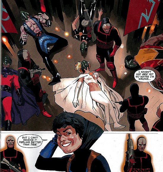
  • A Hellfire Kid saying, “I farted.”
  • And Kilgore saying, “I haven’t had sex yet, so maybe I’m wrong … but I can’t imagine it feeling better than this.”

This is rated T+, but still. Ugh. This is really not a good series of comics, and I don’t think there’s much chance for rescuing it in the final two issues. Having read this, it’s no surprise that the reaction has been somewhat muted and the book failed to break the top 10 selling comics in the direct market for the month of June.

This kind of sloppy work is disheartening and indicates a rather steep drop in quality. Given the relaunch is coming up with the same creators, I can only hope that Marvel keep the reboot button handy and be ready to bring in some fresh talent and let them loose to try some new ideas.

I think you can blame the stink for this one on Marvel.

Good Nonfiction Books About Comics, Part 5 – Comic-Book Movies and Mutant Cinema

I don’t have a lot of books about comic book movies, in part because I don’t think there are many out there that are not direct tie-in books. I have a few of those, including Frank Miller’s Sin City: The Making of the Movie, The Art of X2, The Spirit: The Movie Visual Companion, and one or two more. Reference works are common, including Comic Book Movies by David Hughes and John Kenneth Muir’s comprehensive and readable (though pricey) Encyclopedia of Superheroes on Film and Television.

Of actual books on comics movies, I only have a few, including my own. So I’ll start there with a quick recap of how Mutant Cinema: The X-Men Trilogy from Comics to Screen came to be.


I was attending the first New York Comic-Con in February of 2006, enjoying the show despite having to endure a type of winter weather that had long been absent from my life. On the final day, I walked the floor of the Javits Center and came across the booth of Sequart, manned by Julian Darius and Mike Phillips. Julian had just released his book Batman Begins and the Comics, now re-released under the title Improving the Foundations: Batman Begins from Comics to Screen. He told me about the book and how it analyzed the movie scene by scene citing and analyzing how the comic book source material was used through the movie.

I immediately liked the idea and asked him if they were planning any more books like this. Julian said he was planning one on the then-upcoming Superman Returns. I asked if they had any plans for X-Men, which at that point was also coming soon with X-Men: The Last Stand. Mike said that was a good idea but they were mostly DC guys and didn’t know anyone who could write it. My brain went off and I said I could do it, and after a quick listing of my credentials we agreed to talk about it after the show.

A few weeks later we’d worked out a deal and I started writing. I found writing it to be alternately enjoyable and aggravating. A structure came easily, but finding time to devote to writing it in between other gigs that paid the kind of money I needed to keep the lights on was harder than I thought. Revising it also was tough — I felt like I could have revised it endlessly and made it a bit better with each draft, but then it was never going to get done.

Getting the book finished and revised took longer than expected and the book’s original target release date of autumn 2006 quickly revealed itself to be optimistic. Sequart did a great job in getting a small batch of an early version  printed up under the title X-Men: The Movie Trilogy and the Comics for the 2007 New York Comic-Con, complete with a cool cover illustration from Kevin Colden. Concerns about trademark lead to the revised title of Mutant Cinema: The X-Men Trilogy from Comics to Screen, as suggested by Julian, and another round of revisions was made before the book became final.

Reaction to the book at that NYCC was a surprise to me. Interest was limited among fans, most of whom already had strong opinions about the movie and familiarity with the source material.

The final version of the book was completed later that year and thus began a frustrating process in gaining distribution for the book. There was some technical issue with getting the book listed on Amazon — which took much longer to resolve than anyone expected. By the time all was repaired and the book was up on the site, a lot of key momentum had been lost as interest in the movies had dwindled after X-Men: The Last Stand.

Having watched each of the movies in the trilogy now dozens of times in writing the book, I think the X-Men trilogy will go down as a trendsetter that got the comic book movie off the ground. But they’ve been outpaced in terms of quality by subsequent, more interesting comic book movies.

The biggest puzzle for me is the strength of antipathy fans have toward The Last Stand. I agree with most that it falls short of X2 in most regards. But having watched it many times I also think it’s really not that much worse than X2 or X-Men. Most of the antipathy centers on Brett Ratner, whose public persona is about as far removed from that of Bryan Singer as you can get. But Ratner really was a hired gun on that movie, brought on just a couple weeks before shooting was to begin.  Ratner’s focus was on finishing the movie on time more than making a personal impression on the material.

The real fault for the movie’s problems lies with Fox, which set an impossible shooting schedule for the film and got cold feet when it came to following through with the Dark Phoenix storyline.

The movie works, I think, pretty well up to the point where Professor Xavier confronts Phoenix at her parents home and she disintegrates him. After that, the Phoenix storyline is dropped until the end of the film. And that ending changes the original story significantly from Jean as the hero, sacrificing herself because she knows she can’t control this level of power, to Wolverine becoming the hero and killing Jean even though he loves her. On the surface, it’s similar, but deep down, it’s quite different.

The other thing The Last Stand did well was to just unleash the characters into the action. On the first two films, Singer offered up inventive but short action sequences that always felt restrained. And it worked to keep the audience hungry for more because it gives the creators a place to go. But I don’t know that his instincts would have allowed him to deliver the kind of satisfying mayhem that Last Stand delivered.

In the end, I’m proud of the book, enjoyed the experience of writing it and learned a lot about my own personal strengths and shortcomings in the process.

If you’re interested in more, check out the book’s page on Sequart.com here, where you can read a sample chapter on previous movie and TV adaptations of X-Men and order the book. You also can get it from Amazon.com here.

Comic-book movies are definitely evolving. It’ll be interesting to see where Marvel goes once they’ve done two or three movies each with Captain America, Iron Man, Thor and the Avengers. It’ll be just as interesting to see if DC can recover from the dismal reception of Green Lantern and figure out how to make the likes of Flash and Wonder Woman into good movies. And with Sony already re-inventing Spider-Man, the pressure will be on Fox to find some way to make good with new versions of Daredevil and Fantastic Four. Comic book movies are sure to stick around for a good ten years — it’s just what they will look like and whether audiences will tire of them that is up for debate.

FF Re-read: The Fantastic Four #10 (Jan. 1963)

“The Return of Doctor Doom!”
Script by Stan Lee
Pencils by Jack Kirby
Inks by Dick Ayers
Letters by Art Simek


They might have titled this story, “Lo, There Shall Come — A Stinker!” The previous nine issues all saw improvements of one kind or another, but this issue is truly weak in every respect. This issue is, in fact, so bad that all I can really do with it is do a quick run through and make some snarky comments about it, so here goes.
This issue begins with Reed trying to figure out how Sue’s invisibility power works, using a big machine that looks like a cross between a howitzer and a vintage camera. Far from Kirby’s best splash page, it’s made even weirder by the fact that the Human Torch is assisting Reed by taking notes while in full flame mode. It’s so odd, that it gets a mention in Sue’s dialog, just before the “4” signal appears in the sky and the trio assume Ben’s in trouble and rush off to help.
And it just gets weirder from there.

Someone needs to tell Reed nukes are
unsafe to keep around the house.

There’s a two-page sequence in which Reed, Sue and Johnny all rush to the scene of the signal that is perfunctory and embarrassing in just about every way. It starts with Reed  stopping Johnny from using his flame on a jammed “nuclear lock mechanism” because it’s so sensitive to heat. I’d love to know what was going through Stan’s head when he came up with “nuclear lock mechanism” and exactly how making a lock nuclear would be a benefit in any fashion. Especially since it doesn’t seem to work. Then Reed tries to stretch his arm under the door all the way to the Fansti-car hangar, only to instead get his hand all the way to the Pogo-Plane hangar instead. Exhausted, his arm snaps back to him like a rubber band.  

The trio finds Ben at the apartment of Alicia Masters, now officially dubbed Ben’s girlfriend in a caption, and find he just wants to show them the statues she’s made of their villains. 
Then we get to what I’m sure was the scene that most motivated this issue, as Lee and Kirby themselves appear for the first time in a Marvel story. Doctor Doom shows up at their studio and uses them Reed to a trap. Lee obviously loves this scene, giving himself some crackerjack dialog. Kirby, meanwhile, shows enough restraint to not even show his (or Lee’s) face in the scene. 
That’s the corner of Stan Lee’s head on the left. I wonder if Doom’s destroying one of the famous
FF ashtrays that was produced in the 1960s. And I still think Stan Lee needs to appear on Mad Men.

Having captured Reed, Doom recounts an unconvincing and rather silly rationale for his return from space. Having been last seen in issue six plunging into deep space, he found a race of aliens that are stereotypically very advanced yet totally naive. They hook up Doom with their body transfer technology and return him to Earth. Using the alien technology, he switches bodies with Reed. They fight and the rest of the FF show up and, naturally, help restrain the body of Doom and put him in a prison made of impenetrable plexiglass. 

Returning to Reed’s lab, Doom starts making — of all things — a shrink ray that he tests on some animals he stole from the zoo. He somehow talks the trio into thinking that the shrink ray is the answer to all their problems, though his explanation for why makes absolutely no sense. Of course, the ray won’t do what he says — instead, it’ll shrink the FF into nothingness. Nice.
Back in the cell, Reed of course finds a way to escape and goes to Alicia’s apartment. Sue just happens to be visiting and whacks him over the head. Ben and Johnny come over and they take the body of Doom with Reed’s mind back to the Baxter Building. 

Just thinking about how this might
work makes my head hurt.

Logic completely leaves the story as Johnny uses his power to project a heat mirage of a stick of dynamite being used at a nearby construction site into the lab. The Doom mind in Reed runs, while the Reed mind in Doom tries to save everyone. Convinced the mind switch is real, Doom is shocked enough that the switch somehow reverses itself. The FF then turn the shrink ray on Doom and he dwindles into nothingness.

The transfer is undone.
This is not Kirby’s most dramatic work

As you can see, nothing makes sense in this story and nothing of importance seems to happen. We learn little about Doctor Doom, and almost nothing happens among the FF either. Kirby’s art lacks the scope and innovation of recent issues, and Lee’s script only hampers any potential for salvaging anything decent. 

This reminds me of those lame clip-show episodes TV series used to do when they had no decent script and the season was ending and it was a lame way pad out the episode. Lee and Kirby are lucky that their lackluster handling of Doom in this particular issue didn’t undermine future stories that would secure his position as the series’ premier villain.

Page 6 of 19

Powered by WordPress & Theme by Anders Norén