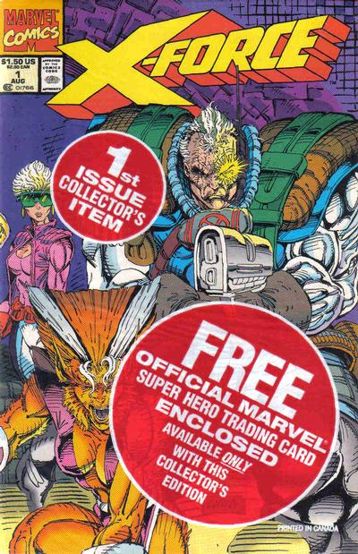
This is really conventional stuff for a second issue, and surprisingly coherent for an early Image title. Dan Panosian takes over all the art on this issue, and it’s quite solid, evoking the style of DC stalwart Dan Jurgens to good effect. The Rob Liefeld-penciled cover makes your head hurt if you think about what motion might be required for two men to get in that position. Not much actually happens inside the comic. Kirby and Prophet fight their way into the Alaska complex and Prophet connects with D.O.C.C. What’s really strange is that it’s this satellite that’s giving him energy and “life force” while the comic’s narration quotes Bible passages. Is D.O.C.C. God? Or does Prophet interpret D.O.C.C. as God? Oh, and Bloodstrike shows up at the end, only to be completely indistinguishable from Youngblood or Brigade or StormWatch, etc. The story runs 19 pages, with the rest of the issue filled out with pinups, Extreme Studios employee profiles, an autograph appearance announcement, and a talent search ad. There’s also a coupon for Prophet #0 stapled into a centerfold that’s a two-page spread, so you can’t read it or see the entire image without — gasp! — removing the coupon and damaging your comic’s collectible value. (It goes for $3 in near-mint condition at MyComicShop.com as I write this.)
Tag: Rob Liefeld
If your prediction for a 1993 Extreme Studios comic was Bible verses quoted over page after page of a grunting hero chopping up robots, you likely won the prize of an extra $2.50 in your pocket. Prophet breaks into his own series with creator, layout artist, and scripter Rob Liefeld mashing up the origins of Captain America, OMAC, and The Six Million Dollar Man into a comic that actually might qualify as a story in the most technical sense. The opening action sequence — a dream, of course — with the aforementioned robots is reasonably entertaining, until it ends in a reveal that makes zero sense. Some idea of who these people are and what they’re doing is helpful. Having Jack Kirby show up as a character improves nothing, neither does repeating the reveal in a random way just few pages later. Sharp readers may learn the following unknown and nonexistent facts: High-ranking FBI agents in 1993 wore lingerie and super-short miniskirts to the office, and Jack Kirby was so manly he didn’t even get cold going shirtless during winter in Anchorage, Alaska.
Things changed again for me in in the autumn of 1990. In pursuing my journalism career, I began working as a reporter for the the college newspaper, the Arizona Daily Wildcat. I worked three days a week at the Wildcat, and my beat was the University Medical Center, and general assignment.
This took up a lot of my time and instantly expanded my social circle from almost nothing to an entire newsroom of like-minded people. My first published article was about students who worked as lifeguards at one of the pools and were suddenly laid off despite new pools opening up in a new recreation and sports center. I wrote about some of the research being done at UMC, covered some student health issues, and did a fair bit of general assignment stuff on whatever needed to be covered.
Boy, was it fun. Very hard, at times, but a lot of fun.
It also cut into my comics time. I didn’t mind so much — it was good to have those new experiences. I had gone back to buying from Fantasy Comics over on Campbell Avenue. I was enjoying the increasing energy in the overall superhero field with the rise of the artists who would soon form Image Comics, and started to branch out more into other types of comics.
I already mentioned I was digging Shade the Changing Man by Peter Milligan and Chris Bachalo. This was before Vertigo was its own imprint. But the “mature readers” section of DC was already pretty unified, as it was all under the leadership of Karen Berger. I started checking out the other titles from this corner that were mentioned in the Shade letters column. Two of them made an immediate impact: Hellblazer and The Sandman.
Cover art by Dave McKean
Cover art by Tom Canty
I saw the ads for the new writer taking over Hellblazer with issue #41 (May 1991), a writer named Garth Ennis. The ads made clear that the series’ protagonist, John Constantine, had lung cancer from smoking in almost every single panel he’d ever appeared in. The art looked cool, so I picked up that first issue and liked it.
But what really blew me away was the second issue, Hellblazer #42 (June 1991), and it remains to this day one of my favorite single issues ever of a comic book.
Cover art by Tom Canty.
This story, titled “A Drop of the Hard Stuff,” has cancer-stricken Constantine heading to Ireland to seek the help of his old pal, Brendan, who lived in a lighthouse with dark-haired beauty Kit and dabbled in magic himself. Brendan loved to drink, and always had time for a pint of stout, glass of whiskey, or goblet of wine.
After catching up and getting pleasantly sloshed, Constantine tells Brendan he’s got cancer and he was hoping that his old pal might know a spell that would help him out of this spot. Brendan replies by saying he was hoping John would be able to help him in the same way, though for him it’s liver cancer, and he’s got very little time left.
So they decide to get completely sloshed, and Brendan takes John down to the cellar of the lighthouse where there’s a pool of holy water blessed by St. Patrick himself. He lights a candle, casts a spell — and turns the holy water into stout beer. John and Brendan start drinking it, and Brendan reveals that he made a deal with the devil to be able to acquire and enjoy the greatest life of drink known to man, in exchange, of course, for Brendan’s soul. Brendan says he tried to get one over on the old man by stipulating that his soul must be claimed by midnight on the day he dies or it goes free.
Brendan spends his final few hours with John, who gets up to leave noting it’s almost midnight. At the top of the stairs, he comes face to face with the devil himself, who’s come to claim Brendan’s soul. John figures he owes it to his pal to try to delay him until midnight, so he offers the devil a drink, saying that doing so would put all Brendan’s drinking adventures to shame. The devil likes this and agrees. John fills two pints of Guinness from the well, they say cheers, and each take a deep drink.
“So that’s what he was up to! Magic stout …” says the devil.
“Yup,” says John. “As long as that candle burns it keeps it from turning back into holy water.”
The devil panics, John smiles, and kicks over the table with the candle and it goes out. The devil screams in pain. John lights a cig and pushes the devil into the pool of holy water, and the devil dissolves in a hideous howl.
The clock strikes midnight. John’s saved his pal, but now he knows for sure he must do anything he can to avoid dying and ending up in hell because he’ll have to pay big time for this offense.
I was so completely hooked by this story, I began to buy every back issue of Hellblazer I could find. The previous issues, mostly written by Jamie Delano and drawn by the likes of Mark Buckingham and Richard Piers Rayner, were quite different, but unlike anything else I had ever read and quite fascinating. Once I figured out stout was Guinness, it became my adult beverage of choice.
Then there’s The Sandman. As I’m writing this, the first season of the Netflix series adapting the first two major arcs of the comic has just debuted. I’ve seen the first episode and adored it, and I can’t wait to see the rest of season one and what’s coming up in season two.
Cover art by Dave McKean
The first issues I bought of the comic book was The Sandman #22 (Jan. 1991) and #23 (Feb. 1991). This was the beginning of “The Season of Mists” storyline, with art by Kelley Jones and script, of course, by Neil Gaiman. I distinctly remember the literary quality of this comic stood in stark contrast to anything else I had read before, even the likes of Watchmen or The Dark Knight Returns. I quickly scored back issues through #16 at Ken Strack’s AAA Best Comics in Phoenix, and in those issues found two stories that made me a forever fan of The Sandman – and comics as a medium.
Cover art by Dave McKean
The first was “Calliope,” in The Sandman #17 (July 1990). This was one of Gaiman’s single-issue stories and it was devastatingly good. The story followed Richard Madoc, a novelist with writer’s block who acquires a real life muse named Calliope. Her services are not acquired freely — he rapes her to get the inspiration that not only undoes his writer’s block, but fuels his rise to literary and cultural stardom unknown in modern culture. Calliope pleads with Morpheus in a dream to help free her — they had one been intimate. The Sandman appears before Madoc and makes his case. But when the writer complains that he’d have no ideas without her, Morpheus unleashes his anger and fills the writer’s mind with so many ideas it drives him mad. He frees Calliope, and the rush of ideas fades away to nothing at all. This was all in 22 pages with fantastic art, and made a huge impression on me.
Cover art by Dave McKean
The other was “A Midsummer Night’s Dream” in The Sandman #19 (Sept. 1990). This is one of the most famous issues of the series, as William Shakespeare and his troupe perform the first of two plays commissioned by Morpheus for a unique audience — the faery folk the play itself portrays as a way to ensure they are never forgotten. It’s clever and engaging beyond words, with delightful, delicate and expressive art by Charles Vess.
I hope both episodes are adapted for season two of the Netflix show, even though I know that even the greatest adaptation could never equal the stature of the comics in my mind.
The Sandman was one of the first comics I set out to read trade paperbacks on. This is because the back issue prices were already pretty high. There already was The Doll’s House, which collected issues #8-16 — a steal at $12.95.
Cover by Dave McKean
I remember looking forward to buying the trade paperback of the earlier issues, and picking up a copy at Fantasy Comics on the day it came out. Preludes & Nocturnes collected issues 1-8 of The Sandman, and did not disappoint. (Yes, both editions included issue 8, “The Sound of Her Wings,” which introduced Death. At the time, I’m sure it made sense to kick off The Doll’s House with that terrific story, but it more correctly belongs as the epilogue to Preludes.)
Cover art by Dave McKean.
In direct opposition to pre-Vertigo DC comics was the explosion of energy new artists were bringing to mainstream Marvel and DC superhero comics.
The X-Men were top of the heap at Marvel, with Jim Lee and his Homage Studios mates taking over the art chores on The Uncanny X-Men, starting with issues #267. The following issue, #268, which came out in early fall of 1990 was a huge jolt of excitement with Lee drawing a single-issue tale by regular scribe Chris Claremont that alternated between an 1940s meeting between Captain America and Logan, and a present-day tale involving Logan, Jubilee and Psylocke helping out the Black Widow.
Cover art by Jim Lee and Scott Williams
That was followed up by the return of Rogue in The Uncanny X-Men #269. Always a favorite, Rogue had vanished into the Siege Perilous some 20 issues before and just now returned. She ended up in the Savage Land, just getting by on her own — in a wonderfully revealing torn up costume that fueled the imagination of many a male reader. She runs head to head in her mind with Carol Danvers, and comes out face to face with Magneto.
Cover art by Jim Lee and Scott Williams
The Extinction Agenda crossover was next. Compared to today’s crossovers, this was a modest affair — it ran a mere nine issues, three each for X-Men, X-Factor and The New Mutants.
(Nov. 1990)
(Dec. 1990)
(Jan. 1991)
(Jan. 1991)
But it was Lee on X-Men that drew everyone’s attention and jump-started sales to a new level. I remember being home at my parents’ house that spring with a cold. My mom was driving past AAA Best and stopped in to get some comics. Ken knew who I was, and my mom came home with copies of Superman #54 and the double-sized Jim Lee glory of The Uncanny X-Men #275 with a gatefold cover.
Cover art by Jim Lee and Scott Williams
Cover art by Jerry Ordway
Things were building now toward the relaunches that defined the summer of 1991. Louise Simonson dropped off of The New Mutants, and Rob Liefeld instantly began transforming it into X-Force. Whilce Portacio took over X-Factor and, with Chris Claremont scripting, finally resolved the identity of Cable and set up the eventual return of the original X-Men to the team.
(Feb. 1991)
(April 1991)
(Feb. 1991)
(March 1991)
(April 1991)
One of the nice thing about comics at the time was they were still cheap. Most Marvel and DC comics cost $1, and most stores were moving lots and lots of copies of Batman, X-Men, Spider-Man and other top heroes. Batman books especially were doing well, with sales strong across the board two years after the Tim Burton movie. We now awaited the sequel, which was due in 1992.
Speculation also was coming into play in a more obvious way. There had for years been people buying multiple copies of certain hot comics as they came out in the expectation that they would increase in value. While the vast majority of Marvel and DC back issues were common and relatively cheap in the 1980s, the influx of both readers and speculators started to have an effect. Once-common back issues became a bit harder to find, and prices started to edge up a bit. DC and Marvel both had hits with multiple covers on Legends of the Dark Knight and Spider-Man, and had now bought into this promotional tool wholeheartedly with X-Force #1 and X-Men #1, coming in the summer of 1991.
Sometimes, life is great. Yesterday afternoon, FedEx rang my door and had me sign for a package from the publicity folks at DC Comics. Quickly tearing open the package, I found inside all 13 of this week’s releases of The New 52.
It was tough to not just stop working and dig right into the big pile. I took a little break and read Hawk & Dove #1 followed by Action Comics #1. I read the rest of the books last night and now will delve into them for your reading pleasure.
The good news is these books are overall quite good. After the mild letdown of Justice League #1, I found every one of the 13 new books to deliver a satisfying and entertaining story. These read a lot like comics from the late 1980s or 1990s, with more story, more action and fewer talking heads than superhero comics have delivered of late. They also have some sharp art and, thankfully, overall good coloring. The books look quite sharp. I still wish there was some kind of introductory text page and maybe a house ad promoting comic shops, explaining digital availability and an ad offering subscription info.
I don’t know how truly new readers will receive these books, but I give DC great credit for doing a pretty good job delivering on material that I think has a wider appeal than superhero comics have delivered in a while.
So, let’s go through them, one by one. I’ll try to avoid spoilers, but if you’re a stickler you might want to wait until you’ve read the books to proceed. Also, this may take multiple posts.
I started with Hawk & Dove #1 just because a comic by Rob Liefeld always evokes some kind of interesting reaction. Yes, the anatomy on the cover is awful, but the image still has that unique energy Liefeld brings to his projects. Inside, the story by Sterling Gates was better than I expected, though in a crazy, comic-book kind of way. It at least delivers on action, complete with monsters, zombies (or maybe monster/zombies) and a close call between a plane and a national monument. The books keeps it simple, though some of the ideas in here are a bit puzzling (what is a “science terrorist”?) if you think about it too hard. The dialog is a bit hammy, especially from the slightly one-note characterization of Hank Hall as a hothead. Still, this works in a very basic way thanks to lots of action and a couple of good twists toward the end.
Action Comics #1 is THE high-profile book of the week, featuring Grant Morrison and Rags Morales’ anticipated revamp of the Man of Steel. And boy, does this get the blood pumping. If you go back and read my take a few months back on how to fix Superman, it looks like Morrison had a lot of the same ideas. This issue is all about the action, and features some great, gritty sequences. Morrison takes Superman back to the beginning — this version of the character is surprisingly similar to the original concept by Jerry Siegel and Joe Shuster. This Superman is a crusader, tackling the powerful interests of Metropolis that are otherwise above the law. His power levels also are scaled back and he leaps more than flies, and has the potential to be hurt. This Superman also is young, but not mopey — he’s out there acting on his convictions and doing what he sees as right. This is a great first issue and it succeeds at being an exciting and fun take on the Man of Steel.
Stormwatch #1 was a slightly more confusing read for me. The plot centers on the new Stormwatch, which includes as members the Martian Manhunter from Justice League and most of the cast of the Authority, as they are faced with no less than three interesting challenges: Finding the superhuman known as Apollo, dealing with something very strange on the moon, and a third mystery involving a horny mystery in the Himalayas. There’s definitely a different vibe to this book that recalls in ways the spirit of the best Stormwatch/Authority stories (most of them written by Warren Ellis).
Animal Man #1 was a true standout for me, with a terrific story by Jeff Lemire and equally good art by Travel Foreman. This one really is the best of all worlds, as it recasts the lead character into a new role, makes him and his family interesting characters in their own right and features some unique action and promise of more to come. I know I’ve read comics drawn by Foreman before, but he’s obviously raised his game significantly because I was never blown away like I was with this issue.The colors by Lovern Kindzierski are also outstanding. I have to put this up there with Action Comics as the best of this week’s bunch.
Men of War #1 surprised me. War comics have never been my favorite — Marvel’s 1980s series The ‘Nam being the lone exception — because I usually find them either unrealistic or too chaotic, confusing and repetitive to follow. This book, however, avoided all those issues while at the same time recasting the venerabel Sgt. Rock into contemporary times. In the lead story, Ivan Brandon delivers a story full of soldi war action (with a tantalizing hint of the superheroic) and good character development. The second story, Navy Seals: Human Shield, by Jon Vankin and Phil Winslde, is even more compelling than the Rock story. It’s a bit more procedural, but it’s done clearly and vigorously, leading to a compelling cliffhanger.
More in the next post.