“The Enterprise Murder Case!” (17 pages)
Writer: Mike W. Barr
Artists: Dave Cockrum & Klaus Janson
Letterer: Rick Parker
Colorist: Carl Gafford
Editor: Louise Jones
Editor in chief: Jim Shooter
Cover: Dave Cockrum & Klaus Janson
“Historian First Class”: Marian Stensgard
This one hurt my brain. The splash page for this one is pretty good for a Star Trek comic: Kirk and Spock rushing to Lt. Rand in the transporter room, where something appears to be going wrong with the beaming up of an important ambassador. I especially like on this page the color hold effect of the transporter, which uses the limitations of the printing technology to good effect. Less impressive is the rather pointless “computer paper” effect on the captain’s log captions. In 1980, that might have seemed futuristic, but anyone who had to use that kind of paper will tell you what a pain it was to remove neatly those perforated side sprockets.

The real problem with this image, though, is that it’s lifted almost directly from the movie. Another transporter accident? Really?
When they pull the transportee through, it turns out that Ambassador Phral is dead, thanks to a dagger that apparently found its way into his back during transport.
That’s a decent premise for a Star Trek story, I’ll admit. I just wish the rest of the issue had lived up to its potential.
The captions reveal the setup for this issue: Kirk is to ferry Ambassador Phral from his home planet of Yannid IV to a ceremony admitting the planet to the Federation, essentially a defeat for its rival, the Klingon Empire. But the death of the ambassador is, clearly, a problem. Especially when it’s revealed that Phral was dead for 10 minutes before appearing on the Enterprise — impossible given he was alive just moments before the transport, which did experience some unusual interference.
Spock, by the way, has this plot figured out by the end of page three. The rest of us have 14 more pages to endure.
Throughout all this, Kirk is more on-edge than normal – snapping at crew members and living up to his lower-decks nickname, “Kirk the Jerk (Off).” There’s a bunch of exposition setting up a subplot for the captain that almost completely crowds the art off the page.

Meanwhile, Sulu, Chekov and Chief DiFalco are boozing it up on Yannid IV and get into a classic bar fight. Barr’s narration is blunt and appears ripped from the pages of a prohibitionist group. I’m not sure if Sulu, et. al, are escaping via beam-up the swords of the Yannidians or the captions.

After a cursory appearance from Admiral Fitzpatrick (who looks like he was originally Commander Adama cut and pasted from Marvel’s Battlestar Galactica comic), Kirk comes clean to McCoy and Spock about his past screw-ups on Yannid IV.
Finally, we get a cool page as Cockrum gets to conjure up some of the wacky space machinery and costumes he did much better in X-Men. We also get to see a tantalizing glimpse of young Kirk, wearing the old green sweater uniforms seen only in the original Trek pilots, “The Cage” and “Where No Man Has Gone Before.” There’s also an original phaser! Yay, Original Series!

Kirk’s version of what happened is that he was an ensign just out of Starfleet Academy, leading an away team into a war on Yannid IV. The pro-Federation King Geror had been killed by pro-Klingon forces that also had captured the king’s son, Prince Arlph. Kirk led a landing party to find the prince and succeeded in liberating him, although a into the fray and rescue Prince Arlph — without casualties. It worked, except a warning shot Kirk fired ricocheted unexpectedly and put Prince Arlph into a coma. Arlph’s brother became king and blamed Kirk, as did Arlph when he came out of his coma, changed his name to Pharl and became the ambassador who died in the transporter accident. Starfleet, of course, exonerated Kirk. That’s a lot to convey in less than two pages, so it’s a lot of cranky copy supported by Cockrum doing his damnedest to make it work.
There’s also signs of just plain crap. Arlph and Phral are both anagrams of Ralph. Geror is one for Roger. And Storf is one for Frost. I don’t know what the anagram is for Yannid, but I assume there is one. Barr is not exactly pulling a Marc Okrand on this one. It pulls me out, because as soon as I realized this, I couldn’t help but read Arlph and Phral as Ralph and Geror as Roger.
Spock comes up with a theory of what happened, and pulls out some really lame proof that apparently so discombobulated Cockrum that he couldn’t keep track of who he was drawing in a single panel.
The rest of the comic is about solving the mystery — something it does in the most comic-book-y fashion imaginable. Kirk, Spock and McCoy beam down in disguise — in this case, that means pirate costumes, “purpleface” makeup (Prince would love it), tails, and some really bad hairdos and facial hair.


It’s here that Spock reveals his deep affection for Calgary Flames icon Lanny McDonald. Don’t listen to me — decide for yourselves!
The trio tracks down a clue leading to “Doctor Loroc,” who’s a female plastic surgeon, and gets shot in her third panel. The idiocy continues as Spock et. al deduce the real killer has changed his appearance and is one of three aliens in the clinic.
In classic Trek fashion, Spock’s bluff exposes — with the current leaders of Yannid VI now assembled in the room — the ambassador and how they subbed the dead body for his during mid-transport. The exposed Phral grabs a weapon and holds the princess hostage. Bones, once again, thinks fast and stabs Phral with a hypo spray conveniently loaded with “the most potent knockout drug I’ve got!”

The grateful Yannid VI leaders agree to sign the Federation treaty and hang out on the Enterprise for a few days before beaming home.
Strangely enough, this is all done in 16 pages — leaving a real clunker of a final page for Kirk, Spock and Bones to tease each other before the ship finally warps off past more overwritten copy and on to the next issue.
The creative team on this issue was clearly attempting to compress a story as complex as a full episode of the original series into a mere 17 pages. And it really doesn’t work, especially when the plot is as underdeveloped and overwrought as this one.

Cockrum and Janson are clearly not meshing any better. This issue struggles to find moments where the art can shine, and way too often has to rely on color effects to get any kind of “wow” factor into the mix.
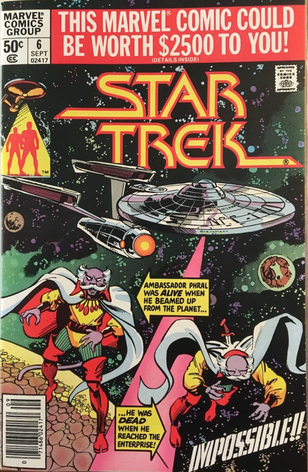
The covers are an obvious problem for this series. This issue’s cover — marred, as were all Marvel comics that month — with an ad promoting a contest for fans as a way to apologize for raising the price to 50 cents, is just plain awful. Again, there’s an apparent aversion to putting Kirk, Spock and McCoy on the cover in favor of a not-great rendering of the inanimate object kn0wn as the U.S.S. Enterprise. And the bit with Ambassador Ralph, I mean Phral, evokes old DC Comics but lacks any kind of visual hook for the story inside.


This issue also features a letters page, with no great revelations from editor Louise Jones. However, at the bottom of the page is “The Mighty Marvel Checklist” of comics on sale this month, at least two of which are stone-cold classics: Star Wars #39, the first episode of Marvel’s adaptation of “The Empire Strikes Back,” by Archie Goodwin, Al Williamson and Carlos Garzon; and the double-size X-Men #137, featuring the final fate of Phoenix, by Chris Claremont, John Byrne and Terry Austin.
Star Trek #6 is not in the same league.