A longtime showbiz journalist and fan's thoughts on comic books, movies and other cool stuff.

Tag: Marvel Page 2 of 7

Indiana Jones and the True Believers of Marvel Comics

Not a bad title, eh? I’d watch that movie.

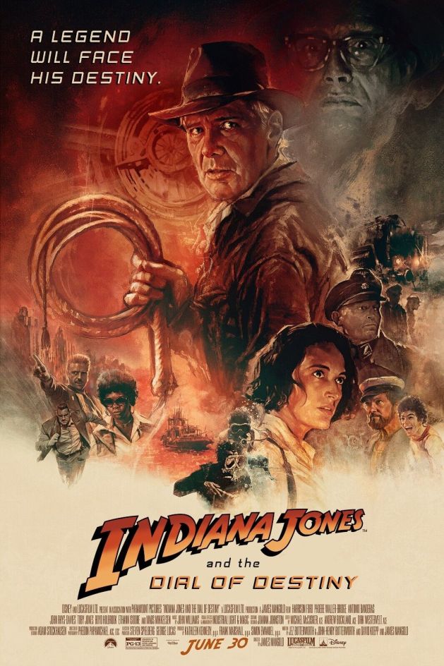
Raiders of the Lost Ark movie poster.

I was 11 going on 12 in the summer of 1981. I loved movies, but knew nothing about Raiders of the Lost Ark until some friends of mine who’d seen it told me how great it was. I pestered my Mom into taking me and a friend to see it at a matinee, which was required by Alberta’s movie ratings system of the day. She thought it was going to be a boring movie about Noah’s Ark or something, and I didn’t know enough about the movie to tell her otherwise.

So me, my friend, and my Mom all headed to the Westmount cinemas in Edmonton one summer afternoon in 1981 to watch Raiders of the Lost Ark. We all loved it. I mean loved it. My Mom said after: “Why didn’t you say it had Han Solo in it!” I really didn’t know.

Seeing Raiders was a big deal that summer. I think I saw it six times in movie theaters — most of them requiring me to buy a ticket for Superman II, which started 10 minutes before Raiders, and then slipping into the other theater. I got caught once or twice, sent back to Superman II, and then usually slipped back into Raiders.

Marvel Super Special #18 cover.

Unlike Star Wars, there wasn’t much in the way of merchandise for Raiders. I read the novelization, but preferred the Marvel Super Special adaptation, which Marvel later split up into three standard comic book issues the same way they had done with Star Trek: The Motion Picture. The magazine-size edition had a great painted cover by Howard Chaykin, whose name I recognized from Marvel’s adaptation of Star Wars.

I wasn’t reading comics in 1982 when Marvel finally launched its new series The Further Adventures of Indiana Jones, and it took more than 20 years for me to come back around and collect this 34-issue run. Even then, I don’t know if I read them all. Some of them seem familiar, others not.

Unlike Star Wars, Indiana Jones struggled to adapt to comic books, which seems strange in retrospect given how much Indy borrows from comics classics like Terry and the Pirates.

For me, Indiana Jones is a frustrating movie franchise, in a way. I consider Raiders of the Lost Ark to be a perfect movie. I can watch it anytime and each viewing is as thrilling and as fun as the first.

From there, it’s a direct downhill slide.

My and friends stood in line to see on opening day Indiana Jones and the Temple of Doom at the Paramount Theater on Jasper Avenue in Edmonton. It’s not as good as Raiders, but I still find its freaky energy entertaining and original. I love that it’s gross and dark and weird —  qualities major movie franchises no longer have.

Indiana Jones and the Last Crusade is a further step down. If Indy was a TV series, this would have been a fifth-season episode that proved it was time to wrap it up. Sure, Sean Connery is great (I met him once), but this movie plays it very safe, with imitations of Raiders and goofy comedy bits that would be more at home in a sitcom.

I know I saw Indiana Jones and the Kingdom of the Crystal Skull in the theater, and I have a copy on DVD somewhere, but I can’t remember much about it save an early sequence where Indy locks himself in a refrigerator to protect himself from an atom bomb test.

I’m looking forward to Indiana Jones and the Dial of Destiny. I overall like James Mangold’s films — in particular Cop Land and Ford vs. Ferrari — and enjoyed interviewing him for the DGA magazine at his office when Logan came out. (He had a large blown up poster of Marc Silvestri’s art from the cover of The Uncanny X-Men #251 on the wall, and a huge collection of classic vinyl albums in his office at Fox.) But we’ll have to see if Dial of Destiny can defy the downward spiral after so many years away.

I’ve been re-reading the old Marvel series and will try to post some highlights here in the lead-up to the new movie. Based on the early issues, it may be rough going, but we’ll see if we can find some comics treasure in this largely forgotten comic serial.

Comic-Shop Memories: Fantasy Comics, 1990-91, Tucson, Ariz., Part 2

Things changed again for me in in the autumn of 1990. In pursuing my journalism career, I began working as a reporter for the the college newspaper, the Arizona Daily Wildcat. I worked three days a week at the Wildcat, and my beat was the University Medical Center, and general assignment.

This took up a lot of my time and instantly expanded my social circle from almost nothing to an entire newsroom of like-minded people. My first published article was about students who worked as lifeguards at one of the pools and were suddenly laid off despite new pools opening up in a new recreation and sports center. I wrote about some of the research being done at UMC, covered some student health issues, and did a fair bit of general assignment stuff on whatever needed to be covered.

Boy, was it fun. Very hard, at times, but a lot of fun.

It also cut into my comics time. I didn’t mind so much — it was good to have those new experiences. I had gone back to buying from Fantasy Comics over on Campbell Avenue. I was enjoying the increasing energy in the overall superhero field with the rise of the artists who would soon form Image Comics, and started to branch out more into other types of comics.

I already mentioned I was digging Shade the Changing Man by Peter Milligan and Chris Bachalo. This was before Vertigo was its own imprint. But the “mature readers” section of DC was already pretty unified, as it was all under the leadership of Karen Berger. I started checking out the other titles from this corner that were mentioned in the Shade letters column. Two of them made an immediate impact: Hellblazer and The Sandman.

I saw the ads for the new writer taking over Hellblazer with issue #41 (May 1991), a writer named Garth Ennis. The ads made clear that the series’ protagonist, John Constantine, had lung cancer from smoking in almost every single panel he’d ever appeared in. The art looked cool, so I picked up that first issue and liked it.

But what really blew me away was the second issue, Hellblazer #42 (June 1991), and it remains to this day one of my favorite single issues ever of a comic book.

Hellblazer #42 (June 1991)
Cover art by Tom Canty.

This story, titled “A Drop of the Hard Stuff,” has cancer-stricken Constantine heading to Ireland to seek the help of his old pal, Brendan, who lived in a lighthouse with dark-haired beauty Kit and dabbled in magic himself. Brendan loved to drink, and always had time for a pint of stout, glass of whiskey, or goblet of wine.

After catching up and getting pleasantly sloshed, Constantine tells Brendan he’s got cancer and he was hoping that his old pal might know a spell that would help him out of this spot. Brendan replies by saying he was hoping John would be able to help him in the same way, though for him it’s liver cancer, and he’s got very little time left.

So they decide to get completely sloshed, and Brendan takes John down to the cellar of the lighthouse where there’s a pool of holy water blessed by St. Patrick himself. He lights a candle, casts a spell — and turns the holy water into stout beer. John and Brendan start drinking it, and Brendan reveals that he made a deal with the devil to be able to acquire and enjoy the greatest life of drink known to man, in exchange, of course, for Brendan’s soul. Brendan says he tried to get one over on the old man by stipulating that his soul must be claimed by midnight on the day he dies or it goes free.

Brendan spends his final few hours with John, who gets up to leave noting it’s almost midnight. At the top of the stairs, he comes face to face with the devil himself, who’s come to claim Brendan’s soul. John figures he owes it to his pal to try to delay him until midnight, so he offers the devil a drink, saying that doing so would put all Brendan’s drinking adventures to shame. The devil likes this and agrees. John fills two pints of Guinness from the well, they say cheers, and each take a deep drink.

“So that’s what he was up to! Magic stout …” says the devil.

“Yup,” says John. “As long as that candle burns it keeps it from turning back into holy water.”

The devil panics, John smiles, and kicks over the table with the candle and it goes out. The devil screams in pain. John lights a cig and pushes the devil into the pool of holy water, and the devil dissolves in a hideous howl.

The clock strikes midnight. John’s saved his pal, but now he knows for sure he must do anything he can to avoid dying and ending up in hell because he’ll have to pay big time for this offense.

I was so completely hooked by this story, I began to buy every back issue of Hellblazer I could find. The previous issues, mostly written by Jamie Delano and drawn by the likes of Mark Buckingham and Richard Piers Rayner, were quite different, but unlike anything else I had ever read and quite fascinating. Once I figured out stout was Guinness, it became my adult beverage of choice.

Then there’s The Sandman. As I’m writing this, the first season of the Netflix series adapting the first two major arcs of the comic has just debuted. I’ve seen the first episode and adored it, and I can’t wait to see the rest of season one and what’s coming up in season two.

The first issues I bought of the comic book was The Sandman #22 (Jan. 1991) and #23 (Feb. 1991). This was the beginning of “The Season of Mists” storyline, with art by Kelley Jones and script, of course, by Neil Gaiman. I distinctly remember the literary quality of this comic stood in stark contrast to anything else I had read before, even the likes of Watchmen or The Dark Knight Returns. I quickly scored back issues through #16 at Ken Strack’s AAA Best Comics in Phoenix, and in those issues found two stories that made me a forever fan of The Sandman – and comics as a medium.

The Sandman #17 (July 1990)
Cover art by Dave McKean

The first was “Calliope,” in The Sandman #17 (July 1990). This was one of Gaiman’s single-issue stories and it was devastatingly good. The story followed Richard Madoc, a novelist with writer’s block who acquires a real life muse named Calliope. Her services are not acquired freely — he rapes her to get the inspiration that not only undoes his writer’s block, but fuels his rise to literary and cultural stardom unknown in modern culture. Calliope pleads with Morpheus in a dream to help free her — they had one been intimate. The Sandman appears before Madoc and makes his case. But when the writer complains that he’d have no ideas without her, Morpheus unleashes his anger and fills the writer’s mind with so many ideas it drives him mad. He frees Calliope, and the rush of ideas fades away to nothing at all. This was all in 22 pages with fantastic art, and made a huge impression on me.

The Sandman #19 (Sept. 1990)
Cover art by Dave McKean

The other was “A Midsummer Night’s Dream” in The Sandman #19 (Sept. 1990). This is one of the most famous issues of the series, as William Shakespeare and his troupe perform the first of two plays commissioned by Morpheus for a unique audience — the faery folk the play itself portrays as a way to ensure they are never forgotten. It’s clever and engaging beyond words, with delightful, delicate and expressive art by Charles Vess.

I hope both episodes are adapted for season two of the Netflix show, even though I know that even the greatest adaptation could never equal the stature of the comics in my mind.

The Sandman was one of the first comics I set out to read trade paperbacks on. This is because the back issue prices were already pretty high. There already was The Doll’s House, which collected issues #8-16 — a steal at $12.95.

The Sandman: The Doll’s House trade paperback
Cover by Dave McKean

I remember looking forward to buying the trade paperback of the earlier issues, and picking up a copy at Fantasy Comics on the day it came out. Preludes & Nocturnes collected issues 1-8 of The Sandman, and did not disappoint. (Yes, both editions included issue 8, “The Sound of Her Wings,” which introduced Death. At the time, I’m sure it made sense to kick off The Doll’s House with that terrific story, but it more correctly belongs as the epilogue to Preludes.)

Back and front covers to The Sandman: Preludes & Nocturnes
Cover art by Dave McKean.

In direct opposition to pre-Vertigo DC comics was the explosion of energy new artists were bringing to mainstream Marvel and DC superhero comics.

The X-Men were top of the heap at Marvel, with Jim Lee and his Homage Studios mates taking over the art chores on The Uncanny X-Men, starting with issues #267. The following issue, #268, which came out in early fall of 1990 was a huge jolt of excitement with Lee drawing a single-issue tale by regular scribe Chris Claremont that alternated between an 1940s meeting between Captain America and Logan, and a present-day tale involving Logan, Jubilee and Psylocke helping out the Black Widow.

The Uncanny X-Men #268 (Late Sept. 1990)
Cover art by Jim Lee and Scott Williams

That was followed up by the return of Rogue in The Uncanny X-Men #269. Always a favorite, Rogue had vanished into the Siege Perilous some 20 issues before and just now returned. She ended up in the Savage Land, just getting by on her own — in a wonderfully revealing torn up costume that fueled the imagination of many a male reader. She runs head to head in her mind with Carol Danvers, and comes out face to face with Magneto.

The Uncanny X-Men #269 (Oct. 1990)
Cover art by Jim Lee and Scott Williams

The Extinction Agenda crossover was next. Compared to today’s crossovers, this was a modest affair — it ran a mere nine issues, three each for X-Men, X-Factor and The New Mutants.

But it was Lee on X-Men that drew everyone’s attention and jump-started sales to a new level. I remember being home at my parents’ house that spring with a cold. My mom was driving past AAA Best and stopped in to get some comics. Ken knew who I was, and my mom came home with copies of Superman #54 and the double-sized Jim Lee glory of The Uncanny X-Men #275 with a gatefold cover.

Things were building now toward the relaunches that defined the summer of 1991. Louise Simonson dropped off of The New Mutants, and Rob Liefeld instantly began transforming it into X-Force. Whilce Portacio took over X-Factor and, with Chris Claremont scripting, finally resolved the identity of Cable and set up the eventual return of the original X-Men to the team.

One of the nice thing about comics at the time was they were still cheap. Most Marvel and DC comics cost $1, and most stores were moving lots and lots of copies of Batman, X-Men, Spider-Man and other top heroes. Batman books especially were doing well, with sales strong across the board two years after the Tim Burton movie. We now awaited the sequel, which was due in 1992.

Speculation also was coming into play in a more obvious way. There had for years been people buying multiple copies of certain hot comics as they came out in the expectation that they would increase in value. While the vast majority of Marvel and DC back issues were common and relatively cheap in the 1980s, the influx of both readers and speculators started to have an effect. Once-common back issues became a bit harder to find, and prices started to edge up a bit. DC and Marvel both had hits with multiple covers on Legends of the Dark Knight and Spider-Man, and had now bought into this promotional tool wholeheartedly with X-Force #1 and X-Men #1, coming in the summer of 1991.

Comic-Shop Memories: AAA Best Comics, 1990, Phoenix, Ariz., Part 2

A lot changed at the end of my third year at University of Arizona. My family was living in Phoenix, just off North 19th Avenue, way up north of West Bell Road. I don’t remember how, but I landed a summer job at a nearby Minit Lube. I mostly took service orders from cars that drove up, squeegeed windows, and vacuumed the floor mats.

Everyone has a job they survive. This was mine. The people were nice, and that was the best part of it. This was an open-air, drive-through oil change place. That meant you were not working indoors, where the Arizona summer temps could be tempered with air-conditioning. The boss was generous with using petty cash to get us Gatorade, water, or sodas from the Circle K next door several times a day to help us avoid dehydration, so that was nice. It paid slightly more than minimum wage — about $4 and change per hour.

But this was an especially cruel summer. On June 26, 1990, the temperature in Phoenix set a record: 126 degrees Fahrenheit — that’s 52 degrees Celsius for those of you who live outside the U.S. I was not working that day. I was home, with the shades drawn, the AC on, cold drinks in the fridge, watching movies on VHS in the dark.

At one point, I remembered I had left several music cassettes in my car and decided to save them. I put on flip-flops, grabbed my keys, and went out to the car. I opened the door and quickly grabbed the hot tapes, pulling my shirt out like an apron to carry them indoors. As I was walking back to the front door, I thought I had stepped in some gum. Looking down, I saw my flip flops were melting on the concrete driveway. I hurried inside and did not re-emerge until the rotation of the Earth had put a merciful end to the sun’s daily punishment.

Star Trek: The Next Generation, "The Best of Both Worlds"
One of the best TV cliffhangers of all time. It was uncertain that Patrick Stewart was coming back, so this really could have gone a number of different ways.

A few weeks before that, my Star Trek fandom hit new heights with the broadcast of the third-season finale of Star Trek: The Next Generation: “The Best of Both Worlds.” What a stunner! The third season had really taken off, and the show was now firmly boldly going into new territory in exciting, well-crafted and thoughtful ways. I miss it.

I remember catching early that summer a couple episodes of The Flash on CBS, which clearly took a lot of visual inspiration from the Tim Burton Batman movie success of the year before. It didn’t click with me, and was canceled at that point after only one season.

Warren Beatty in Dick Tracy.
Don’t have much to say about this movie, other than it seemed like a business venture more than a creative one.

In theaters, there was Warren Beatty’s Dick Tracy. This movie was very hyped in a clear attempt to emulate the success, again, of Batman. The miscalculation was in not realizing that Dick Tracy hadn’t been a character people cared about for decades at that point. There had been no resurgence of interest, or reframing of the character for the times, as Batman had gotten from The Dark Knight Returns and The Killing Joke. It was just an old comic strip, and the only strip back then that had any kind of active audience was Calvin and Hobbes.

Dick Tracy could have overcome that if the movie was better, but it wasn’t. It was a bunch of old actors putting on silly makeup to turn an old comic strip no one read anymore into a movie that no one really ended up caring much about. I haven’t seen the movie since it came out, though I do have a DVD somewhere of it.

Back to the Future, Part III
I like Back to the Future, Part III a lot more than Part II.

Other cool stuff going on that summer included the release of Back to the Future, Part III, which prompted a thorough review on my part of the previous two films in that series. In the end, only the first is a really great film, but the others are at least entertaining.

Less interesting was Die Hard 2: Die Harder. Not at all up to the standards of the first one — a movie series of true diminishing returns.

It was Spider-Man #1 (Aug. 1990) that drew me back to AAA Best Comics. I had a day off work the day the issue came out, June 19, 1990, and decided to head over to Ken Strack’s shop to pick up a copy. He had moved down the street — he was always on North Seventh Street — into a slightly larger space.

He had ordered plenty of copies, and I picked up two each of the green cover and the silver cover, and one each of the green bagged edition and the black bagged edition. I believe the bagged editions are still unopened in my collection somewhere.

I distinctly remember Ken raving about a new DC series called Shade the Changing Man. The first issue was recently out, and he talked up the striking Chris Bachalo art. I can’t remember if he gave it to me or if I paid for it, but I found myself agreeing with him that it was cool, and coming back for the next issue for at least the next two or three years.

It was overall a fun time to be reading comics, which still were cheap. Most DC and Marvel series cost $1 per issue, which made it easy to buy a stack of new, untried books for not a lot of money.

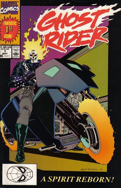
Marvel had this new-series program, where they introduced a new first issue each month for the first half of 1990. Among them were Ghost Rider, the John Byrne She-Hulk, The New Warriors, Guardians of the Galaxy, Byrne’s Namor: The Sub-Mariner, and McFarlane’s Spider-Man.

I was in on Spider-Man and Namor. The others, for whatever reason, struck no nerve with me. With Namor, the appeal was the art. Byrne was using duotone paper that gave his work a new element. And he had some good ideas for the character that made for a really fun read, namely having Namor forage lost treasure from the ocean floor to turn himself into a captain of industry.

I was still reading comics that summer. I recall really enjoying the various Batman and Star Trek series.

X-Men was in an unusual but still very interesting place. In the main X-Men title, writer Chris Claremont split up the team after Inferno and scattered them across the world. Many found completely new identities, with older characters fading away and new ones, as always, coming in. There were a lot of single-issue stories, with the overarching story building in the background — sometimes so deeply, it wasn’t clear to the reader, or even perhaps to Claremont himself, where things were going and how. These were the last Marc Silvestri issues, which were followed by a series of fill-in artists awaiting the inevitable arrival of heir apparent Jim Lee later in the year.

Fans were impatient with this approach to X-Men.

I recall reading in a copy of the Comics Buyers Guide a letter from a fan who answered another fan’s letter asking what the hell was going on in X-Men. The reply letter ended with a plea to Claremont to return to more conventional comic book storytelling, and a note from the CBG editors stating they paid the letter writer a small fee for all the work he put into answering the question.

The Uncanny X-Men #266 (Late Aug. 1990). The first chronological appearance of Gambit, though X-Men Annual #14 (1990) was released first.

The introduction of Gambit was much hyped, though the execution of it was a mess. It took a while for the comics to find some space in which to convey anything about him that wasn’t superficial. And I remember reading that Days of Future Present crossover between the Fantastic Four, The New Mutants, X-Factor and X-Men annuals, and being flat out unable to make sense of it. There was some nice Art Adams art in the X-Men episode, though.

The other X-Men titles seemed like they were in a bit of another universe. Excalibur’s Cross-Time Caper seemed to go off the rails a bit as Alan Davis wasn’t drawing every issue and there were even a few writing fill-ins for Claremont. The momentum, clarity and humor the book had in its earlier days burned off quickly and the title soon was passed around the Marvel office like a hot potato.

The same was true for Wolverine. After the solid but underwhelming arc by Archie Goodwin, John Byrne and Klaus Janson, there were fill-ins galore with a variety of artists and writers. And these issues came out while the book was published twice monthly in the summer months. These were supposed to be highlight issues, top stuff meant to drive traffic into comics shops. And it was far from special material.

In Louise Simonson’s corner, X-Factor had been a bit lost since Inferno, and in 1990 also was rotating through a series of fill-in artists drawing stories that at best were treading ground. I understand there were plans for Cyclops and Marvel Girl to finally marry and be parents to baby Nathan, but soon crossovers and changes in creative direction would push back that actually happening for years.

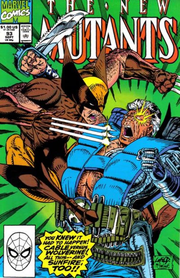
I had stopped reading The New Mutants shortly after Inferno. But Ken recommended issue #93 to me, and I was indeed impressed at Rob Liefeld’s more testosterone-driven take on these characters. That issue had Wolverine both inside and on the cover fighting Cable. I quickly put together the issues I had missed, which was very easy — I paid $3 for issue #87, which is now a key from that time.

The New Mutants #93 (Sept. 1990). Art by Rob Liefeld and Todd McFarlane.

As up and down as Marvel was, DC was even more more hit and miss. I tried Green Lantern, with the original Emerald Dawn series, followed by a regular title. This character just didn’t work for me. It was the same with Lobo. Everyone went ape-shit crazy for this character, but it was all one joke to me, and not one I found funny at the time.

I did very much like Justice League, which at the time was the brainchild of J.M. DeMatteis and Keith Giffen, and really quite funny.

Another title Ken recommended to me was Doom Patrol, by Grant Morrison. This was my first Morrison book, and it immediately stood out as something different, daring, and fun to read. I came on with issue #32, and it was years before I filled in Morrison’s run back to #19. But I bought every issue going forward and really enjoyed that book.

It was a quiet summer, to be honest. I was looking forward to going back to university in the fall, mostly because I had been hired as a reporter for the Arizona Daily Wildcat and was really excited to be a part of that team and to finally get some real experience in my chosen field of study.

For comics, it was in some ways the quiet before the storm.

These books were still enjoyable and worth buying while they were so cheap. But they also weren’t really satisfying, either.

When the bottom didn’t fall out after the year of the Batman movie, it felt like there was an explosion waiting to happen. That there were new heights to reach. That all it would take was the right book at the right moment, and comics would vault out of the shadows and into the mainstream. The signs were there, with an influx of brash boys in comics shops wondering aloud why Batman doesn’t use guns, or why Marvel doesn’t make Todd McFarlane draw Wolverine, or expressing in plainly lustful language their admiration for Jim Lee’s latest rendering of a swimsuit-clad Psylocke.

All things in their time.

Jim Lee Psylocke pinup from Marvel Illustrated: Swimsuit Issue (1991). Yes, such things existed.

Comic Treks: Star Trek (Marvel) #18 (Feb. 1982)

Cover to Star Trek #18 (Feb. 1982). This is the final issue. Cover art by Joe Brozowski and Terry Austin.

“A Thousand Deaths” (22 pages)
Writer:
J.M. DeMatteis
Pencils: Joe Brozowski
Inks: Sal Trapani
Letters: Shelly Leferman
Editor: Al Milgrom
Editor-in-chief: Jim Shooter
Cover artist: Brozowski & Terry Austin

Last issues are often unusual. It often seems like the regular crew jumps ship early, leaving the final issue to be cobbled together to be just good enough. And if it’s not? Well, there’s no next issue, no one to fire. That might explain why there’s no colorist credited on this issue — just a blank space in the credits that never got filled in before this went to press.

As I mentioned last issue, production on the upcoming movie sequel Star Trek II: The Wrath of Khan began in November 1981. This issue would have hit newsstands just a couple weeks before that, meaning the work on this issue and Marvel’s decision to cancel the series came far in advance of any hint of what was to come.

The cover is better than it needs to be. I like the purple tones and the color holds to show the mental connection between Kirk and Spock.

Star Trek #19, Page 1
An odd splash page. It took me a moment to figure out what Kirk was even doing here.

This one starts with Kirk working out on a trampoline, drawn a little more like a superhero than not on the splash page.

Kirk’s workout is interrupted by a call from Spock, who reports a giant mechanical ship has just zipped up to the Enterprise and blocking its way. Of course, it’s 20.6 times the size of Earth, and it promptly sends ethereal probes to the bridge before focusing on Kirk and Spock and transporting them away.

Star Trek #18, Pages 2-3.
It’s deja V’ger! This looks much harder to draw than it is impressive.

I guess it was easier to rehash these points from Star Trek: The Motion Picture and call it a book end than to work out something more original. It fills the first few pages, at least.

Star Trek #18, Page 4.
The top panel foreshadows later encounters with the Borg. The rest of the page has decent art, and I quite like this version of Kirk and Spock.

Then it gets silly. Kirk and Spock appear aboard the vessel and meet a large robot who calls himself The Sustainer. (He sounds like he should play guitar in a hair metal band, but he looks like Box from the Logan’s Run movie crossed with the Superman villain Brainiac.)

Star Trek #18, Page 7.
Meet … The Sustainer!

The Sustainer calls the ship the Solopziz, and announces that one of the two men will die and the other return to the ship. He doesn’t say why, but Kirk and Spock soon find themselves in a holodeck-type experience aboard pirate ships. Of course, they’re set to duel to the death, but Kirk realizes the other pirates are all robots. Kirk and Spock fight them until a mast falls toward Spock. Kirk pushes it out of the way and is killed by the impact.

Star Trek #18, Page 11.
Pirate chic is a surprisingly good look for Spock.

The Sustainer then reveals he can revive Kirk and does so. A second scenario begins when Spock opens an unguarded door into the inner mechanisms of the ship. Fascinated with the layout, he deduces with logic the structure of the ship, how it works, and where they can find the equivalent of the bridge.

Note to aspiring comics artists: This panel layout does not work.
More interesting artwork, this time with a bit of a Klaus Janson vibe. I wonder if he pitched in

But while walking across a narrow gantry, it gives way and Spock falls to his death. Again, the Sustainer revives him, and proceeds to attack the Enterprise, heating its hull to 3,000 degrees.

The Sustainer says this time, one of them will die for sure. No revival. Spock tries to take one for team, using a nerve pinch on Kirk. The captain, however, fights through the effects of the pinch to push Spock out of the way of the killing blow … which never comes.

The Sustainer then explains the reason for all this. The Solopziz people had become intelligent but lost their morality. They had no empathy, so the Sustainer set out to record the feelings of sacrifice Kirk and Spock felt for each other so his people could learn to feel for each other once again.

And with this page, Marvel bids Star Trek au revoir.
They reunited in 1996, with results that were not much better.

Having got what he wanted, Kirk and Spock are returned to the Enterprise and the ship goes on its merry way, with Kirk reminding everyone that the human adventure is just beginning.

No letters column again, but there is a pinup page showing Terry Austin’s unpublished cover for Star Trek #2. Oddly, Star Trek is included in the list of Marvel titles you can subscribe to in this issue. Production work is so much quicker today with computers.

Star Trek #18, pinup.
I like this cover a lot, but I think the one they chose was a bit more dynamic.

It’s kind of nice to see the bit about Kirk and Spock being willing to die for one another, foreshadowing Star Trek II: The Wrath of Khan. But the plot suffered from the silliness and lack of original ideas that plagued the series from the start. Going into the far reaches of space to find haunted houses, gnomes, and pirate ships is pretty dull.

How much of that came down to the restrictions Paramount had on the license is unclear.

While this was the last issue of the comic book, there was one last Marvel Star Trek project under the license. In January 1982, Marvel Illustrated Books published a paperback collection that reprinted issues 11, 12, and 7. The panels were split up and rearranged for the format. The color book ran 160 pages and featured a new cover by Bob Larkin that re-imagined the cover to issue #11. This was a follow up to a similar book published in March 1980 that collected the adaptation of Star Trek: The Motion Picture, also in color and including the glossary from Marvel Super Special #15.

Editor Al Milgrom must have taken on this title as he was transitioning away from a staff job. He’d already started Marvel Fanfare, which was a terrific project for its time and that he worked on as a part-time or freelance editor. He later went on to pencil long runs on Avengers and West Coast Avengers, before settling into a predominantly inking role in the 1990s and beyond.

Marvel’s success rate with licensed books was pretty mixed at this point. They started doing them in the 1970s with Conan the Barbarian, which was arguably the most successful of them all. TV and movie licenses such as Planet of the Apes, Logan’s Run, The Man from Atlantis, Battlestar Galactica, and Indiana Jones all had pretty short runs. Star Wars, of course, was a huge hit for Marvel, but interest in it petered out only a couple years after Return of the Jedi. The toy-based licensed did OK: Rom, Micronauts, and Transformers all had respectable runs, while G.I. Joe was a runaway hit.

Star Trek was certainly in an odd place at the time this comic series ended. The novels were doing well, but other licensing options had not. The original series was still a hit in syndication, and Star Trek: The Motion Picture had turned a profit despite its bloated budget. But I can’t imagine many expected for kind of comeback Star Trek had after The Wrath of Khan was on the near horizon.

Comic Treks: Star Trek (Marvel) #17 (Dec. 1981)

Cover to Star Trek #17 (Dec. 1981). Art by Walter Simonson.

“The Long Night’s Dawn!” (22 pages)
Writer: Mike W. Barr
Penciler: Ed Hannigan
Inkers: Tom Palmer & Dave Simons
Letters: Rick Parker & Harry Blumfield
Colors: Carl Gafford
Editor: Al Milgrom
Editor-in-chief: Jim Shooter
Cover artist: Walter Simonson

Now, that’s a cover!

And it’s no surprise that it comes from Walter Simonson, one of the great comic book artists of all time. This could have been a fill-in piece or pinup that was looking for a slot and Al Milgrom was wise enough to use it. Since it’s in the poster genre of cover art and could have run with pretty much any issue of Star Trek.

Also, I can’t imagine anyone on the editorial side of things at Marvel enjoyed that front-page ad mucking up the cover layout.

Overall, this is a much better issue. It’s not without its flaws, but it’s a near masterwork of competence compared with the previous issues.

Star Trek #17, Page 1
I like this splash page, even though it shows the limitations of comics production in 1981.

The Enterprise has been diverted to the planet Goran IV, where a Federation satellite that had been monitoring its star has fallen into the planet’s atmosphere. It burned up, but its fuel was released and is interacting with the planet’s atmosphere in way that will soon make it toxic to the people living there. They need to run a covert landing party to ensure the antidote they carry will work, though, before deploying it. So Kirk, Spock and McCoy beam down in disguise to carry out that part of the mission.

Star Trek #17, Pages 2-3
Sorry for the page curve, but this is what they should have done more of in this series. The big panel across the top looks great and the rest of the page is well composed for exposition — and nice to look at. That’s not easy to do.

All of this is classic Trek plot. What makes it work is Barr and Hannigan’s collaboration. The thick exposition is effectively played out over a nicely restrained splash page, and particularly nice double-page splash that brings some of the movie’s widescreen scale to the comic.

By Page 4, the landing part has beamed down to a forest, their arrival observed by a girl who believes them to be angels and follows them into a town that evokes Europe in the late Middle Ages or early Renaissance period.

The latter period is more explicitly evoked when an old man named Gorman bumps into Kirk and Spock, dropping scrolls that show diagrams of the planet’s solar system. The old man grabs the scrolls and runs off.

Star Trek #17, Page 6
The detail helps sell this. It’s almost like something you’d see in an issue of Conan the Barbarian.

Then the authorities arrive in the form of Clerics, who serve the Cathedral, and they’re looking for Gorman. Suspicious of Kirk and Spock’s interaction with them, a fight breaks out, and Spock is knocked out. His hood is pulled back to reveal his ears, and he’s declared, of course, a devil.

Star Trek #17, Page 8
Faceless villains are impossible to care about, but the reveal of Spock’s ears is nicely staged.

McCoy meanwhile has found a local hospital. He finds one, though he thinks little of it, given that they refuse on religious grounds to relieve the pain. He surreptitiously scans a patient and learns the atmospheric toxin is affecting the population as expected. He tests out the antidote on one patient, and it starts to work immediately — but he’s been caught by the Clerics and taken prisoner.

The Clerics collect all the tools taken from McCoy, Kirk and Spock, and smash them to bits with a hammer. They then discover the little girl has been watching them, and try to catch her. She escapes, grabbing a pile of the wrecked equipment before Gorman helps her escape into the tunnels under the Cathedral.

Gorman and the girl find Kirk and Spock, but can’t unlock the door. They give them the remains of their equipment as it’s all they have.

Back on the Enterprise, they’re nervously awaiting word from the missing landing party, even as the toxins in the air begin to take effect and people start getting ill.

Spock uses a wire from the remains of a communicator to saw through the bolt of their prison door. They try and fail to free McCoy, and escape to find the girl waiting to take them to Gorman.

Spock stays with Gorman to try to signal the ship to use the antidote, admiring the primitive but scientifically useful astronomical equipment in the old man’s lab. The girl takes Kirk to save McCoy, who is scheduled to be tested as a witch at dawn. Spock uses a nerve pinch on Gorman, and sets to work building a device that can contact the Enterprise.

Star Trek #17, Page 17
Great example of something the comic can do that the TV show would have a hard time with. I also like the grit in Bones’ face in that last panel.

McCoy is set to be dunked into the river to see if he dies or his sorcery will save him. Once under the water, Kirk swims up to him, cuts him free, and they float down river a ways to get away from the Clerics. They come ashore, and the Clerics come after them after seeing McCoy got away and therefore truly must be a witch.

The toxin really kicks in, and the Clerics as well as Kirk and McCoy start to succumb to its effects.

On the Enterprise, Uhura is surprised to receive a primitive signal from Spock, telling them to drop the antidote into the atmosphere. Scotty makes it so, and the antidote quickly does its job.

Star Trek #17, Page 20
Star Trek comics can be cool when they push the visuals in a good way, i.e., they know what it’s supposed to look like and keep that in mind as they exaggerate for effect.

Kirk and McCoy wake at Gorman’s place with the girl and Spock, who explains he was able to use the materials in Gorman’s lab along with wiring from the wrecked equipment to create a crude radio transmitter and order the antidote dropped.

Star Trek #17, Page 21
This page looks like something from the first DC run of Star Trek, which was drawn mostly by Tom Sutton and Ricardo Villagran with great consistency and clarity.

McCoy gives the girl, whose name we finally learn is Lori, a little vitamin shot to clear up a muscle ailment that made it hard for her to walk. She’s grateful, and Spock tells Gorman to keep up the good work, and then they beam up to end another issue.

Barr writes a solid story in the Star Trek style, something he’d do with much more fanfare at DC a few years after this issue came out. It’s the equivalent of a standard episode of Star Trek, which other writers have shown is not an easy mark to hit. It also has good logic, not much fat to it, the characters all behave like themselves, and the script has the right tone and avoids going off into Stan Lee territory. (Stan was still the most admired writer at the time — most Marvel writers tried to emulate him in some fashion, at least until Chris Claremont’s X-Men and Frank Miller’s Daredevil grabbed the industry’s imagination and bottom line by the short hairs — and never let go.)

This issue draws on a lot of coincidences, but does it a thousand times more effectively than the previous one. The bit with Gorman as a Galileo analog is very on the nose, but still works reasonably well. Same with the little girl who saves the day, and the many speeches about how this race will, like humans, evolve out of superstition into a logical and scientific understanding of the universe. Maybe the analogous time period isn’t early Renaissance Europe, but 2022 America.

This is much closer to the quality level that was consistently delivered when DC Comics took over the Star Trek license, about three years away from this point. This issue would have gone on sale in August 1981, so it was still a ways out from when filming began on Star Trek II: The Wrath of Khan, in November of that year. Perhaps if Marvel had a glimpse of what was coming with Star Trek, they might not have canceled this series.

The art is quite good on this issue, though there’s a clear distinction between the first eight pages, which were inked by Palmer, and the rest of the issue, where Simons gives things a scratchier feeling. Hannigan was a real comic book work horse in the 1980s — what some might call a “jobber,” though I dislike how much that term brushes very talented artists who regularly delivered above-average work. Hannigan’s work wasn’t in the same league as a George Perez, John Byrne, or Neal Adams, but I always find plenty to admire and a solid sense of storytelling in the books he draws.

I remember putting this run together at various points in the 1990s. Whenever I’d run across an issue I needed, I’d pick it up. This ended up being the last issue I needed, and no place I looked had it in stock. It ended up being one of the first comics I ordered from on online retailer, from Mile High Comics, back in 1996 or 1997. Their prices were much more affordable at the time.

And with that, there’s only one more issue to go.

Comic Treks: Star Trek (Marvel) #16 (Oct. 1981)

“There’s No Place Like Gnomes!” (22 pages)
Writer: Martin Pasko
Pencils: Luke McDonnell
Inks: Gene Day & Sal Trapani
Letters: Janice Chiang
Colors: Carl Gafford
Editor: Allen Milgrom
Editor-in-Chief: Jim Shooter
Cover artists: Luke McDonnell & Allen Milgrom

This post has been in draft form for months, mostly because this issue is a real chore to get through.

Why?

Just take a look at the cover, with the awful brown color hold background and the strange proportions of the attacking gnomes versus the one in Spock’s hand.

It gets just a little bit better on the first page, which is nicely colored.

Star Trek #16, Page 1.
By far the best-executed page in the book. It’s all downhill from here …

The story begins with Kirk, Spock, McCoy and some guards beaming down to the planet Valerian — Pasko must be a fan of Christin and Mezieres — for an annual check-in with Federation colonists who have not replied to hails.

Scans on the surface and from the bridge show there are humanoid life forms, though they are only 15 centimeters high — too small to be part of the Andorian colony — and they’re coming from beneath the surface.

Star Trek #16, Page 3, panel 5.
Is Chekov a serial harasser? Or is he the victim of bad writing? You decide!

The encampment is abandoned and Chekov comforts Themon, a female Andorian who is on her first planetside assignment. Pasko was clearly trying to echo the season two episode “The Apple.” Today, Chekov’s pattern of romancing junior female officers during landing party missions just looks creepy.

Star Trek #16, Page 5.
I don’t know where to begin outlining what’s wrong with this page.

A shambling humanoid creature appears, trying to speak. He’s zapped with some kind of energy flare, and McCoy takes him back to the ship for examination. Just then, similar creatures grab Themon, Chekov fires his phaser, and a fight breaks out. The creatures, however, appear only interested in disarming the Starfleet officers.

Star Trek #16, Page 6.
Kirk fights an ape-like creature, which is good. The gnomes coming out of the ground are just bad. And it’s a shame there’s no equivalent to “red shirt” for this era of Trek (at least that I know of).

Back at the beam-down point, security guard Sternbach is watching over the supplies when gnomes rise up through the earth and toss him into a tree.

This continues for a few pages, with the humanoids at one point dragging away Themon by her hair (or perhaps her antennae), and gnomes popping up out of the ground wielding crossbows and hammers.

They drive off the humanoids, which Spock identifies as trolls and the little people as gnomes. Back on the ship, McCoy’s annoyed to find his patient is shrinking in height.

Star Trek #16, Page 9.
The inking on this isn’t bad. It’s definitely got a Terry Austin influence to it. But the anatomy is strange, and Kirk and McCoy both look deformed in the first and last panels.

Kirk is bemused and annoyed by the whole thing. Me too.

The crew checks in with Sternbach and decide to take the supplies back to the ship. Once they beam up, though, a little armed troll on a flying bat escapes from the boxes and starts wrecking the transporter room.

Star Trek #16, Page 11.
Security is just as weak as it’s always been on the Enterprise. Imagine how bad this would have looked with 1960s or 1970s-era special effects if this was a TV episode!

On the surface, Kirk and Spock meet with the gnomes and Spock deduces that this alien race must have visited Earth in the past and inspired the legend of the gnomes. This is another of Pasko’s echoes from the original series (“Who Mourns for Adonais?” for example).

The bat-mounted dude on the ship makes it to the bridge, where he dive-bombs Uhura’s station and is at last captured by security. He starts speaking Irish-accented English and surrenders, but communications are out with the surface.

Down below, Kirk, Spock and Chekov follow sensor readings for Themon into a cave populated by Trolls, who attack.

Star Trek #16, Page 15.
Do universal translators even work with dialects like this? I may use that scan of the last panel to reply to online trolls — perhaps the only lasting contribution this issue makes to, well, anything.
Star Trek #16, Page 16, panel 1.
Someone’s reference model was built incorrectly.

Back in space, aboard a ship that bears no resemblance to the USS Enterprise, McCoy and Chapel’s patient continues to shrink. The bat-riding critters are put in the brig, and when zapped by the force field, lose their red caps and transform back into regular looking gnomes.

The landing party finds Themon, who’s just fine. McCoy calls and says the creature he beamed up had an alien virus that caused his transformation. He’s got a cure, of course, which returns the troll to his natural form as a human. He beams down and gives the cure to the trolls, who are revealed as the missing Andorian colonists.

I can’t even begin to summarize the ending of this issue, but it turns out that there’s only two gnomes, and their caps give them powers of illusion, etc. Kirk puts on one of the hats and beats the little shits at their own game, then high-tails it out of this miserable issue.

Star Trek #16, Page 21.
Thank god they did this story in the days of one-and-done issues. Today, this would have been six issues and cost you about $24 to “enjoy.”

Closing it off is a terrible pun from Scotty, again an echo from the final scene in “The Trouble With Tribbles,” though completely lacking in humor or originality.

Star Trek #16, Page 22.
Scotty, you’re demoted.

There’s no letters page this issue, because it’s clear the series is on its last legs awaiting cancelation. Only two more issues to come, but this one is clearly the nadir of the series.

I don’t have much to say about the art. It’s not the worst art I’ve ever seen, and a lot of the time it’s recognizable as Star Trek of this period. But it’s not good, either.

I have to say that I’m glad later versions of Star Trek were able to move past the original series’ predilection for tales in which Earth fantasies turn out to have been inspired by real aliens in space. I know that budgetary and technical limitations drove the need for those stories, but they generally do not hold up well as TV shows or comics.

And with that, I can at last file away this ugly cover and stop looking at it. Blech!

Comic Treks: Star Trek (Marvel) #15 (Aug. 1981)

Cover to Star Trek #15.
Cover to Star Trek #15 (Aug. 1981). Art by Dave Cockrum.

“The Quality of Mercy” (22 pages)
Writer: Martin Pasko
Artist: Gil Kane
Letters: John Morelli
Colors: Carl Gafford
Editor: Al Milgrom
Editor-in-chief: Jim Shooter
Cover artist: Dave Cockrum

Al Milgrom takes over as editor of Star Trek. That lets Louise Jones focus on Star Wars, X-Men, and the upcoming X-Men spinoff — eventually titled The New Mutants.

This issue is clearly a rush job. Martin Pasko’s script is a jumble of plot elements and twists from classic episodes of the show. Gil Kane is one of the all-time great comic-book artists, but his work here is sketchy. It looks like the whole issue was cranked out over a weekend to make deadline.

The problems start with the cover. Dave Cockrum draws a menacing, satanic-looking figure in shadow threatening McCoy, Spock and Uhura. My first thought was this would rehash the previous issue, and have Kirk turn into some version of Satan.

Or maybe it would be an alien posing as the devil. The idea dates back to the original Star Trek series. It was developed for the unmade Star Trek: Phase II series, and resurrected as the basis for the 1991 Star Trek: The Next Generation episode “Devil’s Due.” A three-part comic-book sequel to that episode appeared in DC’s Star Trek: The Next Generation #36-38 (Late Aug.-Late Sept. 1992).

Turning to the splash page shows Pasko has something different in mind. It’s almost impossible to synopsize this issue, but here’s what I think happens:

This is the best page in the issue, which isn’t saying much.

Wearing an alien disguise, as in D.C. Fontana’s excellent “The Enterprise Incident,” Kirk fools his crew into not recognizing their own captain. The alien design is pure Gil Kane — straight out of Silver Age Green Lantern. It’s also painfully generic, and only vaguely resembles the cover image.

The over-stuffed tale begins with the Enterprise engaging a cloaking device on a secret rescue mission to Miaplacidus V, a prison planet where death-row inmates are painfully executed. There’s an unexpected benefit to this, in that it allows Kane to avoid drawing the Enterprise. He doesn’t have the knack or the interest, and the iconic ship never looks right — or even like the same ship — throughout this issue.

One of many pages of talking heads in this issue, plus a terrible version of the Enterprise.

Kirk reveals to his officers his orders for the Enterprise to intercept a shuttle taking new guards to Miaplacidus. Spock will brainwash the guards, who will be returned home while Kirk, McCoy, Spock, Sulu and Uhura take their place using a replacement shuttle. This has to be explained, so Spock volunteers that this will prevent the proud, xenophobic Miaplacidan guards from committing suicide. Right.

Spock and Sulu take two pages to beam over and subdue the guards using a combination of martial arts and nerve pinches. It’s generic as hell, but somehow the inking here reminds me of the work of Walter Simonson. More on him in a few issues.

Hikaru Sulu: Master of Kung-Fu! Plus, nerve pinch! Those uniforms never stop looking like pyjamas.

In the issue’s second briefing-room sequence, Kirk reveals the reason for all this subterfuge: Starbase 9 commander Commodore Markessan married a woman from Antos IV, whose inhabitants have mastered molecular metamorphosis and can take on any form they wish. The commodore’s 18-year-old son, Tak, was involved in some sort of recent tragedy and fled in a small spacecraft headed for Miaplacidus V. The Enterprise crew is to infiltrate the base, find Tak, and bring him home. The Federation can’t be publicly involved — hence the cloaking device, coy disguises, and elaborate plots.

Having studied the Miaplacidan language and customs, Spock telepathically transmits that knowledge to his disguised teammates as they approach the prison planet. They’re greeted by Deputy Supervisor Kohll, who takes them to his boss, the imaginatively named Supervisor Viermann. He delights in showing the newbies the most recent execution in all its gruesome detail, thereby confirming his villain status.

As if the dialog wasn’t enough, you know Viermann is a villain because he holds his hands behind his back.

Viermann orders the newcomers to track down a woman convict who’s escaped. Not trusting them, he commands Kohll to follow them.

Kirk and pals quickly find her remains, and deduce she was melted by the acidic spit of a creature known as a desert-devil — which then attacks the Enterprise crew.

There’s a fight. Kirk is trapped and loses his mask while escaping. How this happens is not shown or explained.

No one in the known universe knows exactly what’s happening on this page.

Meanwhile, Spock fires at some rocks containing magnesium, which explode in a blinding flare. McCoy deduces that Spock isn’t really Spock, because his inner eyelids would have protected him, as they did in “Operation — Annihilate!”

That introduces Tak, the subject of the mission, who has been using his powers of metamorphosis to masquerade as the disguised Spock.

And then it gets very 1980. Tak explains that the tragedy on Starbase 9 involved a girl he loved very much. He was driving home with her from a party and they crashed and she was killed. Tak was exonerated, but the truth is he was stoned on cordrazine. He feels guilty and wants to die. Using his powers to make himself look like “empty air” — this is, unfortunately, the exact term used — he vanishes.

The moral is clear. As any kid alive at the time this comic was published remembers: Don’t drink (or do drugs) and drive (or anything else). Especially if you’ve been shooting up hits of cordrazine!

This message brought to you by AACD: Antosians Against Cordrazine Driving.

Kohll shows up and wants answers, but the real Spock appears to nerve pinch him. Turns out Spock had spotted Tak a ways back — always a sign of poor plotting — and the youth used his powers to lure Spock into a pit used to trap desert-devils. Spock says it took him a while to climb out. I think he just wanted a break for a few pages.

Stuck in a plot he can’t get out of, Kirk orders everyone back to the prison complex. There, Tak has morphed into the woman convict who escaped earlier. Viermann orders her executed, but Kirk arrives with the crew to stun the guards just before they throw the switch on poor, confused Tak.

Add in your mind a Wilhelm scream in that last panel.

There’s another weak fight scene. Viermann shows up and is ready to kill the invaders, but Kohll shoots him in the back and identifies himself as a man of peace who wants to stop executing the prisoners. He illustrates his sincerity by explaining the woman convict was royalty on her planet, but still was sentenced to death for — wait for it — falling in love with a commoner. Silly nameless royal dead woman.

Is Kohll a good guy? Or is he just mad he was shut out of the family retail empire?

Despite all this, Kohll has to follow the law and execute the outworlders for intruding. But Kirk and crew are beamed up by Scotty on a pre-arranged schedule — quite lucky timing that — and zip out of orbit at warp factor 12.

The last page features two panels in which Kane mutilates the Enterprise like a pretzel, while Kirk and McCoy wonder if Tak will ever be — “okay.”

It’s over. Thank you!

Forget Tak — I don’t know if I’ll ever be okay after reading this issue.

If you’ve read this far, it’s clear that this issue is an over-plotted mess. It has to jump through hoops to make sense of itself, rehashing the show’s most tired tropes along the way to make it “Star Trek.” There are no character moments to speak of.

And the art deviates so far from the established Trek esthetic, that most pages would not be recognizable as being from a Star Trek comic. This could be a barbarian comic, a fill-in issue of Green Lantern, or some other generic sci-fi comic. There’s nothing Star Trek about it. Gold Key would have loved it.

I don’t know if it’s my particular copy of this issue, or something that affected the entire print run, but the printing on this issue is terrible. The lettering is at times illegible, and the whole thing is a muddy, ugly mess.

There’s no letters column this issue, which is just as well. The writing is on the wall. The series is fading away gently into cancelation after only three more issues.

How much worse can it get? Well, next issue has gnomes in it. Yes, gnomes. Read on, bold friend, read on.

‘Nothing Changes … On New Year’s Day’

U2 performs New Year's Day in 1983.

Happy New Year. I hope 2022 is good to us all. Headline courtesy of my favorite band, which I hope puts out an album of new music sometime soon. I don’t know if their songs saved my life, but if any band’s music has ever done that for me — it’s theirs.

I have been busy with life and unable to find the time to post regularly to this blog. I’m currently holed up in a mountain home near Lake Arrowhead, with more than a foot of snow expected in the next 24 hours. It’s like old times for this ex-pat Canuck, and my kids are loving their first exposure to winter fun.

If you’ve been reading the blog, or wanting to see what I have to say about the last few Marvel Star Trek comics, I apologize. I promise they’re not that great, which is probably why I haven’t been keen enough to write them up to get it done.

Mage 2 cover
Cover to Mage #2, by Matt Wagner.

Comics-wise, the year’s end saw me go on a big Matt Wagner kick. I’m not sure why, exactly, but I’ve acquired a full run of the original Mage series. I’d read that story before, when Image reprinted it in the late 1990s. But those prestige-format reprints had issues with the glued binding, and I wasn’t a fan of the re-colored and re-lettered pages. The original issues, as soon as I saw one, was the only proper way to read it. The wraparound covers are fantastic.

Cover to Mage #5. Art by Matt Wagner.

Having just acquired right before Christmas the final issues of that 15-issue run, I’m ready to read through The Hero Discovered, the original issues of The Hero Defined, and then finish it off with the relatively recent The Hero Denied series. It’s 47 issues in all, and I’m looking forward to it.

Cover to Mage #9. Art by Matt Wagner.

Along the way, it was impossible to not reawaken my interest in Wagner’s other major character, Grendel. I found in some long boxes the first 12 issues of the color Comico series from 1986 or so and read them — I think for the first time. It’s becoming clear that I’m going to be happier going forward reading rare 1980s gems than most of the current crop of comics being published by Marvel, DC, etc.

Cover to Mage #15, the series finale. Art by Matt Wagner.

I acquired via eBay a cheap copy of the 2007 collection, Grendel Archives, which collects the original black-and-white Grendel tales from Comico Primer #2, and the original Grendel #1-3. That was a fun read. You can really see the early elements of Wagner’s art and writing style that quickly matured over a few short years into Mage and the later Grendel projects.

Cover to Grendel Archives, a hardcover collection published by Dark Horse Comics in 2007. Art by Matt Wagner.

It may seem strange for a grown man to say this, but as I face a new year that promises great successes alongside tremendous challenges, I take great comfort from this strange hobby of reading and collecting comic books. It is art. It is story. And it offers experiences no other medium comes close to offering.

So, thank you, comics. Happy New Year.

Comics Letters Pages, Part 2

Cover to Avengers #289
The cover to Avengers #289 (March 1988). Art by John Buscema and Tom Palmer.

It was 1985 when I returned to comics reading and collecting. I still dug the comics letters pages.

The letters in Marvel’s Star Wars series — the book that got me into the hobby — were solid. I remember seeing in issue #103 that the next issue was coming in 60 days, instead of the usual 30. I thought it was a typo. The two month wait revealed the book’s schedule had been demoted to bimonthly. Not long after that, the series was canceled.

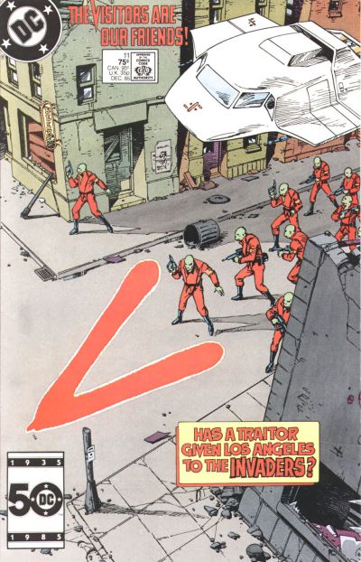
I also read V, which DC published based on the TV miniseries and then regular series. The original miniseries was terrific, and the followup, V: The Final Battle, was five-sixths great — the ending left a lot to be desired. The weekly TV series was a disaster and put out of its misery after one season. But I really wanted the show to succeed and stuck with it. There was nothing else sci-fi related on TV. If you liked that stuff, V was it.

The comic book version ran 18 issues — long past the series’ cancellation. And it had its high points: The covers by Jerry Bingham were terrific. Carmine Infantino penciled the series and his art had many of the same qualities I had come to like from his Star Wars run. And the letters pages also were lively, with lots of fans writing in and good engagement from the editor, Bob Greenberger. More on him later.

Cover to X-Men Annual #10 (1986). Art by Arthur Adams.

I wrote one fannish letter to X-Men editor Ann Nocenti and writer Chris Claremont in autumn 1986, after we had moved to Arizona. I was trying to work out the continuity of the Mutant Massacre storyline, and where X-Men Annual #10 occurred in the run. I’m still not clear on that point, but I’m also glad they didn’t publish it.

A year later, I was a student at the University of Arizona. My initial major was general business, mostly because I had to pick something and had no idea what else to choose.

In Canada, I had been a strong science and math student. But my interest in those subjects was frustrated by the way they were taught at the Arizona high school where I finished my diploma, and in my freshman year at university.

I had intended to take calculus in high school in Alberta, but Arizona — to no one’s surprise — lacked that option. In university, it was taught in an auditorium with 600 freshmen. The weekly session with a teaching assistant was not helpful. Teaching my group was a thick accented man unskilled at — and apparently uninterested in — helping us make sense of the topic.

Buying a set of notes for the class from a local copy shop, I basically re-took the class at home in the last weeks before the final. I got an A, but none of it stuck, and I was already looking at other interests.

I enjoyed being a university student, and liked taking classes on topics as diverse as psychology, world literature, and military history. Few of the other students in my classes, however, seemed to have any real interest in learning about these things. They loved the social scene, but classes were merely tolerated. They were something to get through on the way to the degree and job that would afford them the flashy car they wanted. It was disheartening to see so many people just going through the motions and failing to take an interest of any kind in the amazing world we live in and the opportunity we had as students to learn so much about it.

I also had always liked current affairs, history, and politics. In school, we had studied the history and culture of Canada, obviously, but also places like Africa, India and China. We also studied the industrial revolution, the Reformation, the Renaissance, and the Russian Revolution. Given the threat of global thermonuclear war, the latter fascinated me as much as it scared me. For more than a year after watching “The Day After,” I had to distract my mind with the radio to fall asleep each night.

At university, I took advantage of being a student to read lots of newspapers, magazines and books I had never had access to before. I often stayed up late to watch Nightline, with Ted Koppel. That was a great show, though I always wished he had more time to discuss things — an hour instead of a half.

All this inspired me to put more effort into my writing at college and the results were immediate — good grades and some very flattering compliments from teachers. That had never happened before. I also was really enjoying it, following topics down a rabbit hole and using the power of revision to refine ideas. It was at minimum very satisfying, and more often than not a lot of fun.

I also was reading as many comics as I could get my hands on. I was particularly fond of the X-Men titles and the writing of Chris Claremont. He had a strong style, but he also told complicated stories and defined his characters in ways other comics and books did not. I was a fan. It made me think that one day I could do something related to comics. Maybe.

I would read the Writer’s Market — a guide to publications that buy freelance work — in the university bookstore. It reported at the time that top talent at Marvel earned six-figure incomes. That seemed unreal to me.

But a career related to comics just didn’t seem like a viable goal. And certainly not a serious one you could confess in Tucson, Arizona, in 1987.

All of this came together in the pages of Avengers #289, which came out in November 1987. The book’s editor, Mark Gruenwald, had a series of columns he wrote, called Mark’s Remarks, that ran in the titles he edited. And in this one, he was talking about what it takes to be an editor at a company like Marvel. He wrote that comics require highly structured writing, like journalism. So knowing something about journalism was helpful. Read the whole thing here, especially section 3:

The Mark’s Remarks column from the letters page of Avengers #289.

That stuck with me. It definitely played a role in my decision to switch my major to journalism. It wasn’t the biggest or most important reason. I had noticed in reading so many publications of all types that the people who worked on them seemed to really enjoy what they did, and that they felt it was important and worthy work. And that seemed like the right reason to point myself in that direction.

That choice was the right one for me. And I’ll never forget that moment of clarity, of the fuse that led to that decision being lit by reading that column.

I never had a chance to meet Mark Gruenwald, who died unexpectedly at the age of 43, in 1996. But I owe him at least a thanks for some simple words of encouragement. It’s amazing what a little of that can do — most people hear so little of it.

Next: Writing letters that actually got printed!

Cover to Battlestar Galactica #22

Comics Letters Pages, Part 1

In the days before the internet, comics letters pages were important to fans. It was one of the few places you could connect with other fans and read what they thought about recent issues, the art, the quality of the writing, etc.

Letters pages also gave most fans their first insights into how comics are made and who made them.

I first read the letters columns in Marvel’s Star Wars comics starting sometime in 1978. Those comics were for a while one of the few Star Wars products available, and the only official new stories. I read and re-read those comics — and re-read them again.

I specifically remember reading the first arc with Archie Goodwin as writer and editor. It was issues #11-15 (May-Sept. 1978). The art was by Carmine Infantino and Terry Austin. I bought each issue as it came out and loved it. It was the first time I read an extended story over multiple issues of a comic book and I was hooked.

Eventually, I noticed the letters pages, and read those, too. It was then that I began asking questions like, “Who’s Archie?” “Who’s Carmine?” “What’s an inker?” Discovering the credits finally clued me in that there were actual people writing and drawing these comics. And they were different. I had read the previous issues by Roy Thomas and Howard Chaykin, and I probably was even vaguely aware of having seen their names in the book. But it wasn’t until seeing the completely different outcome that Goodwin and Infantino brought to the comic that it became clear just how much impact the writer and artist had on a comic book.

Putting pen to paper

I remember only once writing a letter of my own. It was after reading Star Wars #26 (Aug. 1979), which had this really cool sequence where Luke Skywalker flies a stolen TIE Fighter into the gas giant Yavin to take out a hidden Imperial base. The story ruled, but Infantino’s art had become increasingly abstract. I’d looked at other comics with more conventional art styles and wanted the characters and ships in Star Wars to look a little more like they did in the movie.

Cover to Star Wars #26
Star Wars #26 (Aug. 1979). Cover art by Carmine Infantino and Bob Wiacek

I have since changed my mind about Infantino’s art on Star Wars and love it unconditionally.

Being that into Star Wars at the time meant I was really down for Battlestar Galactica. In Canada, the pilot was shown in theaters months before it aired on TV. I saw it several times and was excited for it to become a TV show that would air every single week.

Of course, it also became a comic. A friend had the treasury version that came out with the movie release, but Marvel re-adapted it for the first three issues of its monthly comic series. The next two issues after that saw Walter Simonson draw an adaptation of “The Lost Planet of the Gods,” and it was better than the show. I read that comic for the next two years — long past the show’s cancelation — and in particular loved the issues Simonson drew. He later started to write the book as well, and it somehow got even better.

It was at the time a special thing for me — almost like the show hadn’t really gone away. Of course, that didn’t last.

I read on the letters page of Battlestar Galactica #22 (Dec. 1980) that the series “isn’t much longer for this world. Next issue will be the last.” I was bummed. And the next issue, #23, was indeed the last.

Battlestar Galactica #22 letters page.
This letter in Battlestar Galactica #22 (Dec. 1980) is how I learned the series was being canceled.

Shortly after that, I stopped reading comics — and letters pages — for a few years. When I resumed reading and collecting comics in the mid-1980s, the letters pages were still there to inspire.

More on that next time.

Page 2 of 7

Powered by WordPress & Theme by Anders Norén