A longtime showbiz journalist and fan's thoughts on comic books, movies and other cool stuff.

Tag: Marv Wolfman

Comic Treks: Star Trek (Marvel) #4 (July 1980)

Star Trek (Marvel) #4 (July 1980). Cover by Dave Cockrum and Klaus Janson.

“The Haunting of Thallus!” (17 pages)
Cover:
Dave Cockrum and Klaus Janson (signed)
Script/Edits: Marv Wolfman
Pencils: Dave Cockrum
Inks: Klaus Janson
Colors: Carl Gafford
Letters: Jim Novak
Consulting Editor: Jim Shooter

Marvel’s first original Star Trek story is action packed, full of surprises and features much improved art from the movie adaptation. So, of course, this was writer and editor Marv Wolfman’s last issue on the title, which from this point on struggled to find a consistent creative team or direction for itself despite contributions from numerous talented creators.

Raytag escapes as soon as he’s beamed aboard.

Storywise, this issue starts off with a rare teaser splash page of the Enterprise encountering a haunted house in space. The actual story starts on page two, with Kirk and Spock receiving a new mission from Admiral Fitzpatrick (no clue why they didn’t use Admiral Nogura, already established as Kirk’s superior officer) to transport a “totally insane!” prisoner back to the prison he escaped from on the planet Thallus. Overly humble Regulan Ambassador R’kgg is to accompany them on this mission, which goes off the rails as soon as the prisoner, Raytag M’gora, is beamed aboard and escapes.

All this happens by the end of page three, so the pacing is already much ramped up from the sullen pace of the movie and its adaptation.

A nice example of the improved writing and art in Star Trek #4.

The next three pages feature the Enterprise crew trying to recapture Maytag, who’s escaped into the engine pylon structures and fended off attempts by security and Kirk to stop him. Since Raytag is like a bat and “sees” with sonar, they broadcast a “sonic backlash” to distract him long enough for Spock to deliver a nerve pitch.

Crewmembers “forming friendships”.

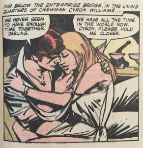
That taken care of, the Enterprise then receives new rendezvous coordinates from Thallus and obligingly changes course. Meanwhile, a pair of crewmen “forming friendships” in their cabin are attacked by and fend off a werewolf, and Chekov and Sulu see a ghost on the recreation deck.

Raytag tries to convince Kirk not to return him to Thallus and suggests that the Enterprise will become as trapped as he will be. Approaching the rendezvous, Dracula appears on the bridge and trounces a couple of guards before turning into a bat and vanishing into the turboshaft. He’s next spotted on C-Deck where a crewman fired at Dracula and Ambassador R’kgg is found dead with puncture wounds on his neck.

This is classic Cockrum — the woman’s pose, the alien, and the circular inset. Nice stuff.

The Enterprise arrives at its rendezvous to find the floating haunted house teased on page one. Raytag warns Kirk that he and his crew are now also prisoners of Thallus.

There’s more action on this page than in all of Star Trek: The Motion Picture.

Beaming over, Kirk, Spock, McCoy and a couple of crew members (they don’t wear red shirts anymore, but they’re definitely in the same category) find an elaborate reproduction of a haunted house with spider webs, dust and a storm brewing outside. They hear a scream and rush in to find Frankenstein’s monster choking a young woman. Kirk knocks it out the window and a whole slew of horror monsters appear around them. Among them is a critter who looks an awful lot like Marvel’s Man-Thing.

Check out Man-Thing at right in the bottom panel.

The girl says they’ve been holding her prisoner here as long as she can remember. Bones suggests they bail, but then a a crew of Klingons appear and its commander saying there is no escape.

The last page shows a Klingon ship arriving to inform the Enterprise it has entered Klingon space and its landing party has been captured. Meanwhile, Raytag laughs at this madness as he sits in the brig.

This issue features a letters page that provides some hints at what’s going on with the publishing of the title. First, it lists not Marv Wolfman as editor, but Louise Jones. There are few responses to letters, but she does explain in in answer to a letter from Sim Parks of Swansea, S.C., a bit about the rights situation vis a vis the original series.

More adaptations of novels and short stories aren’t in the cards right now, Sim, mainly because Marvel only has the rights to adapt the movie and do new material based the movie. As yet, we have no rights involving the TV shows or other Star Trek material. Nevertheless, we hope to do stories that you enjoy … even if they are brand new. Let us know if we’re on the right track, okay?

Louise Jones, Star Trek: The Letters Page, Star Trek (1980) #4.

Wolfman’s story echoes a tactic the original series used to save money: set the story somewhere that looks a lot like a standing set you’d find on a TV studio lot in the late 20th century. Wolfman does a good job of packing a lot of story into this issue and using the dialog effectively to indicate character and make clear who’s who and what they’re doing. The mystery connecting the haunted house, the Klingons and Raytag is built up well enough to be a convincing reason for a Trek fan to come back and see how it plays out in the next issue.

For the art, this story plays so much better to Cockrum’s strengths as an artist. Most fans recall him for his amazing character designs, but he also had a real flair for action sequences that really shows here. Assuming he and Wolfman worked Marvel-style, the top-notch pacing of the story and the effective storytelling that gets a lot of information across comes down to Cockrum’s pencils. More of Cockrum’s flair comes through Janson’s inks, which works to the benefit of the story, even if I still think it’s a less-than-ideal match that fails to convey the sleek, modern look of the movie.

The cover, however, is not effective at conveying the story inside as a Star Trek story. The Enterprise is small and obscured through a window, while Kirk and McCoy have their backs to the camera. Spock looks good, but he’s too small and the jokey nature of the image not something that would have appealed as much to Trek fans, I think. It looks like a rejected monster comic cover that had a couple Trek elements pasted in to work for this series.

This issue was the unexpected final issue for Wolfman, who did not return to plot the conclusion in issue #5. As mentioned previously, Wolfman had been editor in chief at Marvel for a short while around 1975-76, and when he passed that title on he carved out a writer-editor deal that allowed him to run the projects he worked on himself with little or no oversight. That approach changed when Jim Shooter took over as editor in chief in 1978. Shooter realized that the single editor approach for a line of comics as numerous as Marvel’s was unworkable and began hiring a team of editors to each work on a reasonable number of titles. He also did not think writers should edit themselves, and refused to renew the writer-artist deals. As they expired, the writers who had them — Roy Thomas, Len Wein, Gerry Conway and now Wolfman — all left Marvel for DC Comics.

Wolfman’s departure from Marvel was bad news for Star Trek, but very quickly resulted in him pairing with artist George Perez to create The New Teen Titans, one of the most iconic, best-selling and critically acclaimed superhero titles of the 1980s. So that worked out.

New Shooter hires Louise Jones and Denny O’Neil stepped in to fill the gap on issue #5, with Jones taking over Star Trek as her own title the following issue. It’s interesting to note that Jones, who was then very new to Marvel, was at the same time taking over X-Men from editor Jim Salicrup amid the climax of the Dark Phoenix saga under somewhat tense conditions. Not sure that it had an effect on Star Trek going forward, but it sure didn’t help.

Comic Treks: Marvel Super Special #15 — Star Trek: The Motion Picture, Star Trek (Marvel) #1-3

Marvel Super Special #15. Cover painted by Bob Larkin.

Stan Lee wrote in one of his Stan’s Soapbox columns in the 1970s that Marvel had been very interested in getting the rights to do a Star Trek comic book, but that they were all tied up. Western Publishing and its Gold Key Comics line started publishing Star Trek comics in 1967 and retained the license throughout the 1970s as the show’s popularity soared in syndication and its fandom was in full blossom.

As with many things, the success of Star Wars changed the expectations for what a space property could be. George Lucas and company had targeted Marvel for a Star Wars adaptation and had to be pretty persuasive to get them to agree to the project. Of course, the Star Wars comic famously was a huge hit and all by itself propelled Marvel to profitability the year it came out. Its success spawned lots of imitations, with Marvel taking on Battlestar Galactica, adapting Close Encounters of the Third Kind and, of course, landing the rights to Star Trek: The Motion Picture.

Gold Key’s rights ended so abruptly that there exists a script for the unpublished Star Trek #62 that can easily be found online (or here). Gold Key managed to stay in the licensing game with licenses for The Black Hole, which ran a mere four issues, and Buck Rogers in the 25th Century, which ran what looks like 15 issues. But Gold Key’s more child-oriented approach to comic-book storytelling was not to survive much longer; the company closed down completely in 1984.

Marvel seemed the ideal fit for Star Trek, and there was no shortage of professionals on staff at the publisher champing at the bit for a shot at the title. Among them were artist Dave Cockrum, acclaimed artist on DC’s futuristic Legion of Super-Heroes title, co-creator of Marvel’s New X-Men, and working at the time, I believe, on staff at Marvel as a cover designer; and Marv Wolfman, who had parlayed his 1975-76 stint as editor in chief into a writer-editor deal. It was under this deal that Wolfman headed up the adaptation of Star Trek: The Motion Picture and the monthly comic book series that was to follow.

That seemed like an ideal team at the time for a top-tier comic book, especially when they were joined on inks by Klaus Janson, who had made a huge impact on comics as the finisher and inker on Frank Miller’s classic Daredevil run.

The Marvel Super Special series was an irregular line of color comics in magazine size, printed on nicer paper and selling for $1.50 and up. The first issue was an original The Beatles story and a big hit, but by the time it came to Star Trek: The Motion Picture, it became the line for projects like movie adaptations that could sell to fans of the movie that don’t normally read comics. Marvel Super Special #15 includes the complete adaptation of Star Trek: The Motion Picture as a single, 52-page story, along with supplemental material such as photos from the movie, an article on the Star Trek phenomenon, a glossary, and an interview with Jesco von Puttkamer, a NASA consultant on the production of the movie. The cover features a really nice painting by Bob Larkin. A facsimile edition of this magazine was published in 2019 by IDW in celebration of the movie’s 40th anniversary.

The Canadian paperback edition of Star Trek: The Motion Picture. Cover by Bob Larkin.

As was the norm at the time, Marvel was looking for new markets for its comics. With Star Wars, Marvel had a lot of success not just reprinting the original issues, but also in repackaging them into new formats, which included treasury editions and a black-and-white mass-market paperback size edition. The same approach was taken from the start with Star Trek: The Motion Picture, with the Marvel Super Special edition coming out to coincide with the movie’s release, followed closely by the first issue of the regular Star Trek comic and a color mass-market paperback edition. All three featured the same content, with the regular comic book breaking the adaptation across three issues and the paperback edition reformatting the panels into a 144-page reading experience.

Production on the project was admittedly rushed. In a full-page article on the Star Trek comic series in Starlog #33 (April 1980), Wolfman and Cockrum admit to a difficult adaptation. Wolfman says he didn’t think much of the story and found the script inscrutable, making it difficult to do more than transcribe what they had received into comic book form. They had photo reference, but no idea what the effects – which were famously worked on until the very last minute — were going to look like. And Cockrum admits he had to work too fast, cranking out two pages a day, preventing him from giving the project his very best work.

Cockrum himself backs this up in an interview with Peter Sanderson in The X-Men Companion I, published in 1982 by Fantagraphics. Asked about his return to penciling X-Men in 1981 and which of the new issues was his favorite so far, Cockrum replied:

Sanders0n: Which issue is your favorite of the ones you’ve drawn, and why?

Cockrum: That’s hard to say too. I’ll tell you, in some respects I’m most pleased with #145, the first of my new ones, because it was like coming out of a tunnel into the daylight after the Star Trek crap and all that. I’m a Star Trek fan; I got the book because I asked for it, and there was nothing but garbage the whole time. [sighs]

Sanderson: Do you mean the stuff you did, or the writing, the limitations imposed by the Trek people?

Cockrum: No, no … For one thing, Klaus [Janson] and I don’t make a happy combination, I think. I like Klaus’s inking on other people but I don’t think it works on me. Most of the stories were dumb. The whole thing was a big flop, I thought …

The X-MEN COMPANION I, P. 78, FANTAGRAPHICS BOOKS, INC., 1982.

Similarly, Marv Wolfman had this to say:

“The Marvel problem was deadlines. I had to write the entire adaptation of Star Trek: The Motion Picture, which was 64 pages, in less than a month. And that was without knowing a lot of what was going on inside it because the first movie was so late in the working that we flew out to Doug Trumbull’s and John Dykstra’s studios in August and they had yet to design half the major things which would be in the movie which was being released in December. Also Marvel’s deadlines were ridiculously tight because of the release dates. Dave Cockrum had to draw faster than I think he’s ever had to draw in his life, and I had to write it faster.”

Marv Wolfman, Comics Feature #28 (1983), via tom Brevoort’s Marvel 1980s blog.

Covers on the comic book version were drawn by Steve Leialoha (#1), Cockrum and Janson (#2) and Bob Wiacek (#3). There was another version of the cover to #2 drawn by Terry Austin that uses the same basic concept as the published version. Austin’s version was included as a pinup in the final issue of this series, #18.

None of the covers is terribly effective.

Leialoha delivers a movie-poster like image that has decent likenesses of William Shatner and Leonard Nimoy, but its images of Decker and Ilia are soft looking and do little to really sell the book. Cockrum and Janson’s cover to #2 is the best of the lot, extrapolating a much more dynamic image of the V’ger probe’s incursion on the bridge. The coloring kills it though, making it hard to even figure out what you’re looking at. And Wiacek’s cover is just an image of the Enterprise firing photon torpedoes; generic, and likely pulled together at the last minute to meet a deadline.

The adaptation itself is, overall, serviceable. It follows the general plot and tone of the movie rather well, despite being unable to rely upon Jerry Goldsmith’s iconic score. There are obvious attempts to give the art some technical flair via color holds. These work much better in the Marvel Super Special edition than in the regular comic book, which was printed on the then-standard newsprint. That said, there are a few spots where the newsprint edition looks better because of how the paper mutes some of the uses of more highly saturated tones.

The opening splash pages, from Star Trek #1, left, and Marvel Super Special #15.
A closer look at the difference in color brightness, via a color hold on page 2.

The magazine format’s nice paper and larger size also gives some clarity to the artwork that brings out the details and helps it look better. Janson is a formidable artist who has always produced good work quickly and to high standards, but his rough style is a mismatch for the clean and slick look of the movie. Cockrum does an admirable job re-creating the likenesses of the actors, though his work on that aspect is inconsistent. And Marie Severin does a fantastic job on the colors, though as you’ll see production didn’t always serve them well.

Two-page spread of the Enterprise leaving drydock, from Marvel Super Special #15.
The same spread from Star Trek #1. This version’s colors are more harmonious, but the art is muddier.

Coloring a book like this is yet another challenge, given the muted grays, whites, slate blues and faded oranges used for the costumes and sets in the movie. The original Star Trek series at least had variations in the colors of the uniforms with black pants and boots that offered contrast. This version just comes across as muddled, especially on the newsprint page over Janson’s sketchy inking style.

New splash page added to Star Trek #2.
A fuzzy inking job on Kirk.

Wolfman and Cockrum deserve credit for doing all they can to save the pacing and varying the visual storytelling enough to keep it from descending into complete boredom. I’d hate to see how some of the artists today would handle the endless discussions on the bridge and cruises through V’ger’s interior.

The comic book version adds new splash pages to issues #2 and #3 to catch up readers and provide credits for those issues. Nothing special, but it is two extra pages of art.

Artist Dave Cockrum did great hand gestures, keeping things visually less than completely dull.
V’ger revealed looks much better in Marvel Super Special #15, above, which brings out the detail in the art and the color.
It doesn’t translate very well to Star Trek #2.
Advert in Star Trek #2 for Star Trek: The Motion Picture action figures, toys and vehicles. I understand that students at the Joe Kubert School often drew these ads. And, boy, those toys are expensive for 1979!
Decker looks more like a Cockrum character here, while Ilia has a heavy Janson influence.
Splash page added for Star Trek #3.
Spock is caught in a color hold.
Cockrum’s chops just keep shining through, no matter how fast he had to draw. The likeness of Spock in the top right panel is great and the center panel’s action is all Cockrum, baby!

Much of the excitement surrounding the release of Star Trek: The Motion Picture faded pretty quickly after its release. It was clear by Christmas 1979 that the movie wasn’t going to be a huge hit along the lines of Star Wars. It just didn’t tell the kind of story that inspired kids to play Star Trek and send their parents out to the stores in search of that great V’ger playset. (Although, if Roddenberry had his way, I’m sure the parents would be heading out to other kinds of toy stores to re-enact “forming friendships” in the bowels of the Enterprise … ugh.)

So with Marvel Super Special #15 coming out right around the movie, followed quickly in December 1979 by Star Trek #1, that puts the conclusion of the adaptation in February 1980 and the first original issue of the comic book in March 1980. By which time, the movie had already been largely ignored and forgotten, with everyone champing at the bit for the May release of The Empire Strikes Back (I know I was).

Add to that, the changes at Marvel and the restrictions that fans would soon learn applied to the book, and the new comic book series was already seriously behind the eightball.

But more on that next time.

Powered by WordPress & Theme by Anders Norén