John Byrne had been back at Marvel for a while before he took on the challenge of doing a new Sub-Mariner series. And it works. Namor was believed dead at the end of the Atlantis Attacks storyline that ran though Marvel’s 1989 annuals, and here just shows up bursting out of the ocean to attack the natives on a nearby island. Researchers Carrie Alexander and her pop, David, see this, recognize him, and help him out. Turns out David has a theory to modulate Namor’s extreme moods — and it works. So Namor enlists them as he digs up sunken treasure to fund a corporate front to fight ocean pollution and other causes. The art is pleasingly detailed, open, and inviting. The story has enough action and plot to keep things interesting enough to make me want to come back for the next issue.
I realize the biggest gap in what I’ve written so far is that I haven’t explained my earliest experiences with comics.
My first memory of comic-book material was on television. When I was about 4 — around 1973 — one of the local TV stations in Edmonton aired episodes of the various 1960s DC animated series at about 12:30 p.m. each weekday, right after The Flintstones.
(A side note: The Flintstones ran every weekday at noon on CFRN-TV in Edmonton for pretty much my entire childhood. It was how we measured lunch, as the morning session at school ended at 11:45 a.m. You got home just in time to grab your sandwich or bowl of soup and sit down to watch The Flintstones, and then head back to school after it was over. School resumed about 12:55 p.m., so you usually had a few minutes on the playground before class resumed. I remember visiting Edmonton in the mid-1990s, and The Flintstones was still playing at noon!)
These DC toons alternated, with Superman, Batman, Superboy, and Aquaman all getting a day to themselves. I think Superman may have aired twice.
Then there were the 1960s Spider-Man cartoons. Because this show was produced in its first two seasons by Toronto-based Grantray-Lawrence Animation, the show counted as Canadian content. Even back then, the Canadian government required broadcasters to fill a certain percentage of their airtime with shows produced in Canada. Since Spider-Man qualified, and it was popular, it was in constant re-runs from the 1970s well into the 1990s — usually on the independent channel, CITV-TV.
We had cable back then, but it was minimal compared to what we now think of as cable TV. We got via cable all the local Edmonton broadcast channels, plus the broadcast channels from Spokane, Washington. This included an independent channel, as well as the CBS, ABC, NBC, and PBS affiliates — effectively doubling the number of channels we had. There was no cable box, but every channel from 2 to 13 had something on it.
It was through these channels that we got American Saturday morning cartoons. My earliest memories of Hanna-Barbera shows like Scooby-Doo and Speed Buggy, packages of classic Warner Bros. shorts, and, eventually, Super Friends. For years, getting up to eat cereal and watch cartoons was the best and only way to spend Saturday mornings without exposing yourself to dark and freezing winter conditions.
Before we got Super Friends, there was Shazam! This was a live-action show, made super cheap (not that I knew that at the time), and paired with a second superhero show, Isis. But what grabbed my imagination was the transformation sequence where Billy Batson yelled “Shazam!” and turned into Captain Marvel.
Opening credit sequence to the 1970s Shazam! TV series.
Which lead directly to the first comic book I remember owning: A Shazam! treasury edition I later came to know as Limited Collector’s Edition #C-27. I particularly remember one Captain Marvel Jr. story in which Freddy Freeman was captured at a circus, gagged, and left in a guillotine. He managed to loosen the gag enough to shout “Captain Marvel!” in time to transform — the guillotine blade broke on his neck. Cool stuff!
I didn’t buy that comic — or any others for a while — myself. But there always were comics around. We spent summers at various lake cabins with other families with older kids, and comics were just all over the place. There were plenty of Harvey Comics, Archie Comics, Gold Key Comics, Marvel Comics (especially Millie the Model), and DC books (Batman was popular). With no TV, comics were just what we all curled up and read when it rained or you were just tired from running around outdoors all the time.
When I got a little older, the corner store loomed large in the lives of all the kids in our neighborhood. We were constantly asking our parents for a quarter or two to fund a trip to “the store.” The great thing was you could get just about anything you wanted for a couple of quarters: a chocolate bar, pack of gum, bag of chips, small box of candy, a pack of trading cards (with gum), a bottle of pop, or a comic book.
The store did a lot of business with the neighborhood kids, so the candy and comics — displayed in a classic spinner rack — always were upfront. Located at 12305 63rd Ave., the store did not have a name that I can recall. It was a standard neighborhood convenience store that sold basics like bread, milk, canned goods, newspapers, magazines, and cigarettes. It was owned by a family that came to Canada from Lebanon, and they frequently seemed to sell it to a cousin or brother or uncle — but it always stayed in the family, and they always were very kind to the neighborhood kids.
Such stores were everywhere. Every neighborhood had one. And every one of them had a spinner rack of comics. Comics also could easily be found alongside racks of paperback novels at a drug store, and sometimes in supermarkets. Pretty much anywhere you could stop in for a pack of smokes, a newspaper, or a pack of gum was a place to get comics.
Most of the comics I bought were at “the store.” I remember stopping in one night with my dad, who let me buy a Superman and a Spider-Man — likely The Amazing Spider-Man #162 (Nov. 1976) since I pretty clearly remember Nightcrawler on the cover.
Science fiction was popular at the time, with reruns of the original Star Trek in full swing, so I bought several issues of the Gold Key Trek comic off the racks. I also liked Space: 1999 and The Six Million Dollar Man, and bought the Charlton comics based on those shows. I distinctly remember the story in the John Byrne-drawn Space:1999 #6 — and had no idea he lived just down the road in Calgary at the time.
Star Wars, of course, changed everything. I didn’t see the movie until June 1977, and the first Star Wars comic I saw was issue #3. A friend of mine had a copy of #2, and I managed to score a copy of #1 — the first comic I expressly went looking for — one day at Mike’s Newsstand on Jasper Avenue in downtown Edmonton. Actually, what happened is I spotted the comic there while visiting with friends and, having no money, pleaded with my Dad to go stop by from his office on the way home the next week and buy it for me. And he did!
The treasury editions that Marvel and Whitman published were easy to find, and that’s how I and most of my friends read the adaptation of the movie. Over, and over, and over. They had better printing, too, than the original comics, and were what we now would call oversize.
In the fall of 1977, I bought a copy of Star Wars #7 — the first original Star Wars comic book story. And that was it. I was on the hunt for all the issues after that. I missed #8 and #9, though friends of mine had them and I borrowed or read their copies while hanging out at their houses. Starting with #10, I figured out that Star Wars comics showed up about the third week of the month, usually on a Tuesday. I started timing my searches and successfully bought just about every issue from there through #31. Then there was a stretch where the store stopped carrying comics for a bit, then brought them back in time for Star Wars #39 and the adaptation of The Empire Strikes Back.
The other book I read at the time was Marvel’s Battlestar Galactica. I wanted the TV series to be good, but too many episodes were disappointing fill-in episodes using old Western movie sets. The comic, however, started to get really good after the show was canceled. Walt Simonson took over writing and drawing, and his talent in both disciplines was evident.
The last year of my early comics reading was 1981. The Battlestar comic was canceled. I read Star Wars through #54. And I also had the Marvel Super Special adaptation of Raiders of the Lost Ark, which was the hottest movie of the year. I don’t remember making any conscious decision to stop reading comics, I just moved on to other things.
Fall of 1981 was when I started junior high school, began to earn money by delivering newspapers after school, and became more interested in music and sports — particularly soccer and hockey. Edmonton was then a new addition to the NHL with the Oilers, and had this young hotshot named Wayne Gretzky who played for them. Gretzky and the other young stars of the Oilers were not much older than me — I was 12, they were around 20 — but their on-ice heroics made them appear almost like real-life superheroes who lived in our midst.
I don’t think I bought another comic until 1985, when I dug out my stack of Star Wars comics and rediscovered them. That lead me to the 7-11 and my purchase of Star Wars #96 — and I’ve never stopped buying comics since.
In the past month, as promised, I’ve read the entire run of Marvel’s The Further Adventures of Indiana Jones (Jan. 1983-March 1986). I completed reading the run in time to brush up on Indy’s past in 1984’s Indiana Jones and the Temple of Doom, and the brand-new feature Indiana Jones and the Dial of Destiny.
Harrison Ford in Raiders of the Lost Ark.
I’ll start off by saying that Raiders of the Lost Ark is one of my perfect movies. I love it unconditionally, and have since I first saw it at the Westmount Cinema in Edmonton in the summer of 1981. At the time, Alberta’s movie ratings system required a parent or guardian to attend with kids under age 16. So, I had to talk my Mom into taking me the first time. She expected to be bored stiff, based on the title, but thanked me afterward for making her see the movie. I saw the movie at least a half-dozen times that summer — sometimes by buying a ticket for Superman II and then sneaking in to see Raiders. Sometimes, I got caught, and sent back to watch 10 minutes or so of Superman II before re-sneaking in to Raiders.
Marvel Super Special #18: Raiders of the Lost Ark. Cover art by Howard Chaykin.
Unlike Star Wars, Raiders didn’t inspire a flood of merchandise. I don’t remember there being any Raiders toys, though I did have some action figures from Clash of the Titans, which came out around the same time. There was a novelization, which I read and enjoyed, and Marvel Super Special #18, which adapted the movie. The really enjoyed this adaptation, which was written by Walter Simonson, penciled by John Buscema, and inked by Klaus Janson — all under a terrific painted cover by Howard Chaykin.
I stopped reading comics shortly thereafter. I was 11 going on 12, about to enter junior high school, and toys and comics were giving way to hockey, rock music, and secret crushes on the girls in my class. So I missed Marvel’s continuation of Raiders, which started in the fall of 1982 and roughly spanned the period in my youth when I didn’t collect or read comics.
Somehow, over the years, I acquired the full Marvel run, but had never sat down to read it until now. The series is wildly uneven, and mostly unremarkable. It never really achieves the kind of high points that Marvel’s Star Wars found, even with plenty of top-notch creators involved.
Cover by Terry Austin.Cover by John Byrne and Terry Austin.Cover by Richard Howell and Danny Bulanadi.Cover by Ron Frenz and Mike Gustovich.Cover by Ron Frenz and Mike Gustovich.Cover by Howard Chaykin and Terry Austin.Cover by KerryGammill.Cover by Howard Chaykin and Terry Austin.Cover by Howard Chaykin and Terry Austin.Cover by Howard Chaykin and Bob Wiacek.Cover by Kerry Gammill.Cover by Bob McLeod.
The difficulty in doing an Indiana Jones comic in 1982 was apparent right there in the first issue, which featured a story and layout by superstar John Byrne, who also contributed a plot and layouts to the second issue before leaving the title to make room for Alpha Flight. Byrne’s story is quite talky — more like a Sherlock Holmes story than anything.
David Michelinie had the longest run on the title, taking over with issue #4 and writing most everything through issue #23. This was roughly concurrent with his run on Star Wars, which produced some of the best Marvel issues set in a galaxy far, far away.
But Indiana Jones was a tougher nut to crack. For one, the character operated in a more realistic world than most comics. It was difficult to find distinctive villains that weren’t retreads of the Nazis. And it was more difficult to create plots where a “finder of rare antiquities” could play the hero. And incorporating the pulp fiction-style supernatural elements was even more difficult.
For most of the series, Indy went on missions for his pal Marcus Brody on behalf of the National Museum, based at Marshall College in Connecticut. Marion Ravenwood showed up and Marcus hired her as a publicist for the museum, assigned to tag along and document Indy’s adventures to promote the good work the museum was doing. At least she did until issue #25, when she abruptly left the series and never returned. This was around the time Temple of Doom, in which she didn’t appear, was released. Short Round made a brief appearance in one issue, but that was it.
The style of action Raiders delivered also was difficult to recreate on the comics page. The workhorse artist of the series was Herb Trimpe, a true comics journeyman who brought a more conventional style of art to the character.
But nothing really works. Even when artists like Chaykin and David Mazzuchelli contributed to the series, it was flat and dull. The covers from Terry Austin, Chaykin, and Michael Golden were the best part of the series,
Cover by Bret Blevins.Cover by Bret Blevins.Cover by Herb Trimpe.Cover by Herb Trimpe.Cover by Herb Trimpe.Cover by Herb Trimpe and Jack Abel.Cover by Bret Blevins.Cover by Eliot R. Brown and Jack Morelli.Cover by Joe Brozowski and Bob Wiacek.Cover by Joe Brozowski and Mel Candido.Cover by Michael Golden.Cover by Michael Golden.
Sometime after Indiana Jones and the Temple of Doom was released in 1984, there was a shift at Lucasfilm that affected both the Indy and Star Wars comics. Interest seemed to evaporate, with both titles eventually being demoted to bimonthly publication for their final year before cancellation.
The later issues of Indy’s comic, however, were some of the better ones. Linda Grant took over writing the series, and Steve Ditko drew a number of the later issues. The results were more entertaining, though still falling short of anything that inspired further reading or required the continuation of the series.
Cover by Michael Golden.Cover by Bob Budiansky and Bill Sienkiewicz.Cover by Keith Pollard.Cover by Keith Pollard.Cover by Keith Pollard.Cover by Keith Pollard.Cover by Keith Pollard. Cover by Keith Pollard. Cover by Keith Pollard.Cover by Keith Pollard.
I think Indiana Jones definitely could work as a comic. It takes so much inspiration from the serials of the 1930s, which in turn took inspiration from the pulp fiction mags that preceded comics and the great adventure comic strips of the era. Terry and the Pirates is as close to a blueprint for Indiana Jones as you’re ever likely to find. Tapping into Milton Caniff’s approach would seem the obvious way to make good Indiana Jones comics.
I know Dark Horse published many Indy comics in the 1990s and beyond. I think I’ve only ever read one of them, and it must not have made any impact on me as I never read any more. If there’s a good one I missed, let me know.
Harrison Ford in Indiana Jones and the Temple of Doom.
Back to the movies to wrap this up: My friends and I bolted out of school the Friday Indiana Jones and the Temple of Doom opened to get in line for a screening at the Paramount Theater on Jasper Avenue in Edmonton. We’d heard about the bugs scene, and one pal brought a pack of Goodies candy to toss from the balcony during the bug scene. I don’t remember being able to see any kind of reaction, but it was fun.
I still love the Temple of Doom. It’s not as good as Raiders, but I love the freaky energy, the pulpy thrills, the strangeness, the dark plot, and even the tension with Willie Scott and the friendship of Short Round.
I’m not as thrilled with Indiana Jones and the Last Crusade, which I saw opening weekend with my girlfriend at the time in Scottsdale, Arizona. Temple of Doom had been roundly criticized as being too dark for kids, inspiring in part the creation of the PG-13 rating. So Last Crusade played it safe, following the pattern set by Raiders for its plot, and injecting some humor with Sean Connery arriving as Henry Jones Sr. It should have worked, but it played more like this was a character brought in to prop up the ratings in the third season of a TV series that was running out of gas. I felt pandered to, at least a little bit.
Sean Connery and Harrison Ford in Indiana Jones and the Last Crusade.
I know I saw Indiana Jones and the Kingdom of the Crystal Skull when it came out, but remember only the chase sequence at the start of the film and Indy’s silly hiding in the fridge to avoid being nuked scene.
Harrison Ford and Cate Blanchett in Indiana Jones and the Kingdom of the Crystal Skull.
So, that brings me to Indiana Jones and the Dial of Destiny. I’m a bit predisposed to liking it because I have interviewed director James Mangold and came to enjoy his work: Copland, Walk the Line, 3:10 to Yuma, The Wolverine, Logan, and Ford v. Ferrari. I liked the movie a lot — it’s not as good as Raiders, and probably not quite good enough to knock out Temple of Doom as my No. 2 favorite, but it has enough style and nostalgia to feel like a real Indiana Jones movie. And in this day and age, that’s enough.
Phoebe Waller-Bridge and Harrison Ford in Indiana Jones and the Dial of Destiny.
The summer of 1991 was huge for two reasons: X-Force #1 (Aug. 1991) and X-Men #1 (Oct. 1991).
I was mostly buying new comics from AAA Best, where I had a pull list. But I was really into it at this point and spent most of my free time that summer hitting every comic shop I could find in the Phoenix area. All About Books and Comics was my No. 2 choice. They had their main store on Camelback Road and also a small Scottsdale location close to where I was staying with my parents.
Most of the comics I was reading at this point were solidly entertaining, and I was buying a lot of them, so I wasn’t trying a ton of new books. Batman, Spider-Man, Justice League, Doom Patrol, Avengers, The Sandman, Hellblazer and probably a few others were keeping me pretty busy.
It was all about the X-Men that summer. The commercial success of the book with Jim Lee on it just spilled over into everything. Interest in X-Men comic books may never have been higher. Both the collector crowd, dominated at this time by speculators who bought up multiple copies — even cases! — of new issues as they came out, and the fans more into the creative and storytelling side of things were unable to resist the oncoming onslaught of X-Men books.
But this interest also was so intense, it couldn’t help but radically change the comics themselves. When Chris Claremont took over as writer on X-Men in 1974, this was a very small and unimportant corner of the Marvel Universe. A mere 17 years later, X-Men and its various spinoffs were an industry of their own. The demand for X-Men material was insatiable, and Marvel was more than happy to do its best to deliver.
There was one problem. Claremont and his closest collaborators — the artists he worked with, as well as the editors who backed him, most notably Louise Simonson and Ann Nocenti — couldn’t deliver on their own nearly enough material to meet that demand, though they appeared to have a solid grip on the core of the X-Men franchise. And other comics creators, spying the very large checks X-Men books generated under Marvel’s sales incentives program, wanted a piece of that pie.
That changed with the publication of Barry Windsor-Smith’s Weapon X serial in Marvel Comics Presents #72-84 (March-September 1991). Claremont for years resisted any attempt to fill in the gaps in Wolverine’s past, and now another creator was doing exactly that.
Marvel Comics Presents #84 (Sept. 1991). Cover art by Barry Windsor-Smith.
Suddenly, copies of Marvel Comics Presents were hard to find. I had missed a number of issues prior to Weapon X and had to track down the first issue in particular by visiting just about every store in the Phoenix area before finding one at, I believe, All About Books and Comics.
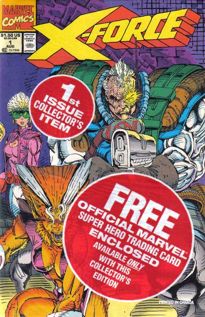
As the release of X-Force #1 approached, there was a lot of excitement because, for the first time I could remember, comics were becoming popular within the larger culture. I saw people wearing X-Force T-shirts at Target. The Levi’s TV ad featuring Rob Liefeld and Spike Lee was a minor sensation on TV. Comics shops on new release day and weekends were crowded.
And suddenly the comics world didn’t seem so distant from the rest of the world.
I stopped by AAA Best the day that X-Force #1 came out — the first week of June 1991 — to pick up my regular stack of comics as well as take part in that momentous event. The store was more crowded than I’d ever seen it, with people lining up to buy huge stacks of copies of that issue. One guy proudly boasted that he was buying 25 copies of the book – and that this was nothing compared to what he was going to get when X-Men #1 came out.
Polybagged copy of X-Force #1 (Aug. 1991). Cover art by Rob Liefeld.
While there was only one cover, each copy of X-Force #1 was polybagged with one of five trading cards drawn by Liefeld. That means most people bought six copies — five to save, and one to open and read. Within a week, I saw All About’s main location was selling the extra cards from opened copies — for a premium. There also was a brief sensation about a certain number of copies that for some reason had a reversed image of Captain America in the UPC box on direct market issues. I don’t know if that’s a legit variant, but I did scoop up an extra set of those for some reason I’m glad to have forgotten.
This is the version of X-Force #1 with the reversed Captain America image in the UPC box.
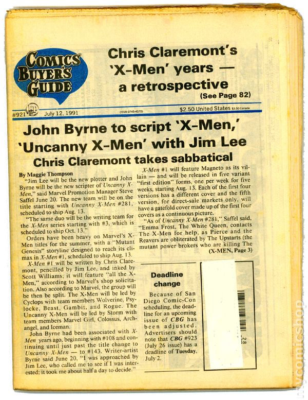
I spent most of my free time that summer driving through the desert heat from comic shop to music store to movie theater to bookstore and back around again. One of the nearby stops was a Bookstar outlet in the then-still-new Scottsdale Pavilions. They didn’t have much in the way of comics, but they did have a big newsstand that included copies of the Comics Buyers’ Guide. I doubt I’ll ever forget picking up the July 12 issue and reading that Jim Lee was taking over as plotter of the book, with John Byrne stepping in to script, while Claremont took a “sabbatical.” This was less than a month before X-Men #1 was due out.
Cover story in Comics Buyer’s Guide #921 (July 12, 1991).
There was no internet back then, and few publications that carried comic book news in a timely enough fashion to learn any more details before X-Men #1 came out on Aug. 13, 1991. The new issues of The Uncanny X-Men offered no hint of what was to come. Jim Lee stopped drawing the series after issue #277 (June 1991), with the incredible Paul Smith returning for #278 (July 1991), and Andy Kubert on #279 (Aug. 1991), on which Claremont’s run ended halfway through the comic. The rest was by Fabian Nicieza, who wrapped up the storyline in #280 (Sept. 1991) and set the stage for the Mutant Genesis relaunch.
That summer also was a big one for Star Trek, which was celebrating its 25th anniversary. Star Trek: The Next Generation continued to thrive on TV, its reputation growing with every new episode that aired. The original crew also was due back for one final voyage, with Star Trek VI: The Undiscovered Country scheduled for a December release. Not only was the original crew getting back together, but Star Trek II: The Wrath of Khan director and writer Nicholas Meyer was returning to both roles. There also was a rumor that TNG’s Michael Dorn had been cast in a small role in the movie.
The teaser trailer was frustratingly unspecific, but the title — originally meant by Meyer for Star Trek II — was terrific and built up expectations for a satisfying and very final finale.
Star Trek Annual #2 (1991). Cover art by Jerome K. Moore.Star Trek: The Next Generation Annual #2 (1991). Cover art by Jerome K. Moore.
On the comics side, DC put two more great Star Trek annuals, and put together the first sanctioned crossover between TOS and TNG with a pair of four-issue miniseries called The Modala Imperative. The creative teams swapped, with TNG comic scribe Michael Jan Friedman starting things off with a four-issue story of Kirk and Co. that was released biweekly that summer.
Star Trek: The Modala Imperative #1 (Late July 1991). Cover art by Adam Hughes.Star Trek: The Modala Imperative #2 (Early Aug. 1991). Cover art by Adam Hughes.Star Trek: The Modala Imperative #3 (Late Aug. 1991). Cover art by Adam Hughes.Star Trek: The Modala Imperative #4 (Early Sept. 1991). Cover art by Adam Hughes.
It was followed up with a sequel TNG series by regular TOS scribe Peter David that brought back Admiral McCoy from the TNG premiere episode “Encounter at Farpoint,” as well as an older Spock who was now an ambassador. (That last detail later panned out on the show itself when Leonard Nimoy returned that fall for a two-episode run as Spock on TNG, “Reunification.”)
Star Trek: The Next Generation — The Modala Imperative #1 (Early Sept. 1991). Cover art by Adam Hughes.Star Trek: The Next Generation — The Modala Imperative #2 (Late Sept. 1991). Cover art by Adam Hughes.Star Trek: The Next Generation — The Modala Imperative #3 (Early Oct. 1991). Cover art by Adam Hughes.Star Trek: The Next Generation — The Modala Imperative #4 (Late Oct. 1991). Cover art by Adam Hughes.
There also was to be an original hardcover TOS graphic novel titled Debt of Honor from Chris Claremont and artist Adam Hughes, but it was delayed into 1992. More on that later.
X-Men #1 — Cover A (Oct. 1991). Cover art by Jim Lee and Scott Williams.X-Men #1 — Cover B (Oct. 1991). Cover art by Jim Lee and Scott Williams.X-Men #1 — Cover C (Oct. 1991). Cover art by Jim Lee and Scott Williams.X-Men #1 — Cover D (Oct. 1991). Cover art by Jim Lee and Scott Williams.
August was the big month. With X-Men #1 (Oct. 1991), Marvel was releasing five variants of the double-size first issue. The first four would be standard format comics with covers that would connect to form a single image. Each also had its own pinup spread by Jim Lee. The fifth edition was a deluxe edition on glossy paper with no ads, all the spreads from the other four variants, a double gatefold cover with all four of the other covers as a single image, and some bonus sketches by Lee. The editions were released once a week, rather than all at once, with Marvel pushing back the release of X-Men #2 (Nov. 1991) a week to make room for the deluxe edition room to have its own week in the spotlight.
X-Men #1 — Cover E (Oct. 1991). Cover art by Jim Lee and Scott Williams.
Ken Strack at AAA told me that he thought the deluxe edition might be hot enough to be worth something. But at that time no one expected Marvel would print and ship 8 million copies of the book, making it the highest-selling comic of all time (at least to comics shops) and the most common. I picked up a couple copies of the first edition at AAA Best on the day of release, also swinging by All About’s Scottsdale location just to get some of the contact buzz.
Reading the book was bittersweet. It was much better than X-Force #1, featuring the full-on return of Magneto as a villain, some cool Danger Room shenanigans to introduce the new Lee costume designs, an orbital nuclear blast, and a final showdown in Genosha. To be continued!
The Uncanny X-Men #281 (Oct. 1991). Cover art by Whilce Portacio and Art Thibert.
The Uncanny X-Men #281 (Oct. 1991), came out the same day as the first edition of X-Men #1, and was more of a mess. Marvel countered Claremont’s departure by bringing back John Byrne to script both series over plots from Jim Lee (starting in X-Men #4 (Jan. 1992)) and Whilce Portacio in Uncanny #281. While Portacio’s art was exciting, let’s just say letting an artist with limited writing ability plot one of your most visible and top-selling series is about as good an idea as it sounds. The story involved some Sentinels, the return of the Hellfire Club, and some new villains that didn’t make much of an impression at the time.
X-Men #2 (Nov. 1991). Cover art by Jim Lee and Scott Williams.
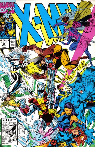
Claremont changes his plans for the series to wrap things up as best he could. While X-Men #1 was originally intended to be an introductory issue Claremont referred to as “X-Men 101,” it now kicked off a three-issue storyline that attempted to resolve the Xavier-Magneto conflict in some kind of convincing manner. When X-Men #3 (Dec. 1991) shipped in October, it was truly the end of an era. There was no acknowledgement of Claremont’s departure, no farewell message — no mention in any way that the man arguably most responsible for this commercial triumph was being displaced from that role.
X-Men #3 (Dec. 1991). Cover art by Jim Lee and Scott Williams.
Between the release of the first edition of X-Men #1 and the fifth edition, I returned to Tucson and the University of Arizona for my final semester. I was originally slated to be the assistant news editor for the Arizona Daily Wildcat, but after only a few weeks found myself promoted to full news editor, in charge of keeping something like eight reporters busy covering the goings on of a campus of 36,000 students. Oh, and a full load of classes, too.
Next: How I almost — almost! — stopped buying comics after graduation.
There were a few other Edmonton comic shops from the time that I visited but no longer remember. I’ve hunted online for any trace of these shops and they are, I’m sure, long gone and exist now only in the memories of those who shopped at them.
I recall one shop located on Stony Plain Road that I visited some time in 1986. I know the year because the woman who was working there was having a loud conversation with a friend about how much she was enjoying both Frank Miller’s The Dark Knight Returns and John Byrne’s The Man of Steel. There were plenty of back issues in this shop, which is what I remember the most. And I remember scoring a beautiful copy, that I still own today, of this pivotal issue of X-Men:
X-Men #166 (Feb. 1983). Cover by Paul Smith.
This was my first issue with Paul Smith art and, when I got it home, I loved it. Loved, loved, loved it. It was double-size, had all kinds of amazing stuff happening in it, and it concluded the long-running Brood saga with a satisfying punch — and still ended with a cliff-hanger that ensured next issue was going to be even better. This was a high point of writer Chris Claremont’s long run and did a lot to cement X-Men as my favorite comic book.
The other shop I recall was located in West Edmonton Mall. For those who don’t know, WEM was as much an amusement park and tourist attraction as it was shopping mall. When it opened in 1981, it was just a nice mall. Big for the times, but nothing too special. It had the usual anchor stores, food court and movie theater (six screens!) where I saw Time Bandits more than once. In 1983, the mall doubled in size and exposed its ambitions, adding an NHL-size skating rink, even more movie screens, a huge McDonalds, and an amusement park area called Fantasyland that featured a handful of rides and attractions for mostly younger kids. In 1985, it doubled in size again, adding a third set of movie screens, a second food court, submarine rides, a dolphin tank, a replica of Christopher Columbus’ Santa Maria, miniature golf, a massive water park with a wave pool and slides, and two theme streets: Europa Street, which evoked a European feel for high-end fashion stores as tenants, and Bourbon Street, with restaurants and bars for lovers of the night life. There was a hotel with theme rooms planned, and Fantasyland doubled in size, adding a triple loop rollercoaster and “drop of doom” style ride for older thrillseekers. Yes, it was a lot. And legal action from Disney did prompt a name change from Fantasyland to Galaxyland.
Cover to Power Pack #1 (Aug. 1984) by June Brigman and Bob Wiacek.
When the second phase opened, it included an area for smaller retailers who sold things like sunglasses and jewelry. I forget the name of that part of the mall, but it was located above the massive video arcade in Fantasyland. You’d take an escalator up from Fantasyland, and then if you went to the immediate left, there was a small comics shop that sold new issues and had a modest selection of back issues. I remember buying there a copy of Power Pack #1 for $3, which was a good deal at the time. And the store ended up being drawn by former Edmonton resident John Byrne into Alpha Flight #26 (Sept. 1985).
Alpha Flight #26 (Sept. 1985). Cover by John Byrne and Bob Wiacek.
The issue starts with Alpha Flight — newly reunited in the previous issue with its founder, Guardian, who was believed killed in Alpha Flight #12 — undergoing a training exercise with the Canadian Military near Red Deer, Alberta. This takes up 12 pages of the issue’s 22 pages. Guardian then gets a message from his wife, Heather Hudson, that Alpha Flight is needed at West Edmonton Mall! They arrive and some man in a suit tells them everyone was chased out of the mall by these super-powered types who called themselves Omega Flight! The team splits up and each member is defeated by a member of Omega Flight — with help from a mysterious benefactor. Finally, we find Heather, who’s in front of the mall’s real comic shop when Guardian finds her.
Heather Hudson strolls past a comic-shop in West Edmonton Mall in Alpha Flight #26 (Sept. 1985).
Byrne draws the shop pretty much exactly as I remember it, though there appears to be more Byrne issues on sale there than I remember them having.
The story concludes with Guardian revealing himself to not be James McDonald Hudson, but the android that previously posed as Delphine Courtney in the death of Guardian arc. The story continues into Alpha Flight #27 (Oct. 1985), Secret Wars II #4 (Oct. 1985) and concluded in Alpha Flight #28 (Nov. 1985), which was Byrne’s last as writer and artist on the series.
Covers to Alpha Flight #27 (Oct. 1985), Secret Wars II #4 (Oct. 1985) and Alpha Flight #28 (Nov. 1985)
The comic shop eventually moved to a larger retail space on the lower floor. There, it was the last comic shop I visited prior to our family’s move to Arizona. I distinctly remember that visit, and buying copies of the just-released X-Men #213 (Jan. 1987) with Sabretooth fighting Wolverine on the cover, and a copy of The ‘Nam #2 (Jan. 1987), which I had seen in a report on one of the American network news shows and decided to give it a look.
Cover to X-Men #213 (Jan. 1987) by Alan Davis, and The ‘Nam #2 (Jan. 1987) by Michael Golden.
The only other comic shop I can recall was in the now-defunct Heritage Mall. It was mostly a gaming store, but they did have a small rack of comics and I recall thumbing through copies of Star Wars #104 (March 1986) and Power Pack #21 (April 1986) there, likely while just killing time until the next bus home.
Covers to Star Wars #104 (March 1986) by Cynthia Martin and Steve Leialoha, and Power Pack #21 (April 1986) by Brent Anderson and Terry Austin.
And that’s it for Edmonton comics shops. I’ll do one more post on my newsstand experiences there, then move on to shops in Arizona.
John Byrne is at his best when he’s doing science fiction. Take Next Men as the ultimate example. That series followed the old-school rules of science fiction, by setting its premise and following through as realistically as possible. Byrne’s affection for classic Star Trek (i.e., the good stuff, not the recent reboot flicks from Jar Jar Abrams) and its attempts very early on to be the TV version of classic science fiction literature is obvious.
A lot of that drives The High Ways (IDW, $3.99 each) a four-issue sci-fi series that should be better than it is. The story begins with rookie Eddie Wallace joining the crew of the space freighter Carol Anne, along with first mate Marilyn Jones and Captain Jack Cagney. After Wallace is appropriately initiated into space life (always wear your suit!) the Carol Anne heads out to pick up some cargo on Europa. That’s where the mystery begins, with a strange creature spotted outside the science base there and no cargo for Cagney to pick up.
What follows is an odd story with a bunch of twists and turns that end up feeling very random instead of satisfyingly twisty. This is the kind of story that attempts to avoid the common sci-fi criticism of scientific inaccuracy by being as scientifically realistic as possible. And it achieves that aspect of it, but in doing so it fails to give its characters any real personality or tell a story with sufficient emotion or reason for the reader to fully engage in this world.
Byrne’s art remains consistent and I still think no one draws spaceship-style tech stuff as well as he does. The storytelling is very solid and Byrne’s style has evolved over the years into something looser and more expressive than his classic 1970s and 1980s work on X-Men, Fantastic Four and Superman. It’s quite a nice change if you can just let go of expecting his work to have that same clean and pristine quality and just enjoy it for what it is, and what it is is some damn fine drawing.
I would check out a sequel to The High Ways — I think there is something in the approach and style. A more engaging story could build this up into something really cool.
The Incredible Hulk #1 was better than I expected. Not having read the book in years, I missed out on and don’t understand most of the Red Hulk stuff or what mental state Bruce Banner and the Hulk are in these days. I therefore expected to be confused, but wasn’t, though I’m sure it helped that I recognized the Mole Man’s underground minions. Writer Jason Aaron did a good of job of putting it all together and making sure there was some actual action in a first issue. The art by Marc Silvestri et. al was quite good — definitely Silvestri’s distinctive style but amped up with some nice detail that came through quite well in the inks and was well-complemented by Sunny Gho’s colors. That said, I”m not interested enough in the Hulk to make this a regular read at $3.99 a pop.
Daredevil #5 is another terrific issue from Mark Waid and Marcos Martin. This reads very, very smoothly and is clear enough that I think the average reader could pick it up and understand pretty much the whole thing. It looks incredible, too. Martin and colorist Javier Rodriguez deserve very high marks for making such a great-looking book.
Cold War #1 is a new, period espionage thriller from John Byrne that I was mildly disappointed with because I thought Byrne had done such a great job on the revived Next Men series. This isn’t quite as good as that, as it’s just a bit too restrained and dated. The dated part is on purpose, as though this is a series Byrne has wanted to do for decades, i.e., a time when this kind of thing would have been much more relevant. It’s still a nice modern Byrne comic, though, with solid art and decent storytelling. It just doesn’t have the kind of zip that a book like this should have.
The Last of the Greats #1 by Joshua Hale Fialkov and Brent Peebles is for me a tough one. I like the concept, which is that seven alien beings came to Earth and used their powers to solve many of mankind’s problems in return for demanding control and fealty from the people of Earth. People then turned on them, and all but one were killed. The issue begins with six humans coming to the last of these aliens, dubbed the “Greats,” and asking for his help with a fairly big problem. But I think the execution is talky and exposition heavy, and think this could have been much more compelling by show more than telling.
On to the DC relaunch books, Aquaman #2 was about the same as the first issue — a story that’s slick and commercial if not particularly deep — but it was the cover that struck me the most. My first thought was it was a recolored version of the cover to Star Wars #64, my least-favorite issue from the original Marvel series. It’s close enough to be an homage — or a swipe if you’re so inclined — but it’s far too distracting for me and I don’t know I will remember much else about this particular issue.
Justice League has been getting better with each issue and #3 is the best yet. Finally, we get to meet Wonder Woman, and she both charms and kicks ass. The action kicks into high gear with a huge invasion from Darkseid’s minions, while writer Geoff Johns delivers a nice chunk of the ongoing Cyborg origin subplot. It’s interesting to note the ways in which Jim Lee’s art has evolved as well as the ways its stayed the same. The finale’s introduction of Aquaman gives him a hairstyle, facial hair and costume straight out of 1996. Some other details, like the cops on the first page also look a bit dated. But the way Lee draws his heroic figures — both men and women — has improved tremendously from his days on The Uncanny X-Men, with anatomy and posing that’s overall more realistic and more solid looking. Wonder Woman here is a far cry from the somewhat plastic looking sexy Psylocke from way back in the day. Anyway, issue #4 looks like it’s going to be a barn-burner.
That’s only a fraction of the stack I’m looking to get through, so I may just stay up late and read funny books until my eyes pop out of my head to get a look at more New 52, the Fear Itself epilogues and more X-Men: Regenesis.
I don’t have nearly enough books in the category that this post covers: Books about the art and lives of specific artists. I think there are a lot more out there, but for some reason I don’t have as many of them as I thought I might.
I’ll start with The Amazing World of Carmine Infantino, which I bought at a convention directly from the publisher and it was an autographed copy. I only met Carmine once, and it was at a convention and I simply said how much I had enjoyed his art on the old Marvel Star Wars series. That series was the one that got me reading comics and I had, as a kid, mixed feelings about the art. First, the comic was a lot better as soon as Infantino came aboard with writer Archie Goodwin. The stories were cool, fun to read, easy on the eyes and had some very clear storytelling. On the downside, none of the characters in the comic looked like the actors from the movie. That part bugged me enough — especially after seeing the bang-up job Mike Vosberg did on Star Wars Annual #1 — to write a letter to Marvel about it. All of which digresses from this book, which is an amiable recounting of Carmine’s career as he remembers it. That’s both a good and bad approach — there’s lots of good little anecdotes and plenty of cool artwork throughout the book, but there’s not much criticism. That leaves a few areas of comics history — especially during Infantino’s tenure as top editor at DC Comics during the late 1960s and early 1970s — no closer to any kind of definitive history than we were before. Still, fans of Infantino’s artwork should get a real kick out of this volume.
Kirby: King of Comics by Mark Evanier is a very solid and enjoyable read that attempts to cover the life and work of Jack Kirby in a single volume. Given the sheer amount of writing that Kirby’s generated over the years, it’s obviously not going to be possible for any such book to cover every single thing Kirby did in the detail his fans would like. (For that, I always understood Evanier also was working on a much more detailed biography of Kirby that, I assume, will be published at some point in the future.) But this is a very solid account of Kirby, packed full of his amazing artwork and photos and well worth the time of die-hard and casual fans alike.
If you can’t get enough Kirby, then there is always TheCollected Jack Kirby Collector. I have four volumes of this series, and expect a few more have come out I don’t own. These are terrific for getting into not just the specifics of Kirby’s career, but also his impact on the field and fans. The articles range from scholarly examinations of Kirby’s work to vintage interviews the artist gave over the years to recollections from people who either worked with Kirby or were just huge fans of his. Each volume also is generously illustrated with Kirby art, often photocopies of his original pencils. Reading this much about a single artist can be a bit overwhelming, so I read through these somewhat slowly, taking my time between stints to avoid Kirby burnout.
Mythology: The DC Comics art of Alex Ross is a beautiful art book packed full of Ross’ amazing paintings. No one really captures a sense of how classic superheroes would look in the real world quite the same way Ross does, with his extensive use of models, photo reference and an amazing talent for producing finished art that looks photographic. I think in a lot of ways, Ross’ art is better suited to being displayed in this kind of glossy format than in actual comic book stories, where painted art can slow down the reading process because it demands to be looked at. I bought my edition at a signing Ross did to promote its release a number of years ago at Meltdown Comics in Hollywood. Putting on my Variety hat, I asked him what his favorite comic-book movie was. His answer: RoboCop.
Tim Sale: Black and White is a lovely art book produced by Richard Starkings’ Active Images. Printed in stark black and white on glossy paper, this book really shows off Sale’s atmospheric art to great advantage. The dark, inky pages are easy to get lost in, and there’s a career retrospective interview in there to boot. I think this particular book was released around the time Sale’s art was making a big impact on the TV series Heroes, back in its first season when it was quite the hot property.
Last on this list (for now) is Brush with Passion: The Art and Life of Dave Stevens. This was a gift I received from a fellow comics fan on my 40th birthday and really loved digging in to. I had long known Stevens’ work from various pin-ups and, of course, The Rocketeer. But this books goes a lot deeper and shows some of his contributions to many other projects, including such great films as Raiders of the Lost Ark and the long-form music video for Michael Jackson’s Thriller. It is a satisfying portrait of the artist, written mostly as autobiography but, unfortunately, finished by other hands after Stevens died from cancer a few years back.
One other volume that springs to mind is another TwoMorrows project, the Modern Masters series. I picked up the John Byrne volume at least in part because of some of the sketches from Byrne’s days at Charlton and later on X-Men. I also was pleasantly surprised to read Byrne talking about his days as a kid in Edmonton, Alberta, which is my hometown, and recognizing a couple of the places he described. In particular, I remember the newsstand at the downtown Eaton’s department story, which was right inside the front door and well-stocked with magazines, newspapers and paperbacks, though not too many comics by the time my teen-age collecting years kicked in. I also enjoyed Byrne’s brief recollection of Mike’s, a famous newsstand on Jasper Avenue that always had several spinner racks stuffed full of comics. I once made my father trudge over there on his way home from work to pick me up a copy of Star Wars #1 that I had seen there the day before but not had the 35 cents to pay for at the time. Here’s a story on Mike’s, which went out of business just a few months before my family moved to the States, complete with a photo of its distinctive neon sign.
I think I have one more post for this series, this one on comic book movies, including my own tome, Mutant Cinema: The X-Men Trilogy from Comics to Screen.
I have several large stacks of comics on my desk right now, including a bunch of current superhero releases from Marvel and DC. Some of these are not recent releases, but most are, and indicate where my head is in terms of comics these days.
Love and Rockets: New Stories #3 (Fantagraphics, 104 pages, black and white, $14.99) contains one of the best comics stories I’ve read in a very long time: Jamie Hernandez’s “Browntown.” It fills in the history of Maggie’s family with a story that is realistic, honest and true in every way that matters. Throw in a tale of “current day” Maggie, and some fantastic sex weirdness from Gilbert, and this easily is the best $15 you can spend in a comics shop.
Zot!: The Complete Black and White Collection (Harper, 576 pages, black and white, $24.95) is really interesting to read for the first time so many years after having absorbed Scott McCloud’s most famous work, Understanding Comics. That’s because he obviously is experimenting with some of the ideas for comics storytelling he eventually put into Understanding Comics, and it’s interesting to see those ideas put into practice with a real story. What I didn’t expect from this book was how gentle and sweet it is, and how well McCloud’s art style fits with the story. It’s also a big, thick and satisfying read — complete with commentary by McCloud on each story. Another excellent read for a great price.
John Byrne’s Next Men #(3)1 and (3)2 (IDW, 28 pages each, color, $3.99 each) were a pleasant surprise. I have been a fan of Byrne’s work for many years and I thought his original run on Next Men was easily the best, most original thing he had ever done. I love a lot of the work he’s done for DC and Marvel superheroes, but Next Men really stood out to me as the kind of comic top creators should be free to do. Having just re-read the entire original Dark Horse run prior to digging into the new issues only reinforced this in my mind, and I really think that the series would have been a huge smash and run for years had Image Comics and the speculator phenomenon not come along at the same time. But I have to admit disappointment in Byrne’s recent work — especially such DC projects as the unreadable Lab Rats and underwhelming takes on Doom Patrol and The Demon. I haven’t read his previous IDW stuff. But the first two issues of the revived Next Men really popped — the story picked up seamlessly and with plenty of surprises, and the art recalls Byrne’s style from the time he did the original series and is more inviting and stylish than anything I’ve seen from him in years. I’m glad Byrne finally came back to this series and hope it’s successful enough to encourage him to try more creator-owned material in this vein.
The Official Marvel Index to The Uncanny X-Men (Marvel, color, $19.99). I have always liked these indexes because it’s a lot of fun to just flip through info on so many series in one convenient place. This is a complete revamp from the previous X-Men indices (published in 1987-89 and 1994), and while I like that things like variant covers and some behind-the-scenes creative notes are included, I do have a few complaints: Please, Marvel, number the pages — especially if you’re going to say in the text things like “This issue has a 2nd printing variant cover, which can be seen on p. 165.” Because I can’t find p. 165 with no page numbers short of flipping through the book until I spot what I’m looking for. Second, I know space is tight, but using abbreviations for every title is a bit annoying even as I like that you added a year to each issue cited in this way. And lastly, if you’re going to index the X-Men, it would be useful to treat the X-Men in the index the same way Marvel publishes the comics: As a line of comics. It’s especially annoying when you have so many crossovers between The Uncanny X-Men and X-Men, and the index only includes the Uncanny side. I would hope a second volume is on the way to fill in those gaps. Still, I’m glad to have this and pleased is goes all the way up through 2009’s Utopia crossover.
Back to singles: The New York Five #1 (DC/Vertigo, 32 pages, black and white, $2.99) surprised me by being a lot better than I remember The New York Four being. This sequel from writer Brian Wood and artist Ryan Kelly — about a group of young women finding their way through their freshman year at college in New York City — feels more appropriate to a college age than the younger first book. The full-size comic book format also lets Kelly’s artwork really shine — it looks fantastic in all its detailed, gritty, urban black and white glory.
I picked up 27 #1 (Image Comics, 24 pages, color, $3.99) as part of an effort on my part to find something — anything — new to get excited about. And it’s a good start. Scripted by Charles Soule with art by Renzo Podesta, this is a tale of a rock guitar god whose hand injury has put his career on the rocks. Until an unusual solution is offered that has its drawbacks. Printed in a slightly oversize “Golden Age” format, the art looks like it was actually drawn (instead of the heavily Photoshopped
Lastly, I snagged a copy of Who is Jake Ellis? #1 (Image Comics, 28 pages, color, $2.99), which presents an unusual take on the well-worn spy drama. Written by Nathan Edmondson, our titular hero is a spy who has a sort of imaginary friend who warns and advises him on how to do his job and get out of the sticky situations it lands him in. It’s not clear either to Ellis or the reader exactly what this presence is, but it is nice (again) to read a first issue that presents enough of a new story to make me feel like I got my $3 worth. The art, by Tonci Zonjic, is clear, atmospheric and well-colored, making for a nicely designed package.
I realize this is the second John Byrne comics I’ve picked for this feature in a week, but I just came across this one and couldn’t resist for a number of reasons.
First, I loved the “Space: 1999” TV show when it was first on the air back in 1976 or 1977. It aired on ITV in Edmonton in the afternoons on Tuesday and Thursday, while “Star Trek” filled the same slot the rest of the week — making it perfect after-school viewing for a space fan in those pre-“Star Wars” days. The show seemed much cooler than it really was — especially now that I’ve revisited it on DVD — but the visual effects were terrific for the times, the Eagle was one of the coolest space ship designs ever, and this show had a great opening title sequence and theme.
Second, I bought this Charlton Comic off the stands when it came out and loved it for having all the action that the show promised but never really delived. The story is simple — an alien warrior whose ship is the size of an apple and more powerful than a small star slams into an Eagle on patrol and splits it in half. Commander Koenig, in the middle of the ship when this happens, is sucked out into space. There’s this great sequence where Koenig’s holding his breath as he twists and turns in zero gravity to try to reach his helmet. Byrne, who wrote and drew this tale, presents a great double page spread of 10 vertical panels of Koenig reaching for the helmet, counting down to the moment when Koenig’s lungs will burst. He grabs the helmet, of course, and manages to turn the back half of the Eagle into a flaring pinwheel that alerts his fellow Alphans to their location and they’re soon rescued. Simple, but cool.
Byrne’s art is the reason this whole thing works. All the elements that would in short order make him the most popular artist in the industry are here — in the inventive design of the alien, the detailed technology of the alien ship and the clean, sharp look of the Alphans’ ship and base.
It was about eight or nine years after this that I had returned to comics as a teenager and learned that Byrne was living just down the road in Calgary when he did this issue — a fact that surely would have impressed me to no end at the time I first read it.
The TV series remains a guilty pleasure for me — I own every episode from both seasons on DVD — but this comic remains my favorite Space: 1999 story and one of my favorite Byrne comics.


