A longtime showbiz journalist and fan's thoughts on comic books, movies and other cool stuff.

Tag: Comic du jour

Comic du jour: The Bionic Woman #1 (Oct. 1977)

It’s been a long time since I’ve seen an episode of the TV show this comic is based on, but I hope it was better and less silly than this comic from Charlton.

To say something nice about this book, the art is interesting and offers a decent likeness of actress Lindsay Wagner. But the story! Let’s get to it ….

First off, is a little ditty called “Rico, Come Home.” In it, Jaime Sommers gets involved in the personal life of the child Rico when the kid is nearly abducted in an extensive family dispute involving Rico’s dead father, rich grandfather and normal mother. It’s kind of confusing, but it somehow ends with Rico nearly falling off a cliff into the ocean and Jaime saving him. I guess in the 1970s it might have made sense if you just looked at the pictures, but still …

The second story is titled “Weaker Sex?” and is pretty much what you’d expect. Oscar Goldman, in all his wise manliness, decides Jaime doesn’t need to have her bionics on all the time — he’s only going to give her super strength and speed when she goes on dangerous missions. He then proceeds to send her on a mission in which she’s disguised as a flight attendant so she can keep an eye on a recently paroled terrorist who’s being returned to Algiers on a commercial flight. This, apparently, doesn’t qualify as dangerous, but she does get to wear a cute flight attendant hat that, were it made of paper, would require to ask folks to drive through, please. Of course, shit goes wrong and she has to save the day without her powers, prompting Oscar to realize he was being an ass and restore her powers.

There aren’t any credits that I can see, but I will say the art is not bad — especially for a Charlton book of this era. It also manages to be only slightly more entertaining than the NBC revival series that came out last year and could have easily exceeded it had only Max the bionic dog made an appearance.
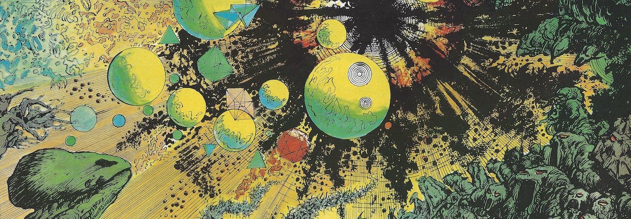
Comic du jour: Giant-Size Man-Thing #1 (Aug. 1974)

I bought this comic recently at flea market pretty much only because of the title. In general, swamp monsters and 1970s horror comics have never held much interest for me, but this was a lot more fun than I expected.

I imagine a lot of that comes down to writer Steve Gerber, who gives the story a kind of hip, tongue-in-cheek quality that keeps things lively. How else can you describe a story in which some occultists worship The Golden Brain, which falls into the swamp and emerges as a blank slate in a perfect body and joins a sort of hippy commune based on alternative energy sources. The cultists, who lost the brain during a scuffle with the Man-Thing, are ruled by a guy name Yagzan, who looks a lot like Richard Nixon. (And yes, there’s a bit of serendipity with a Nixon lookalike in an issue cover-dated with the month he resigned as president.)

There’s also a hip city radio reporter named Richard Rory, who looks a lot like Marvel’s then editor-in-chief Roy Thomas. Of course, Yagzan conjures a muck monster to fight with Man-Thing and the Man-Thing wins out, with Yagzan during to stone or something and sinking into the swamp. All of this is pretty fun, with fun art from Mike Ploog and Frank Chiaramonte and that color palette that only existed in the 1970s from Petra Goldberg.

All in all, a cool story, but there also was a great trilogy of backup tales reprinting monster tales from pre-hero Marvels drawn by Steve Ditko and Jack Kirby. I get why some folks really love these little oddball gems — they’re simple and fun diversions — even though I’m not likely to spend the big bucks on Marvel Masterworks or Omnibus editions because while the art is good, the stories just remind of other versions that I think work better (even though these comics came first).

For example, the ending of Ditko’s “Ice-Monster Cometh” reminds me of the gorilla gag at the end of Trading Places, while the plot device in “Goom! The Thing from Planet X,” in which the rampaging alien turns out to be a child, falls short of many similar tales told later on in the various incarnations of Star Trek. (I’m thinking in particular of “The Squire of Gothos.”) And I can’t help but evoke in my mind the bass player for U2 when the scientist in “I Was the Invisible Man!” introduces himself as Adam Clayton.

All in all, a cool comic with a funny name.

Comic du jour: Dazzler #1 (March 1981)

Of all the superheroes Marvel has created over the years, were created under stranger circumstances than Dazzler.

As chronicled by folks with a deeper love for this character (and I mean that in the most non-icky kind of way) than I will ever have, Dazzler began as a collaboration between Marvel and Casablanca Records in the 1970s. The idea was that Marvel would create a singing supehero character, Casablanca would find a real singer to fill the role and they’d make and cross-promote records, comics and even try to make a movie.

But having that many cooks meant there were many starts and stops on the project. Marvel’s then editor in chief Jim Shooter reportedly wrote a Dazzler movie treatment over a single weekend to try to make Casablanca happy. But things didn’t work out with Casablanca, and Marvel finally decided to put her out there as a guest star in a couple of top titles, namely The Uncanny X-Men #130-131 and The Amazing Spider-Man #203, before they gave her her own title about a year later. (BTW, the cover to that issue of Spider-Man was drawn by none other than Frank Miller. Also, the original art is currently for sale on eBay, though try not to gag at the asking price.)

Of course, by the time Dazzler #1 hit stands, the disco craze that inspired it was already dead and the character’s roller skates, disco slang and mirror-ball logo were instantly dated. Also, Marvel decided to make Dazzler its first comci book series to be distributed only in comic shops. The reasons for that aren’t clear, considering the character’s intended broad appeal should have been better served by the broader newsstand outlets. Either way, some 400,000 copies were pumped into comics shops — a sales figure that any publisher would absolutely kill for these days and a number that explains how I can buy this comic 29 years later for cover price at the Pasadena flea market.

The story itself isn’t that bad, though writer Tom DeFalco seems to go to great lengths to get wannabe singer Alison Blaire into the kind of trouble that requires superpowers to get out of. There’s also guest appearances from Spidey and the X-Men horned in here, too. The art’s decent but pretty dull, too — pencils were by John Romita Jr. before he’d really developed his own distinct style, with inks by Alfredo Alcala.

The villain of the piece was The Enchantress, who comes to Midgard and tries to take the singing gig Alison’s also trying out for. I don’t have a copy of Dazzler #2, but I really hope it’s a kind of superheroic proto-American Idol trashfest. I not only want to read that issue now, but I think I’d spend as much as 60 cents for a copy.

Who says comics aren’t cheap fun anymore?

Comic du jour: Ltd. Collector’s Edition C-27 – Shazam!

In honor of today being my dad’s 70th birthday, I’m going to review the first comic he and my mom ever procured for me: Limited Collector’s Edition C-27, a treasury size Shazam! comic from 1974. I would have been about five when I got this comic, which I seem to recall arrived by mail order and would have been requested by me because of the Saturday morning TV show airing at the time.

Looking back at this, it’s a pretty amazing first comic. Not only is it in the huge treasury format (80 pages for $1 must have seemed like a lot back then), but it reprints eight stories from the Golden Age run of Captain Marvel and the entire Marvel family.

The story that made the greatest impression on me was the Captain Marvel Jr. story, “The Man with 100 Heads!” There’s a sequence where Dr. Slicer, the villain of the piece, captures Freddy Freeman and sets him, gagged, in a guillotine. Of course, Dr. Slicer leaves before the blade drops, and Freddy manages to get the gag free in just enough time to say Captain Marvel and save his neck — literally! Something about that scene captured my imagination and never let go.

I bought my current copy of the book a few years back — my original long since discarded and gone. Looking at this book again, I was impressed by the quality of the art and the liveliness of these stories. It also looks great. The reproduction on those treasury size pages is crisp, sharp and lovely to behold. This also was a great package for kids — there were puzzles, clip activities, a fairly sultry pinup of Mary Marvel, photos from the 1940s Captain Marvel serial and, best of all, the table-top diorama on the back cover. I’m pretty sure I cut up the back cover of my original copy to make this. Thankfully, now I can just make a copy with my scanner. Here’s what the finished bit looks like:

Having tried to cut out all the bits around Billy Batson, I wonder if anyone at DC tried to see if a kid could do this well — or even safely — and get a good result. I’m not sure this looks a whole lot better than the one I did at age five, even with my now-obsolete paste-up skills. The final product looks a bit like the boxes those old Mego action figures came in.

Either way, it’s still a brilliant comic and one of my favorites.

Thanks, Dad.

Comic du jour: Detective Comics #437 (Nov. 1973)

I was visiting flea markets again this past weekend and came across a good deal on this classic issue of Detective Comics.

Was there ever a better time to be a Batman fan that the early 1970s? You had Denny O’Neil and Neal Adams doing their classic thing. And then there was this issue, the first edited and written by Archie Goodwin and featuring art by Jim Aparo and the first installment of “Manhunter” with art from then-newcomer Walt Simonson.

The lead story is a solid Batman detective story in which the Caped Crusader stumbles across and foils an elaborate criminal blackmail plan revolving around a mysterious artifact in a Gotham museum. (I’d like to know how often the Gotham museum cliche has been used in Batman stories over the years – I’d guess it’s in the top five.) But this is a solid, complete story told in a mere 12 pages. Aparo is one of those workman-like artists who never got the acclaim that guys like Adams or Simonson did, but he should have. Looking at the quality of both his storytelling and his illustrations, this is top-notch stuff. There’s even a stellar “silent” action sequence on page 2, in which Batman dispatches a group of rooftop thieves in an economical and compelling eight-panel layout. And Aparo still was a top-notch Batman artist more than 16 years later, when I first started reading his work on such seminal 1980s Batman stories as “10 Nights of the Beast,” “A Death in the Family” and “A Lonely Place of Dying.”

The backup story is known as a tried and true classic. I have a trade collecting the Goodwin-Simonson “Manhunter” stories, and they are definitive of the best comics of this era. Simonson remains one of my all-time favorite comics artists, mostly for his work on Thor, X-Factor, Star Wars and even Marvel’s old Battlestar Galactica series, (which I believe gave him his first credits as a writer). Seeing these stories from early in his career, it’s remarkable to see how consistent his distinctive art style has been, even as he improved his storytelling and drawing abilities in quite significant ways over the years.

Even more interesting is the letters page in this issue, in which Goodwin introduces himself as the successor to Julie Schwartz and outlines his plans for reviving Detective. (At the time, the book’s sales were slumping and the series was being published bimonthly! I don’t know how long this lasted, but I’m sure the quality of issues like this one helped turn that around.)

The weakest point of the whole package is, surprisingly, the cover. It looks like Aparo to me, but the illustration is poorly composed and completely overwhelmed by a design that overemphasizes the logo and trade dress. Even so, with regular comics today about to reach en masse the $3.99 price mark, this comic was a tremendously entertaining bargain, even at the princely sum (in 1973) of 20 cents.

Comic du jour: Space: 1999 #6 (Sept. 1976)

I realize this is the second John Byrne comics I’ve picked for this feature in a week, but I just came across this one and couldn’t resist for a number of reasons.

First, I loved the “Space: 1999” TV show when it was first on the air back in 1976 or 1977. It aired on ITV in Edmonton in the afternoons on Tuesday and Thursday, while “Star Trek” filled the same slot the rest of the week — making it perfect after-school viewing for a space fan in those pre-“Star Wars” days. The show seemed much cooler than it really was — especially now that I’ve revisited it on DVD — but the visual effects were terrific for the times, the Eagle was one of the coolest space ship designs ever, and this show had a great opening title sequence and theme.

Second, I bought this Charlton Comic off the stands when it came out and loved it for having all the action that the show promised but never really delived. The story is simple — an alien warrior whose ship is the size of an apple and more powerful than a small star slams into an Eagle on patrol and splits it in half. Commander Koenig, in the middle of the ship when this happens, is sucked out into space. There’s this great sequence where Koenig’s holding his breath as he twists and turns in zero gravity to try to reach his helmet. Byrne, who wrote and drew this tale, presents a great double page spread of 10 vertical panels of Koenig reaching for the helmet, counting down to the moment when Koenig’s lungs will burst. He grabs the helmet, of course, and manages to turn the back half of the Eagle into a flaring pinwheel that alerts his fellow Alphans to their location and they’re soon rescued. Simple, but cool.

Byrne’s art is the reason this whole thing works. All the elements that would in short order make him the most popular artist in the industry are here — in the inventive design of the alien, the detailed technology of the alien ship and the clean, sharp look of the Alphans’ ship and base.

It was about eight or nine years after this that I had returned to comics as a teenager and learned that Byrne was living just down the road in Calgary when he did this issue — a fact that surely would have impressed me to no end at the time I first read it.

The TV series remains a guilty pleasure for me — I own every episode from both seasons on DVD — but this comic remains my favorite Space: 1999 story and one of my favorite Byrne comics.

Comic(s) du jour: City of Dust #1-3 (Oct.-Dec. 2008)

Writer Steve Niles throws a pretty good twist into this five-issue series from Radical Comics. This starts off following the footsteps of Ray Bradbury’s classic “Fahrenheit 451,” introducing future copper Philip Khrome patrolling a future in which stories, religion and books are all banned. Khrome’s a dutiful cop, doing his duty by the book. But the twist — the twist! — comes out of left field (at the end of the second issue, no less) and really makes you sit up and notice. Perhaps given Niles’ track record as the creator of “30 Days of Night” (the comic rocks, even though the movie definitely does not), it shouldn’t have surprised me, but it did.

The art on the first two issues of this are by the mono-named Zid, with Brandon Chng and a few others chipping in. It follows the Radical style, which is rapidly becoming a house style. It’s a generally attractive, fully painted look that is dark and moody and looks in some way heavily processed. It reminds me of the look of the film “Beowulf,” which was dank and murky. That film also had detail, which is something that some more traditional comic line art could add.

I don’t know how much life this has beyond this initial five issues, but for now it’s a nice injection of coolness into the comic scene.

Comic du jour: Fantastic Four #562 (Feb. 2009)

I don’t know why the run by Mark Millar and Bryan Hitch on this title is not getting more attention, because it’s one of the most polished, pretty and interesting superhero comics out there right now.

This particular issue is a good example, even though it’s an issue that bridges the previous “Death of the Invisible Woman” arc and whatever comes up next. The bridging issue is the sort of thing we used to see a lot of in the 1980s (which for many of us was the last time we could keep track of Marvel continuity without a scorecard), especially in books like The Uncanny X-Men. Perhaps I’m just nostalgic, but it speaks to a certain degree of continuity that has been lacking in superhero comics, which these days tend to lurch from arc to arc, with dramatic shifts in tone and style coming every time the creative team changes.

Bryan Hitch shows why he’s so great on this book, delivering an art job that delivers in storytelling, design, emotion and realism. His portrayals of the FF team have been incredibly consistent, and no one since Kirby (OK, maybe Byrne at his best) has been able to create settings as perfectly suited to the cosmic tone of the title. These settings look like set designs — you can see the movie practically unfold before you. Lots of artists attempt this, but Hitch here is as close to cinematic as I’ve seen in a long time.

And Millar is no slouch either. The guts of this tale involve the funeral for the Invisible Woman (I won’t spoil it with an explanation — go get the back issues or the hardcover if you want to find out what’s going on) and a conversation between Dr. Doom and Reed Richards that is cool, in character and a lot of fun to read.

So, yeah, the first big complaint is going to be that this comic doesn’t come out on time, every time. But it’s worth the extra time and is, at least so far, nowhere near as late as Ultimates and Ultimates 2 became. It’s also completely self-contained and is exactly the sort of thing that I would love to see more of from Marvel and DC.

Comic du jour: FX #1 (March 2008)

This is a bit of a throwback to the days of simpler comic book superheroes that I picked up recently in a bargain bin, mostly out of curiosity to see what John Byrne’s drawing. The story by Wayne Osbourne tells the tale of Tom Talbot, a kid about 10 to 12 years old who mysteriously acquires a superpower that lets him pretend up any effect he wants. Taking the superhero name FX, he and his pal Jack test out the powers against a renegade gorilla.

This story began as a commission Osborne wrote and paid Byrne to draw, with the result getting picked up by IDW. This very much falls into the fairly rigid interpretation held by Byrne and the fans at his forum of “what superhero comics should be” and undeniably does evoke the kinds of stories comics told back in the days when the only place to get them was the spinner rack and every issue was somebody’s first. Byrne’s art remains clear and strong, even as it reflects the somewhat more cartoony nature of his recent work.

At the same time, FX is too much of a throwback — too simple and simplistic – to make much of a mark in today’s market. Just because this kind of tale worked once, doesn’t mean it still resonates with the same force, especially as kids are increasingly exposed to more choices and more sophisticated fare than ever before. The result is little more than a nice bit of well-constructed nostalgia that has all the relevance of a “Leave it to Beaver” revival.

Comic du jour: The Flash #309 (May 1982)

First in what I intend to be a regular series looking at various individual comics of yesterday and today.

This is a pretty typical comic from a period not remembered as especially good for B- and C-list titles. Still, there’s almost always an element of charm to be found in such comics — and this is no exception.

Written by DC workhorse Cary Bates, the story involves an alien who comes back in time from a future in which the superheroes have become legends. Pleased to find the heroes really did exist, he kidnaps Flash and attempts to extract his speed energy by force. Flash escapes and, during a mind-link, learns the alien has the best of intentions — he needs the power to save his world from an alien threat. So Flash takes him back in time a bit further to the day he got his powers so the chemical soup Barry Allen was doused with could be analyzed and duplicated on the alien. The alien gets the Flash’s powers and goes back to his time to fight the alien. Flash tags along to make sure everything goes OK, but the monster is too tough, forcing the alien Flash to sacrifice his life to stop it. In the process, he resparks interest in the ancient superheroes and Flash goes back to his own time.

Carmine Infantino does the pencils on this issue and give it that special flair only he can deliver. As a kid, I didn’t like Infantino’s art on the “Star Wars” series because it didn’t capture the likenesses of the actors very well. But I came around on that, thanks to Infantino’s graceful and unique artistic talents. A lot of Infantinoisms are on display in this issue, too, from the design of the alien space ship, to his inimitable faces peeking out from the hyper-sketchy speed lines, the soft features of the alien’s face, and of course the Infantino hands! There are some drawbacks too: The unfortunately phallic imagery of the cover (duck, Barry!); a story told almost completely in thought balloons and the occasionally excessive looseness of the art.

Then there’s the backup feature, an 8-page Dr. Fate story written by Martin Pasko and drawn by Keith Giffen and Larry Mahlstedt. This feels like the last of several parts, and I was pretty much lost as to what was going on. But Giffen showed his chops on the art, which was polished, compelling and fresh in the way that a lot of stuff from this era seemed at the time. I also love the use of color holds — line art printed using only the red, blue or yellow plate — to create a unique look that’s both archaic and still pretty cool even by today’s standards.

As always, there’s plenty of interesting ephemera in an old comic: The inside front cover ad for the first “Swamp Thing” movie; house ads for the debut of new series Saga of the Swamp Thing and Firestorm; and a letters page with a rare DC statement of ownership that puts The Flash’s 1981 average paid circulation at 92,151 copies — good enough for a top ten ranging in the direct market these days.

Powered by WordPress & Theme by Anders Norén