A longtime showbiz journalist and fan's thoughts on comic books, movies and other cool stuff.

Tag: Batman

Comic-Shop Memories: AAA Best Comics, 1990, Phoenix, Ariz., Part 2

A lot changed at the end of my third year at University of Arizona. My family was living in Phoenix, just off North 19th Avenue, way up north of West Bell Road. I don’t remember how, but I landed a summer job at a nearby Minit Lube. I mostly took service orders from cars that drove up, squeegeed windows, and vacuumed the floor mats.

Everyone has a job they survive. This was mine. The people were nice, and that was the best part of it. This was an open-air, drive-through oil change place. That meant you were not working indoors, where the Arizona summer temps could be tempered with air-conditioning. The boss was generous with using petty cash to get us Gatorade, water, or sodas from the Circle K next door several times a day to help us avoid dehydration, so that was nice. It paid slightly more than minimum wage — about $4 and change per hour.

But this was an especially cruel summer. On June 26, 1990, the temperature in Phoenix set a record: 126 degrees Fahrenheit — that’s 52 degrees Celsius for those of you who live outside the U.S. I was not working that day. I was home, with the shades drawn, the AC on, cold drinks in the fridge, watching movies on VHS in the dark.

At one point, I remembered I had left several music cassettes in my car and decided to save them. I put on flip-flops, grabbed my keys, and went out to the car. I opened the door and quickly grabbed the hot tapes, pulling my shirt out like an apron to carry them indoors. As I was walking back to the front door, I thought I had stepped in some gum. Looking down, I saw my flip flops were melting on the concrete driveway. I hurried inside and did not re-emerge until the rotation of the Earth had put a merciful end to the sun’s daily punishment.

Star Trek: The Next Generation, "The Best of Both Worlds"
One of the best TV cliffhangers of all time. It was uncertain that Patrick Stewart was coming back, so this really could have gone a number of different ways.

A few weeks before that, my Star Trek fandom hit new heights with the broadcast of the third-season finale of Star Trek: The Next Generation: “The Best of Both Worlds.” What a stunner! The third season had really taken off, and the show was now firmly boldly going into new territory in exciting, well-crafted and thoughtful ways. I miss it.

I remember catching early that summer a couple episodes of The Flash on CBS, which clearly took a lot of visual inspiration from the Tim Burton Batman movie success of the year before. It didn’t click with me, and was canceled at that point after only one season.

Warren Beatty in Dick Tracy.
Don’t have much to say about this movie, other than it seemed like a business venture more than a creative one.

In theaters, there was Warren Beatty’s Dick Tracy. This movie was very hyped in a clear attempt to emulate the success, again, of Batman. The miscalculation was in not realizing that Dick Tracy hadn’t been a character people cared about for decades at that point. There had been no resurgence of interest, or reframing of the character for the times, as Batman had gotten from The Dark Knight Returns and The Killing Joke. It was just an old comic strip, and the only strip back then that had any kind of active audience was Calvin and Hobbes.

Dick Tracy could have overcome that if the movie was better, but it wasn’t. It was a bunch of old actors putting on silly makeup to turn an old comic strip no one read anymore into a movie that no one really ended up caring much about. I haven’t seen the movie since it came out, though I do have a DVD somewhere of it.

Back to the Future, Part III
I like Back to the Future, Part III a lot more than Part II.

Other cool stuff going on that summer included the release of Back to the Future, Part III, which prompted a thorough review on my part of the previous two films in that series. In the end, only the first is a really great film, but the others are at least entertaining.

Less interesting was Die Hard 2: Die Harder. Not at all up to the standards of the first one — a movie series of true diminishing returns.

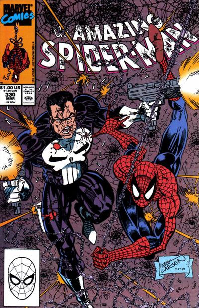
It was Spider-Man #1 (Aug. 1990) that drew me back to AAA Best Comics. I had a day off work the day the issue came out, June 19, 1990, and decided to head over to Ken Strack’s shop to pick up a copy. He had moved down the street — he was always on North Seventh Street — into a slightly larger space.

He had ordered plenty of copies, and I picked up two each of the green cover and the silver cover, and one each of the green bagged edition and the black bagged edition. I believe the bagged editions are still unopened in my collection somewhere.

I distinctly remember Ken raving about a new DC series called Shade the Changing Man. The first issue was recently out, and he talked up the striking Chris Bachalo art. I can’t remember if he gave it to me or if I paid for it, but I found myself agreeing with him that it was cool, and coming back for the next issue for at least the next two or three years.

It was overall a fun time to be reading comics, which still were cheap. Most DC and Marvel series cost $1 per issue, which made it easy to buy a stack of new, untried books for not a lot of money.

Marvel had this new-series program, where they introduced a new first issue each month for the first half of 1990. Among them were Ghost Rider, the John Byrne She-Hulk, The New Warriors, Guardians of the Galaxy, Byrne’s Namor: The Sub-Mariner, and McFarlane’s Spider-Man.

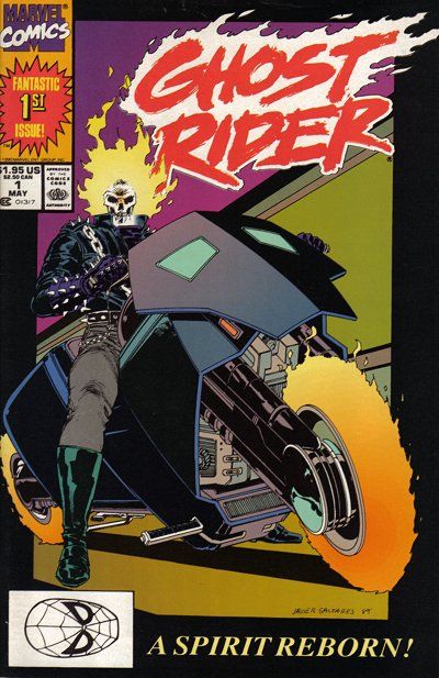
I was in on Spider-Man and Namor. The others, for whatever reason, struck no nerve with me. With Namor, the appeal was the art. Byrne was using duotone paper that gave his work a new element. And he had some good ideas for the character that made for a really fun read, namely having Namor forage lost treasure from the ocean floor to turn himself into a captain of industry.

I was still reading comics that summer. I recall really enjoying the various Batman and Star Trek series.

X-Men was in an unusual but still very interesting place. In the main X-Men title, writer Chris Claremont split up the team after Inferno and scattered them across the world. Many found completely new identities, with older characters fading away and new ones, as always, coming in. There were a lot of single-issue stories, with the overarching story building in the background — sometimes so deeply, it wasn’t clear to the reader, or even perhaps to Claremont himself, where things were going and how. These were the last Marc Silvestri issues, which were followed by a series of fill-in artists awaiting the inevitable arrival of heir apparent Jim Lee later in the year.

Fans were impatient with this approach to X-Men.

I recall reading in a copy of the Comics Buyers Guide a letter from a fan who answered another fan’s letter asking what the hell was going on in X-Men. The reply letter ended with a plea to Claremont to return to more conventional comic book storytelling, and a note from the CBG editors stating they paid the letter writer a small fee for all the work he put into answering the question.

The Uncanny X-Men #266 (Late Aug. 1990). The first chronological appearance of Gambit, though X-Men Annual #14 (1990) was released first.

The introduction of Gambit was much hyped, though the execution of it was a mess. It took a while for the comics to find some space in which to convey anything about him that wasn’t superficial. And I remember reading that Days of Future Present crossover between the Fantastic Four, The New Mutants, X-Factor and X-Men annuals, and being flat out unable to make sense of it. There was some nice Art Adams art in the X-Men episode, though.

The other X-Men titles seemed like they were in a bit of another universe. Excalibur’s Cross-Time Caper seemed to go off the rails a bit as Alan Davis wasn’t drawing every issue and there were even a few writing fill-ins for Claremont. The momentum, clarity and humor the book had in its earlier days burned off quickly and the title soon was passed around the Marvel office like a hot potato.

The same was true for Wolverine. After the solid but underwhelming arc by Archie Goodwin, John Byrne and Klaus Janson, there were fill-ins galore with a variety of artists and writers. And these issues came out while the book was published twice monthly in the summer months. These were supposed to be highlight issues, top stuff meant to drive traffic into comics shops. And it was far from special material.

In Louise Simonson’s corner, X-Factor had been a bit lost since Inferno, and in 1990 also was rotating through a series of fill-in artists drawing stories that at best were treading ground. I understand there were plans for Cyclops and Marvel Girl to finally marry and be parents to baby Nathan, but soon crossovers and changes in creative direction would push back that actually happening for years.

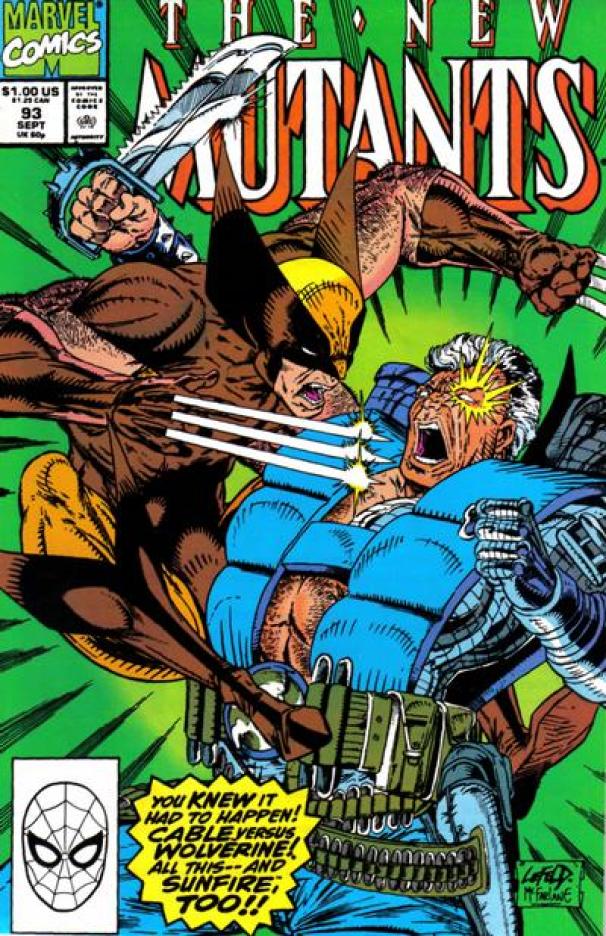
I had stopped reading The New Mutants shortly after Inferno. But Ken recommended issue #93 to me, and I was indeed impressed at Rob Liefeld’s more testosterone-driven take on these characters. That issue had Wolverine both inside and on the cover fighting Cable. I quickly put together the issues I had missed, which was very easy — I paid $3 for issue #87, which is now a key from that time.

The New Mutants #93 (Sept. 1990). Art by Rob Liefeld and Todd McFarlane.

As up and down as Marvel was, DC was even more more hit and miss. I tried Green Lantern, with the original Emerald Dawn series, followed by a regular title. This character just didn’t work for me. It was the same with Lobo. Everyone went ape-shit crazy for this character, but it was all one joke to me, and not one I found funny at the time.

I did very much like Justice League, which at the time was the brainchild of J.M. DeMatteis and Keith Giffen, and really quite funny.

Another title Ken recommended to me was Doom Patrol, by Grant Morrison. This was my first Morrison book, and it immediately stood out as something different, daring, and fun to read. I came on with issue #32, and it was years before I filled in Morrison’s run back to #19. But I bought every issue going forward and really enjoyed that book.

It was a quiet summer, to be honest. I was looking forward to going back to university in the fall, mostly because I had been hired as a reporter for the Arizona Daily Wildcat and was really excited to be a part of that team and to finally get some real experience in my chosen field of study.

For comics, it was in some ways the quiet before the storm.

These books were still enjoyable and worth buying while they were so cheap. But they also weren’t really satisfying, either.

When the bottom didn’t fall out after the year of the Batman movie, it felt like there was an explosion waiting to happen. That there were new heights to reach. That all it would take was the right book at the right moment, and comics would vault out of the shadows and into the mainstream. The signs were there, with an influx of brash boys in comics shops wondering aloud why Batman doesn’t use guns, or why Marvel doesn’t make Todd McFarlane draw Wolverine, or expressing in plainly lustful language their admiration for Jim Lee’s latest rendering of a swimsuit-clad Psylocke.

All things in their time.

Jim Lee Psylocke pinup from Marvel Illustrated: Swimsuit Issue (1991). Yes, such things existed.

Comic-Shop Memories: Fantasy Comics, 1989-90, Tucson, Ariz., Part 1

I don’t remember why I stopped shopping at AAA Best when I started my junior year at the University of Arizona. Instead, I starting shopping weekly in Tucson at Fantasy Comics, which is located at 2745 N. Campbell Ave.

Fantasy was in an unremarkable one-story building, with a glass case at the front full of its more expensive comics. New releases were racked to the immediate right. The rest of the current comics were stocked in alphabetical order in racks that stretched to the back of the shop. The main floor featured lots of back issues. Charlie Harris, a frequent DC “letter hack,” either owned the store or worked there.

One of the most memorable things for me about shopping at Fantasy was that back issues were in heat-sealed bags. To get them open, you needed scissors, so there were lots of discarded comic bags in my trash.

Into the Trek comics wormhole

I fell deep into Star Trek at the time. DC published in August new Star Trek and Star Trek: The Next Generation series that I really enjoyed. Star Trek V: The Final Frontier had done poorly at the box office and with critics, but Star Trek: The Next Generation‘s third series debuted in September and was by far its best to date.

But it was the classic Star Trek comic that really caught my eye. It had clever scripts by Peter David and slick art printed on good paper from the team of James Fry and Arne Starr. And nothing beat those covers by Jerome K. Moore. They are spectacular and I never tire of looking at them or admiring the skill Moore brought to those illustrations.

My Star Trek obsession led me to a Star Trek convention experience that cemented my fandom for that franchise. It was a weekend Creation Convention at the Tucson Convention Center, with special guest Patrick Stewart.

Prior to Stewart’s entrance, Gene Roddenberry’s assistant, Richard Arnold, previewed upcoming episodes of The Next Generation. These were sneak peeks at some of the best in the series’ run: “Deja Q,” “Yesterday’s Enterprise,” “Sins of the Father” and “Captain’s Holiday.”

Stewart appeared for a charming Q&A session at the end of the day. Among the secrets he revealed: He had accepted a teaching job at the University of Arizona. But the offer slipped through through the cracks and after landing the role of Captain Picard, he never looked back. What might have been!

Marvel’s X-Men on the rise

The other hot franchise was X-Men. It had been a best-seller for years at this point, but new artists raised the excitement to a new level. Jim Lee’s arrival on X-Men seemed inevitable after lengthy runs on Alpha Flight and Punisher War Journal. He did a few issues here and there at first, before taking the full reins in the summer of 1990. At the same time, Rob Liefeld also was pitching in on X-Men titles and getting some heat. He took over the penciling chores on The New Mutants in 1990 and introduced Cable, another high point. Erik Larsen took over penciling The Amazing Spider-Man from Todd McFarlane, who was set to launch a new Marvel title. With Marc Silvestri jumping from X-Men to Wolverine, the seeds of the Image revolution were taking root.

But Star Trek had sort of taken over my mind. I collected the first DC series, re-watched the movies and original TV shows, and even enjoyed some of the Star Trek novels. “Writer of Stuff” Peter David was the creator whose work I most enjoyed, leading me inevitably to The Incredible Hulk.

Lost in the aisles of Bookman’s

Fantasy was but one of the shops I frequented that year. Another mainstay was Bookman’s, a used-book store that filled a former grocery store space with tons of fascinating objects. Each visit took hours, it seems. I’d start with out-of-town newspapers and move on to a newsstand section full of old and new magazines. Then there were aisles full of used books, cassettes, CDs, and bargain low-grade comics. I always flipped through Comics Scene and the Comics Buyers Guide, catching in the latter news of a Peter David signing at All About Books and Comics in Phoenix. I skipped out on school to drive up from Tucson in time to hit the Thursday evening event.

The Hulk tour hits Phoenix

The signing was part of a tour promoting David and artist Dale Keown’s work on The Incredible Hulk. Keown had only drawn two issues of Hulk at this point, and the signing was sparsely attended. That gave everyone a chance to hang out with David and Keown and chat about a lot of things. David signed several Star Trek issues for me, a Next Generation novel he’d written, and some Hulks. He joked about calling his editor back in New York to rave about the warm Arizona weather.

To my surprise, Keown hailed from Alberta, so we talked about Canada and Arizona, as well as comics. I remember he sold the splash page to The Incredible Hulk #367, his first issue, for about $150. A few years later, I saw the same page for sale in another Phoenix-area store for many multiples of that.

The signing was part of a mini-tour that continued that weekend to comic shops in Los Angeles and Las Vegas. All About produced a poster for the signing similar to the McFarlane one I wrote about previously. Mine is framed but in storage.

Hunting for back issues in Tucson

After that, I started seriously looking for back issues of The Incredible Hulk. David had been writer on Hulk for about three years, and I began by tracking down his back issues. I often visited a Tucson shop called Comics and Things, located in a strip mall at 3934 E. Grant Road, in search of Hulk and Star Trek back issues. It had a good selection of recent back issues but soon vanished into the ether.

The writing and art on Hulk surprised me. David started with a fairly conventional Hulk story with McFarlane on art. Their collaboration ended with a satisfying climax that completely changed the series’ premise. David next turned the Hulk gray and got him a job as a high-end Las Vegas bouncer named Joe Fixit. Jeff Purves drew this run and did a fabulous job before disappearing from the world of comics.

Hulk was so good that Sam Kieth drew the fill-ins — if you could call them that.

Keown drew Hulk for the next three years, and it became was a huge hit. David stuck with the title for years after, and still writes new Hulk stories from time to time. Great stuff.

How much is too much Batman?

This also was a time when Batman was still riding high on the popularity of the Tim Burton movie. So Batman was super-hot and DC released in the autumn of 1989 Legends of the Dark Knight #1. Promoted as the first new solo Batman book since 1940, this series set free top talent to do their ultimate Batman story.

The first issue also marked the first time I remember variant covers from a major publisher, as DC promoted the book with a second cover that came in four different colors. They said in the book that it was “just for fun,” but the result surely made DC’s accountants happy as fans decided they needed to have a copy of each color — and therefore bought four copies of that first issue.

Pointing out the differences between Tucson and Phoenix, that first Legends of the Dark Knight sold out immediately down south. The same was true of The New Titans #60 and 61, which were key parts of the current Batman storyline, “A Lonely Place of Dying.” I easily found both on my first comic shop stop on my next trip to Phoenix.

Next: My short career as a “letter hack.”

‘Batman: Earth One’ is redundant and pointless

It’s taken almost three years from its first announcement for Batman: Earth One to arrive, and reading it the same weekend The Dark Knight Rises was released in theaters, the only questions to ask is: Why?

This is not a bad comic, by any stretch. It’s well-written by DC’s chief creative officer, Geoff Johns, and features some very nice art by Gary Frank. Like Superman: Earth One, this is a 144-page original hardcover graphic novel selling for $22.99 aimed at new readers by retelling the origin story as though it were happening today and updating certain elements to make that work.

So we have many of the familiar elements: The shooting deaths of Bruce Wayne’s parents, his struggle to find the path of becoming Batman, and being successful as Batman. We also have the younger Jim Gordon, who’s struggling with being a good cop in a corrupt city. And of course, the two form an uneasy-at-first alliance that we know will become a pivotal relationship for both.

The biggest differences this time around is that Alfred is much younger, and as a former soldier is a much more gruff and ornery bastard type character. We also have an interesting introduction for Harvey Bullock, who arrives in Gotham seeking to lift his fame and fortune above the success he’s had hosting a real-crime TV show in Hollywood.

Most all of this content has been much better before in Batman: Year One. And I don’t know that we really need yet another ongoing version of the character after the reboot of The New 52 and seemingly forgotten efforts like All-Star Batman and Robin, The Boy Wonder and the endless variations of Elseworlds.

Also, this book doesn’t change the status quo of Batman as radically as Superman: Earth One did for the Man of the Steel, making it seem even more superfluous. And with the success of the many versions of Batman on film, in television and those DC Universe original animated movies, the need to radically update and constantly remind people how Bruce Wayne becomes Batman appears even more ridiculous.

It will be interesting to see how much further DC goes with the Earth One line, the very idea of which was trumped by The New 52. Short of a sales success on a par with Superman: Earth One, which is certainly possible, I see this dropping off fans’ radar quickly. For new readers, I still think Year One is better than Earth One.

Ranking DC’s New 52

We’re now about halfway into the second month of DC Comics’ The New 52, and I’m now at the point where I have to pick and choose which books I really want to follow and plunk down my own money for. So I made a list and found it quite interesting.
The good news is that I am buying more DC Comics than I was before the relaunch, when I was pretty much just getting the core Batman books. 
Starting with the books I liked enough to stick with, these are the titles I have bought the second issue for already:
  • Action Comics
  • Animal Man
  • Batgirl
  • Detective Comics
  • O.M.A.C.
  • Batman and Robin
  • Batwoman
  • Batman
These books I definitely plan to buy the second issue of:
  • Justice League
  • Wonder Woman
  • Superman 
  • I, Vampire
That’s 12 so far, just one title less than a quarter of the New 52 offerings. 
These books I am very likely to pick up, availability and funds allowing: 
  • Supergirl
  • Aquaman
  • Batman: The Dark Knight
  • Superboy
  • Green Lantern Corps
  • The Flash
So if I pick up those books, that means DC got me back for 18 of the 52 books. Again, that’s not too bad — it’s a lot more than I was getting. 
These books just missed the mark for me, and I could reconsider:
  • Green Arrow
  • Swamp Thing
  • Deathstroke
  • Green Lantern
  • Blackhawks
  • Teen Titans
I admit that I had picked up Green Lantern #2 at the store last week, but changed my mind and put it back once I saw Love and Rockets: New Stories, Vol. 4 was out. 
These titles were the mediocre group of the bunch — not bad, but also neither interesting enough or good enough to make me want to come back. And I’ll admit, some of these surprised me.
  • Batwing
  • Hawk and Dove
  • Justice League International
  • Men of War
  • Static Shock
  • Stormwatch
  • Demon Knights
  • Frankenstein, Agent of S.H.A.D.E.
  • Grifter
  • Legion Lost
  • Mister Terrific
  • Resurrection Man
  • Birds of Prey
  • Blue Beetle
  • Captain Atom
  • DC Universe Presents
  • Legion of Super-Heroes
  • Nightwing
  • All-Star Western
  • The Fury of Firestorm
  • Green Lantern: New Guardians
  • The Savage Hawkman
  • Voodoo
That’s a full 23 our of 52 books that fall into that category, nearly half of the line.
And then, there’s the titles I actively disliked or thought were flat-out terrible.
  • Red Lanterns
  • Suicide Squad
  • Catwoman
  • Red Hood and the Outlaws
  • Justice League Dark
Again, not bad, but the relaunch hasn’t really improved the quality of DC Comics, despite all the hype. I wish that the publisher had taken the time to dig deeper in terms of talent and offered up more surprises. They only get one shot at this — at least for the time being — so I would have liked there to be more comics that I could wholeheartedly recommend to both lapsed fans and new readers.

DC’s New 52, Wave 3, plays it safe except when it comes to sex

The final batch of first issues in DC’s New 52 arrived Monday this week instead of Wednesday. I’ve already read a few that I quite like, but I have to wait until tomorrow because of the embargo. That leaves me with today to catch up and go through all of last week’s books, which contained more than its fair share of bombshells.

FYI, due to some of the topics that came up in this week’s books, the language used below may not be suitable for all ages. Proceed at your own risk.

Top book on the pile is Wonder Woman #1, by Brian Azzarello and Cliff Chiang. As you might expect from Chiang, the book looks great and is well colored with an appropriately moody palette by Matthew Wilson. The story is a pretty significant deviation from the typical Wonder Woman story, getting into an area I think you could call occult, except it deals with Greek mythology so maybe that’s a better way to describe it. But it is darker in tone and look that the shiny, bright take on Wonder Woman that has prevailed over the years at DC. I’m not sure how effective this is as a first issue, however, because not much is explained. Diana doesn’t even appear until halfway through the issue, where she’s found sleeping naked (though covered) in a London flat. It’s not clear what the set up is, who she’s supposed to be or how she’s intended to fit into the world. I think Azzarello and Chiang have a bit more leeway based on their reputation to get things going in the next couple of issues, and this was much better than the Odyssey revamp of last year. So, this is promising.
Dick Grayson gets his old costume and book back with Nightwing #1, which was a competent if completely average superhero comic. The art by Eddy Barrows and J.P. Mayer is nice, and I enjoyed the scenes where Dick returns to the circus he grew up in to say hi to his friends. I don’t know if anyone has ever done that idea before, but I thought it was a nice touch here. The superhero-ing part of the book was less thrilling, and I really wish the industry would institute a ban on the hero narrating the story in captions. That was interesting and effective in 1982 when Chris Claremont popularized it on the first Wolverine miniseries, but it’s been overused to death. How about having characters talk to each other once in a while? It might be a good trend to start.
I really wanted to like DC Universe Presents #1, featuring the first part of a new Deadman story by Paul Jenkins and Bernard Chang. It almost completely won me over, too, because this is a good character and Jenkins does some interesting things with it. But somehow it just didn’t cross the finish line and I’m not entirely sure why. The art’s well done, though not as stylish as I remember Chang’s art being in the past. Maybe it’s just that a character called Deadman is a bit of a downer, and this needed a bit of brightness in it to keep it from just being dim.
Batman #1 is one of the slickest releases so far, and I mean that in a good way. Scott Snyder writes a really good Batman, and this debut pulls in a lot of elements and kicks off a pretty good mystery. It also looks fantastic, with Greg Capullo on pencils bringing just a hint of Todd McFarlane-style cartoonyness that recalls, for me, the much-beloved Batman: Year Two arc of 25 years ago. It’s slickly polished by inker Jonathan Glapion and the result is a book that any Batman fan, old or new, should be able to get behind. 
Green Lantern Corps #1 was surprisingly violent, which is not something I expect from this particular franchise. It’s all in service to the buildup of the story to introduce a very serious and grave threat to the Corps that should make a nice backdrop for the lead characters of Guy Gardner, John Stewart and Kilowog to tackle. It was the character stuff that I most liked about this issue, even though it didn’t make much sense to me. I don’t see why Guy wants a full-time coaching job, when he seems too busy as a Green Lantern to even begin to fulfill that role well. I have a soft spot for both Guy and John, so this may turn out to be the GL series for me if they can keep it up. 
Blue Beetle #1 is a complete reboot of the most-recent version of the character, the Jaime Reyes one. This is a typical origin story, that establishes where the Blue Beetle power comes from, how it gets to Earth and how it ends up affecting Jaime. Not having read the previous Blue Beetle series, I don’t know how different this is from what was done there. It’s OK, kind of the typical high school stuff comics readers have known and loved since Peter Parker was a lonely student at Midtown High, though with a Latino flavor and set in Texas. The art by Ig Guara is solid, and it works OK as a comic book but does nothing to really elevate it past pure middle-of-the-road mediocre to must-read level. 
Captain Atom #1 is at about the same level as Blue Beetle. It’s a competent setup for a series, but offers nothing really new to set it apart. The script by J.T. Krul takes no real risks with a character that you could do just about anything with. And Freddie Williams III’s art is surprisingly sketchy, which I think is the wrong style for this character, who I think would work better with a clean, technical look. I can’t help but compare this to the recent Dark Horse run of Doctor Solar: Man of the Atom, as the good Doc and Captain Atom are very similar characters, and while neither sets the world on fire Captain Atom seems the lesser of the two.
OK, now things get interesting with the awful Red Hood and the Outlaws #1, by Scott Lobdell and Kenneth Rocafort. This was another of those titles that, being brand now, I hoped would offer something surprising and different. Instead, we get the most juvenile, pandering book of the bunch. The book starts with Red Hood, a.k.a. the former Robin known as Jason Todd, breaking out Red Arrow from a prison. Hood’s aided by Starfire, formerly of the New Teen Titans, and the three of them sit on a beach, have sex and agree to team up for some outlaw-ish “jobs,” the first of which goes wrong. This book got a lot of deserved criticism for its portrayal of Starfire as a super-hot amnesiac who’ll fuck anyone who asks, while Red Hood and Red Arrow act like Jersey Shore castoffs who are drinking and high-fiving each other over getting to fuck Starfire like they’re on spring break. Now, I get that there are a lot of young men and boys in the DC target range who act like this or would like to act like this. And there’s no denying that a lot of this kind of skeevy behavior on the part of the guys and the girls goes on in frat houses and at spring break bashes every year. But the appropriateness of this in a DC Comic rated “T for Teen” is at least questionable. But the biggest problem by far is the degradation of Starfire. This is a character who, in the original New Teen Titans comics, was certainly a bit voluptuous, but also was far from stupid or casual. Her romance with Dick Grayson developed convincingly over time and turned out to be quite sweet, normal and responsible for folks in their late teens. I remember what a scandal it was when a single panel implied Dick and Starfire shared a bed, and how much smoothing of ruffled feathers writer Marv Wolfman had to do to defend that idea. The other thing that strikes me is that the best-known version of Starfire would be from the animated Teen Titans series, in which she was a skinny, sweet, kind of shy girl. Anyone who likes or expects either version of the character is going to be horrified to see Starfire so blatantly turned into a walking, talking fuck toy for a pair of quite unlikable characters for whom it’s apparently OK to be assholes because they’re “outlaws.” I don’t know how much blame to lay at the feet of Rocafort, who is a terrific artist, because I don’t know how much of a say he had in the story. The book does look nice and he draws a very sexy fantasy girl. But the overall package is just one that makes me think there’s no point to this title than to be shocking, stupid and quite insulting to readers of all ages and genders.
Birds of Prey is a title that I’ve tried and read for short stints a number of times in its long run. The idea is great, the title is great, but I’ve always found it never quite achieved the scale it needs to be the megahit it could and probably should be. Birds of Prey #1 does nothing to change that assessment, though it definitely rises above the middle of the crop. This is a new version of the Birds team, with Black Canary still in charge but, with Oracle now back in the Batgirl costume, the team now includes Poison Ivy, Katana and what appears to be a new character called Starling. Not every team member appears in this first issue from writer Duane Swierczynski, but Black Canary’s character and the intro of Starling are compelling enough to hold the center. There’s some good action in here too. And I like the art, by Jesus Saiz, though I would like a little more detail and coloring that’s less dark. 
Supergirl #1 is one of my favorites from this week. It offers a compelling introduction for Kara from writers Michael Green (of the Green Lantern movie) and Mike Johnston, and some very stylish art from Mahmud Asrar and Dan Green. Most of this issue is a big fight scene, with Supergirl discovering her powers and kicking some serious ass, and it’s quite well done and a lot of fun to read. The finale, in which Superman arrives, makes me think it was a mistake for DC to publish Superman #1 in the final week of September, as he’s appeared as a cameo in a number of other issues now without his new status quo having really been established. Either way, this was a fun one.
Legion of Super-Heroes #1 is very much standard-issue Legion. I’ve tried a couple times to get into the Legion, but either I’m not finding the good stuff or it’s just not my cup of tea. The stuff I have read that I like is very similar to this story, from Legion veteran Paul Levitz and artist Francis Portella. I don’t know if this has any appeal to new readers, but I imagine it’ll make the Legion’s many fans happy.
Lastly, we have the other bombshell of the week in Catwoman #1, the climactic scene of which caused a huge outcry because, well, it shows Batman and Catwoman rather explicitly having sex. Thankfully, DC upped the rating on this one to Teen +, so those 12-15 year olds won’t be exposed to it. Before I talk about the sex scene, I’ll talk about the rest of the issue, which I thought was decent. Catwoman has always been a sexualized character, from the old comics to the 1960s TV show to Batman Returns and, I’m sure, in the upcoming movie The Dark Knight Rises. It’s part of her appeal, that she’s a villain who’s also so tempting in many different ways to Batman. She’s often been shown as willing to use her sex appeal to get what she wants, again it’s part of the modus operandi. I think a non-sexy Catwoman would be a boring Catwoman. 
The specifics of the way writer Judd Winick and artist Guillem March try convey that she’s sexy are questionable. Laura Hudson at Comics Alliance wrote an excellent piece and explained why she had a problem with the character’s face not appearing until the third page while the first two were full of closeups of her cleavage and butt. I get the point but I don’t think there was any malice in it — it’s a common technique that only becomes an especially notable backfire when you get to the end of this issue. 
The final scene consists of Batman showing up at Catwoman’s place, they fight and the fight slowly turns to stripping off gloves and clothes and a particularly creepy final splash page of them seemingly in coitus. This crosses a whole bunch of lines that it would have been best to not cross, and there’s a lot of reasons for disliking it from the general distaste of having to think about things like Batman’s erect penis penetrating Catwoman (a sentence no one with taste ever wanted to hear uttered) to what it says about how DC’s creators view women. 
I think the relationship between Batman and Catwoman should remain a kind of tense, will they or won’t they thing. The conflict for Batman is that he’s attracted to her but she’s a thief, and for him to give in on this and either let himself be seduced or use his costume and cape and resources for the mundane purpose of getting laid is beneath him. I think it’s less problematic for Catwoman, who always has used sex and has a more flexible morality than other characters. I know Catwoman has been recast from being a straight villain to a kind of anti-hero in the past 25 years, but it’s that conflict and that ability she has to operate in these murky areas that define the character. Which doesn’t mean I think it’s good for her character to be portrayed having sex with Batman in such detail. It’s just gross, and I thought so just as much a few years ago when Frank Miller and Jim Lee did a scene in All-Star Batman where the Caped Crusader has sex with Black Canary on a rainy pier at the Gotham harbor. I also remember hearing morning zoo deejays making fun of the scene in the 1989 Batman movie where Bruce and Vicki have sex. The joke was something along the line of what kind of sound effect will appear on the screen (a la the 1960s TV show’s infamous “Biff!” “Pow!” “Pop!”) and thinking they weren’t wrong. They were assholes, and one of them may have been Glen Beck, but they weren’t entirely wrong. And the X-Force: Sex and Violence miniseries of a few years back in which Domino made explicit references about wanting to or having given Logan a blowjob were not sexy, just icky. 
It’s OK to imply sex — even casual sex — between characters if it works for the characters and the story, but this kind of explicitness with these two characters violates all common sense and good taste, and denigrates all the work involved. And it’s a shame, because I think without the sex scene, this was shaping up to be an OK comic book. But instead it’s something to denounce and decry and get upset about. 
 
Tomorrow: The beginning of the end of the New 52 launch month! Superman! Aquaman! Blackhawks! 

Batgirl Surprises, ‘Tec Shocks and Two New 52 Surprises

It appears that Batgirl #1 by Gail Simone, Ardian Syaf and Vicent Cifuentes is the surprise hit of The New 52, becoming the first book to sell out in many stores. It’s no surprise that Simone writes a great Barbara Gordon, but I was especially impressed by the artwork. Not only was it attractive looking and nicely polished, but the coloring by Ulises Arreola really added to the tone of the book without sacrificing clarity. I keep harping on this point, but coloring has been a real weakness at both Marvel and DC in recent years and it’s nice to see DC make a concerted effort to improve the coloring in their comics. The story was very engaging, though I missed exactly how Babs got the use of her legs back. The new outfit is very cool and the book is overall just a good bit of fun. I’m not sure why this particular book is so in demand — it could just be pent-up demand for seeing Barbara back in the cape, but I think there’s more going on here and I hope the book continues to be as much fun to read as this first issue.

OMAC #1 was a book I thought had potential right from the start. This was a great concept for the character when Kirby came up with it back in the 1970s, but its original run was cut short and no one has ever quite found the right mix. But Keith Giffen, getting back into the Kirby mode he exhibited years ago on Legion of Super-Heroes, really delivers a story that gets the Kirby spirit right. Working with Dan DiDio as co-writer and Scott Koblish as inker, this is another action-packed and fun comic book that evokes the King’s work in every panel and twist and turn of the story. That it does so without seeming dated is an impressive feat that few other Kirby imitations have succeeded in doing. This is exactly the sort of book I was hoping to find in the New 52 — an unexpected surprise that delights and entertains.

Detective Comics #1. The last time we saw a Detective Comics #1 on the stand was March 1937, and this  is the title from which the company derives its name. (Yes, DC Comics does mean Detective Comics Comics, and trying to correct that lack of logic is just as pointless as trying to get people to stop saying ATM machine.) So, this is one of the titles that changed the least, with writer and penciller Tony S. Daniel moving over to ‘Tec from the same job on the just-concluded run of Batman. Daniel does raise the bar here. The storytelling is better, the color is better and the scripting is better than his recent Batman run. He’s also telling an especially intense story with a conclusion that is already getting a lot of shocked responses online. I admit that it surprised me, by being both unexpected and particularly gory for a Batman comic. But it does make me want to read more.

Green Arrow #1 is another example of the kind of book I was hoping to find in the New 52. Now, Green Arrow has never been a character I’ve been especially fond of. He is, after all, a guy with a bow and arrow. I walk my dog in Lower Arroyo Park in Pasadena, and see archers there almost every day at a public range down there. Archery just isn’t threatening to me in the same way that firearms would be, even in a safe setting like a shooting range. As a character, Green Arrow has always been a bit of a caricature, going all the way back to his role as the voice of hippiedom in superhero comics when he teamed up with that square dude Green Lantern way back in the early 1970s. This new Green Arrow keeps Oliver Queen as the hero, but updates him to be much more modern and less one-note. Gone is the goatee, and Queen is like a young Steve Jobs who runs a major tech company as a side job to playing superhero. He’s assisted by tech girl Naomi and skeptic Jax. The book is, again, heavy on the action and it plays like vintage late 1980s DC, courtesy of writer J.T. Krul, penciler Dan Jurgens and inker supreme George Perez. The art really helps sell this book, as both Jurgens and Perez are veteran superhero artists who seem to relish the opportunity to revisit a more fun take on this character. This book would have easily fit into the post-Crisis on Infinite Earths relaunches of 1986-1989, which makes me very happy because that’s perhaps my favorite era of DC Comics.

One more post to wrap it up.

Wilma Flintstone in Batman? Joker in X-Men? It’s all in the coloring …

It’s strange the things you notice when you’re reading a comic. Take this panel from DC Retroactive 1970s Batman:

“Oh, Willlllmmmaaaa!” 

I don’t know if this was intended by writer Len Wein and artist Tom Mandrake or if colorist Wes Hartman is just having a bit of fun. Of course, The Flintstones is part of the Warner Bros. animation empire, just as the DC Universe is.

It reminds me of this panel from X-Men #130, about which artist John Byrne later said he had hoped colorist Glynis Wein would pick up on his idea and color it in green, white and red. Here’s the printed panel:

The joke’s on Scott and Jean.

Oddly, Byrne also has said in interviews that he realized as a child that he could write stories with the best of them when he came up with an idea for a TV series about cavemen who had prehistoric equivalents of modern conveniences long before The Flintstones came on the air with much the same idea. 
I admit I liked the three Retroactive issues DC publicity was kind enough to send me, though I admit to not being interested enough to buy any more of them. This is a good idea for a project, and the reprints were nicely chosen, but it should have been spread out over more than a month. Six specials each for the 1970s, 1980s and 1990s at $4.99 a piece ads up to a whopping $89.82, which is way too much.

Mutants drift further from Utopia, but Batman and Spidey are doing quite well, thanks

It’s taken me a awhile to get to reading the giant stack of comics that piled up the past few months. Reading them has been sadly dull — I don’t know if it’s the comics or if it’s me, though I suspect if everything was a great read I wouldn’t have written what I just wrote. So let’s get to it.

Dark Avengers/Uncanny X-Men: Exodus #1 (Marvel, $3.99) is the conclusion to the Utopia crossover storyline, and it’s reasonably good. That’s to be expected when you have folks like Matt Fraction writing and Mike Deodato and Terry Dodson drawing. The Utopia storyline was pretty overtly political for X-Men, starting with an initiative called Proposition X that would require medical birth control for all mutants. That leads to the mutants, who’ve established San Francisco as their new home base, going on the riot path and H.A.M.M.E.R. director Norman Osborn bringing in his Dark Avengers to restore order and discredit the X-Men and install his own lackeys — the Dark X-Men — as the public face of mutant kind. It’s a heavy handed and painfully obvious attempt to tie the mutants into the gay rights issues that are at the forefront of society. And that would probably work, but there’s such a sense of change fatigue when it comes to the X-Men franchise that none of this really has a chance to stick. It was only a year ago that the X-Men came to San Francisco, and nothing about that switch really stood out as meaningful or interesting — and now we’re on the move again to the remnants of Asteroid X, now renamed Utopia. It would have been nice for the X-Men to have stuck around San Francisco long enough for that setting to made a difference. And it’s hard when your arcs all run four, five, six issues to establish a real sense of place the way comics used to back in the days when they were periodicals through and through. I think of the first Wolverine series from 1982, where that setting of Japan really came to life and was important to the story. Nowadays, even with a half dozen spinoff titles, the X-titles (and Marvel titles in general) have become kind of cookie cuttered in the Bendis mode — where characters’ dialog rarely has much to do with the story and the overall tone is self-conscious and self-referential to the point of inanity. All of this was fresh 10 years ago, but at least for me, this style has worn out its welcome.
I also read the Utopia tie-in issues Dark X-Men: The Confession #1 (Marvel, $3.99), X-Men: Legacy #227 (Marvel, $2.99), both of which suffer from much the same symptom. Confession is basically an entire issue of Cyclops and Emma Frost having it out over the status of their relationship and their respective guilt and responsibilities in the whole thing. And character is important — it’s part of what made Marvel great — but this exemplifies the self indulgence that I think is plaguing the X-books in particular. Another example is The Uncanny X-Men #515 (Marvel, $2.99), the first issue of the new “Nation X” storyline that heralds the return of Magneto, usually a big event with lots of drama even when it’s not done well. But here, it’s sudden and just seemingly random. Even the things that should work don’t — a minor character dies in a rather nice scene, but again it’s a character who hasn’t been around long enough or done anything interesting enough for the reader to care about his passing with the same passion some of the X-Men display.

In the Wolverine corner of Marvel, Mark Millar and Steve McNiven’s alternate future run concludes in Giant-Size Wolverine: Old Man Logan #1 (Marvel, $4.99). Alternate future storylines can be fun, and this one has had its moments of coolness. But the ending, delayed from the regular run of the title to this special, is disappointing for just being so damn obvious. This post-apocalyptic Western tale, in which Old Man Logan has to rediscover his spine as he tries to protect his family from the victorious supervillains that rule the land. The end, however, sees Logan finally pop the claws and go to town on everyone — but it does so in so mundane and excessively violent a fashion that it’s hardly satisfying or even terribly interested. The art’s nice, even though it’s a bit gross at times, but this ending throws no curves at all and I couldn’t help but think, “That’s it?”
Still, it’s better than X-Men Origins: Wolverine #1 (Marvel, $3.99), the most recent Origins one-shot. I guess this does a decent job of recapping the character’s origin and making it jibe, both storywise and visually, with what appears in the movie of the same name. But in simplifying the story, it loses the interesting parts of the good stuff and exposes the lame stuff for being truly lame. It also doesn’t do much to explain itself — like who are Heather and James Hudson, who weren’t in the movie? The art, however, is nice — no surprise since it’s by Mark Texeira, who did a good job drawing the Wolverine series way back in the early 1990s.
X-Factor #47-48 (Marvel, $2.99 each), continues to be a consistently entertaining read. Yeah, it’s gotten complicated, with future Dr. Dooms, an adult Layla Miller, a future Cyclops and more Madrox dupes than you can shake a stick at. But writer Peter David does a good job of giving everyone a personality and structuring his story so that it’s entertaining even if you don’t remember every detail of the previous 46 issues.
Before we leave the mutant corner of the Marvel Universe, there’s X-Men Forever #7 (Marvel, $3.99), which reminds me how great writer Chris Claremont was at establishing a new direction for a series and how quickly the new status quo could be forgotten. After a memorable five-issue opening arc, the last two issues have been a lot more murky and directionless. This one features a lot of flashing back on Nick Fury’s part to the days when Logan (currently believed dead in this timeline) did a lot of dirty work as a solider. It’s all still very recognizably Claremontian, which is comforting at times, but lacks the obvious forward momentum and focus of the first arc. Given that the outcome of Claremont’s stories usually depends greatly on the talents of the artist he’s working with, Tom Grummett can’t return to these pages soon enough.
Fantastic Four #569 (Marvel, $3.99) wraps up another Mark Millar run, though this time without the artist who kicked it off, Bryan Hitch, and with an assist on the scripting from Joe Ahearne. This is a definite ending point, though I recommend rereading as much of the run before trying to tackle the finale as possible because who’s who and what’s what is, once again, a complicated matter. The best part of the book comes at the end, when Ben Grimm’s wedding day arrives at long last. Removed from the plot complexities of the first half of this book, the characters are fully enjoyable and the situation surprising for the nature of the conflicts and how they play out. The art, by Stuart Immonen, is a good imitation of Hitch’s style, giving a bit more warmth to the characters. Looking back, the run didn’t measure up to the potential of the earliest issues. Seeing the acclaim for the follow up run by writer Jonathan Hickman tells you all you need to know about fan reaction to Millar’s run. But it still turned out well and I think will grow a bit in fans’ eyes over time.
Lastly from Marvel is The Amazing Spider-Man #602-604 (Marvel, $2.99 each). The plot in these issues, written by Fred Van Lente, features a good twist on the old Chameleon character (he’s been a villain since way back in ASM #1) as he mistakenly takes on the appearance of Peter Parker without knowing he’s Spider-Man. There’s some funny moments as Chameleon manages to fix a lot of Peter’s personal problems without really trying too hard. The return of Mary Jane figures fairly prominently, not completely justifying three consecutive MJ-themed covers, but OK, they’re well done. The Amazing Spider-Man has succeeded in its attempt to be a serial of its own — it may be the only part of the Marvel Universe that doesn’t rely on constant crossovers or participation in things like Dark Reign. Shipping three times a month, it’s also worked out a unique rhythm to its plotlines that is most like that of a TV series. I don’t know how much of an effect this had had on readership — whenever I ask at the comic shop, I’m told that overall interest in Spider-Man is down — but I think Marvel should stick with it because it’s, at the very least, different.
Having dug through the Marvels, it’s time to look at a few DCs from the Batman corner. Batman and Robin #4 (DC Comics, $2.99) is the first issue drawn by Philip Tan instead of Frank Quitely. I think it takes Tan a bit to find his groove on this issue, as I had a hard time following the art in the early pages but was very much enjoying the issue by the end. Grant Morrison’s story brings back The Red Hood, though who’s under the hood remains a mystery at this point, and his sidekick Scarlet. This is a good Batman story — the plot, villains, conflicts and visuals all work as well, if not better than, the previous Quitely-drawn issues.
It’s only moving on to read Batman #689-690 (DC Comics, $2.99 each) that I wonder what specific purpose each book is intended to serve. Maybe it’s just that with Batwoman having taken over Detective Comics, they needed to start Batman and Robin to have that second main Bat-title. I don’t know. But these issues, written by Judd Winick and drawn by Mark Bagley, were also quite enjoyable. Bagley’s art, especially, is refreshing on Batman because his style is so associated in my mind, and I’m sure others’, with the sunnier superhero fare of Thunderbolts and Ultimate Spider-Man. His Batman has some of the same quality, but after so many years of downplaying the superhero aspect of Batman it comes off as cool and interesting. Of course, Winick’s script helps, emphasizing as it does new Batman Dick Grayson’s happier outlook on life when compared to that of Bruce Wayne.
Lastly, comes Detective Comics #855-857 (DC Comics, $3.99 each), featuring solo tales of the new Batwoman by writer Greg Rucka and amazing art from J.H. Williams III. Considering how easy it would be to butcher a series about Batwoman, who was introduced to the world in a flurry of news articles about her homosexuality, it’s a bit of a minor miracle that this is so good. A lot, I think, comes down to Williams, who remains underrated despite outstanding work on Alan Moore’s Promethea and the seemingly lost Desolation Jones with Warren Ellis. The “Alice in Wonderland” villain is beautifully rendered, the pages are shockingly designed to be read as comics rather than movie storyboards and the imagery is powerful and beautiful all at once. And it does so with an unmistakable homoerotic undercurrent that’s attractive and playful in a way no comic has been since Alan Moore and Melinda Gebbe’s Cobweb feature from the ABC Tomorrow Stories series. And let’s not forget Rucka, who gives Kate Kane everything a character needs to be interesting and true to herself without doing the obvious sex scene. Instead, there’s a rather romantic dance between Kate and Maggie Sawyer from the Superman books that is really well written, staged and drawn. I also like that this series doesn’t interact with the other Batman books, that the series is getting a chance to stand on its own and hopefully develop its own identity and audience. There’s also a backup strip in these issues, written by Rucka and starring The Question. This is the new Question, former Gotham City cop Renee Montoya, and it’s so far so good there too.
We’ll see how much more of the pile I can plow through this week, though I’ve been on a real Jack Kirby kick of late and am interested in revisiting some of his work. Also, I’ve been reading Moebius — Blueberry Vol. 1 (the Marvel/Epic version) and The Airtight Garage just arrived in the mail today — and picked up a couple of interesting items in France and Italy that I want to get to and will … eventually.

Thoughts on E3, The 10-Cent Plague and Batman & Robin #1

I got to spend at day at E3 this week for Animation Magazine and walked away pretty impressed by the video game industry, which has changed a lot since the last big E3 I went to in 2006. Aside from toning down the noise, bright lights and over-the-top booth babe pandering, the games themselves were noticably brighter, less violent and more fun. I think a lot of this has to do with the success of casual games, the Nintendo Wii and the runaway success of things like Rock Band. (How cool-looking is that Beatles game? Yowza!)Yeah, there were still plenty of violent games as well, but even those were sharper looking and more stylish than the somewhat ugly and overbearingly geeky fare of just three years ago. Relating to comics, there were some very cool game on display, with Batman: Arkham Asylum looking like the best Batman game ever. There were batarangs to throw, an RPG element, “detective mode,” tons of comics-related cameos including Commissioner Gordon, Oracle, Zzasz and a few others, and some really great action sequences. It was especially cool to watch Batman glide down from the rafters to rescue a prison guard held hostage in one sequence. Next to this, the DC Universe Online MMORPG looked a little dull. I’ll admit I didn’t give it a spin and that the pleasures of that kind of game come from playing with others. But despite the long development, it just didn’t pop enough visually to stand out from some truly cool-looking stuff.Amond the cool-looking, I’ll count Marvel Alliance 2 from Activision. The trailer for this was running on huge screens at the Activision booth in between trailers for DJ Hero (which looks amazing, cool and super sexy) and Guitar Hero: Van Halen. It looks to take a cue from Civil War, with rival teams of Avengers lead by Captain America and Iron Man squaring off, with a third team of more villainous characters entering the fray. The HD visuals were truly stunning — you could see the cloth and chain mail in Cap’s costume, for example. And the lineup of characters itself was promising, including everyone from Luke Cage and Cable to 1980s faves Firestar and Cloak & Dagger. Here’s a look at the trailer:

It’s also clear that video games have a cultural cachet with both youths and adults that the comics industry hasn’t had since the 1960s and likely never will again. But comics do have one thing that video games, for all their immersiveness and entertainment value, still can’t quite match, and that’s in telling stories. Which is not to say that there aren’t good stories being told in games, but the interactivity of the experience scratches a different itch (I think) than the kind of straight storytelling you find in comics, novels, TV shows and movies. All of which leads into my second topic, which is David Hajdu’s book The Ten-Cent Plague (Farrar, Straus and Giroux, $26), which came out last year and I finally got around to reading just now. For those who don’t know, this is a thoroughly researched account of the anti-comics crusade of the late 1940s and early 1950s. It makes for fascinating and entertaining reading for anyone who ever wanted to know more about this topic. What came through most vividly for me was the vehemence of the attacks on comics, and the accounts of the comic book bonfires are especially chilling. Hajdu does a great job digging into the reaction of the folks on the receiving end of this — the writers and artists who were vilified and deprived of not just their livlihoods but their outlets for creative expression. It also has interesting bits from the kids of the time, who, being kids, didn’t have the tools to really protest their parents’ and teachers’ attacks on the comic books they loved to read. The book is subtitled “The Great Comic-Book Scare and How It Changed America,” and that’s the one area I thought the book fell short — in putting these events into the context of censorship and ratings systems both before and after the Comics Code. It’s interesting to read at the end how the publishers installed Charles Murphy to head up the CMAA expecting him to be a figurehead of sorts. But Murphy turned out to be a hard-core believer in the code and enforced it far more vigorously than anyone expected. It would have been interesting to read more about how the anti-comics crusade compared to earlier American censorship efforts, talk about how the Code evolved and changed the comic book industry, and how these events influenced later attempts to either rate or regulate everything from movies to song lyrics, TV shows and most recently video games. I got a bunch of great previews this week that I hope to read this weekend and write about next week, but I did get around to reading the much-anticipated Batman & Robin #1 (DC, $2.99) by Grant Morrison and Frank Quitely. I’m on record as very much having liked Grant Morrison’s first Batman arcs back in 2006 (I think). But I found later arcs to be more arcane and difficult to really get into and follow. (Batman R.I.P. and Final Crisis, I’m looking at you). This was much better and has some real promise, but I’m afraid I don’t see much reason to get really excited — yet. I think the problem is that Morrison isn’t the best fit with Batman. Morrison’s ability to get weird in interesting ways is a much better fit for the misfits of Doom Patrol (still my favorite long-running Morrison series), New X-Men, or the experimentation with new ideas like We3. None of which will stop this from being a huge commercial hit for DC, but I’ll be quite interested to see how far Morrison can go with Batman and how many folks will stick around for the ride once the novelty wears off.

Comic du jour: Detective Comics #437 (Nov. 1973)

I was visiting flea markets again this past weekend and came across a good deal on this classic issue of Detective Comics.

Was there ever a better time to be a Batman fan that the early 1970s? You had Denny O’Neil and Neal Adams doing their classic thing. And then there was this issue, the first edited and written by Archie Goodwin and featuring art by Jim Aparo and the first installment of “Manhunter” with art from then-newcomer Walt Simonson.

The lead story is a solid Batman detective story in which the Caped Crusader stumbles across and foils an elaborate criminal blackmail plan revolving around a mysterious artifact in a Gotham museum. (I’d like to know how often the Gotham museum cliche has been used in Batman stories over the years – I’d guess it’s in the top five.) But this is a solid, complete story told in a mere 12 pages. Aparo is one of those workman-like artists who never got the acclaim that guys like Adams or Simonson did, but he should have. Looking at the quality of both his storytelling and his illustrations, this is top-notch stuff. There’s even a stellar “silent” action sequence on page 2, in which Batman dispatches a group of rooftop thieves in an economical and compelling eight-panel layout. And Aparo still was a top-notch Batman artist more than 16 years later, when I first started reading his work on such seminal 1980s Batman stories as “10 Nights of the Beast,” “A Death in the Family” and “A Lonely Place of Dying.”

The backup story is known as a tried and true classic. I have a trade collecting the Goodwin-Simonson “Manhunter” stories, and they are definitive of the best comics of this era. Simonson remains one of my all-time favorite comics artists, mostly for his work on Thor, X-Factor, Star Wars and even Marvel’s old Battlestar Galactica series, (which I believe gave him his first credits as a writer). Seeing these stories from early in his career, it’s remarkable to see how consistent his distinctive art style has been, even as he improved his storytelling and drawing abilities in quite significant ways over the years.

Even more interesting is the letters page in this issue, in which Goodwin introduces himself as the successor to Julie Schwartz and outlines his plans for reviving Detective. (At the time, the book’s sales were slumping and the series was being published bimonthly! I don’t know how long this lasted, but I’m sure the quality of issues like this one helped turn that around.)

The weakest point of the whole package is, surprisingly, the cover. It looks like Aparo to me, but the illustration is poorly composed and completely overwhelmed by a design that overemphasizes the logo and trade dress. Even so, with regular comics today about to reach en masse the $3.99 price mark, this comic was a tremendously entertaining bargain, even at the princely sum (in 1973) of 20 cents.

Powered by WordPress & Theme by Anders Norén