“We Are Dying, Egypt, Dying!” (22 pages)
Writer: Martin Pasko
Artists: Luke McDonnell & Gene Day
Letters: John Morelli
Colors: Carl Gafford
Editor: Louise Jones
Editor-in-Chief: Jim Shooter
Parallel civilizations became a Star Trek cliche during the run of the original show. Episodes like “Who Mourns for Adonais?” “A Piece of the Action,” “Patterns of Force,” “Bread and Circuses,” and “Spectre of the Gun” established the convention firmly within the Star Trek premise.
Of course, the reason for doing this was obvious: It saved the production lots of money. Any time they could use stock sets or costumes instead of making new ones, the show saved money. Within the limitations of 1960s TV production, the show did as much as it could with this trope to good effect — mostly.
One of the advantages of doing any sci-fi or fantasy TV or movie property as a comic has always been that those restrictions were nonexistent. It costs just as much to make a comic with new costumes as it did anything else. In fact, it was probably easier, given that there was no need for the artists to research something vaguely accurate. They could just make it up.
But here we go again, anyways. This time, it’s ancient Egypt, and this comic is lot more fun if you imagine the Star Trek crew is raiding the wardrobe and sets of the 1963 classic Cleopatra — perhaps to avenge Star Trek alumna Joan Collins’ losing out on the lead part to Elizabeth Taylor.
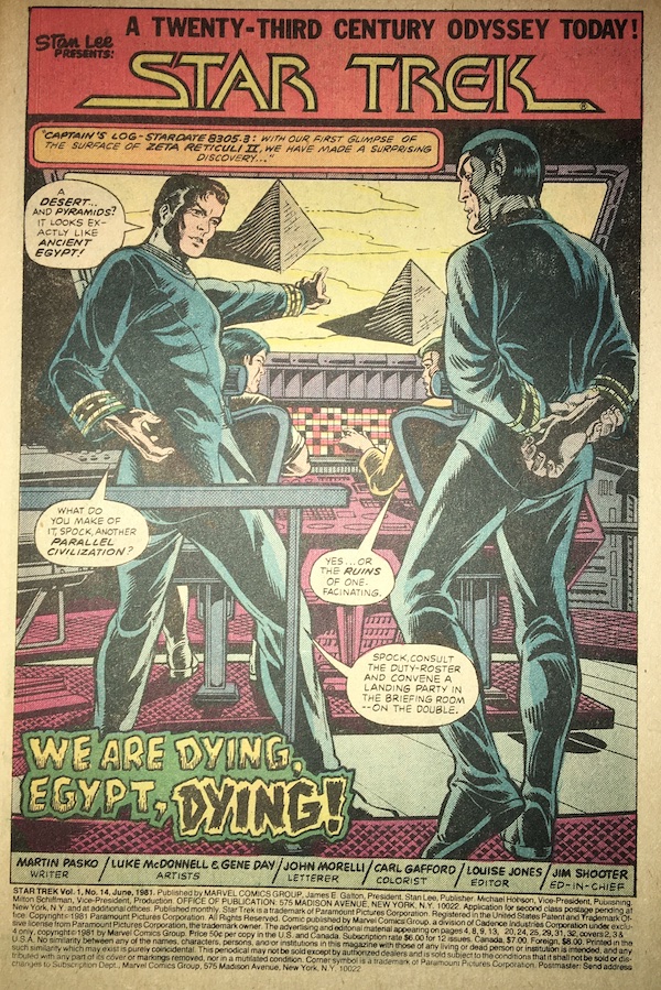
The story starts off simply. The USS Enterprise arrives for the first time at Zeta Reticuli II, and discovers a civilization similar to that of ancient Egypt on Earth. A meteoroid shower composed of siderites will bombard the planet within two days. Made mostly of iron, they will strike the planet’s surface with catastrophic effect. The crew needs to warn the inhabitants of their impending doom — and save them, if possible.
All this is established in only two pages. It seems like today’s comics would spend half an issue on that. As Bill Clinton sort of said, it’s about economy, stupid!
The rapid storytelling continues as Kirk leads a landing party and discovers a burial chamber with statues of Khnum, the Egyptian god of creation, and lots of mummies.

Of course, there’s technology behind the ancient gods, in the form of a powerfield! And then a giant statue comes to life — that’s comics for you. Kirk stumbles and grabs Khnum’s scepter and it transforms him according to an ancient prophecy. Again — that’s comics for you. The statue zaps some security guards while Chekov rants in transliteration of his accent while he, Uhura and Sulu manage to destroy it. But then, the transformed Kirk shows up.

I especially like the last two panels.
Back on the ship, Spock and Scotty are tracking the meteoroids, and check in with the overdue Kirk. The captain, alas, is possessed by an ancient spirit and now wears a nemes. Spock and Scott notice the change.
But not as much as they notice down on the planet. Kirk announces he’s Menteptah II, descendant of the pharoahs, and he will to save his people from the death that comes from the sky.
I can’t help but read this page and think of how great it would have been on the original series to have William Shatner play Kirk as King Tut from the Batman TV series, a la “The Enemy Within.” It would have been epic on TV. But here, it’s pretty meh.

Kirk confiscates the communicators, but misses one that Bones collected from the killed security guard. While Kirk destroys what he thinks are all the communicators, Spock is slowly reaching the conclusion he needs to beam down to find out what’s happening on the surface.
And then it starts to get both weird and predictable. Kirk prays to a statue of Khnum, which responds in a voice I personally hear as the same as that of the Guardian of Forever from “City on the Edge of Forever” when I read it. He explains, in pure Erich von Daniken mode, that the people of Zeta Reticuli II originated on Earth and traveled across the galaxy on a spaceship and would one day return to their homeworld. Of course, it also evokes Jack Kirby’s work on The Eternals, etc.

So it turns out Khnum has chosen Kirk to lead the people of Zeta Reticuli II back to Earth. And if it hadn’t started to unravel by now, the story is definitely unraveling now. Spock gets through to the communicator McCoy took from the security and receives a call for help. So of course, McCoy gets caught and Spock beams down to the planet to help — all by himself.
Meanwhile, Kirk takes Uhura as his “queen.” This is not explained. But they take the now-captured McCoy to join the other landing party members, who are laying on stone slabs with intravenous contraptions that infuse them all with the “Elixir of Obedience.”
Right.

Spock arrives and hears from Scotty that a beam from the pyramid is shrinking the Enterprise, but not its crew. That means everything’s becoming more intimate by the second — and Kirk’s not there to enjoy it! Also, wouldn’t the air pressure increase to the point that people would be crushed?
Spock and Kirk fight it out, while McCoy slips free and makes the ensorcelled Uhura take him to his medical kit — so he can giver her a shot of cordrazine that returns her to normal. Of course, there’s only one drug anyone remembers from Star Trek, and that’s cordrazine. Thank you, Harlan Ellison.

Spock breaks free of Kirk’s death grip long enough to grab a phaser and take out the statue of Khnum. Kirk’s now free, but the ship is still shrinking, and McCoy has freed the rest of the landing party.
At this point, not much sense remains of the plot. Whatever decent ideas it once may have contained are now just tossed out for any reason that will wrap this up by page 22.

It’s mummy time. The mummies were actual aliens in suspended animation and they come to life to attack the infidel invaders. This scene reminds me of a much better comic, X-Men #56 (May 1969), the first issue of that series with art by the great Neal Adams.
Giants on one side, a shrinking ship on the other! Who doesn’t love this?
Of course, Spock looks at the alien technology and figures out how to reverse the ray affecting the Enterprise, while Kirk “reprises” his role as Menteptah II to get the mummies to stand down.
At long last, page 22 arrives. The landing party beams up, the Enterprise destroys the approaching asteroids and a lame joke from McCoy at Spock’s expense wraps up yet another weak issue of Star Trek.

This issue sports a letters column, with several missives complimenting the improved artwork on issue #11, and more than a few complaining about the high prevalence of Star Trek cliches in each issue. (They’re not going to find much improvement by this issue.) There’s no reply from editor Louise Jones, who bows out with this issue to focus on more successful Marvel titles, like The Uncanny X-Men and Star Wars.